Software
Houzz Logo Print
sandnsky503

Help choosing between paint colors

7 years ago
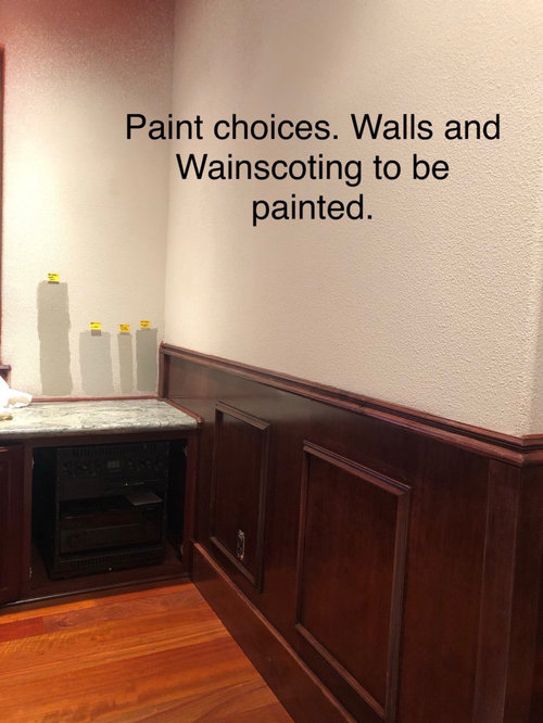
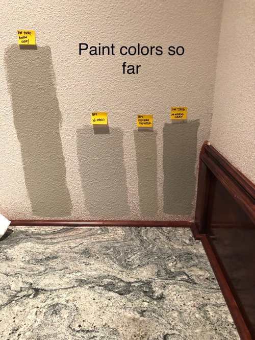
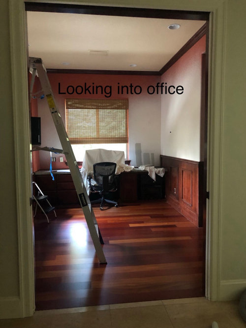
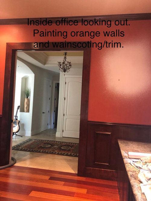
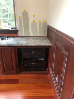
We are painting our home office and I am seeking help/opinions on 4 colors (or others) that I am considering. Can you please weight in on which you like best?

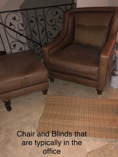
Furnishings throughout the rest of the house are warm tones with some warm grays (BM Collingwood in the Kitchen, Burberry Beige in main outside of office). The furnishings normally in the office are a tan leather chair, ottoman and natural woven blinds.

Left to right
SW Anew Grey
BM Nimbus
BM Revere Pewter
SW Mindful Grey.

Anew Grey seems to go with furnishings and Mindful goes with the grey/blue granite countertop. Not sure what may pull things together AND go with the CHERRY floors. We want it a little darker in the room.

Thank you!!

Comments (22)

  • 7 years ago

    I am just not sure about going with the flooring , which is beautiful by the way. To my eyes I am liking the 2nd one, nimbus overall. While it doesn't jump out as great with the granite, it works and I think it seems to go a little better with the cherry.

    That said, it's so hard to judge things like this monitor to monitor so hopefully some with more trained eyes will comment.

  • 7 years ago

    Thank you. I agree I was leaning to Nimbus but hesitate that it may not be a warm enough feeling for the office.

    Here’s a pic of the blinds and chair that are typically in the room.

  • 7 years ago

    I really like Revere Pewter.

  • 7 years ago

    Thank you for the comments and input!!!. Helps bouncing off ideas and thoughts!!
    Seems like the 2 lighter colors had likes (Revere Pewter and Nimbus). Are those dark enough to feel cozy, library feeling?

  • PRO
    7 years ago

    Nimbus. I see some green in Revere Pewter.

  • 7 years ago

    I like the Nimbus best too.

  • 7 years ago

    I like Nimbus but want it a little darker and Revere Pewter but it a little darker that one doesn’t go green (I think Anew is darker but it’s looking green). It’s a North facing room. Any suggestions?

  • 7 years ago

    Here are pictures and names of all the warm grays, some are outstanding. https://www.bing.com/images/search?q=Warm+Gray+Benjamin+Moore+Colors&FORM=RESTAB

  • 7 years ago

    Another gray (but it's sherwin williams ) worth checking into is SW LAZY GRAY.looks light but it has definite depth

  • 7 years ago

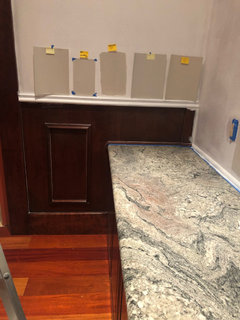
    I’m still staring at paints. I’m leaning to

    BM Revere Pewter (little greener than I like with the floor).

    BM Nimbus - someone mentioned possible pink tint. Yikes, I see that too (wonder if its reflection) but I love it otherwise.

    New ....BM Apparation. Anyone had first hand experience or see undertones in this color?

    Really like something warm due to the rest of the house and furnishings. We have a lot of trees outside but a lot of the warm greys are showing some green which I think will not look good with the floor.

  • 7 years ago
    last modified: 7 years ago

    Is the new one the one furthest left? If so, I like it. well I mean I like the one furthest to the left regardless of the name!!!

  • 7 years ago

    The one to the left is Apparation. Can you tell what undertones it is?

  • 7 years ago

    I am not really good with undertones. To me Apparation looks more "grey" than the others and very similar to Nimbus. I can see some green in the Revere Pewter and Mindful Grey. We have Mindful Grey in our basement and it does have a slight green undertone so I'm guessing in a north facing room it would too.


    If you like Revere Pewter but want something slightly darker, try SW Worldly Grey. I have Revere Pewter in my garage and was considering it for my kitchen and family room but it wasn't dark enough for my liking to contrast with my white trim. Worldly Grey is slightly darker in my space. I too am considering Anew Grey.

  • 7 years ago

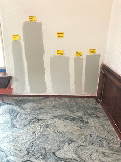
    I tried a different wall and included Wordly Grey. I had eliminated it earlier as I think I was seeing green but included in the photo for comparison. The Apparation looks SO different as does Nimbus. It’s evening with artificial lights vs natural light earlier. From this pic I’m liking far left...agreeable grey. I need to redo back wall with this color selection. I would welcome any thoughts.

    From left to right:

    SW Agreeable Grey
    BM Nimbus
    BM Apparation
    SW Repose Grey
    SW Wordly Grey

  • 7 years ago

    Nimbus looks best in all your photos.

  • 7 years ago

    Are you committed to a grey? With that flooring and furniture, I don't see a grey being compatible. Have you looked at beiges or even off-whites? Or even a soft color? You seem to be trying to avoid a greenish hue, but in my experience, soft green goes very well with cherry floors and warm furnishings.

  • PRO
    7 years ago

    2,1,4

  • 7 years ago

    @jay06 not committed to a grey. I’m trying to keep as neutral as possible as to flow with rest of the house (beiges and warm greys). Husband just wanted a little darker color to give warmth. I am open to beiges too. The countertop is driving me to the colors I picked up. I want to help neutralize the floor since it’s, well so colorful. I thought green opposes red which meant it accentuated it more. I’m no color expert though so maybe wrong there. I appreciate and am trying all suggestions to get a feeling of different looks.

  • 7 years ago

    How about going in a little different direction, especially if your husband is looking for something darker? Sherwin Williams Slate Tile would be wonderful with the floor and countertop and adds warmth to the office. Slate Tile

  • 7 years ago

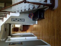
    If your husband wants something darker one of my favorite colors is SW Quiver Tan. We painted our two story front foyer (east facing) this color and I love it. I took this picture for a different post where I was showing my bench.


  • 7 years ago

    Thank you Jay06 and chocolatebunny123 those look beautiful. I will check them out. Chocolatebunny123 beautiful home.