Software
Houzz Logo Print
hzdeleted_19691726

Mirror vs. rug on wall - ?

7 years ago

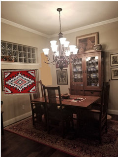
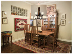
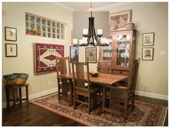
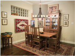
I guess I'm into some kind of weird autumn nesting mode, as I've been greatly enjoying trying to see my home with fresh eyes lately, making a few tweaks here and there, trying to use things I already have if possible. To that end, I've been considering whether I want to keep the mirror in the dining area or replace it with something else. Now, before anyone chimes in with the familiar refrain of, "Who wants to watch themselves CHEWING?!?", please note that that's not a problem for us, and we have enjoyed having the mirror in this space very much. It doesn't come across as well in the photo as it does in person, but the mirror helps a bit to fill the awkward wall space beneath the window. (And we aren't changing the window, and cannot rearrange furniture to do anything other than what you see in the pic. This is what we will continue to work with.)


Lately I've been thinking about replacing the mirror with a Navajo-made Ganado red rug that currently hangs at the top of our upstairs landing. This is a very nice piece, purchased at the historic Hubbell Tradng Post in Arizona, and is very special to me. I don't have a photo of the actual rug, but it is similar in style and color to the one I've used in the mockup. It is attached to a custom-made wooden support that basically holds it off the wall slightly and gives it a bit more "presence." So I'm asking for opinions on which looks better. You may think NOTHING would look best in this space, but that's not an option for me. I NEED something to hang here. ;-) Here's the space currently:

Comments (65)

  • 7 years ago
    last modified: 7 years ago

    Ida, I’d like to see something with softer/rounder edges in that spot, whether it is art, a round basket or a round/oval/irregular shaped mirror. At least from the picture, one thing that stands out to me is all the straight edges, the table, the chairs, the China cabinet, the pictures, the windows, the mirror ... something to break the straight lines of all the right angles would be worth trying, imho. You may have a better sense of the space in real life, and I’m just going by the picture.

  • 7 years ago
    last modified: 7 years ago

    I think the rug could work if you took down the two pics beside the window on the same wall, especially since you said there are windows looking to your patio across from that wall.

  • 7 years ago

    In looking at this some more, I'm wondering if the wall would look better if the sill were removed from the bottom of the glass block window. Then the overall effect would be "cleaner", in that it's just the window inset into the wall without calling attention to the fact that, "Hey! I'm actually a WINDOW, with a real, big-boy sill and everything!" Hmmm. Wonder if it would make much of a difference to try to simplify the look somewhat by doing that. We do have a trusted drywall guy now who could do that and leave it looking intentional.

  • 7 years ago

    If you squint REALLY hard, here's what it looks like with the two pieces of art removed from the wall to the right of the window. (I do have a pair of 8x10 watercolors on the wall to the left that transitions into the kitchen - one atop the other - and they will stay.) I can see how removing the artwork to the right would make the rug look better here though.


  • 7 years ago

    I'd go with the rug, but then I don't really care for mirrors as decor items.

  • 7 years ago

    Clearly I lack mad skillz, but I took out the sill. (Well, if you squint, I did. Sorta. I don't have dark tan walls, but this is the best I can do. ;-))


  • 7 years ago
    last modified: 7 years ago

    I like the rug. It adds color and even though it too has straight edges, it’s a softer material. I prefer it with those two photos gone on the end of that wall.

  • 7 years ago

    I wouldn't take the two pictures down because the wall is perfect the way it is. Not quite understanding how the two pics would interfere with the blanket, which BTW, would look nice, and I also like the mirror.

  • 7 years ago

    I think I'm going to have some "let's give this a try" sort of stuff to do once I get home this evening. I can already see DH's eye roll coming.

  • 7 years ago

    Never mind, I mistook the pictures you all were talking about. lol.

  • 7 years ago
    last modified: 7 years ago

    Those two pictures referenced above were actually just hung two days ago, and when I finished I thought, "There. Now it looks finished." My, a mere 48 hours and I have "new" ideas. ;-D


    ETA: Just want to say I appreciate how you bear with me in these posts. It's so nice to be able to bounce ideas off others with excellent style and good eyes. So ... thanks!

  • 7 years ago
    last modified: 7 years ago

    I can't decide on the window sill...still thinking lol

    Update: I think the hardware/rod (if you use any) used to hang the rug will add a little more decor, so then I would say, no sill? Still questioning myself though.


  • 7 years ago

    I like the idea of the rug but I would leave the artwork because you then have the blanket and two pieces of art work wrapping the corner and another piece of art work going into the kitchen (of which one is hopefully at the same level). They just seem to wrap the dining room with colour. And then there is the rug.

    Do show us what the results of your play time are. How would the rug be hung? to follow up on olliesmom's point.

  • 7 years ago
    last modified: 7 years ago

    Ida, if you were someone who doesn’t like to change things up now and again, I could understand why you’d hesitate, but you aren’t. You like to toy with changes, think outside of the box and basically have fun with decor, why not give it a try. You can always live with it for a bit and keep the mirror on stand by. If the rug works for you there, you can always add the mirror into your rotation for another spot. BTW, you have a pretty good success rate with your ideas too, so I’m sure it will look great.

  • 7 years ago

    I think Ida needs a new kitten!

    ;-)

  • 7 years ago

    Wouldn't that be fun, chispa? Hopefully, we'd get pictures. :)


    I don't mind a mirror in a dining room. I love how mirrors reflect light in a room. I'm just not sure about this particular mirror in your dining room. Feels too contemporary to me but perhaps I'm not seeing it correctly. I also like the idea of your rug (softness and colour!) and streamlining the window sill.

  • 7 years ago

    You've wanted to put something in this space for years so I would do it. I prefer a mirror.

  • 7 years ago
    last modified: 7 years ago

    Oh heavens, no more kittens!

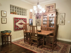
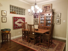
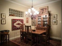
    We hung the rug and I'm really liking the change. The space feels warmer somehow. I tried taking down the two pieces of art to the right, but it felt oddly bare so I think I'll leave them. (Or will I? See pics below, with and without those two pieces.)

    Now I have a blank spot at the top of the landing where the rug was hanging and a displaced mirror that I don't have a ready spot for, but I'll figure it out. Thanks to all for the input and encouragement!

    With art to right of rug:

    Miscellaneous Ideas · More Info


    And without:

    Miscellaneous Ideas · More Info


    Or maybe JUST the Edward S. Curtis sepia photo. My dad made the frame, so I'd like to use it in this space.


    Miscellaneous Ideas · More Info


  • 7 years ago

    I agree with you about your chandelier. I think you need something along these lines. The rug looks great. I like it better now that you have it hung, and I do like it better than the mirror. Your southwestern art always looks so nice.


    https://www.lampsplus.com/products/ranger-36-and-three-quarter-inch-wide-rustic-farmhouse-linear-pendant__40w13.html

  • 7 years ago

    I think it looks great!!!

  • 7 years ago

    I don't really care for the single sepia photo, it just seems to throw the weighting off. I do like both of them there. However, at this point I think it's what you want to show and how you want to show it but I really, really, like the rug there. It just suits the space and the paint colour really sets it off.

  • 7 years ago

    I like the rug there and I agree with blfenton on the other art.

    Speaking of kitties, yours will leave the rug alone right? :)

  • 7 years ago
    last modified: 7 years ago

    I hung both pieces of art back as was originally done and agree that it completes the space. I like the blue in the one painting, and the subject of that portrait is a Navajo woman, so it just seems to fit.

    I hope the cats will leave the rug alone and think they probably will, but time will tell. So far they have zero interest.

    Outside, that is a very interesting chandy! I'm not big on filament or bare bulbs, but I have found myself wondering how something completely different than what we currently have would look.

    Oh, and thanks for the votes of approval! I appreciate it!

  • 7 years ago
    last modified: 7 years ago

    I actually kinda like this. 32.5 wide so still pretty good size, but doesn't seem as imposing as our current fixture.


    But $1,000! Why?!

    I like this too. Also a grand. Yikes.


    And a new chandy would require new island pendants. Maybe I'll just lie down until the urge passes.

  • 7 years ago

    Hahah I love that 1k chandy!

  • 7 years ago

    I know ... the more I look at the first one, the more enamored of it I become. This is not good.

  • 7 years ago
    last modified: 7 years ago

    One thing always leads into another! LOL

    Love the rug there! Still think it looks way too crowded with the pictures on that wall, and takes away from the simplicity of the rug, but if it makes you happy, that's all that matters.

    You could probably find a less expensive light fixture somewhere, which would look great.

    I guess I was kind of thinking just a little more on the contemporary side of Southwestern...which to me is, less is more.

  • 7 years ago


    Ohhhhhhhhhhh! I want. :-(

  • 7 years ago
    last modified: 7 years ago

    Project creep! Ugh! Yeah as I was looking, the one I really liked was $1800. And I forgot you needed pendants too. I was looking for craftsman, which seems to lean slightly toward southwestern or farmhouse sometimes and would go with your Stickley.

    With all your art, I would go with a single ‘layer’ of fixtures (hence the linear) rather than a layered chandy as you have now for better views of the art.

  • 7 years ago

    I see your point about the linear piece. I think I prefer the overall look of a chandy, and not sure a linear piece will fight or complement the window, but I'll mock up the other piece to get a feel.


    I guess we could sell the current fixture. Haven't mentioned any of these thoughts to DH, who might have a different view. That said, he's been quite agreeable about upgrading things like our exterior doors (one of which is in the dining area), so perhaps he could be convinced.

  • 7 years ago

    I like the rug there a lot. Prefer it to the mirror. My two suggestions: switch the two pictures on the right with the two on the right of the cabinet and try different shades on your chandelier. (I do like pictures on both sides of the rug.) I like the idea of a rectilinear chandy to keep the view as unobstructed as possible but if you want to change the look of your current one at minimal cost, maybe try more streamlined shades? Also, I don't recommend clear glass shades because I have one in my kitchen and despise how quickly it shows dust. (And I never seem to manage to clean it to my satisfaction. Streaks are always visible.) Btw, if it were my chandy, I'd be tempted to paint it bronze but I understand these types of "makeovers" aren't always the best idea. Light fixtures are expensive and you don't want to permanently muck up something that's perfectly lovely on its own. Which this chandelier is.


    Destination Lighting - Replacement glass shade

  • 7 years ago

    Could you do something like this? I don’t know if the candlelight bulbs appeal to you.

    https://www.lampsplus.com/products/balsimo-30-inch-wide-8-light-spanish-traditional-chandelier__7c885.html

  • 7 years ago

    It's probably impossible to tell from the photos, but the current chandy is ORB with alabaster swirl shades, nearly identical to the one in the link above. The current fixture ties in with the island pendants and bath fixtures and I do like the continuity throughout the house. But I also like change. ;)

  • 7 years ago

    Late with my $.02. I like the rug there. I would remove the plants from the sill. (if you paint the sill the same color as the wall, the sill will almost disappear.)

  • 7 years ago

    I didn't squint hard enough, Ida. :) The fixture reads black on my screen. This online decorating advice stuff can get beyond iffy when it comes to colours! lol As for the shades, yours have a slight flare at the top. It's a most subtle difference and most probably not worth the time or expense.


    Btw, when you're "restless" for change, do you find it corresponds to season changes or imminent big holidays?

  • 7 years ago

    I don't mind either of these. They don't make my heart sing quite like the $1k chandy does, but ... they aren't $1k either. So that's a bonus.


  • 7 years ago

    Maddie, I'll remove the little cactus planter and statue from the sill and see how that looks. In looking closer at having the sill removed completely, the window began to strike me as somewhat "jailhouse", so maybe the sill is best kept visible? I dunno.


    Tartan, I'm not sure I can pinpoint my restlessness to anything in particular. Sometimes it coincides with recent travel and a desire to reconnect with my home which sort of takes on a life of its own. Other times, it's just a renewed interest in all-things-decorating, which has been such a huge part of my life for just about as long as I can remember. I like the whole process of creating the nest and "refeathering" it from time to time, usually just at whim.

  • 7 years ago

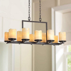
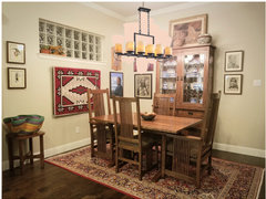
    What do y'all think of this one? It's the same fixture as the one I really like (the $1k), but this one has 6 lights vs. 9, which should be adequate. We currently have a 9-light fixture and it's a bit of overkill. This fixture is $600, which is still pricey (to me), but better than a grand.


    Here's the 9-light, for comparison:


  • 7 years ago
    last modified: 7 years ago

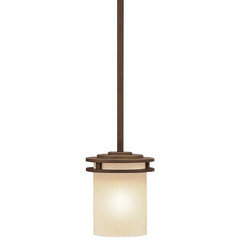
    The Hendrik (the 6-light posted just above, same as the 'spensive one I like but with fewer lights) has a pendant:


    And I really like it too.

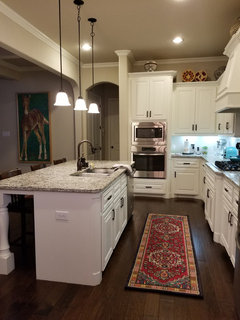
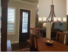
    Here's my current pendants:


    Miscellaneous Ideas · More Info


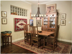
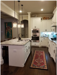
    And a mockup (probably a bit larger here than what they'd truly be), along with the 6-light Hendrik:


    Anyone wanna buy my huge-azz current chandy? (Nah. Didn't think so. ;-))

  • 7 years ago

    Oh I like that. The one with just the 6 lights. It's nicer than the one you currently have with all the curlicues which seem to overwhelm the area. Your current light is a statement whereas I think you should let your artwork take center stage and the 6-light fixture allows that to happen.

  • 7 years ago

    I really do like the 6-lighter too. I'm still not sure why this particular fixture is priced as it is, but the fact remains that I like it best of any I've seen thus far.


    I like the way it looks with the iron door in this space too. (My mockups are the worst, I realize!)


  • 7 years ago

    It works because it repeats the pattern of the chairs.

  • 7 years ago

    Yep. I hadn't even really noticed that until you said so, Bb!

  • 7 years ago

    That's a great choice and yes, I agree it would look better in the room but there's no rush to change it, is there? (If you need help resisting project creep, just say the word. ;-))

  • 7 years ago

    switch the two pictures on the right with the two on the right of the cabinet


    I may try that this evening. :-)


    Tartan, there's definitely not a rush, and I'll likely keep watching Lampsplus to see if the fixtures I like go on sale. That happened after we bought/installed our new foyer light a couple of years ago -- within a very short time after completing that project, the fixture we chose went on sale and we could've saved a bit had we waited. There's a Lampsplus store near us and we may make a trip to check out their in-store offerings before proceeding with anything.

  • 7 years ago
    last modified: 7 years ago

    You have a lot going on in that small space. I think I'd be shooting for less instead of more.

  • 7 years ago

    Much better! Plus I like the round shape and curvature with all the other angular things going on, and the pendants are cute too.

  • 7 years ago

    And the lights on the pendants repeat the pattern/shape in the door pane window.

  • 7 years ago

    I’ve always liked that Hendrik glass shape. I considered those pendants for over my peninsula and I probably should have chosen them.

Sponsored
J.Holderby - Renovations
Average rating: 5 out of 5 stars4 Reviews
Franklin County's Leading General Contractors - 2X Best of Houzz!