Software
Houzz Logo Print
pattyva

Was it better before or after?

6 years ago
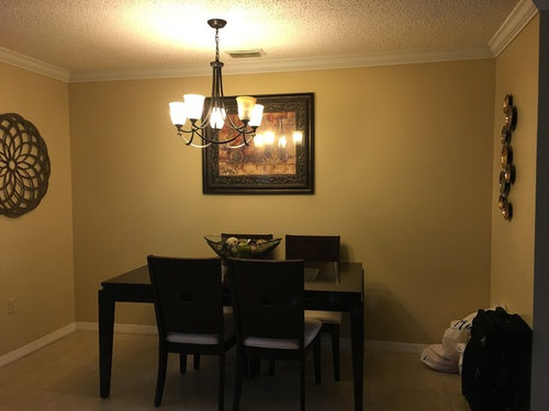


Dinning Room/kitchen · More Info


Dinning Room/kitchen · More Info


Comments (49)

  • 6 years ago
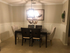

    Dinning Room/kitchen · More Info


    Dinning Room/kitchen · More Info


    Dinning Room/kitchen · More Info


    Dinning Room/kitchen · More Info


    Dinning Room/kitchen · More Info


  • 6 years ago
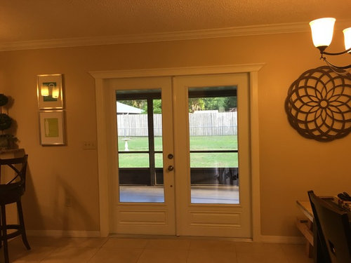
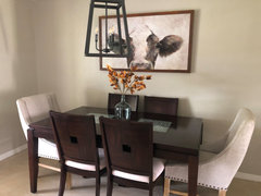
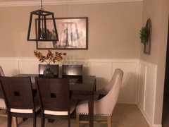
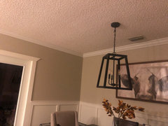
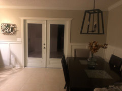
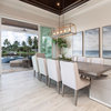
    The second sets of photos are the after. Overall I like the space I’m just struggling on what to put for wall art and some of those blank walls I feel like it doesn’t all flow together? Any suggestions or ideas?!

  • 6 years ago
    Board and batten was recently added too.

  • 6 years ago

    ..

  • 6 years ago

    Your room looks very lovely with very nice trim! I think that the chandelier is overpowering for the space. I would also prefer more colorful art, preferably something unique.

    pattyva thanked grapefruit1_ar
  • 6 years ago

    The art is sized better in the new photos, and the wainscoting is nice, but I liked the first light fixture. The new one seems very heavy and the wrong shape for the space. You can swag a light over so you can pull the table out a little more into the room, and still have the light centered on the table.

    pattyva thanked calidesign
  • 6 years ago

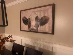
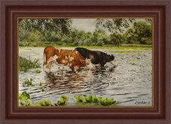
    I like the new room but would exchange cow pix for a mirror. The light fixture blocks the picture so a mirror would be better.

    pattyva thanked Hansen
  • 6 years ago
    last modified: 6 years ago

    There are things to like about both before and after. I agree the light fixture is wrong and the way the table is up against the wall makes it feel very scrunched.

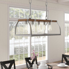
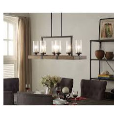
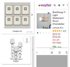
    If you can't move the light out from the wall as Manon suggests, why not try turning the table the opposite way so it runs perpendicular to the wall. I prefer the old fixture, but you could probably find a new one that suits your space better than that lantern style. Maybe:


    I like the new chairs and the cow would make me smile every time I look at it.

    pattyva thanked Olychick
  • 6 years ago

    The after is better. More light is reflected by the lighter color of the walls. The cow picture is totally okay by me, both in color, cow, and size. It is an prominent eye catcher.

    Before the walls (and floor) were too full. Best refrain from putting anything else on the walls there. I do not see the added value of the 'thing' with something green on it on the right wall. Would be better to be left open. The beautiful wood panelling is decor in itself and connect the dining area to the kitchen area. Love it. So to me it flows well.

    Someone mentioned that the table is a bit too close to the wall. We don't all own big mansions. I would rather sit a bit tighter to the wall, than to have my walk way to the open doors obstructed. So I think you did a fine job. (The 'Eat' picture is also a lot better than the two pictures on top of each other before.)

    Any lantern would be in front of the cow. So to replace it with something even bigger seems to offer little help. I like the lantern you picked, it is airy. If someone wants to see the cow, let him step aside one step for a better look from the sides. Of course you could go for a ceiling lamp, but that wouldn't do it in my perspective, since you clearly miss something above the dining table then.

    The new look has a crisp and clean feel to it. So I'd say: well done.

    pattyva thanked treesstandingtall
  • 6 years ago
    last modified: 6 years ago

    The new chandy doesn't jive with the formality of the board and batten--you could do better. Find something less "front door entrance" and more casual bling. Moving the table out as MF suggested works for diners but with the counter seating and doorway I am thinking you don't have it there for DAILY traffic flow. Not sure I would have ramped up the formality in what is essentially kitchen eating area, but now that it's there--and if you move the table perhaps the counter seating is redundant?

  • 6 years ago

    Ohh I love the after!! Love your cow picture!

    pattyva thanked AC LB
  • PRO
    6 years ago

    I love the cow picture but it needs to be lowered I finf the light is too much for the space look for something mostly glass I would paint the walls a different color besides beige and I agree the table does not allow for seating behind it but I assume you pull it out when you have guests Your upholstered chairs are too much for that small table. I do not like word art so the 2 pics were nicer IMO.

    pattyva thanked Patricia Colwell Consulting
  • 6 years ago

    Thanks everyone for your comments. I could center more the dining table but I feel it would just be in the way of the doors. We hardly sit there, we like to gather more about the kitchen area for dinner.

  • 6 years ago

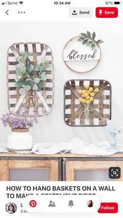
    I had thought about adding something like this on opposite side of the wall? I may just leave as is

  • 6 years ago

    Less is defenitely more. Better leave both walls next to the cow completely free. It will only start to make things cluttered, It will compete with each other for attention. Let the cow get it all.

    pattyva thanked treesstandingtall
  • 6 years ago

    I would not want to eat a steak or pot roast dinner in the new room. Awkward.

  • 6 years ago

    Don’t hang those baskets or sign, it’s not the sophisticated look you’ve been headed toward. In the interest of opening up the table, try only 4 chairs. I don’t think the upholstered chairs work unless you have 4 of that style.

    pattyva thanked Anne Duke
  • 6 years ago


    Any other type of lighting ideas? Pictures?

  • 6 years ago

    I do like the cow. It makes me smile.

    My thought on the table is that it gets pulled out for guests.

  • 6 years ago

    That’s correct. We do pull it out for guests.

  • 6 years ago

    Hi Patty!

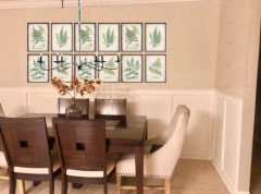
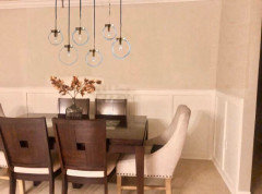
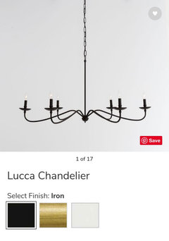
    Great job on the space! It looks wonderful as is or could do with a couple of tiny tweaks - as all new rooms need in the beginning! I agree with a lot of the commenters here - the lantern is just a bit too heavy, and something visually lighter like clear glass, crystal or more “leggy” fixtures will work. Pottery Barn has a handful of great options - I personally have the blown glass chandelier and love it but the Lucca chandelier, and the Lynden chandelier both take up less visual space and color wise aren’t so heavy that they take over the room. I’m happy to suggest more price points and options.

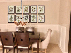
    I do love the cow print but I think he’s a tad too small for the space - I think that’s why you’re inclined to fill the other walls, because with him centered on the long wall, and nothing on the other 2, the overall space feels empty. How do you feel about a series? I’d think 8 or 12 prints would be lovely (maybe botanical), help fill the space, and make it feel more finished. You could certainly find a book of botanical prints online, cut out a dozen and then use frames from places like IKEA or Target for a very affordable solution that would allow you to customize the size of the art to your space. Two rows would look best.

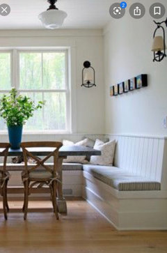
    And I think you’ve done a great job adhering to the logical flow of the room by placing the table against the wall. If you used the space more I would suggest a banquette solution for the space which allows for tight and cozy seating along the wall there that doesn’t block flow. But this isn’t a must, just something to mention.

    I’ve included some images - the one without any artwork is Pottery Barn’s Lynden chandelier, just wanted to show how visually unobtrusive some lighting can be and allow for the artwork - whatever you choose- to shine.

    Wonderful job again on the space!

    pattyva thanked Renee
  • PRO
    6 years ago

    Very good input. Three problems to address. 1. Chandelier is wrong for shape/size and style. Your table and chairs are modern and the fixture is not. 2. Position of table doesn’t allow space for chair push back. 3. Table and chairs are sophisticated modern and cow art is farmhouse. So change that out. How long is the table?

    pattyva thanked Flo Mangan
  • PRO
    6 years ago

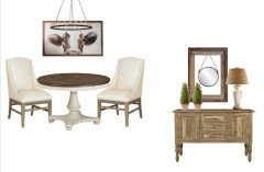
    Here are some concepts. You can hand make wall hangings and if you pull table away from wall, you may need to relocate junction box or swag it.

    pattyva thanked Flo Mangan
  • 6 years ago

    Thank you everyone SO much for all the great feedback! Renee the visuals put things into perspective, giving me extra ideas.

  • 6 years ago

    I also have an extra leaf that extends the table out but due to space we don’t use it much, but that is an option

  • PRO
    6 years ago

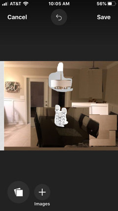
    Tried to give you visual. Hard with photos you posted but might help

    pattyva thanked Flo Mangan
  • 6 years ago

    Thank you! Going to continue working on my project, overall just a few tweaks

  • 6 years ago

    Can I go with half-and-half?

    I liked the warm color on the walls in the "before" picture, but the artwork just disappears and is kinda blah.

    In the "after", I love the cow! But the light switch blocks our view of it. I also don't love white chairs -- maybe if you Scotchguard them, they'll stay clean. Also like the wainscotting very much.

    pattyva thanked Mrs Pete
  • 6 years ago

    Flo, some may be interested in following only one certain style exactly. But many combine several styles and it still looks great. No need to keep it too tight here. There are more than enough of us that love her combination and would choose that cow as well.

    On the other hand, the things you like to see there, I wouldn't dream of wanting. Taste is very personal. Give her some space.

    pattyva thanked treesstandingtall
  • PRO
    6 years ago

    The main thing is you like it no doubt.

    pattyva thanked Flo Mangan
  • 6 years ago

    After looks great. Nice job on the board and batten. I like the combo of styles and chandelier.


    While I understand that you will pull the table out when you need to access the two chairs against the wall, I still think the chairs look a bit like they are being held hostage. How frequently do you eat at this table and usually often are you seating 6 people? I wonder if it would look more visually appealing to replace the chairs with two benches that take up less visual space, or at least chairs with a more open back so we don't see so many large dark squares shoved into the space.

    pattyva thanked Kendrah
  • 6 years ago

    We hardly ever sit there, we gather more in the bar area/around the kitchen. There are four in the household. I see what you mean.

  • 6 years ago

    ...

  • PRO
    6 years ago

    I would advise against benches. No one wants to sit on a bench for a meal.

    pattyva thanked Flo Mangan
  • 6 years ago

    I like the bench look but would prefer chairs.

  • 6 years ago
    last modified: 6 years ago

    Pattyva, since you and your family rarely dine there, would you consider thinking of the dining area as more of a sitting area? A round expandable table would serve one or two for a sit down cup of coffee, but could expand to seat four - maybe more - when necessary. With a smaller table, you'd have room for a small sideboard either to the right of the double doors or opposite (where you have the wall leafy decor).

    This configuration would be more accessible and look more intentional. While I like the changes you've made, the dining table position and crowded seating doesn't look mindful.

    Here's the concept:


    pattyva thanked Manon Floreat
  • PRO
    6 years ago
    last modified: 6 years ago

    Looks better after. When staging or testing different ideas, I would try pulling the table out from the wall and adding a very skinny - 12” - sideboard or console under the cow, with buffet lamps or sconces.


  • 6 years ago

    Manon, I love the round table concept! Very nice.

  • 6 years ago

    Love the after better ..except for the lamp ...its just too strong ...! Love the cow !

  • 6 years ago

    Normally I agree with FLO but in the instance of the cow art ...hmmm , this cow having her face displayed only is very modern and bold ...farmhouse looks like this photo below and would not fit ...but , .....I think your cow fits great ...and brings a smile to my face , ...it's the lamp that bothers me ...you need a funky chandler to go with the cow and tie it all together . And a beautiful bowl full of white tulips ...

    pattyva thanked skunst2017
  • 6 years ago

    Any suggestions on chandeliers?

  • 6 years ago

    I think the after is a great improvement, but you could still give more thought into the layout and the elements in the room. Sure, decoration wise it looks amazing, but there seems to be a lot of space that isn't properly used, especially with that dining table looking to tight.

    pattyva thanked Andrea Pedra
  • 6 years ago

    I’ll take better pictures tonight to get a better view also.

  • 6 years ago

  • 6 years ago

    Hopefully this gives you more of an idea on space

  • 6 years ago

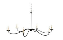
    It's too tight, pattyva. A new chandelier and additional decor won't fix that. Because it's imbalanced, it will be perpetually "off". But, if the Emperor insists on New Clothes, give him this (I think Renee suggested it, or something like it, up thread). At least the cow will be visible


    Saxon Chandelier


  • 6 years ago

    Very nice! I like this one

  • 6 years ago

    Thanks Manon! I recommended the Pottery Barn version - the Lucca chandelier. Looks like pretty similar specs but a bit easier on the wallet!

    pattyva thanked Renee