Software
Houzz Logo Print
bpath

Just what are we selling here?

6 years ago
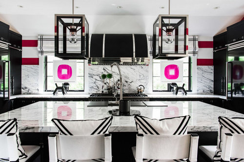
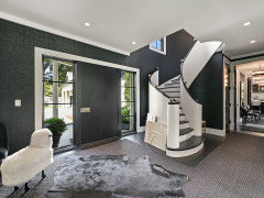
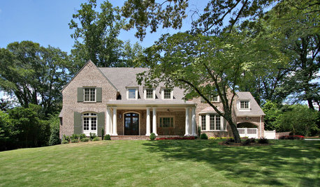
This house came up in a newsfeed. The owner is an interior designer. The house was originally built by a popular architect around here, and the listing makes note of that. Then, it goes on to note how the current owner gutted the house and re-laid it out. So why mention the original architect? I guess because of the outside. Oh well. But look at the listing photos. Can you tell what the house looks like? All I see is decor.

Here is the kitchen photo.


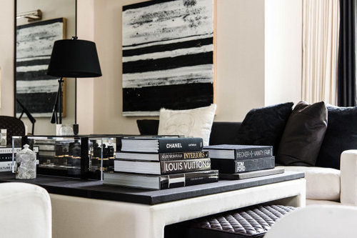
And here are some books. And some art. Doubled in the mirror!


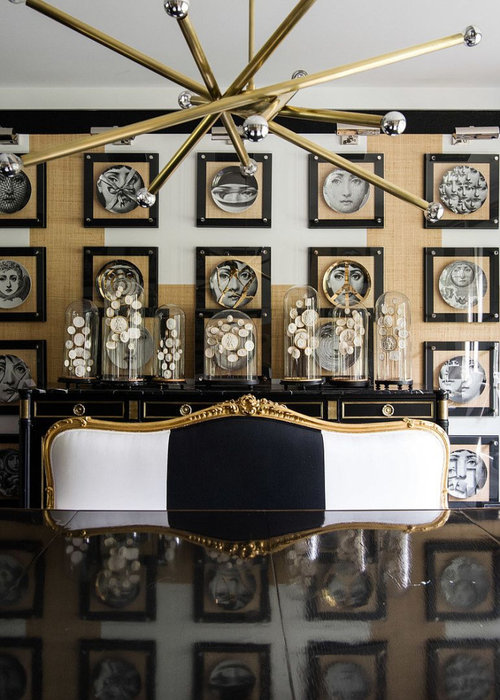
This, it might surprise you to know, is a dining room.


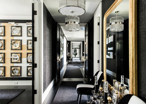
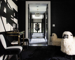
This hall goes . . . Somewhere . . .


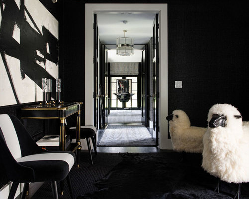
Oh, to the sheep cote, I guess.


I don’t care about decor, I care about the house! Show me some rooms so I can get an idea of how it lives, does the kitchen have drawers. I know, I know, at this price point and in this location in the town, whoever buys it will redecorate anyway (heck, they may even hire the same decorator) but then why bother showing off the current decor at the expense of the house itself?

Sorry, just ranting because I was so disappointed not to see a house when I clicked on this listing for my nightly fantasy lol.

Comments (42)

  • 6 years ago

    I wonder if writing a comment will help my post appear?

  • 6 years ago

    I agree. But I do love that b/w/gold dining room!

  • 6 years ago

    This might be all some people care about... how the house shows off to others, not how livable it actually is. (It also might be an ad for the decorator.)

  • 6 years ago

    Yikes. The sheep, LOL. I do think it’s cool how they framed the plates in the dining room, though.

  • 6 years ago

    Yep, that's definitely a trend these days, isn't it? Same thing on the tired ol' HGTV redo shows, where a house is purportedly rehabbed, but the camera on the big reveal is positioned squarely on the row of coat hooks in the mudroom or the tray of succulents on the dining table. Hey! I thought ya'll just moved walls and removed a fireplace and installed structural beams??

  • 6 years ago

    bp I saw that listing and was thinking of posting it to the building forum because of the architect......until I read the article and looked at the pics. Yuk.

  • 6 years ago
    last modified: 6 years ago

    Interesting that you should post this as I was looking at a new listing on Redfin and all of the pictures were extreme close-ups of the decor. There wasn't even one picture of a room or the exterior. Weird. If this is a new trend in real estate photos, I hope the trend is over quickly.

  • 6 years ago

    DLM, not much seems to remain of Cerny's style in there, right?

  • 6 years ago

    Fun2be, I know! I love looking at houses and how the house is designed, not how it is decorated.

    That is a cool dining room wall, though.

    I think the point was to advertise the designer, given her signature W in a chair back.

  • 6 years ago

    I find it disturbing

  • 6 years ago
    last modified: 6 years ago

    I absolutely do not like this interior designer. I especially do not like the settees/sofas at the dining table in lieu of chairs - I want individual chairs. That type of seating looks extremely awkward.

    While I do like black and white, I think it is very off-balance in a lot of the rooms in this house, sometimes with too much black, and sometimes with too much pattern, which tends to make me dizzy. The light fixtures over the island are very clunky. Overall, it looks like it was done in the 1980s, which I normally like, but not this time.

    Also, did you notice in the close-up of the dining table that one of the leaves appears to be damaged?

    I don't want someone else's signature in my house, and I do not want to see Chanel's name in bold letters - my name is not Chanel. In general, I do not like text or letters used in decor. It reminds me MTM's "M" on her wall, although I've not seen that much of her show, since I did not have a TV in the 1970s.

  • 6 years ago

    Finally had a chance to actually look at the listing. I find the interior oddly incongruous with the rather genteel-looking exterior, and really dislike the decor. It actually kinda made my eyes hurt to look at some of it ... it's just very harsh and garish, IMO. No thanks.

  • 6 years ago

    And with all of that, I have no idea what the house is like inside, nor do I really want to ask the Realtor to show it to me. There probably won't be an open house but I wonder if it will be on a home tour?

  • 6 years ago
    last modified: 6 years ago

    Ida that's a great word choice - genteel - as that quality is highly sought in the area. And it is very incongruous.

    bpath I imagine Cerny is rolling in his grave. And the neighbors are probably clutching their pearls - literally!

    edit: Came back to say I went through the pics again and there is not a single thing I find appealing in this house. Nothing.

  • 6 years ago
    last modified: 6 years ago

    Framed plates are one thing. Lots of framed plates with creepy faces on them is another matter. Ick!

    Are sheep replacing llamas as decor items?

  • 6 years ago

    The owner is flipping the house for profit. That’s why she dressed the house up in full gear. I do love the two lambs with real fur. They are beautiful. I think she filled the place with too much black color, but everyone has different tastes in life, and she sure can do whatever she wants since she owns the place. :-). The owner purchased the property in 2017 for $1,500,000, now she is selling it for $3,799,000, more than double. The property tax is $26,066 . For that much $$$, it should have a pool and a better landscaping........ for some reason the house doesn’t look that big from outside. It doesn’t look like there is a basement. I wondering if they counted in garages for 5,682 sq ft.......

  • 6 years ago

    Yeah. That's pretty bad. I wouldn't go so far as to say I liked nothing about it; the interior design workroom with the upholstery samples on the wall and the wire baskets of who-knows-what seemed kind of nice. And the Fornasetti plates amused me. But on the whole it was not appealing at all.

  • 6 years ago
    last modified: 6 years ago

    I do like the abstract painting that one of the sheep is looking at, and I like the gold balls on the stair railing. I also somewhat like the attic. But why is there a gold sunburst clock hanging in the middle of two window (photo #6) preventing the drapes from being closed, but also preventing the windows from being opened? That is a major faux pas in my estimation. I'm sure that if I looked more closely, I would find more, but it hurts my eyes to look at the photos that much.

  • 6 years ago
    last modified: 6 years ago

    Don't make fun of the sheep ... they cost as much as a used car!

  • 6 years ago

    Does the house come furnished, art like Lalanne sheep included?

  • 6 years ago

    I think the lambs are the two best things in the house. :-) They don’t cost a real car, maybe a fancy toy car, about $395 each online. They’d cost more if they are covered with Mongolian lamb fur ( long hair) , I saw them for sale online around $3,000-4,000. You could buy a pelt for $75-100, and make it yourself, a huge mark up . I like the ceiling light in the dinning room and the faucet on the island........

  • 6 years ago
    last modified: 6 years ago

    Lars, yes, the railing is nice, and good thing too because it would be expensive to change. I also like the bar/butler pantry.

    I was about to write about how a potential buyer's internal adding machine would start whirring as they walk through, but maybe once the accessories are gone and some of the furniture, it might be okay. The window blinds are nice. Even aaaallll those picture lights in the dining room, hey, I could hang my Danish plates in columns under them!

    But I can't help but wonder if the agent tried to say "Megan, darling, let's just remove this throw, and maybe put one of the sheep in the garage so people don't think they are a couple with potential lambs on the way, and maybe replace some of those faces on the plates with, oh, some Royal Copenhagen, or some Bjorn Winblads could work." And the homeowner saying archly, "why?"

  • 6 years ago
    last modified: 6 years ago

    Chispa is most likely referring to vintage Lalanne sheep sculptures

    I saw the house earlier this week (eta: Online) . I thought the exterior was okay (garage is overbearing) and the inside beyond bad.

  • 6 years ago

    That's why there's chocolate and vanilla - I really dislike those gold balls on the railing!

  • 6 years ago
    last modified: 6 years ago

    Allison, does this house have a basement? I am just wondering. A house without a basement would be hard to sell up north.

  • 6 years ago

    summersrhythm that house is up north - suburban Chicago. I checked other listing sites and apparently it does have an unfinished basement but I'm betting it's only partial. The house looks to sit very low but what happens a lot with homes in that area is a build up of grade over time. The landscaping is strategic to hide any window wells which would be the norm for the time built.

  • 6 years ago

    I don’t think I’d like all those faces staring at me as I dine. I do like the chandy, but the white, black, gold theme throughout is overdone and tedious imho.

  • 6 years ago

    Wait, those sheep are moving around when we aren’t looking. (shiver)


    Chuckie:


    unless . . . they really are multiplying? (shiver again)

  • 6 years ago

    I’ve had an interest in this since I was a child. I’ve been in some really amazing homes.

    This is a giant fail in my eyes.

    Too much. Tried too much, and it’s painfully obvious. Too much of everything. It’s not visually pleasing

    Just my humble, non pro opinion


  • 6 years ago

    I'll pass on this house. Too dark and dreary. A lot of stuff, no substance. That long hallway just calls for 2 creepy little girls asking you to come and play with them...forever and ever and ever... I'd walk in then leave after a minute during a showing. Not my style in the least.

  • 6 years ago
    last modified: 6 years ago

    And that's the thing. Surely this house still has some great bones underneath the decor, but you can't see them. The hallway could be quite nice, and surely isn't as long as the pictures make it appear. Maybe the homeowner just gave the Realtor her own pictures to use for the listing?

    I don't think it's so much whether you like the decor or not. There's just so much of it.

  • 6 years ago
    last modified: 6 years ago

    Are those morgue gurneys behind the chairs?


  • 6 years ago

    This reminds me of the Catalog Living posts/blog! LOL.

  • 6 years ago
    last modified: 6 years ago

    Good eye bbstx - and major creep factor! Doesn't everyone want autopsy tables in their theater room? Gotta wonder what's in those trunks!

  • 6 years ago

    I was a bit surprised to find that this house is in Lake Forest, IL. I would have guessed it is one of the ridiculously over-the-top LA digs. I never would have guessed, from looking at the outside, what the inside looks like. Not my style either.

  • 6 years ago

    @summersrhythm_z6a, I meant saw it online. Not IRL. Sorry for the confusion. I am in the South and also always want a basement.

  • 6 years ago

    bbstx, I think those are RH side tables, scissor-lift or something like that.

  • 6 years ago

    So it's a mortuary cadaver scissors lift.


    What an inspired decorating touch!

  • 6 years ago
    last modified: 6 years ago

    B-aaaa-a ;-) The interior is dire. Many of the specific decor choices,e.g., that wall of Fornasetti plates, have been done with so much more verve by others. Strikes me that this interior designer needs an editor. And some quiet time away from social media.


  • 6 years ago

    This designer must be closely related to some of the chefs of hipster bistros we've been to. Their motto seems to be "if it's too much, it's not enough yet!!!!"

    Spouse and I call that "kitchen sink" cuisine, as in, 'let's just throw it all in.....'

    I sincerely hope this will not set any decorating trends. And I even LIKE black and grey, LOL.

  • 6 years ago

    The video was a tish more helpful. Imagine all the furnishings gone and what is left is the paint and paper. I am thinking that house would need a lot of work. The inside/outside juxtaposition is rather confusing. I think THAT is a trend. The belts on the cabinetry for handles was curious. It needs a schematic so one can get an idea of the flow.