Software
Houzz Logo Print
caitlin_morris88

Help choosing Cambria countertops

6 years ago

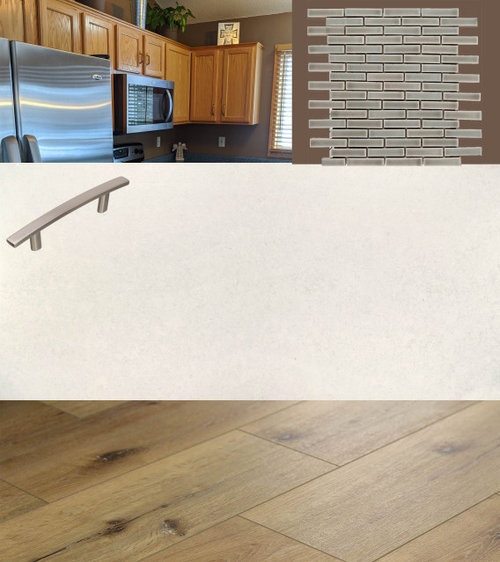
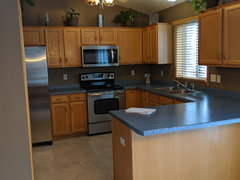
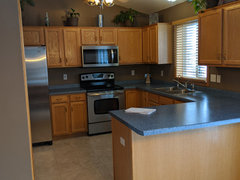
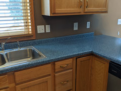
We just bought a house with oak cabinetry, brown walls, tan laminate flooring and blue countertops (yikes!!!). We are planning on installing vinyl plank flooring in a light honey color (yellowstone by Urban Surfaces, they look awesome in the space) and redoing the fixtures, counter tops and back splash. My husband loves wood cabinetry and the brown walls so we are not changing those (he hates the all white/grey look). In an effort to modernize the space I was thinking off white marble looking Cambria countertops. They have a couple new designs I really liked, Malvern and Whitby (they both have very subtle grey veining). For the backsplash I was thinking of a warm grey mosaic tile with hopefully a bit of contrast. Thoughts?? Since the Cambria styles are so new there aren't many example pictures to see so I made a quick mock up!


Option 1- Whitby with a marble herringbone backsplash (too much marble?)


Option 2- Malvern with grey mosaic


Comments (30)

  • 6 years ago

    It may help to see the full kitchen!


    Also..who chooses blue laminate countertops :(


  • 6 years ago

    I like the floor you chose but I don't care for gray with the oak cabinets. Look at cambria ridgegate

  • 6 years ago

    Agree with jck. I don’t care for gray or griege with the warmth of oak. I’d go with a warm veined quartz or just a creamy Corian. I see your husband’s point about the paint but it seems a little off to me. Very chocolate against the gold. Personally, I would lighten the tone up toward a warm tan if he can’t be persuaded to do a color. Lots to like about this kitchen. Look forward to seeing the results!

  • 6 years ago

    Can you post a picture with any of these samples in the same space WITH your cabinets? I agree with @jck910, not sure I like the cream and gray countertops with your cabinets.


    And as a general rule of thumb, do not install marble tile with a faux marble countertop.

  • 6 years ago

    Unfortunately, because it's such a new design we can't check out the samples yet. I see what you mean about gray countertops but they really don't come off gray, they look like a warm cream and then have slight veining when you look up close.

  • 6 years ago

    I'm still pretty open to other countertops colors, although I do really want a lighter toned Cambria quartz.


    Crowndale also caught my eye, better choice?


  • 6 years ago

    so pretty hilu morabito


    Caitlin the crowndale is very pretty also

  • 6 years ago

    We did Cambria Ironsbridge. Warm gray, and off white.

  • 6 years ago

    Caitlin, the cabinets and flooring are in the beige/tan/brown family. You will be hard pressed to find a grey that will compliment those.

    Crowndale is very pretty but very busy. If you are okay with that, awesome.

    The Dovedale is very subtle and not busy at all and appears to have a more beige/brown vein which will go very well with your cabinets and flooring.

    We have Cambria Bellingham. It is very busy. It has black and grey and beige.

    Neither of your mosaics will go with your cabinets or flooring.

    Try to make a story board so you can see the bigger picture. And so you and your husband can see where the kitchen is headed. It also helps you get a handle on costs.

    Usually the back splash is picked after the cabinets and countertop are in so you can see the tile in your kitchen's lighting.

    Usually the paint for the walls is chosen last so you can see the paint with your cabinets, countertops, flooring and lighting.


  • 6 years ago

    We don't intend to pick out backsplash until the counters are installed. I just put those in the collage to get an idea of what they could look like.

    We are really just picking the countertop now. I want some movement and variation. I am not a big fan of the larger/statement veining. I also don't want a solid white (dovestone looks a bit too solid white for us).

  • 6 years ago

    Cambria has so many pretty countertops, it is very hard to choose!!!

    I would still make a story board to help you with your vision.

  • 6 years ago

    Crowndale to me has a lot of green in it.

  • 6 years ago
    last modified: 6 years ago

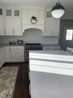
    I have Crowndale on my perimeter and its sister Beaumont on the island. I chose them because I had to match a lot of oak trim I was stuck with in a reno. I think they look great. Crowndale is very neutral, IMHO, and the ivory base is creamy. The dramatic veins in Beaumont read a bit warm — it has lots of olive-gold sparkle — but it was too dramatic for me to use everywhere. If you can take drama, look at Britannica Gold. Or is it Britannica Warm? Can never remember. Or do look at Beaumont. It is Cambria’s prettiest quartz, to my eye.

  • 6 years ago

    Hilu Morabito - What edge profile did you use?


    We are deciding between Piedmont and Ridgeline. I worry about Ridgeline being too sharp.

  • 6 years ago

    Following

  • 6 years ago

    The Volcanic edge is an edge that has no sharp edges.

  • 6 years ago

    Caitlin, we used a 1 1/2” flat polish straight edge, but added a 1/8” bevel to soften it a bit.

  • 6 years ago

    Caution... Our CAMBRIA Quartz Countertops are now 10 years old and the section in front of the window is fading (turning whitish). BEWARE!!!

    UPDATE: CAMBRIA does NOT honor their Warranty if it is UV (that is Light) damage.

  • 6 years ago

    Update: we are going with the Crowndale! I loved the sample in person, it looks very different from the online image. I hardly noticed the green.

    We are also going to paint all the trim white! 😬

  • 6 years ago

    Hilu - what backsplash is that? It’s lovely!

  • 6 years ago
    last modified: 6 years ago

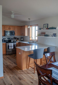
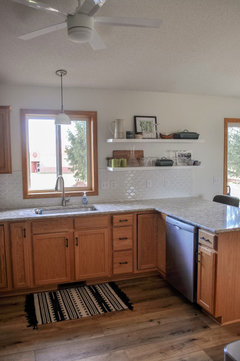
    We finished our kitchen reno!

    We installed the vinyl plank flooring, faucet, light fixtures, backsplash tiles and floating shelves (BEHR Bit of Sugar) on our own! We also painted the walls (BEHR Soft Focus).

    The sink and countertops (Cambria Crowndale) were professionally installed.

    I LOVE IT. It's so much brighter and happier. Embrace the oak :)


    Before:


  • 6 years ago

    removal of cabs to the side of a sink window, as you did, above the peninsula creates such a nice change. I guess it depends on whether people can lose the cabinet storage. But wow, it really transforms things. All......NICE NICE NICE !! The old kitchen was so dark...I'm sure it feels so different.

    Caitlin Morris thanked herbflavor
  • 6 years ago
    last modified: 6 years ago

    I really had a problem with the old cabinet and peninsula not lining up for the backsplash tile. That was my biggest reason! The new shelves are a bit longer too so they still hold a lot. We moved from an apartment with a teeny tiny kitchen so we were not worried about storage!

  • 6 years ago

    Love it! Such a small, but mighty change!

  • 6 years ago

    Wow, you did a great job! I love your choices!

  • 6 years ago

    Kaitlyn, your before picture looks like my kitchen. Oak and blue, LOL. And it looks like the same dang blue. My cabinets were oak but in great shape. I also went with crowndale about 6 mos ago and love it.


  • 6 years ago

    Dovedale would work although it might be more subtle than you want. We have it with pecan stained alder cabinets and yellow toned walls I love it!

  • 6 years ago

    I just saw the completed pics - great job, it is lovely!

  • 6 years ago

    Great color on the walls too