Software
Houzz Logo Print
kellyinthehills

Advice for cabinet paint color to go with sea foam/light aqua counter

6 years ago
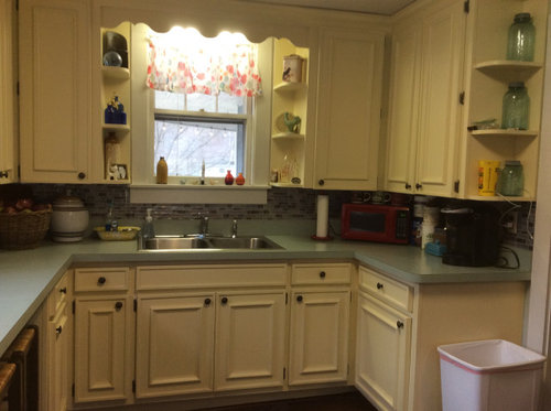
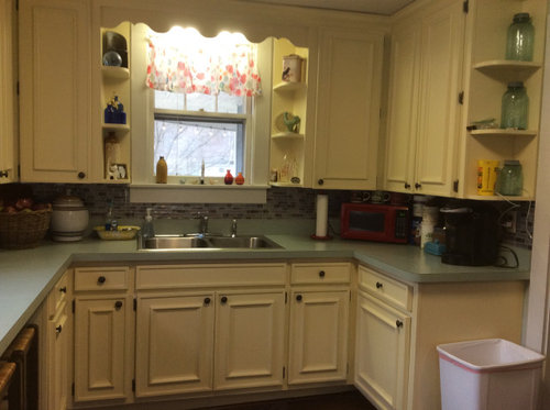
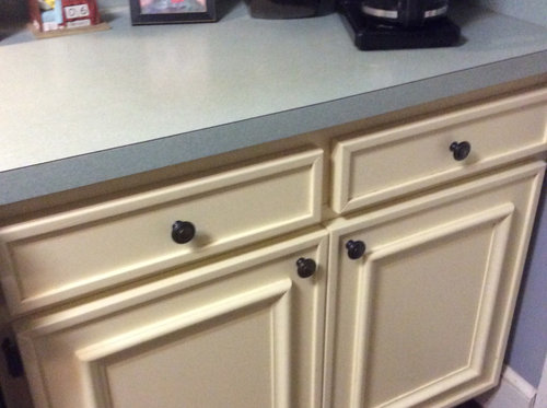
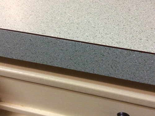
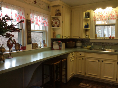
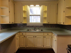
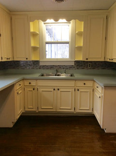
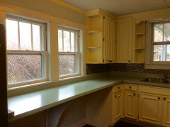
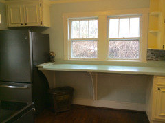
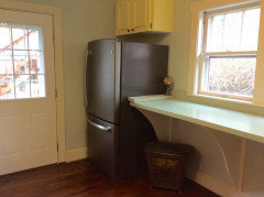
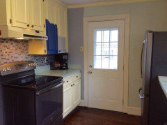
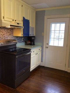
Hello! I am needing help with choosing a cabinet paint color to go with what I'd call sea foam green/light aqua counter tops.


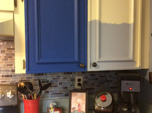
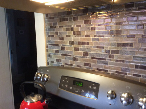
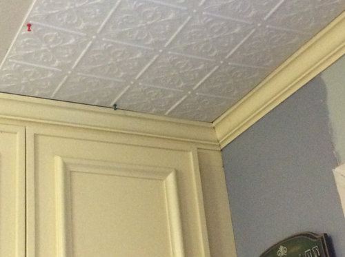
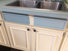
Our house is a 1900 farm house style in a small mountain town. Our floors are wood and we plan on putting decorative direct mount tiles on the ceiling. The wall color needs updating as well. We do plan on keeping the back splash and we cannot replace the counter tops at this time, We will be doing to painting etc ourselves. I have included photos of the kitchen and you can see where we were playing around with a more dramatic blue or a grayish/blue(?) I was playing off the blue of the fiesta plate. Not sure if we are on the right track?


Do not think I can change out the hardware - this IS the new hardware I picked out as opposed to the white/cream porcelain knobs that were there in the past Lol!


Any advice would much appreciated, thank you!


Comments (93)

  • 6 years ago

    I would go a shade darker on lowers. If you don’t have a Benjamin Moore paint store near you, you can still get their color White Dove, which is a warm white, from Sherwin Williams. They know each other’s color formulas.

    kellyinthehills thanked rocoad123
  • 6 years ago

    It's funny how you have an actual farmhouse when so many people are trying to do brand-new farmhouse style. The cream cabinets and countertop are very much in true farmhouse style. Old fashioned cream subway tiles would work very well as an affordable backsplash in character with the folksy style.. Then continue with the turquoise accents. Honestly, I think the kitchen is wonderful--very sweet, homey, and unique.

    kellyinthehills thanked housegal200
  • 6 years ago

    Sherwin Williams usually have color consultants. It might be worth a consult. I think either of the blues would be to much with the countertop. The navy will be to bright. The light color is to close but not a match to the counter. I actually prefer the original color. Another option might be a soft taupe. Or you could just paint the bottom cabinets the same color as the counters or a bit lighter and keep the uppers a soft off white.

    kellyinthehills thanked Mary Nigro
  • 6 years ago

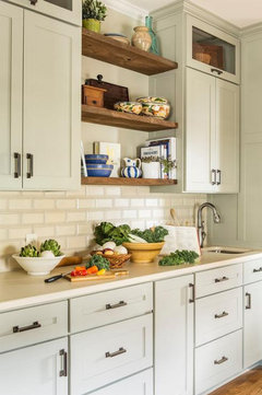
    Something like this?

    kellyinthehills thanked Mary Nigro
  • 6 years ago

    Cream subway tile backsplash in vintage kitchen:


    kellyinthehills thanked housegal200
  • 6 years ago

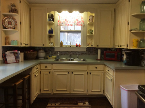
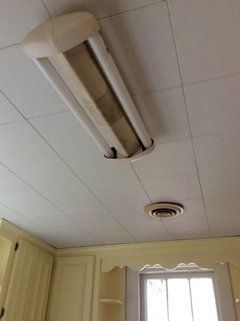
    Hi everybody! I have cleared the clutter and am ready to tackle this exciting endeavor! I have attached some more pictures that might help to see things more clearly. Thanks to all the wonderful feedback, here is what I'm thinking: I am either ALL WHITE cabinets or WHITE UPPERS/GREEN LOWERS (some shade a bit lighter or a bit darker than countertops). REMOVING the BACK SPLASH and coming up with a complimenting WALL COLOR. I wanted to ask you all about lighting and ceiling.....as you can see we have a very old fluorescent lighting fixture in the center of the ceiling between 2 heating vents and another fluorescent light fixture over the sink....suggestions? Ceiling height is 7.5 feet. Also....trying to save where I can, does anyone know if you can PAINT the type of ceiling we have? If so, what type of paint? Will the tiles get soaked/saturated? Thank you, once again! Also.......should I be concerned about the white getting DINGY/DRAB?


  • 6 years ago

    Since you can’t see the fixture above the window (if you plan on keeping the wooden valance), then just replace it with a LED FIXTURE that throws a lot of light. If the fixture on the ceiling is the only other light in the room, you can’t be getting much light on your counters. I would consider under cabinet lights. You could even get battery operated ones so you don’t need to mess around with electrical work. Lowe’s carries some and you can find lots online too. It looks like your ceiling is low so you will need a low profile ceiling light, with a farmhouse style. Is it a dropped ceiling and are those ceiling tiles like acoustical tiles?

    kellyinthehills thanked rocoad123
  • 6 years ago

    Agree with under cabinet lights. That will make a huge difference. I would switch the lights (or lightbulbs at least) to 3500K-4000K BEFORE you paint the cabinets. Right now, the cabinets look very yellow (esp the upper ones compared to lower ones) and I'm guessing some of that is the lighting issue.

    You have a very charming kitchen!

    kellyinthehills thanked Gcubed
  • 6 years ago

    To save money, buy new LED tubes that fit where the fluorescent tubes are now. They make standard sizes for exactly this purpose. Check online or at big box stores. The fluorescent fixture above the sink is probably cheapest and easiest to replace if you decide to go that route.

    kellyinthehills thanked apple_pie_order
  • 6 years ago

    I will look into the LED options - ceiling tiles are the type I think snapped/grooved together one tile at a time. There is no drop ceiling grid, where each tile is dropped in, these are put together to make a smooth ceiling (?)

  • 6 years ago

    What are they made of? I would think you could paint with a regular latex paint, but you could ask at Sherwin Williams.

    kellyinthehills thanked rocoad123
  • 6 years ago

    For the cabinets, choose a white that matches your window trim. Start with the uppers. I think a blue/green slightly darker than your countertop would look great for the lower cabinets. Then use the same white color for your walls, in a matte finish, including the area between the countertop and cabinets. In a small room without much wall space it will make the space seem more open. You can then paint the door a deep version of the blue/green if you want some contrast. I agree with others to decide what you're doing with your lighting first so you can better judge the paint colors before you begin.

    kellyinthehills thanked calidesign
  • 6 years ago

    Calidesign - the trim paint is called "7005 Pure White" from SW....are you/anyone familiar with it? It would work for the white on the cabinets? As opposed to say, the "White Dove" or "Dover White" mentioned in prior posts (?) Thank you!

  • 6 years ago

    Following because your kitchen is absolutely darling and has an authenticity a lot of people try very hard to achieve. A brighter, crisper white for the cabinets would be beautiful. We used Benjamin Moore Simply White for our trim. It looks great in all types of light. I’d love to see some warm wood (new bar stools? Stacked cutting boards?) and glass knobs (teal or celadon or a bright, happy coral).

    kellyinthehills thanked Wendy Cortopassi
  • 6 years ago

    If you like the look of your trim, go ahead with that on the cabinets. If you want the cabinets to have a slightly warmer white, you can also do that while keeping your Pure White trim. Just don't go toward the gray or cool whites. Using the Pure White will tie everything together and keep it simple. It will look slightly different anyway in a different sheen and on the different surfaces.

    kellyinthehills thanked calidesign
  • 6 years ago

    To choose paint color go to the paint store. They will help and you can buy samples. The color will not look the same in your home as it would look in your neighbor’s. Paint is a hands on decision. Your kitchen is adorable.

    kellyinthehills thanked Linda Thomas
  • 6 years ago

    One small thing: if there is enough room on the left hand side of the fridge for the door to swing fully open, switch the fridge door to open the other direction. It will greatly improve your access to the fridge and will give you landing space on the counter when you take things out of the fridge.

    kellyinthehills thanked izeve
  • 6 years ago

    Hello Everybody! I have decided to go with White Dove on the upper cabinets and am debating between SW Quietude and SW Halcyon Green for the lower cabinets. I am in love with both and they are just a tiny bit different from one another. I am thinking maybe SW Sea Salt for the wall color. We will be doing bead board for the back splash area.


    Two questions: satin versus semi-gloss for the cabinets? I like the ease, feel and look of satin (to paint with), but do you recommend semi-gloss for the cabinets over satin or is it a matter of preference?


    Also, should the backsplash area be the SAME color as the wall or a different color but in the same family?

  • 6 years ago

    Semi gloss is more durable than satin. I really love satin, but I would go with semi gloss for cabinets. I like what you are doing. Can’t wait to see your photos!

    kellyinthehills thanked rocoad123
  • 6 years ago

    I would do same color on backsplash as wall.

    kellyinthehills thanked rocoad123
  • 6 years ago


    Halcyon green on left......quietude on right

  • 6 years ago

    On my monitor those both look too blue. The paint matches the small vertical surface of the countertop, but looks way off from the flat top surface. Be sure to stand back and view both in your lighting, both at night and during the day. Use semi-gloss on the cabinets so they are easier to clean, and use the same paint as the walls on the painted area of the back splash.

    kellyinthehills thanked calidesign
  • 6 years ago

    Following

    kellyinthehills thanked plf12652
  • 6 years ago

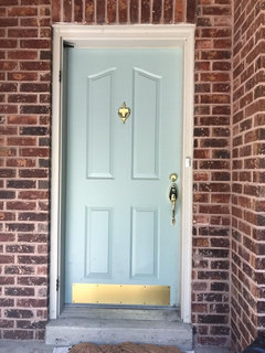
    I feel like your photo colors are very skewed, so it’s hard to give an accurate opinion. My front door is Halcyon Green, and it looks significantly different.

    kellyinthehills thanked Hillside House
  • 6 years ago

    following

    kellyinthehills thanked Kathi Steele
  • 6 years ago

    Every screen is going to show color a bit differently, so you’re going to have to decide that. If you are changing out your lighting, make sure to look at the colors in the new light. It makes a big difference!

    kellyinthehills thanked rocoad123
  • 6 years ago

    I highly recommend changing light bulbs to 3500-4000K before picking cabinets paint. Even if you don’t have your new fixtures yet, see the room in the right light. It will affect your paint color so much

    kellyinthehills thanked Gcubed
  • 6 years ago

    Blue/greens can be funny in the light. I have Bear’s Valley Mist on my walls, and in the morning it looks aqua, and in the evening it’s more blue. I think I am leaning towards Halcyon.

    kellyinthehills thanked ShadyWillowFarm
  • 6 years ago

    Regarding your ceiling, were you planning to paint the existing tiles or referring to painting the new stamped metal look panels you showed? The existing tiles look old enough to be asbestos, so I would be careful in handling/removing/nailing into them. Painting them would actually seal them, which would be a good thing. See DoItYourself.com for instructions on painting asbestos tiles. You can have the material tested for asbestos free of charge...call a local building contractor or code office for a source.

    Though I’m not a huge fan of all-white kitchens, when they are as small as this one, painting the cabinets and walls white can help the kitchen look larger, and would brighten up those dark under-cabinet corners. I do like the colors you’re considering for the lowers, however, and your choice of bead board for the backsplash. I would use the white of the uppers for the bead board...more classic and brighter. Let the countertop be the divider between light and dark. And don’t forget to paint the door the same white as the walls so it doesn’t Stan out so much. You can also get little plugs to fill in the screw holes on the door’s window trim ;)

    kellyinthehills thanked Katho
  • 6 years ago

    Ceiling is acoustical tiles - but we plan on putting in bead board on the ceiling as well .... am open to WALL

    color suggestions to go with white dove uppers and we’ve decided on quietude for the lowers...

  • 6 years ago

    But asbestos fibers were used in some acoustic asbestos ceiling tiles, often amphibole asbestos such as amosite, crocidolite, anthrophylite, tremolite, and actinolite, with amosite among the most commonly-found. Modern ceiling products do not contain asbestos.

  • 6 years ago

    How high is your ceiling? If low, I would paint it white. Paint the bead board before you put it up!

  • 6 years ago

    Yes, agreed, we plan to paint the ceiling bead board white, and definitely before we put it up. : ) Now....we are thinking of painting the back splash bead board area white....so still struggling with a wall color option....someone mentioned CORAL.....any thoughts or paint color suggestions?

  • 6 years ago

    Love your kitchen! Take down the thing over sink and remove curtains and let in that mountain sunlight.

    kellyinthehills thanked kps65
  • 6 years ago

    I think the counters are your statement color. I would stick to neutrals for everything else.

    kellyinthehills thanked Hillside House
  • 6 years ago

    I like Quietude better as a color, but Halycon Green looks like it can compete with your countertop better.

    kellyinthehills thanked Super Lumen
  • 6 years ago

    you are doing a play on color: I would indeed pick a beautiful coral on the bit of wall. Its an older space and color as your friend can be engaging fun and spirited. Don't shy from color. but you use care to get shadings right. I love color and I love neutrals too. There are new generations wall papers too...that bit around the door could be an interesting spot for that as well.

    kellyinthehills thanked herbflavor
  • 6 years ago

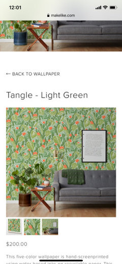
    It doesn't look like you have too much wall space for paint/color. If you are doing the green-ish lowers, white uppers, white beadboard backsplash and ceiling, what about trying to find a cool new but vintage-y wallpaper that incorporates the aqua/teal color + white and a coral? I feel like I saw something like this in a magazine recently. If I can find it, I'll post.

    kellyinthehills thanked Gcubed
  • 6 years ago

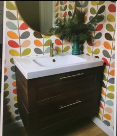
    Ok, my memory of the colors is wrong but the idea is to have a big colorful print:

    kellyinthehills thanked Gcubed
  • 6 years ago

    You can wait on picking the specific wall colour after other updates are completed, although it’s a good idea to have a general idea or vision of your end result. As others have said lighting plays a big part in determining colours.
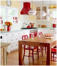
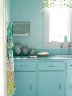
    I found this kitchen photo with same colour counter and notice you have some red accents too. You may not like as much red as in this photo but just to give you an idea of a buttery yellow on wall could work. If you want more neutral there are a lot of warmer greiges that work with white dove.

    kellyinthehills thanked MarleneM
  • 6 years ago

    Agree on the blue-green being the statement color. I would paint the walls the same white as the upper cabinets and use coral for accent pieces. The kitchen is small and too much/too many colors will close it in and make it very busy. Or at least wait on the walls until everything else is done and see how it feels. Then get a paint sample and paint a piece of cardboard, hold it up or take a photo and then decide.

    kellyinthehills thanked Katho
  • 6 years ago

    If alpine spruce colors are in counter, seems to me that it's got a delicate look? and could benefit from a less strong blue-green lower.

    kellyinthehills thanked everdebz
  • 6 years ago
    last modified: 6 years ago

    You have wood floor, and I'm curious if backsplash has a rustic-rough appearance? if not, might be ok [without beadboard though].

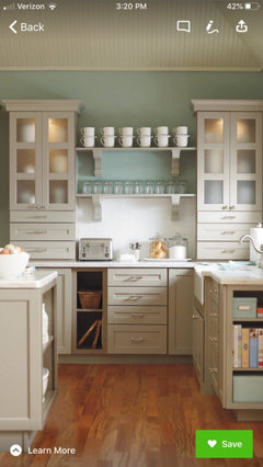
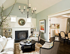
    Would this kitchen combo here - be a direction? what is your whole house like? rustic or more retro....

    Ridge Road Remodel · More Info


    kellyinthehills thanked everdebz
  • 6 years ago

    White can appear yellow if it gets dirty from cooking in the air Soap and water well clean it Aircab the top looks more blue to me then green Their kitchen doesn't need more color Make sure you use a daylight Bob so what doesn't Have a dreary Feel to the Room And under cabinet lighting is a must

    kellyinthehills thanked happyleg
  • 6 years ago

    I have an older kitchen similar to yours. You would be shocked at the amount of light that scalloped piece is blocking. We replaced our old fixture with this and it has made an unbelievable difference. https://www.lowes.com/pd/Juno-JSF-7-77-in-White-Modern-Contemporary-LED-Flush-Mount-Light-ENERGY-STAR/1000704810

  • 6 years ago

    Light BULB Daylight

  • 6 years ago
    last modified: 6 years ago
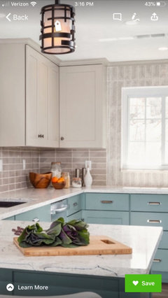
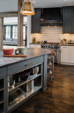
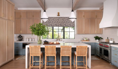
    There's a slight disconnect with lower color and dark handles. With dark hardware, I'd choose more this island color. Top photo shows Del Mar Blue 704.


    My Houzz: Antiques Mingle With Modern Style in a 1920s Tudor · More Info


    Forest Heights Remodel · More Info


    Contemporary Kitchen · More Info


  • 6 years ago

    I hope this brainstorming helps. Just say you had cool metal handles [and lighter tiled floor] -- then your kitchen could've gone this direction with fresh/ lighter paint.

    EJ Sooley House, Heart's Delight Newfoundland · More Info


  • 6 years ago

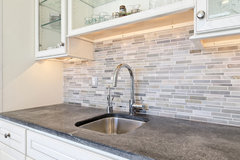
    I’d embrace the retro look. I think it would be adorable. I keep Picturing something like this as your backsplash.


  • 6 years ago
    last modified: 6 years ago

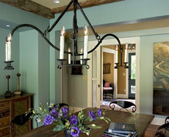
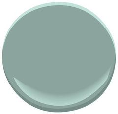
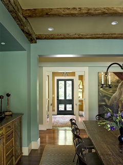
    Someone else posted this idea - called Grenada Villa - in their farmhouse.

    As you know there are variations on paint strip, less of the color.

    Farmhouse Reinterpreted · More Info


    Grenada Villa 690 Paint · More Info


    Farmhouse Reinterpreted · More Info


    https://www.houzz.com/photos/farmhouse-reinterpreted-farmhouse-dining-room-burlington-phvw-vp~107130