Software
Houzz Logo Print
joey_r_

Quartz Counters Color Issue

6 years ago
last modified: 6 years ago
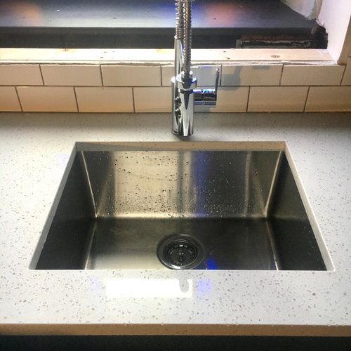
Hi! New here and would welcome any suggestions to help with this quartz counter dilemma that has been bothering me since they were installed last week.
I was basically railroaded by the general contractor into choosing counters sight unseen, except for photos, due to the current Corona issue. Initially I was given one option which was Giallo Ornamental which I really didn't like at all. I finally made the case that there should be more than one option and suspect the only reason there was one choice was due to whatever was available as remnants. Remnants would be fine with me if price reflected such since the counters only encompass 14 square feet anyway. I also frantically began searching for other options such as teak and stone shops that could work within the budget and provide a classic, timeless look.
Out of the blue I get a message saying that a white quartz is available, a photo is sent, and I'm told that the entire kitchen can be finished within one day. The photo sample appears white and neutral, plus I had seen what I thought was the same at the showroom of another vendor the previous day, I'm told it would be the same cost as the Giallo Ornamental--so I stupidly okay it. I'm also burnt out from renovations, the constant mess, doing dishes in the bathtub, so just want it all to be over at that point.
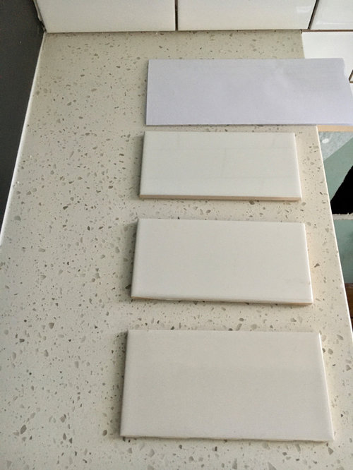
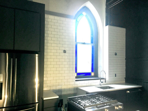
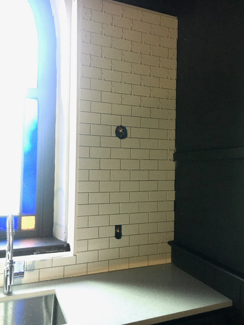
It is then installed and to my horror it is cream colored with yellow kind of peach undertones. I cringe when I see it as it looks dingy to me. The counter at the left side of the stove looks really yellow to me. It also looks horrible with the appliances which are cool toned stainless steel and especially the stark white subway tile I already had on hand, so I ordered more tile (again sight unseen) in hopes that it is warmer white. It shipped within two days and it is not as stark as the other tile, so bit the bullet and did the install myself.
I need help trying to bridge the two materials and harmonize the counters with the rest of the room.
Originally, the grout was to be a neutral dark grey "Natural Grey" by Custom Polyblends, but I'm doubting that and since I yet again cannot seem to get any sort of samples besides the color swatch on a tube of caulk to make a decision, I'm ambivalent of making any decisions at this point and have exhausted my budget as the counters were actually more expensive after receiving the final bill.
I have come up with maybe three ways, in order of extremity, to help combat this issue such as:

  • Using cooler tone LED lighting (not the blue kind) I figure since the kitchen is north facing the cooler light in the daytime does neutralize it a bit.
  • Using a warmer grout tone.
  • Changing the cabinet color and trim to a taupe versus the current Brunswick Green which I really wanted to keep. The walls would also become more of a putty tone versus brilliant white. Tricking the eye into comparatively thinking it's white I guess.

Any other suggestions would be welcome!
Current Materials + Colors:

  • Walls: Sherwin Williams, High Reflective White.
  • Ceiling: Blueish-grey mid-to dark tone that I had color-matched from a sample I created.
  • Trim + Cabinets + doors: a very dark greenish, blue black that I also created.
  • Floors: The original 146 year old wide plank raw Douglas Fir which have silvered slightly.
  • Faucet: Chrome which looks horrible and blue with the counters, but is pulled from the KitchenAid appliance handles.
  • Sink: stainless steel under-mount, chrome drain.
  • Back-splash: White subway tile; grout to be determined.
  • Appliances: Stainless Steel and chrome, besides the fridge and washer/dryer which is black stainless to blend into their respective built in units which is the dark Brunswick Green.
  • Hardware: Raw brass.
  • Other Materials: There are exposed copper pipes, plus I have a lot of copper pans which will be hung inside an alcove painted the Brunswick Green.
  • Island + Large Larder: Neutral, dark toned oak. Island will have lighter tone 11" thick butcher block top contingent on other materials.


I'll also post some photos in the comments section of other items that will be in the room to get a better idea of finishes.


Sink:


Sink View:


Right Side:


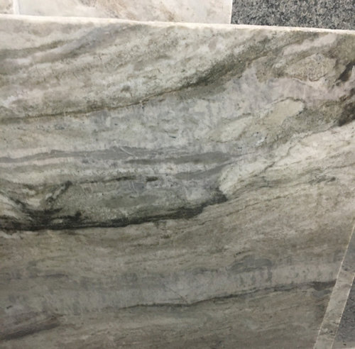
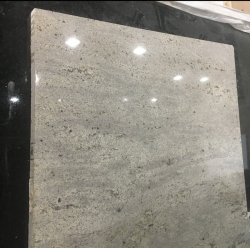
What I would have preferred:


Right of Stove:


Another Stone I would have preferred:

Comments (19)

  • 6 years ago

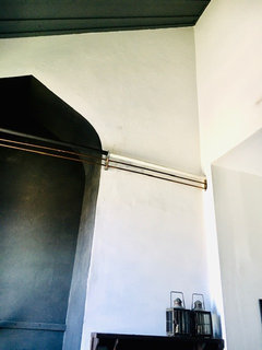
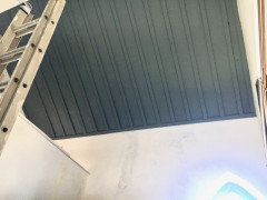
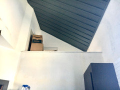
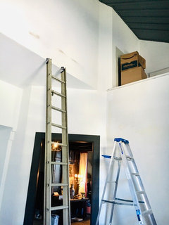
    Ceiling and Upper Walls:


  • 6 years ago
    last modified: 6 years ago
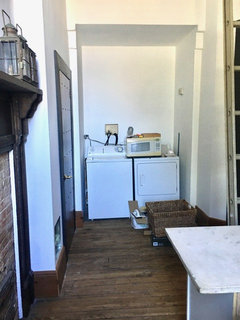
    Other items that will be in the room to get a better idea of finishes.


  • PRO
    6 years ago

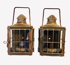
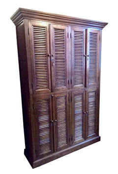
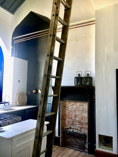
    I have no idea if I wanted to read a book I would have bought one. When posting here less is more you are unhappy with a choice you were forced to make IMO you have way too much going on to even try to tie it together you have been forced to do stuff backwards , like the backsplash which IMO is never chosen before the counter is in. You show no pictures of the room, why is the stove next to the sink? So many things and after all the writing rally without pic of the whole space no way to know how to help. I would say first deal with the lighting which means LED bulbs in 4000K since all those dark colors are going to gobble light like crazy.I have no idea what the lanterns and cabinet in the last picture are.

    Joey R. thanked Patricia Colwell Consulting
  • 6 years ago

    Non issue.

  • 6 years ago

    As @Patricia Colwell Consulting said, you’re going about this arse backwards. The time to have come here was before you began this project. You’d have learned to wait on the backsplash. It’s the last element to be chosen, or you wind up with your situation.

    Who designed your kitchen? Doubtful it was a KD, or you wouldn’t have the setup of fridge-stove-sink, with virtually no prep space. This is the mantra...ice, water, stone, fire...that is, fridge (ice), few steps from the sink (water), which is next to ample prep space (stone), next to the cooktop (fire).

    “Faucet: Chrome which looks horrible and blue with the counters, but is pulled from the KitchenAid appliance handles.” Why did you match the faucet to the appliance handles? What does it matter, since you’re going to have “raw brass hardware”? Not that anyone would ever notice whether the metals of your faucet and appliance handles match.

    Patricia is correct, we need pictures of the whole space.

    Do you intend to use those lanterns? ‘Cause first look tells me those aren’t going to provide much light, and they’re going to be a nightmare to keep clean.

    So, what’s the deal with the cabinet in your last pic?


    Joey R. thanked darbuka
  • 6 years ago

    are you an over-thinker? looks fabulous. It’s eclectic- go with it. The colors work together in my opinion. Kind of modern, industrial, old-world church. 👌

    Joey R. thanked Katie B.
  • 6 years ago

    Counters look good in pics. I don’t see a problem.

  • 6 years ago

    Patricia, first time posting, so I apologize for the long post! I'm going to experiment with the 4K and a 5K LED lighting, then base all future decisions on whichever LED works best in combination with the northern natural light. I'll post a panoramic of the room once I clean it up a little.


    The stove is pulled out from the wall while I was tiling. It's roughly 24" from the sink in reality.


    The room is very vertical and has lots of turns with the walls which makes photographing it difficult.

  • 6 years ago

    Katie, with this project I have been a total over-thinker due to nothing being really standard, plus thank you for the compliment!


    It's actually within a former church. I don't have any accessories or natural stuff in there at this time as it's under construction still, but think once those things go in, it'll soften up a bit.


    I'm a bit sensitive to yellow tones since I on my own stripped seemingly miles of dingy "white" paint off all the woodwork in the former sanctuary here.

  • 6 years ago

    Really neat. My dream is to convert a barn or school or church to a residence. The copper piping and accessories, wood furniture, and I’m assuming warm wood floors go with the warm counter. It doesn’t look very yellow on my monitor- more Grey.

  • 6 years ago

    Katie, it's surely been an adventure! The number one challenge with a church was that it essentially is one big room and everything proportionally is way bigger than normal. I spent a few months ripping out the 1970s era offices and drop ceilings that broke it up, then another few months with it just open trying to figure out how to divide it with sensitivity to the original architectural details, natural light, and flow.


    I ended up doing a lot of research into Early English architecture and their concept of working off a great hall which is what I essentially ended up doing as well the Gothic use of division via a rood screen to split the space visually from the profane into the holy.

  • 6 years ago

    Where is this?

    The large scale of everything is the appeal- the ceilings, windows


    having a hard time visualizing a rood screen for this application, but I’m sure it’s amazing. Is that metal on the ceiling?


  • 6 years ago

    I think it's looking very nice. I love that it's so eclectic and historical. Be sure to post finished pics!

    Joey R. thanked alladd
  • 6 years ago
    last modified: 6 years ago
    I'm located in Baltimore, MD. The rood screen and upper gallery are in the Main Hall/Sanctuary. It's comprised of a large walnut Gothic Revival Victorian organ housing I was able to salvage; it acts as a gateway into the private space where I primarily live in the back of the building. I'll see if I can add more photos or even the floor plan.

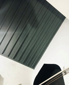
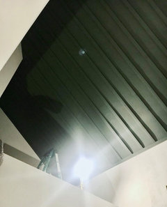
    The ceiling is plaster. It had been extremely damaged by old water damage and in the 1970s when the drop ceiling was installed. I repaired, patched, and painted it myself. The color is sort of a zinc like blue-grey-green depending on the light. It had originally been stenciled with chevrons and a reticulated pattern which I found evidence of while doing the repairs.

  • 6 years ago

    @darbuka and @Patricia Colwell Consulting (I just figured out how to reply with attention)


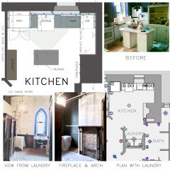
    Yes, I wish I had been able to utilize this resource prior to work and your mantra regarding the elements is very helpful. I've photographed the room and attached a floor plan. The room is obviously quirky even with my naivete regarding kitchen design.


    photos spinning counter-clock-wise (please note, the island photographed is not staying, but will be replaced)


  • 6 years ago
    last modified: 6 years ago
    I think it’s counterproductive to regret the layout at this point, and the finishes for that matter. It’s such a small kitchen, I don’t think you’ll have a problem getting from one appliance to the next efficiently, even if it’s not the ideal layout. Stay on course.

    How big is the entire church?

    what are you going to do with the fireplace? Store cookbooks? Or get it working again?

  • 6 years ago

    @Katie B. I agree, and anything is better than the previous year-plus of appliances living everywhere there's no construction. It's all lessons learned :)


    The square footage is roughly 2900 sq. feet. There is an attic that goes up another 15' or so above the plaster ceiling. The basement is like a dungeon and was walled off in the 50s where the furnace/boiler used to be. I've been wanting to try to access that side, but that would open another can of worms...


    Not sure regarding the fireplace. Originally, I think there may have been some sort of iron stove as there is no permanent hearth. It's been sealed forever and it has a twin fireplace on the opposite side of the laundry. That room is the same footprint as the kitchen. It's a stair hall that leads upstairs. A new hearth and a chimney professional would have to take a look at it. The chimneys are massive brick lined/cut marble clad, and are very tall. The roof is very steep, original slate.

  • 6 years ago

    I love what you’re doing. I’ve been working with a realtor to find a property like this (much smaller) for a mountain cabin for years. Very inspiring!

Sponsored
J.Holderby - Renovations
Average rating: 5 out of 5 stars4 Reviews
Franklin County's Leading General Contractors - 2X Best of Houzz!