Software
Houzz Logo Print
vtrobee

Settle a design argument

6 years ago
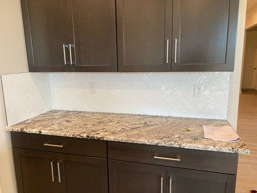
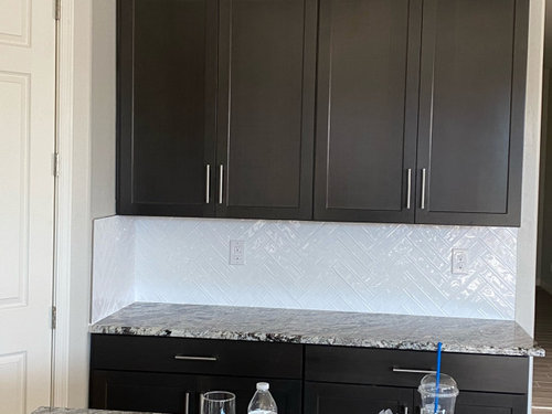
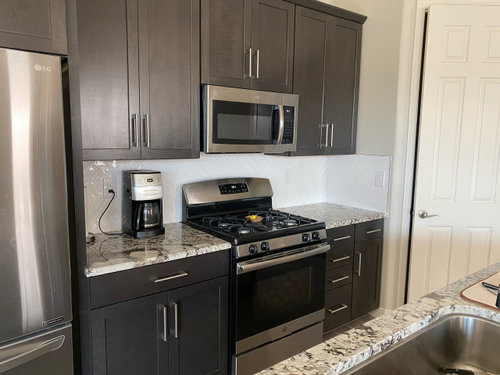
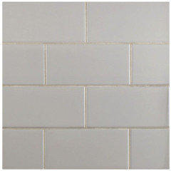
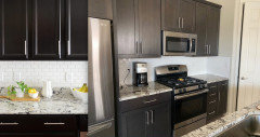
My husband and I in disagreement on our newly installed backsplash. I would have preferred a cream color tile while he choose the white.

To me the white seems to draw attention away from the counter top.

What are you thoughts?

Comments (24)

  • 6 years ago

    The countertop is "busy" so you needed a solid color or nearly solid color but my inclination would have been to choose a light color from within in your countertop rather than a shiny stark white. That said, it doesn't look bad as is. You might consider hanging a few heavy metal trivets in your favorite bold colors where they'd be handy for use as needed but out of the way.


    https://www.google.com/search?q=colorful+metal+trivets&tbm=isch&ved=2ahUKEwjLhorz_NfoAhXMs1MKHaDeB3EQ2-cCegQIABAA&oq=colorful+metal+trivets&gs_lcp=CgNpbWcQDFDHDFiBEmCNI2gAcAB4AIAB1gWIAZMSkgELMC4zLjQtMS4xLjGYAQCgAQGqAQtnd3Mtd2l6LWltZw&sclient=img&ei=0FCNXsveIsznzgKgvZ-IBw&bih=654&biw=1366&client=firefox-b-1-d

  • 6 years ago

    Great idea! Thanks for the tip.

  • 6 years ago
    last modified: 6 years ago

    I agree with you and suezbell, that backsplash is too white. It has no relation to the countertop. One of the creamy colors from within the stone, would’ve been a better choice.

  • 6 years ago

    I probably would have gone with a cream but the white doesn’t look bad. The only part that sticks out to me is the backsplash past the upper cabinets.

    Maybe add a row of ornate tiles to that section that has white & cream to blend the wall color with the backsplash?

  • 6 years ago
    last modified: 6 years ago

    If you decide against the ornate tiles suggested by J Jones, you might also consider peel/stick wallpaper for those side narrow side walls by ty the cabinets above the backsplash.

  • 6 years ago
    last modified: 6 years ago

    Another alternative for where the backsplash meets blank wall might be a very narrow shelf over that "seam" for S&P shakers and spices or just a trim piece of wood that matches the cabinets over the seams with a hook or two for a potholder, and/or put cork on the wall above the backsplash and trim board for holding pictures or receipts or grocery lists.

    .

  • 6 years ago

    I think the white is a nice choice. It lends a very contemporary feel with the dark cabinets, keeps it bright, and I think it actually helps to showcase the countertop even more. A cream would not give you as much of a contemporary edge.


    I also like Suezbell's trivet idea. Art that is functional, too.

  • 6 years ago

    I love white, but I personally would not have chosen it for this application. My choice would be in the cream family. does not work fot me.

  • PRO
    6 years ago
    last modified: 6 years ago

    Too white. For everything. Sorry. But you knew that when he insisted on having white, yes? No offense to the morale boosters, but no trivet or doo dad will change the fact....it is too white. It's not just the " splash" problem; it appears too white for trim ( paint ) white, as well.

    A very pale and warm gray might have been better than ANY white. But there are in fact a million whites in tile and in paint. Bet me your trim white, is Ben Moore Simply white? Is it ? Not white enough, cool enough, for THAT white tile.. Look at the pantry/casing/ door.. Picture it the white of the tile, and the tile as the wall color. Monitors differ, but that's what I see... A fight of warm/and ice cold. Tile is Icy white. Trim is not : ) Your eye sees color by comparison, and that close pairing of the two whites, makes your eye see the door as far less white against the tile, than when compared ONLY with the espresso cabs, and wall paint. In fact, I think the combination of the two in that fight are making the tile look a bit......cheap. Very sorry to say that,


    here too.... look at the door and casing


    Now picture more as this.....................

    see what happens when your eye compares , warm and cool. Left side of screen shot looks crisp and right side?? Put a hand over the door....


  • 6 years ago

    It’s ruining your kitchen; sorry. Choose a warmer tile and this time, don’t tile the side walls.

  • 6 years ago

    Sorry but I agree the white is too stark, and the part on the wall unnecessary. It should have been creamy ivory at the lightest, something warmer for sure.

  • 6 years ago

    The "stark" white lends the modern edge.


    Take off the side parts of the backsplash, and if the doors bother you, paint them a brighter shade of white, maybe BM's White Dove. But really, various whites can work together, and there is no emergency currently happening in your kitchen.


    Or you could just bring in the cream, etc., of course. Depends on the look you want.

  • 6 years ago

    The design on the tiles is fighting with the design on the countertop IMO. That would be more problematic for me than the white.

    However.... some great canister jars on the countertop? A steaming stew? A batch of fresh cookies? A spring green salad? By the time you put necessaries on the countertop, you won't notice the backsplash.

  • PRO
    6 years ago

    You win this fight.

  • 6 years ago

    Yes, you are right. The white is too white and totally distracts from the counter. Hubby should have selected a light color from the counter and chosen backsplash tile to match it.
    He probably thought “Let’s just get it done, already” and made a “safe” but wrong decision. Give him a kiss (through your mask), call the tile person back and get the right creamy white or pale gray tile ordered and installed. Never remind him of this decorating fail again.

  • 6 years ago

    I like it but paint your baseboards, doors and casings a brighter white to match. Also remove the tile on the sides just leave it on the back wall.

  • 6 years ago

    I don’t know if this is possible at this time, but I think you need a design professional to help. I could see this domino-ing into a complete redo. Are you willing to repaint the walls, doors, trim. Then it will be different from the rest of the house, am I right? Maybe the best thing would to rip out the tile and go with gray subways. The layout pattern should be simple. The countertops are very pretty and should be accented. By changing the tile it will be the only thing to change. Good luck

  • 6 years ago

    Well... you could re-paint all of the walls and trim so your backsplash looked better... but then that gorgeous stone would look totally wrong. That tile is WAY too bright of a white next to that countertop.

  • 6 years ago

    It will all be fine once you remove that tile from the side walls. That's just wrong.

  • 6 years ago

    Before scrapping the entire backsplash, try removing the side panel and consider some other ideas such as


    leave the white on the back wall but add 4" solid color creamy tile at the base of it and along the sides.


    or hang a removable peel and stick washable wall paper just to those side walls,


    or just paint those side walls an accent color ... some color from within your countertop. .

  • 6 years ago

    Sorry...really!...but it's not working for me at all. The backsplash just doesn't connect with anything in the kitchen. The lightest color from the granite (cream?) would have fit better. I would not want any pattern in the backsplash due to the pattern in the granite.

  • 6 years ago
    last modified: 6 years ago

    I don’t care for the stark white at all. Sorry.

  • PRO
    6 years ago

    Sorry hubby but that does not work and BTW you don’t usually tile the side walls and colorful trivets will not change the fact it is the wrong color.