

This I could do...not gray
6 years ago
last modified: 6 years ago
Featured Answer
Sort by:Oldest
Comments (21)
 6 years ago
Related Professionals
Elkton Interior Designers & Decorators · Corpus Christi Interior Designers & Decorators · Texarkana Interior Designers & Decorators · Pittsfield Interior Designers & Decorators · Binghamton Interior Designers & Decorators · Spokane Interior Designers & Decorators · Hopkinsville Architects & Building Designers · Waco Architects & Building Designers · Utica Architects & Building Designers · Youngstown Architects & Building Designers · Erie Architects & Building Designers · Grand Junction Architects & Building Designers · Cheyenne Architects & Building Designers · Chatham Architects & Building Designers · Victoria Architects & Building Designers 6 years ago
 6 years agolast modified: 6 years ago
 6 years ago
- 6 years ago
- 6 years ago
 6 years ago
 6 years ago
 6 years ago
 6 years ago
 6 years ago
- 6 years ago
 6 years ago
- 6 years ago
- 6 years ago
- 6 years ago
 6 years ago
- 6 years ago
 6 years ago
 6 years ago

Related Stories
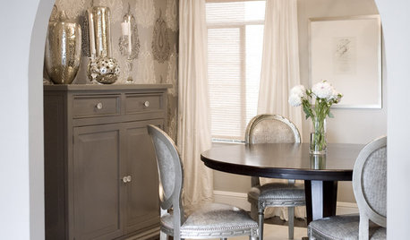
DINING ROOMSDesign Dilemma: I Need Ideas for a Gray Living/Dining Room!
See How to Have Your Gray and Fun Color, Too
Full Story
PRODUCT PICKSGuest Picks: If I Could Have a Dorm Room Do-Over
One interior decorator reimagines the drab dorm room into a stylish, fun space to study and sleep
Full Story
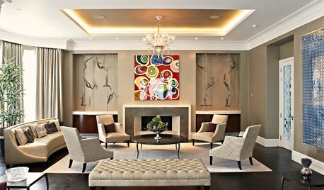
MOST POPULARRethinking Beige in a World Gone Gray
Gray, the ‘it’ neutral of recent years, has left beige in the shade. But is it time to revisit this easy-on-the-eyes wall color?
Full Story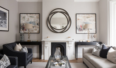
MOST POPULARWhat’s Your Neutral: Beige or Gray?
A designer shares 10 tips for using the neutral shade that works best for you
Full Story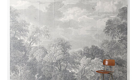
PRODUCT PICKSGuest Picks: Sweet, Soothing Pink and Gray Accents
Instill a restful vibe with a touch of romance, using furnishings and decor in shades of rose petals and clouds
Full Story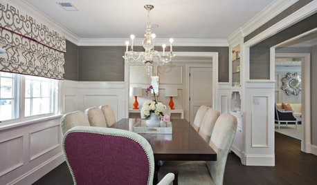
DECORATING GUIDESColor Guide: How to Work With Charcoal Gray
The most modern neutral, charcoal gray looks great in dining rooms, living rooms and even nurseries. Here's how to use it best
Full Story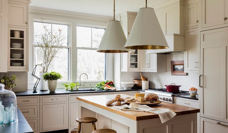
MOST POPULARHouzz Tour: Easygoing and Elegant in White, Cream and Gray
The renovation of an 1860s Massachusetts home creates a sophisticated, serene and comfortable living space
Full Story
DECORATING GUIDES10 Reasons to Love Pink and Gray Again
Mix luscious raspberry with classy gray for a classic combo just right for today
Full Story
DINING ROOMSColor Feast: When to Use Gray in the Dining Room
The right shade of gray pairs nicely with whites and woods to serve up elegance and sophistication
Full Story


Annie DeighnaughOriginal Author