

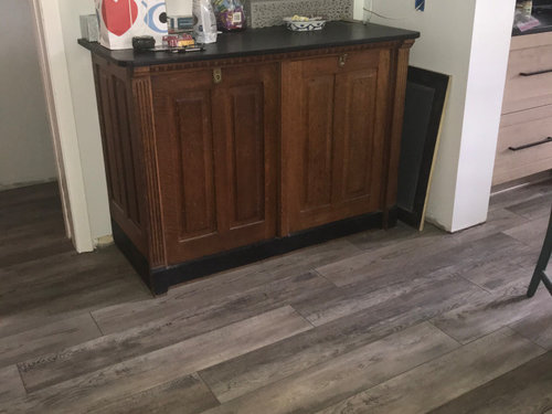
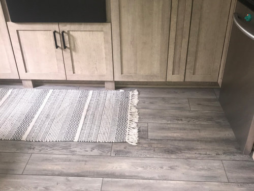
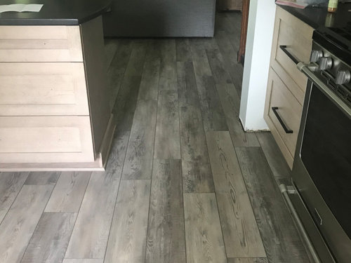
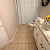
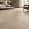
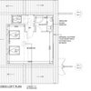
Comments on my floor please!?
6 years ago
last modified: 6 years ago
Sort by:Oldest
Comments (5)
Related Stories
FLOORSChecks, Please! 13 Choices for Checkered Floors
Checkerboard Patterns Go From Casual to Ritzy, From Marble to Grass
Full Story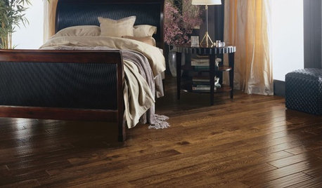
REMODELING GUIDESYour Floor: An Introduction to Solid-Plank Wood Floors
Get the Pros and Cons of Oak, Ash, Pine, Maple and Solid Bamboo
Full Story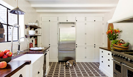
DECORATING GUIDESThings Are Looking Up for Artistic Floors
Why should walls get all the glory? Pleasing rug patterns and dramatic inlay details make for eye-catching statements underfoot
Full Story
HOME OFFICESQuiet, Please! How to Cut Noise Pollution at Home
Leaf blowers, trucks or noisy neighbors driving you berserk? These sound-reduction strategies can help you hush things up
Full Story
HOUZZ TOURSMy Houzz: Hold the (Freight) Elevator, Please!
Industrial style for this artist's live-work loft in Pittsburgh starts before you even walk through the door
Full Story
TILEMoor Tile, Please!
Add an exotic touch with Moroccan tiles in everything from intricate patterns and rich colors to subtle, luminous neutrals
Full Story
OUTDOOR KITCHENSHouzz Call: Please Show Us Your Grill Setup
Gas or charcoal? Front and center or out of the way? We want to see how you barbecue at home
Full Story
HOUZZ TOURSMy Houzz: Two Floors With a Daycare in a Toronto Victorian
Custom carpentry and an eye for antiques turn a rental apartment into a home that's like a hug
Full Story
SUMMER GARDENINGHouzz Call: Please Show Us Your Summer Garden!
Share pictures of your home and yard this summer — we’d love to feature them in an upcoming story
Full Story
MATERIALS5 Sustainable Flooring Materials to Consider for Your Home
If you’re seeking style, durability and sustainability, these materials are worth a look
Full Story
SJ McCarthy
Carla SemancikOriginal Author
Related Professionals
Sebring Flooring Contractors · Zanesville Flooring Contractors · Georgetown Flooring Contractors · Rutland Flooring Contractors · Yuma Flooring Contractors · Dodge City Flooring Contractors · Missoula Flooring Contractors · Calgary Flooring Contractors · Gary Tile and Stone Contractors · Evanston Tile and Stone Contractors · Sanford Tile and Stone Contractors · Gulfport Kitchen Remodelers · Moline Kitchen Remodelers · Chatham Kitchen Remodelers · Bronx Kitchen RemodelersSJ McCarthy
melle_sacto is hot and dry in CA Zone 9/
Kate