Software
Houzz Logo Print
darlene_smith28

hello! thoughts are appreciated...

6 years ago
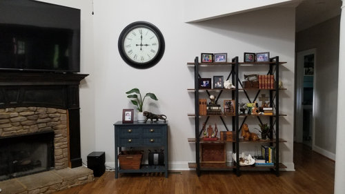
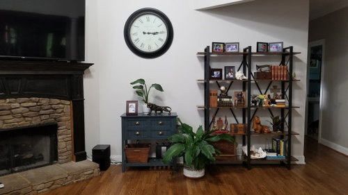
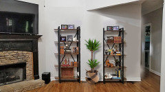
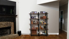
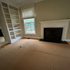
hi! I'm wondering what y'all think of the overall look here especially scale (ignore the black box on the left...it will go away). We just got the new shelves on the right with plans to replace the horizontals with real wood. So now we need something to go on the left side, right?
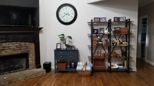
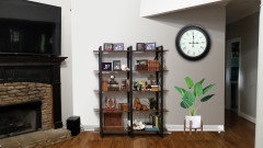
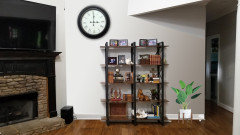
I have this extra piece (blue cabinet) that my husband wanted to try here. The benefit is that we wouldn't have to buy anything new, but, I'm not sure it works. It feels a tad small, and I don't like the dark blue next to the dark brown shelves. Plus, the depth of the cabinet and shelves are the same, so when looking from the side it feels very flat. There is a vent in the floor between the shelves and the cabinet, so that is a factor. But I thought maybe something between the two pieces might add some interest and tie them together. I tried a plant, and and tried a basket (but that basket is just for scale... I'd want a soft round basket). Also I thought about maybe painting the cabinet white.

Thoughts? thanks for your time!!!

Comments (34)

  • 6 years ago

    I like the second picture, with the plant. I wouldn't paint the blue piece white because then you would lose the contrast you currently have between that piece and the wall. Also, the blue piece and the shelf now look like they go together because they are both dark in color. You may want to pick up that blue color elsewhere for a unified and cohesive look.

  • PRO
    6 years ago

    I would go with wall art


  • 6 years ago

    @User, there's a support beam that looks like a partial wall that cuts the wall in half. I thought it might look odd to have those shelves centered there. You don't think so?

  • 6 years ago
    last modified: 6 years ago

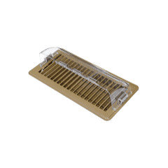
    If you want to center the bookshelves but are worried about covering the vent, you could try a magnetic vent deflector. They're $5 at Home Depot, Walmart and similar.

  • 6 years ago

    Also, I've been thinking about removing the "X" brackets from the back of the shelves. They offer zero support or bracing, and they seem to clutter up its own space. Y'all think that would help reduce the busy look?


  • 6 years ago

    @Lala, yes, if we put something over the vent, there definitely needs to be space there, and yes, the vent deflector is a good idea.


  • 6 years ago

    Darlene, I agree about the X brackets. I was thinking you could just paint them white. I think they make the shelves look more cluttered than they really are.


    The basket and the plant out on the floor make things look too cluttered. You could put something to the right side of the hearth but of course it would have to be moved if you ever use the fireplace.


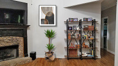
    I like the clock but for some reason the picture celery posted with a piece of artwork there looks a little better. You don’t have to spend much to get a poster or somesuch. Do you have another place for the clock?

    Darlene Smith thanked socks
  • PRO
  • 6 years ago

    The blue piece is too small in my opinion. The x brackets gone would make a huge positive change!

  • 6 years ago
    last modified: 6 years ago

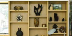
    What about something like this?


  • 6 years ago

    @Celery. Visualization, Rendering images

    the shelves are one system. Can't break them up. .Maybe should have gone narrower?

  • 6 years ago

    If you are going to use the shelving unit, use it by itself with just a few pieces in it. Take everything else out.


  • PRO
    6 years ago
    last modified: 6 years ago


    Darlene Smith thanked Celery. Visualization, Rendering images
  • 6 years ago

    Yes, and definitely remove X brackets, also.

  • 6 years ago
    last modified: 6 years ago

    I don't care for the shelving so close to the fireplace. I'd either center it on the wall or move it back to your original spot.

    Did you try centering it and removing everything else as IdaClaire originally suggested? If so, can you post a picture?

  • 6 years ago

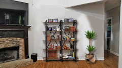
    @lala not yet, but here is the photoshop version.... doesn't feel like enough to me.


  • 6 years ago

    maybe this?


  • 6 years ago

    I like it centered, by itself. It probably looks bare to you because you're used to seeing that space filled, but your eye really needs a place to rest, and the simplicity is quite nice. Then again, it's definitely not bare with the number of items on the shelves. I think the clock is overkill and the plant looks like an afterthought to me. But YOU have to like it, so how do you think it looks best?

  • 6 years ago

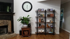
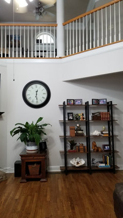
    well, this is what I decided on. I removed the Xs from the shelves, removed some of the clutter on the shelves, and changed out the blue cabinet for an old end table we had. I feel better about. what do yall think? I appreciate all the advice

  • 6 years ago

    pics...

  • 6 years ago

    The clock is not attractive.


    This is your house, and you have to go with what you like. But IMO this looks crowded and cluttered and is not doing anything for your space.

  • 6 years ago
    last modified: 6 years ago

    I like the plant, but find the end table odd. Do you have a plant stand or stool? If not, how about a plant about double that size?

  • 6 years ago

    @lala, thank you. Yes, I agree the end table is odd. :D It's acting as a stand in until I get something that works better. A bigger plant would look better, yes... that would probably do the trick. :) I do have a large palm tree, but I'm pretty happy with where it is now and I think it will protrude was too far out in this space (its at least a 4 foot spread!).


    One thing that I have not pointed out is that our cable and wifi come out right where that plant is. I should have mentioned that earlier. There is a big pile of cables and plugs and it has to get covered up somehow. That's part of why I've been resisting centering the shelves... it wouldn't quite cover up the mess. So I have to have something there.

  • 6 years ago

    @freedomplace1

    Trying to learn here... can you explain what is so terrible about the clock? Is is just an ugly clock? Is the placement? I'm just not seeing what is so awful about it.

  • 6 years ago

    No to table and clock. The bookshelves are fine. Plant is good too

  • 6 years ago

    ▶Create a Workplace You Would Love To Work In : Urban Decor Vinyl Wall Panels


    About this item

    • BRING IN A TOUCH OF NATURE - Create an authentic wood featured wall at an affordable price
    • BETTER THAN REAL WOOD - Water and mold resistant, light-weight
    • FLEXIBILITY - Made with flexible material, these panels could be applied to almost every rounded surfaces, even on angled edges
    • CUT, PEEL, AND STICK - These panels can be easily cut with a box cutter or a pair of scissors. Apply with peel-and-stick application in just a minute


    Material ▶ Polyurethane

    Item Dimensions(L x W x H) ▶ 36 x 6 x 0.3 inches

    Installation Type ▶Peel and stick

    Surface Recommendation ▶ Wall

  • 6 years ago
    last modified: 6 years ago

    I like your updates to the shelves a lot!

    To me, the clock seems generic, rather than personal, and doesn’t add anything to the space, like color or visual interest, since it’s rather bland. Beauty is in the eye of the beholder, though! If you need a clock there, you could get one that’s more interesting, or you could replace with art, or just remove something from that spot altogether.

  • 6 years ago

    thank you, Ellen.

  • 6 years ago
    last modified: 6 years ago

    @Darlene - Nothing is wrong with the clock. I think the consensus is that (most) clocks don't add much interest and that art would be a better choice aesthetically.

  • PRO
    6 years ago

    IMO that space was the perfect space for the TV and I find those shelves and the chest all just a cluttered mess and that clock has to go.

  • 6 years ago

    so, put the tv on the wall with the shelves, put art over the mantle?

  • 6 years ago

    No shelves. A media cabinet.

  • 6 years ago

    ...