Software
Houzz Logo Print
tiana_harris27

2000 dated kitchen

What would you change first

Comments (12)

  • 6 years ago
    last modified: 6 years ago

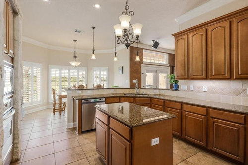
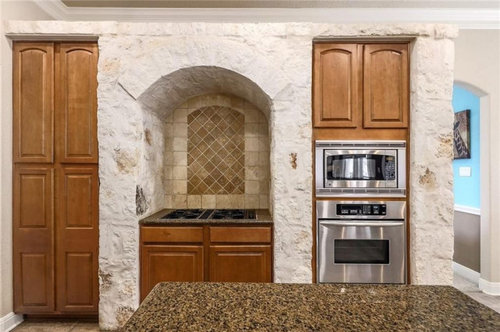
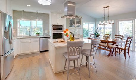
    Not a pro or expert. Gorgeous kitchen, love the wood cabs! However, maybe lower the raised breakfast bar, put pulls/knobs on cupboards, different countertop perhaps (but they co-ordinate with the floor rather well), new light fixtures, is the island a barrier between fridge, ovens and sink? Depending on budget, I would remove the cooktop/oven surround. But that is a messy job.

  • 6 years ago

    There are a couple things but more to do with infrastructure of the working aspect of the kitchen . So that should wait. I would take down the fixture above the island . Put something simple , close to ceiling in its place. Hardware to be added and then think over that cooktop situation . If some things like that were to change the island might change or be removed that’s why a big Reno might be necessary in the future. You plan these things out.

  • 6 years ago
    last modified: 6 years ago

    As far as looks go, I'd be pretty happy with it as is... hardware handles or pulls for the cabinet. While the surround around the cooktop looks good, it seems a bit claustrophobic to cook in, and I don't like the idea that I can't have any space aside the cooktop to put things for my mise en place, etc. So, yes, I'd remove that. And while I'm renovating, I'd change out many of the lower cabinets for drawers...

    But the overall appearance of this kitchen - I like the colors and the lighting.

  • 6 years ago

    The light fixtures. After that I'd start figuring out how to get the cooktop out of its cave.

  • 6 years ago
    last modified: 6 years ago

    First, it looks like you have a lot of light. Is that your backyard and then woods for a view out the Nook/Dining area? That will be very nice view while working!

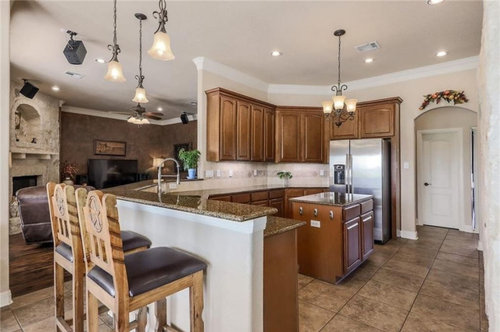
    And, you can see the fireplace from the Kitchen -- that's something I really like! (I love fires!)

    So, number one, I would do something about the cooktop area -- it has no emergency landing space or workspace. (It looks claustrophobic!)

    In fact, the Cooking Zone is located in the worst place possible -- in the middle of the path through the Kitchen. The Cooking Zone, especially the cooktop, should be in the most protected location, not the least protected.

    Second, get rid of the tiny island -- it looks out of scale and it's pretty useless (unless it's supposed to be the emergency landing space for the cooktop!) It looks like it was plopped down just so there's an island (I know, islands are all the rage, even when they're inappropriate).

    The island also looks like it's an obstacle to run around when trying to work in the Kitchen (a.k.a., a "barrier island").

    • If you work to the right of the sink, it's a barrier b/w your prep space and the range.
    • If you work to the left of the sink, it's a barrier b/w your prep space and the refrigerator. [However, since the DW is on the left, that's the most logical place for the Cleanup Zone -- but I wouldn't like it since it puts the dirty dishes in one of the most public locations in the Kitchen; not to mention that dish storage is probably an issue. You'll probably have to store your dishes in the middle of the Prep Zone -- far from ideal.]


    Then there's the corner sink and the angled peninsula -- but they're not nearly as important as the two above.

    Oh, and the lack of a decent overhang for the seats at the peninsula. The peninsula is bar-height, so there should be a minimum of 12" of clear/leg knee overhang space -- 15" would be better.

    Even better? Lower it to counter-height for more/better workspace. (For counter-height, 15" is the minimum clear leg/knee overhang space.)

  • 6 years ago

    The only things I would change are the gas cooktop to induction, and the dark countertop to something that reads more like a solid color. We have that countertop. It looks good but I can lose my eyeglasses on it, paper clips, and my dear husband can't see the crumbs he makes so they are left on the counter. (If he doesn't see it, it's not there....Gah)

  • 6 years ago

    I guess I am the only one who thinks that stone around the claustrophobic cooktop area is hideous and fake looking.

  • 6 years ago
    last modified: 6 years ago

    Assuming I haven't gone blind overnight, I don't see a proper ventilation system for the cooktop. Maybe there is a downdraft slot between the burner groups, but that will be totally inadequate for real cooking. I can't see the stone surface well enough to observe grease levels indicating whether any attempt at real cooking ever took place, but if there were, it wasn't routine. That nook needs an overhead baffled hood with adequate flow rate, matched by some appropriate form of make-up air system. (See dozens of threads here on those topics.)

    As @Buehl noted, the cooking zone would be better put somewhere else. I recommend that the candidate areas be evaluated for ease of ducting to the outside. Turn this stone cooking alcove into the coffee nook or something and save the cost of stone revision to accommodate a hood.

  • 6 years ago

    I think it's a really nice kitchen. Cosmetically, I would change the lighting and add cabinet hardware.

  • 6 years ago

    Looks like a Texas kitchen. It's beautiful but not terribly functional. Personally, I don't care for the granite but that's not hurting anything. And I like the Austin chopped limestone around the stove but YIKES! How would you clean it? And there's just no place to put things, no landing place and I agree that it looks like it would be claustrophobic. Did the contractor forget the cabinet hardware? :o I like the lighting :) Overall, nice kitchen!