Software
Houzz Logo Print
isabelle_nguyen17

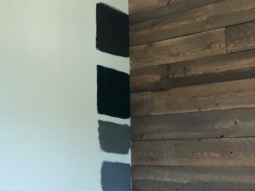
Which color looks best?

5 years ago


I am repainting the office room, and it will mostly be used by my boyfriend so I want a deep muted blueish color and I can’t decide which one.

Comments (60)

  • 5 years ago

    I like the bottom but also the second from the bottom

  • 5 years ago

    bottom shade

  • 5 years ago

    second up from the bottom looks beautiful. manly, rich, and moody

  • 5 years ago

    bottom

  • 5 years ago

    Bottom one looks best with the wood.

  • 5 years ago

    3rd

  • 5 years ago

    Bottom one, seems to bring out the wood the best.

  • 5 years ago

    bottom

  • 5 years ago

    I think the top two are too dark. I personally like the bottom color better, but I think the third from the top goes with the wood better.

  • 5 years ago

    My suggestion is to look at these colors at different times of the day because they could appear very different depending on the light. And, what time is the room going to be used the most? Also, what accent colors or other furniture do you plan on having in the room? All of these things will affect the way the wall color will look. And, of course, unless it's a surprise for your boyfriend, you'll want to get his input -- if he's going to be the one who's in there most of the time, it should be a room that he likes. But, ultimately, it's going to be whatever color(s) make you and your boyfriend feel the best. Happy painting!

  • 5 years ago

    bottom

  • 5 years ago

    The bottom shade, the others would make the room too dark once the entire wall is painted.

  • 5 years ago

    I like the bottom one, but I would consider cutting it by 1/4.

  • 5 years ago

    Bottom

  • 5 years ago

    Colors always seem darker and deeper to me once the room is completely painted. I’d go with the bottom of those choices

  • 5 years ago

    Third down seems to complement the grayish blue in the wood.

  • 5 years ago

    I like bottom two. Love your wood wall. I would probably need to paint larger sample areas, I always have a hard time deciding. I use the SW sample paint.

  • 5 years ago

    3rd from the bottom - what color is the floor/carpet?

  • 5 years ago

    How many windows are in the room? How much natural light? Trim color for door, window and baseboards? Floor or carpet color? Will the room be lit by recessed lights or lamps? Are the office furnishings and upholstery white or very light? Might be useful to consider before committing to any of these very dark choices, especially if you want to highlight the board wall. Good luck with your project.

  • 5 years ago

    The wood appears to have a little green tone in it. Have you considered something similar to the bottom two shades, but with a greenish tone?

  • 5 years ago

    Bottom color.

  • 5 years ago
    last modified: 5 years ago

    What time(s) of day will this office be used? Do you have many cloudy days in your area? Personally, I like the bottom color best as it will indeed look darker when the whole wall is painted. You might consider using the dark color for only one wall, the second or third lightest color on the same paint strip for the other two walls, the first or second lightest color for the ceiling, and the lightest color for the trim, depending on how much light you need in the room. Or, the trim might be a light gray from the same section of the paint strip fan that you carry throughout your living space. This prevents the room from being too dark on cloudy days and at night.. Furthermore, it adds interest as the light changes throughout the day. And as a bonus, the dark color will make a great place to feature art. This technique ensures that all of the colors work well together and allows you to vary tints and shades of the walls and ceiling from room to room.

  • 5 years ago

    3rd one is nice!

  • 5 years ago

    1st Place - The top one. 2nd Place - The bottom one. I only mention a 2nd place because I’d be a bit hesitant to paint any room black, but I think I’d take a chance and try it here and go with the top one.

  • 5 years ago

    An after thought... I wonder if a nice brown would be nice too. I might look at some brown tones too myself.

  • 5 years ago

    My preference is the bottom color.

  • 5 years ago

    Second from the bottom.

  • 5 years ago

    They all seem really dark. If those are the only colors available, I would go with one of the bottom two. My eye was drawn to 3rd one down. With the dark wood tones though, maybe a beigey brown would be better. Is there natural light in this room that would affect the colors during the day? I do like grays and blues (like a slate color) but that is not what you have reflected in those wood tones.

    Using Sherwin Williams color picker, the grays I like are Slate Tile, or Smoky Blue. There is also a darker Salty Dog that is much bluer than gray. For beige tones, maybe Backdrop, Dry Dock, or Tiki Hut. Going to the blue section, Refuge, Riverway, or Waterloo.

  • 5 years ago

    3rd from top

  • 5 years ago

    I think the bottom one looks the best. The top 3 look to dark. If you don't mind me asking, what color is the bottom one? it looks almost like the color I want to use for my house.

  • 5 years ago

    I like the bottom one.

  • 5 years ago

    I'd go with the second from the bottom. I think it's in the same shades of the wood, but still enough of a shade away that it'll hold its own look through out the day.

  • 5 years ago

    The bottom one, it will go darker.


  • 5 years ago

    Since you say your boyfriend is mostly using this room, go with the one your boyfriend prefers rather than what you want or preferred by strangers. You better have good office lighting or strong sunlight if you go with your dark color choices.

  • 5 years ago

    Bottom

  • 5 years ago

    @sandra, yes I love this! this was what I pictured more in my mind. a lighter dusky blue. I think those colors the OP posted is going to make the room to dark and depressing.

  • 5 years ago

    How can anyone really say when all we know is that a wood ceiling exists (which frankly goes with every color under the sun). We need to know the floor finish, what furnishings will be used especially if any are upholstered, decor and art? Knowing all of that then one can comment on paint which is always the last thing you select in a room.

  • 5 years ago

    The bottom color. The color always looks darker once it is on the wall.

  • 5 years ago

    Bottom color if painting all the walls

  • 5 years ago

    Many are saying the bottom one, but it looks like the same time as the wood and might compete with it. The top one will complement the woods and with art on the walls it will break up the dark of it and with white matting it could be very dramatic!!

  • 5 years ago

    Third. The top two are sooo dark, the bottom is ok but the third one feels more creative for his work environment.

  • 5 years ago

    I, too, like the bottom one but maybe a shade or two lighter, depending on the room’s natural light.

  • 5 years ago

    #3

  • 5 years ago

    I agree go a few shades lighter. All choices presented are too dark.

  • 5 years ago

    I recently painted my stepsons bedroom Glidden Mountain Slate Blue darkened 25% and it looks amazing. I was worried about going so dark but it works because the room gets a good amount of light (southern exposure) has light carpet, white trim/doors and white a ceiling. My first choice would be the bottom one, second choice would be the second from the bottom.

  • 5 years ago

    Second bottom. That’s a beautiful colour. Not sure what the floor or lighting is like but I’d suggest white trim and great lighting

  • PRO
    5 years ago

    All those paint selections seem too dark for an office unless you have a wall of windows to lighten the whole place up. I would go significantly lighter. Good luck!

  • PRO
    5 years ago

    The 3rd from the Bottom is THE ONE !
    I have been a historic color specialist for 35+ years . So, IMHO, the third one down brings out some of the tones in the wood grain in a very handsome way. The Upper two are fierce competitors, trying to take over the wood accent wall(?) .
    The one on the bottom seems too blue(?) Hard to see it exactly.
    But when you have a chance to find a unifying shade between other elements in the room -it is a winner !!

    Two sidebar comments :
    1)it is not acceptable to say that if you use a lighter color stating “ it will darken as you paint the entire space” unless you get the color family correct in the first place!! Full value colors will appear darker when there is more of it, but it will not darken AND THEREFORE MATCH, unless you be sure it works in a sample size or painted wall sample.
    I urge you to paint a 4’ swatch once you think you have the final paint choice . Check it out day & night before you say” GO!”
    2)While folks really believe full saturation/ dark shades of paints in a dim lit or north or western facing window will be depressingly dark.
    Counterintuitive thinking is warranted here: FULL VALUE OR FULLY SATURATED PAINTS bring full color to the walls which do not read gray or dim lit from lack of natural light. Painting a windowless room white will only serve to cause gray shadowing from any objects put into this space & it often looks like it is an old paint job!
    TRY DEEP TONE PAINTS ON INSIDE BATHROOMS ~ BRINGS REAL JOY to the toothbrushers!!
    GOOD LUCK & PLS POST the FINISHED SPACE! LUCKY BEAU ‼️

  • 5 years ago

    ask him