Software
Houzz Logo Print
matan_abel

Nailing down this kitchen design

6 years ago
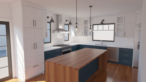
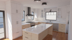
Hi. I am needing to nail down this kitchen design. The layout and cabinet designs are locked. Just curious about the overall impression, colors, tiles, and anything that may stick out to you guys. Thanks!


Comments (20)

  • 6 years ago

    Is there undercabinet lighting?


    Matan Abel thanked jewelisfabulous
  • 6 years ago

    Yes, there will be. And yeah missing the wall sockets here as well.

  • 6 years ago

    I'm not a fan of different tile pattern behind range (anywhere, not just your kitchen). I'm like, commit to a pattern here!

    Contrasting hardware finishes are interesting, nice touch.

    Matan Abel thanked rebasheba
  • 6 years ago

    I love the wood and Aqua. Very cool and beautiful. How is it so well lit with just a few sconces and pendants? Might make sure it’ll be that bright In real life

    Matan Abel thanked roccouple
  • PRO
    6 years ago

    The edison bulb lighting needs to go IMO a kitchen needs the best lighting possible and that is all LEDs 4000K everywhere.and IMO you do not have enough lighting in that space you need pot lights too.I find the island somehoew does not connect to the rest of the space maybe once you are in a nice big wood bowl on the other counter to just tie that counter in somehow. No to the different design behind the stove IMO it only works with a huge Tuscan style kitchen and preferably in Tuscany.

    Matan Abel thanked Patricia Colwell Consulting
  • PRO
    6 years ago
    last modified: 6 years ago

    A waterfall counter on the working end of the island will drive you crazy. You’ll end up prepping in the corner, with your back turned. The clearance between the island and pantry does not look to be the needed 48” aisle. The window style doesn’t fit the modern pop aesthetic of the rest. Either the modern kitchen, or the house, is mismatched. The lighting plan needs a complete reworking. It hits the high notes of 2020 popularity. Be very careful about doing that.

    Matan Abel thanked User
  • 6 years ago

    The room feels off balance to me. The lower half warm and comforting and the white with black upper is stark and sterile.


    My eyes are searching for something on the top - the range hood in the same blue as the lower cabinets and large blue handles on the cabinets. A light gray back splash to break up the white on white on white, a blue ceiling. That or add wood somewhere.


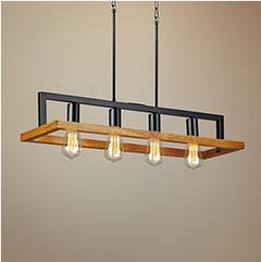
    I would use can lighting throughout the room and have a hanging rectangular wood fixture over the sink and more substantial pendants over the island.


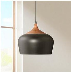
    Maybe something like this over the sink


    and this over the island


    Matan Abel thanked Jennifer Hogan
  • 6 years ago

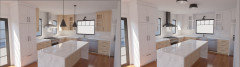
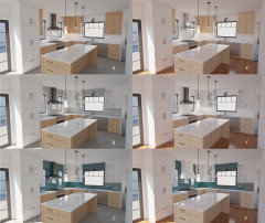
    Thank you so much for the feedback. The island is quite large at 8' and while I do need to spend more time on light fixtures, I am trying to nail down the materials/balance a bit more as well. The ceiling will have inset(can?) lighting, and I took out the lamps over the windows on the left as it felt a little too busy. I am trying some flush mounted ceiling lights in one variation, though not sure about the light throw from that far. Here's a couple variations I am playing with at the moment. Thanks for taking a look.


  • 6 years ago
    last modified: 6 years ago

    No way to add a prep sink to the island to make it more useful?

    FYI...I like the island in your latest renderings better than the wood in the first. I think it better matches the rest of the Kitchen.

    I suspect, though, that the waterfall look will be outdated soon. If you are in love with it, then keep it, but if you're doing it b/c it's the "thing to do" right now, then I would pass on it.

    Aisles do look to be an issue but, without measurements, I can't tell for certain.

    Is that island at least 42" deep with at least a 15" seating overhang (the minimum recommended)?

    Matan Abel thanked Buehl
  • 6 years ago

    Thanks for the feedback Buehl. Unfortunately, no on the island sink. I started to feel the same way about the waterfall so I reverted a bit back to a previous island. Yeah, I think I do have an issue with the island space. From cabinets/pantry to island its 42/40 respectively, island is 42, walking space is 44. Thinking maybe taking 4" away from the walking space or maybe going 40" on the island itself...

  • 6 years ago
    last modified: 6 years ago

    How are you measuring your aisles? 24"D base cabinet-to-cabinet?

    Aisles are measured to/from the items that stick out the farthest -- counter edges, appliance handles, etc. They are not measured cabinet-to-cabinet. Cabinet measurements only include the "box", they do not include doors/drawer fronts or counter overhangs. Counters overhang the fronts of cabinets by 1.5", so in reality, a perimeter run that consists of standard 24"D base cabinets is really 25.5" deep.

    If you are measuring cab-to-cab, then your aisles are even narrower than you think.

    The numbers......

    25.5"D perimeter

    + 41.5"D island (or 40.5" if no decorative door/end panel on the back of the cabinets)

    ============

    67"

    Kitchen Depth (I don't know what it is) - 67" = what you have to work with for aisles.

    Work Aisle...The minimum recommended work aisle:

    • 42" for a ONE-person Kitchen (45" is better if there's a DW on the aisle)
    • 48" for more than one person working in the Kitchen (helping prep/cook/bake, cleaning up, etc.)
    • So you should have at least 42" b/w the perimeter counter edge or range handle, whichever sticks out the farthest, and the island counter edge.


    Aisle behind the island...

    • Is that a wall behind the island seats? Or something else?
    • If that's a wall and there will be very little traffic behind the seats, then 44" is the minimum aisle behind the island.
    • If it will be a busy aisle, then you need more like 48" to 54".
    • Beware -- skimping on seating overhang will not "fix" the lack of aisle space issue. It just means people sitting at the island will stick out farther into the aisle (the same amount as if there were the 15" overhang) --and-- they will be uncomfortable if sitting there for more than a few short minutes (they have to lean farther forward to reach the counter or they have to sit sideways or they "straddle" the island - none of which are comfortable long-term).
    Matan Abel thanked Buehl
  • 6 years ago

    Is the photo the existing kitchen or just an inspiration photo?
    There are no discernible electrical outlets for countertop appliances, and the over-island lighting is insufficient. Is there an outlet on either end of the island?

    Matan Abel thanked felizlady
  • 6 years ago

    I think it looks beautiful ...as is !!!!! but , are the electrical outlets forgotten ? How are you going to put them in without ruining the work done ?

  • 6 years ago

    Do you like the “disappearing” look of the all white uppers? I liked the blue but not with the wood island and all white uppers. The mix of light wood (upper and lower) and the last island configuration look best to me. Your island overhang has to be longer for people to comfortably sit. Yes, you need at least 9 recessed lights plus the pendant, task lights and something over the sink. I like the darker hood too.

    Matan Abel thanked RedRyder
  • 6 years ago

    @Buehl Thank you for the detailed measurement info. Will reevaluate that this weekend. We might have to reduce the island drawer depth by a bit but yeah I see we could use a little more breathing room on either side of the island.

    @felizlady The images are 3d renderings. Not included are ceiling can lighting or outlets, etc.


    @RedRyder I think the white on white getting lost is a good point, and yes I do find the wood upper to be attractive as well.


    Going now with some exploration into concrete style flooring tile. The tile is non-specific at the moment, just a way to cover the surface to visualize the concept in the space. Sorry if it seems I am jumping all over the place with the design elements, it's just that I have so much creative freedom with it I'd like to explore and visually test as many options as I can.


  • 6 years ago

    I still like A. Even with teal tiles as the backsplash, the wood uppers (especially that soft light colored wood) seems so modern. And it goes with a concrete floor. Are you sure you want that? It’s hard on your back. Wood is nicer to live with.

    Matan Abel thanked RedRyder
  • 6 years ago

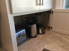
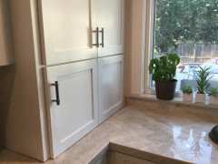
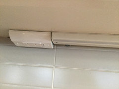
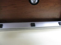
    Re the outlets: I would look into the outlets being integrated into the under cabinet lighting. I did that everywhere except where the coffee machine stays plugged in. Makes for a much cleaner-looking backsplash. Other thing I’m very happy I did is a nice version of an appliance garage, where all of the little appliances I use regularly (toaster, juicer, blender, etc) can be plugged in and pulled forward for use. Allows me to have uncluttered counters.

  • 6 years ago

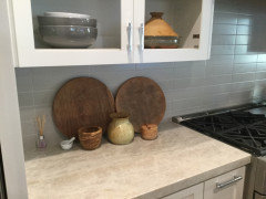
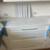
    This is what the outlets under cabs look like. So happy I did that.

  • 6 years ago
    last modified: 6 years ago

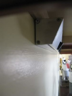
    Angled Plugmold is even better -- it's easier to plug things into and still fits under the light rail:


Sponsored
Mary Shipley Interiors
Average rating: 4.8 out of 5 stars34 Reviews
Columbus OH Premier Interior Designer 10x Best of Houzz