Software
Houzz Logo Print
heather_bridge46

help please with paint color

6 years ago
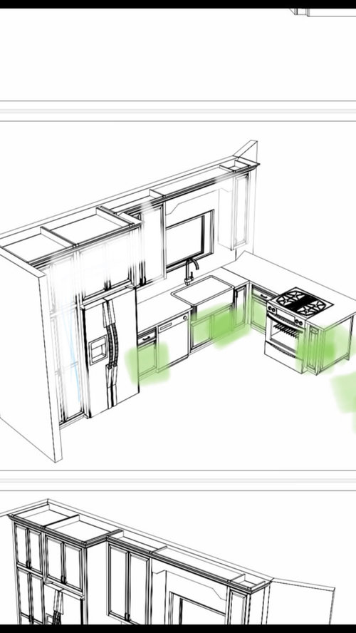
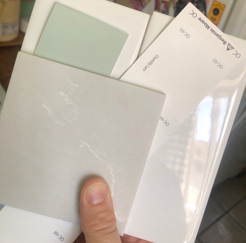
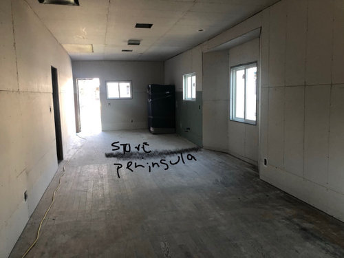
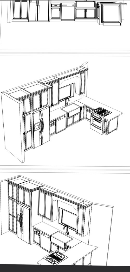
Hello everyone please excuse my rudimentary renderings.. open concept walk in to the right will be seating then the bay window will be built in seating for dinning. This will butt up to a peninsula and then our kitchen. I’ve attached the colors for the lower cabinets (BM antique jade ) and the upper cabinets (BM Chantilly lace). Our countertop is also picture in the swatches I’m holding up it is a light grey with white veining. Our backsplash will
Be white subway tile with Greg grout. My question is this , we got a sample of BM stonington and it looks horrible and not warm and inviting.
When walking in you will get a glimpse of the antique jade but will mostly see the grey quartz along with white upper cabinets. I am open to any colors and will take any advice.

Comments (25)

  • 6 years ago

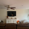
    Here is the flooring as well

  • 6 years ago

    Wait until the flooring and kitchen is installed to pick paint and backsplash. Just have the walls primed for now.

  • 6 years ago

    Ok my husband primed them already I don’t have the updated picture. He really wanted to paint before the install on Tuesday. 😅

  • 6 years ago

    I will suggest that thank you!

  • 6 years ago
    last modified: 6 years ago

    Well, all of your color choices are cold, so it’s no wonder that it’s not “warm” feeling. Get rid of the CL. It’s a cold yellow green. You need something warmer, like SW Alabaster, as your white. Rethink the counter too. And for goodness sake don’t be using house paint on cabinets!

  • 6 years ago

    @juneknow thanks for your input !

  • 6 years ago

    @juneknow thanks we aren’t doing the cabinets ourselves. They will be using a lacquered base paint of course and they have there own painter that will take a sample and match .. thanks for your input !

  • 6 years ago

    I disagree about getting rid of Chantilly Lace. It’s a very popular colour for a reason... it reads as a very neutral warm
    in my home. I have it throughout and am considering it for my kitchen cabinets too. I was actually going to tell you to consider matching the walls to the upper cabinets because of all the other colours you already have going on. I would wait to paint until everything is in for sure though.

    I’ve used Stonington Grey in a previous home and loved it but I don’t see as a good choice with your current mockup.

    Good luck!

  • 6 years ago

    @msteezzy thanks for that .. one of the reasons I chose CL was for the neutral warm .. I just read that it has a blue undertone. Will most likely wait until everything is installed to get a better idea. Thanks for your input and taking your time to post

  • 6 years ago

    I think I’d do all the cabs the CL or equivalent. Liking the counters . Liking the floor . You could do something more special on backsplash . The kitchen is tucked in a corner . Shadows will have an effect . It is not open in the sense of a full on view .., it’s a sideways pitch. A more special backsplash will be the surprise element you would find special : it won’t be in your face but once back in the kitchen it can serve as delight , along w hardware. Maybe texture or colored backsplash tile . The green cabs wont do that much . I’d skip the expensive sink go w special faucet and fanciful ceiling light fixture in addition to can lights . You will see a nice close to ceiling (somewhat ) bling fixture from every position / maybe Tiffany type glass/ Good luck I’m sure you are excited

  • 6 years ago

    Thank you I am so excited will be doing a cool light in the kitchen for sure !! Thank u for your input !! We were going to have the green cabinet as a surprise instead of backsplash lol .. but hey maybe that’ll change .. thanks again !!

  • 6 years ago

    I agree with the poster above about backsplash. White subway with grey can be beautiful - I have it in a bathroom - but it can steal the show with all those pronounced grout lines. I don’t think you want it to with all the other things you chose. If your set on subway, at least do matching grout.

  • 6 years ago

    The green is so pretty so if that’s your surprise don’t detract with the grey/white backsplash

  • PRO
    6 years ago

    I like the green

  • 6 years ago

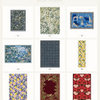
    https://www.olympiatile.com/sites/default/files/pdfs/series/Picket Product Guide.pdf

    These could be nice in white with white grout.

  • 6 years ago

    I don’t think my first link works

  • 6 years ago

    That’s nice !! I’ve always pictured that tile straight up and down lol!
    The husband is set on plain white subway tile and says he will change it out later down the road if we want , I initially wanted something that was more geometric and exciting lol

  • 6 years ago

    Thanks Patricia I love the green a lot ..

  • 6 years ago

    Will look into white grout with white tile valid point @msteezzy

  • 6 years ago

    Is your hubby doing the backsplash himself? That’s great. Then he can do a mock-up for you on cardboard or something. I always see people recommend that here and I think it’s a good idea. Then you can decide on grout colour before it’s too final to change.

  • 6 years ago

    Yes ! He is thank God .. he’s so great and such a handy man (union carpenter) he re did everything took it down to the studs, changed the layout .. he hung the drywall but hired someone to tape and mud .. we are having someone make the cabinets and install
    Looking into hiring someone to complete the left side of the house where the 3 bedrooms and 3 bathrooms are ..
    We are currently living in one bedroom on the same lot with our kids .. so we are so excited to move into a bigger place

  • 6 years ago
    last modified: 6 years ago

    So, you’ve decided against “warm and inviting” and are going for a “Cool and calm” feeling? Because that’s what choosing cold colors instead of warm ones does for a home. What is your mission statement? Describe your feeling that you want. Then do what it takes to get that.

    CL is a stark and cool green yellow white. It pairs well with cool grays leaning to blue, and cool greens. Pairing it with warm colors shows off its green, or creates a muddy yellowed look in the other warmer colors.

    Lori’s Colorography.


    Alabaster is a great warm white, that works well paired with warmer tans, greens, and grays. It’s especially valuable in low light rooms, and reads as a bright white there. Paired with blue based colors, it can appear yellow due to being opposites, which intensified any color contrast.


  • 6 years ago

    So with that chart because CL is stark yellow green white wouldn’t it pair well with antique jade ?

  • 6 years ago

    Thanks for taking the time to show me what you mean with these charts