Software
Houzz Logo Print
talar_s21

Solutions for dull windowless bathroom

6 years ago
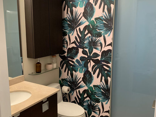
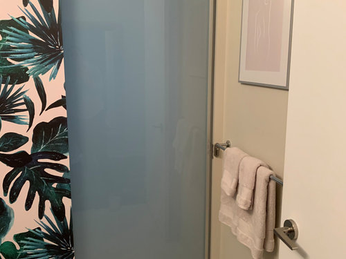
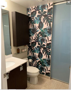
I just finished painting and redecorating my small windowless bathroom — but the end result still looks quite dull and dingy to me. The walls are Benjamin Moore Edgecomb Gray. I’m not a fan of the traditional wood finishings or beige in general but I have to live with them. I was hoping the final result would be crisp and fresh looking yet somehow it still looks like an older bathroom that needs a coat of fresh paint! Any advice re paint, lighting or decor is appreciated!


Comments (14)

  • 6 years ago
    last modified: 6 years ago

    That tropical leaf wallpaper is very heavy feeling. Even the size of the pattern is too large for a petite space like yours. That should be replaced. Have you upgraded your lights to 4000K LEDs? They make for a daylight feeling and keep paint color the same, even at night. Grey only looks crisp and fresh when there is plenty of light. Your dull towels aren't helping either. Shiny metals would add some brightness too.

    Tal S thanked decoenthusiaste
  • 6 years ago

    I like the idea of turquoise towels, such an easy thing and cheap. Also a rug and maybe change the artwork to something a little more interesting? I do like the panel a lot!

    Tal S thanked K R
  • 6 years ago

    Thanks for your comment. I should have clarified that I didn’t pick those finishings - the original owners did. The countertop is probably my least favourite asoect as well. Thanks for your suggestions. I’ll try swapping out the bulbs.

  • 6 years ago
    last modified: 6 years ago

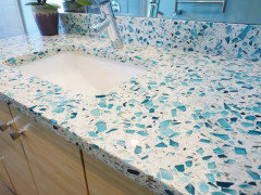
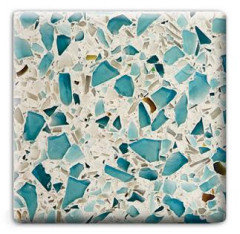
    oh, well good! if you want to change it, try the recycled glass countertop

    this color would be perfect w/the panel. then you can paint the walls w/a bright, crisp white


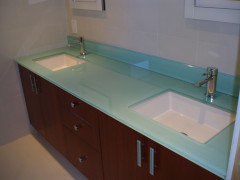
    or, have a piece of glass cut to fit, and paint the back of it a bright blue/green


    Tal S thanked Beth H. :
  • 6 years ago

    My immediate reaction also was to change up the lighting & accessories! The framed art needs to be almost as bold as the wall panel & the towels should be two colors pulled from panel as well. Can’t see vanity top - soap dispenser? The glass wall shelf under cabinet looks like decorative items so change those out to coordinating pops of color too! Is this a powder room half bath or is that a shower? What’s on the wall perpendicular to vanity?

    Tal S thanked KW PNW Z8
  • 6 years ago

    I don’t normally go for bold patterns or colours, so my initial logic was to do a bold print on that one wall then keep the rest of the bathroom in neutral tones to keep it clean and modern. I was worried it may start to look too “kitschy” if I kept the theme throughout so I picked a soft art print and accessories.


    there is a sliding door in the middle that separates the shower/tub area so you can section off into a powder room when you have guests over. I’m in a condo.


    heres a photo of the vanity top (excuse the messy products!) Just very basic standard finishings.


  • 6 years ago
    last modified: 6 years ago

    you could rotate the fixture so that it points down, (all your light is going to the ceiling. flip it) and then put in some brighter bulbs.

  • 6 years ago

    Ok, I get the layout now. I personally like a hand towel closer to sink so I would add a towel ring - not a bar- to that blank space on side wall of sink. If the towel bar under pictures is hand towels only & there‘s another towel holder in shower area, I’d take it down & get a larger framed picture On that wall that coordinates with feature wall - doesn’t need to be as bold but needs some pop or weight to it. I love Beth’s suggestion about rotating light fixture. I did that in my windowless half bath & wow what a difference! And I would still add towels that are the turquoise blue teal whatever that color is in panel!

  • 6 years ago

    Thank you! Regarding the picture, I do have another frame in a dark wood That matches the cabinets. Do you think changing the frame would help?

  • 6 years ago

    Tal, looking at your art on wall - I think it’s a white line drawing of a woman & is pale pink in color. If that is a special piece for you & it’s a standard sized print not needing custom frame, could you try it with a pale turquoise matting & darker frame - not a heavy frame since it’s a delicate piece, but a color that Stands out more against light wall? Just a thought.

  • 6 years ago

    Didn’t see your post about having darker frame! Try it - interested to see what difference it makes. Think about changing matt too. If you have something in the turquoise color family – clothing etc. lay the picture on it with darker frame to get an idea if works with art..

  • 6 years ago

    I know you spent time, money and energy renovating a room that now disappoints.

    We have all done this at some time in our lives and we learn from these experiences.


    The truth is that you have a lot of muddy colors in the room - muddy colors never look clean and bright.


    The vanity top was probably the biggest issue in the room and drove many of your decision.

    That would not have cost a fortune to replace and would have given you the opportunity to change the whole aesthetic of the room.


    If I were looking at renovating this room I would have started with the vanity top


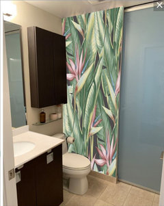
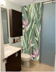
    I then would have picked a lighter, brighter tropical wallpaper to go with the light top


    Then painted with a clean, light color


  • 6 years ago

    As much as I love glass counter tops I wouldn't do it in this room because you still have the beige flooring and the blue green glass is so bright and clean it would make the flooring look dingy. The beige flooring has some white, light shading, so you can pull it into the white and works okay with the tiny bits of beige in the topical print I picked. I specifically picked a print with a bit of pink to work with your art.