Software
Houzz Logo Print
webuser_368903710

Front Exterior Design

6 years ago

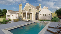
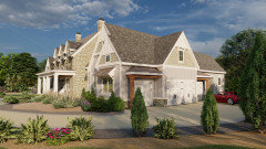
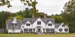
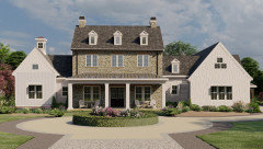
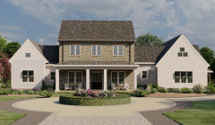
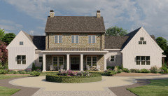
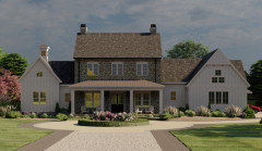
Hello! We have received our 3D renderings from our Architect and are trying to decide between having six round columns versus 4 square posts (notice the window placement will change as well - 4 single windows versus 2 double windows). Would love to hear which look is preferred. Also any suggestions on Hardieplank color? We are leaning towards arctic white, but would love to hear your thoughts. Thank you!!

4 square posts & 2 double windows
6 round columns & 4 single windows

Comments (72)

  • 6 years ago
    last modified: 6 years ago

    Maybe I'm just old but I've never warmed up to shallow nested gables especially on barn-like garages but I like the connected farmhouse idea.

  • 6 years ago

    If you have anything "faux" that's a good indication that you don't need it and the house would look better without it. Those chimneys look like expensive ears. If there is no fireplace or furnace attached to them, get rid of them.

  • 6 years ago

    Thank you, SashaDog! I've asked our architect to do a 3D rendering without the three gable dormers and instead just have a second floor with windows and possibly adding one gable dormer above to help tie in the gables on the left and right. I also asked if he could do a single gable on the garage side instead of the double gable. I will share that rendering when I receive it.


    I agree Jennifer K. I really thought that the house needed the little extras (chimneys, cupula) but after removing them, I actually think I like it better - helps simplify. Plus it will save a good chunk of money...win, win!

  • 6 years ago

    The house exterior is way too busy. The old adage less is more really rings true. Your architect should know better as they teach that in school

  • 6 years ago
    last modified: 6 years ago

    The 1947 Mies modernest dictum "Less is More" was popular in the 70's. Venturi put it to rest with "Less is a Bore."

  • 6 years ago

    Please show me houses where less is a bore are well done that are newer than the 2000's. Adding fake garbage stuck on, plus extra gables, etc does not create a well designed house

  • 6 years ago
    last modified: 6 years ago

    You seem to be using the famous Mies quote too generally. He was a modernist of the Bauhaus tradition; "less" to him was bare bones. He would have wanted this house to be a plain box preferably of glass; no stone, dormers, sloped roofs or historic architectural features.

  • 6 years ago

    I think the stone on the dormers looks awkward, too. Like it's floating above the porch.


    I like the shed dormer - the way it was drawn I am live with the stone - doesn't feel like it's suspended in mid air. Siding should be traditional, I think and not all the ornamentation and batten work.


    Try to remove the nested gables on the garage end if possible too.


    I don't mind the awnings if they are serving a purpose - i.e. to the south facing....


    I think that simplification will create a more substantial look and feel to a new / old house - and then your details can be larger / more substantial (fewer columns, heavier moldings, etc) and the house will feel more solid.


  • 6 years ago

    Thank you Just_Janni!!! Substantial, simple and solid!!!! YES!!! You summed up exactly what we are hoping for. Thank you for your suggestions on ways to improve the design of our home!!


    And thank you again, PPF!! I really appreciate all the time you took to share some different options with me!! My eye is really drawn to option 5 and 7.

  • 6 years ago
    last modified: 6 years ago

    The wall dormers are not just features; they're the essence of the design. However, they're a bit crowded on the roof, the windows fill too much of he dormer faces and the porch roof is a little too steep so too much of the stone facade is obscured. The proportions seem like a wood framed building rather than a masonry one.

    What is driving the size of the dormers and windows? Do you need 3 large ones? It would help to see the second floor plan and an elevation.


  • 6 years ago

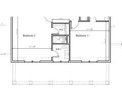
    Thank you, HU-137405552! I agree that the dormers feel crowded. And it's interesting that you say the proportions seem like a wood framed building rather than a masonry one. My dh really wants stone on the main body of the house, but I'm loving the look of the white sided home that you posted above. There's no changing my dh's mind on the stone (in fact if the budget allowed, he would stone or brick the entire home). Attached is the part of the second floor plan that faces the front of the home. I really would like two windows in bedroom 1 and 2, but do not need the oversized window in the bathroom. Thanks!


  • 6 years ago
    last modified: 6 years ago

    @Kate Since you would like 2 windows in those bedrooms, have you considered doing "five, four and a door"?

  • 6 years ago

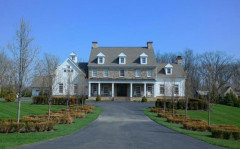
    Thanks, tendrac. I actually spoke to the architect today and asked if he could do a 3D rendering with a full 2nd story, five single windows up top, four below and a double door. I sent him the attached picture (it's a home that we fell in love with years ago). I'm just worried that ours won't look nearly as nice as this one, being our main house is only 35' across and the inspiration home is 46' across.


  • 6 years ago

    For the upstairs how about doing a full 2 story and have a window on the side in those upstairs bedrooms. One on front and one on the side and that way you might be able to capture some cross breezes too.

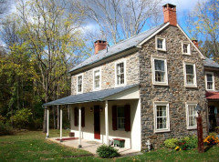
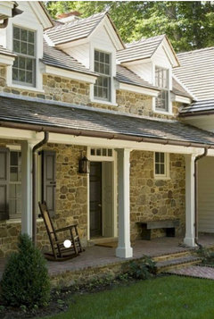
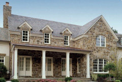
    Here's an old Pennsylvania farmhouse in stone and narrower like your house with a porch.


    I'd keep the whole front stone though and not stucco like this one has under the porch. The pic is from here: https://www.findbuckscountyproperties.com/fern-rock-bucks-county

  • 6 years ago
    last modified: 6 years ago

    @Kate I actually like that house a lot, and it has a timeless appearance.


    ETA: I think that your house could look just as visually appealing if your architect could balance the side wings. As many of us have stated, the gables /nested gables, as shown, are over-powering the center or main-mass.

  • PRO
    6 years ago
    last modified: 6 years ago

    .

  • 6 years ago
    last modified: 6 years ago

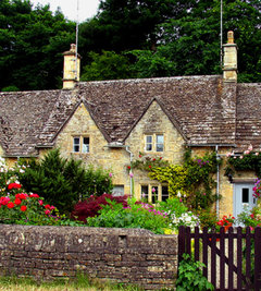
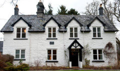
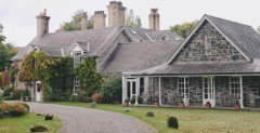
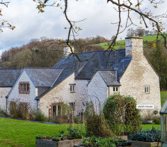
    The white building with the 4 wall dormers is an old stone farmhouse in Wales.

    If you raise the eaves to the second floor ceiling level (like the Pennsylvania farmhouse), it will be important to keep the central house with connected smaller buildings in order to maintain an older rural feeling instead of a newer suburban feeling. Omitting third floor dormers would also help.

  • 6 years ago

    Wow! Thanks, PPF!!! I really like the 8th and 9th rendering and appreciate your advice on setting the wings back. Thank you!!


    Thank you, HU-137405552! I see our biggest issue being that the right wing is actually larger in width than the central house (left wing is 23 ft, main body of home is 35 ft and the right wing is 36 ft). The only area that has a second story is the main body of the home, but dh wants 14' ceilings in the garage for his lift. I am liking what PPF designed above (8th & 9th rendering) however if we eliminated the dormers, I think all I would see is roof.

  • 6 years ago

    I don't see a problem with the widths of the elements. The garage will look like a barn if you get rid of the nested gable. The original massing is quite nice.

  • PRO
    6 years ago

    I hope the other three elevations will be equally as nice as the front elevation. Do not neglect them.

  • 6 years ago

    I always hope people heed that reminder, Mark. My grandfather (an architect) designed his house so that the views back to the house from the back and the side yards are as enticing as the front.

  • 6 years ago

    Yes, in my area we have many sub-divisions where all of the attention was placed on the front of the home and the remaining 3 sides look as if they belong on some industrial building. Awful and ugly.

    I like the "added on to an old farmstead" look you're going for.

  • 6 years ago

    Thanks, HU-137405552! That makes me feel better!!


    Here are the side and rear elevations, Mark Bischak, Architect. We did ask the architect to change the design of the one gable to the far left on the back of the home. And the giant hole by the side of the home is a tiered egress window and we are told will actually only be half that size.


  • 6 years ago

    Dormer windows create wasted valuable floor space in a room. Have you considered a saltbox stle? It would look like a full second floor in the front, but the back roof would remain the same. It would give you more floor space in those upstairs bedrooms. If you go up one more floor in the front, I would eliminate the dormers, as they would be an added cost, especially to the roof. (And down the road, if you have to re-shingle the roof.)

  • PRO
    6 years ago

    Refreshing to see a design that does not have just one window at the master bathtub.

  • 6 years ago
    last modified: 6 years ago

    Some ideas:

    from Wales


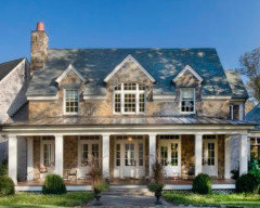
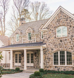
    wall dormers in stone without stone above eave.


    Ahern


  • 6 years ago
    last modified: 6 years ago

    Another wall dormer with no stone above eave


  • 6 years ago

    Unwise to be modifying a design without knowledge of the site, neighborhood or climate.

  • 6 years ago

    Thank you HU-137405552! Those are some beautiful examples of homes with dormers!


    Thanks, Mark Bischak, Architect, the bathroom will have a total of five windows...when it comes to windows, I figure the more the better!


    Good advice, Nancy Walton! We asked our architect to remove the dormers and make it a full second story...hoping to see those renderings today!

  • 6 years ago

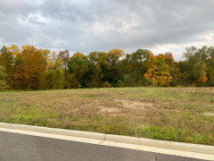
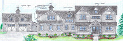
    HU-137405552, the home will be built in Ohio on a 1 acre flat lot within a new neighborhood consisting of 14 homes. The back of our home will face south. Our lot will have trees along the East (master bedroom side) and South (back of home). There is only one home currently being built - a large white farmhouse. All of the lots have sold and several are in the design phase. Attached is a picture of our lot and a rendering of the home that is currently being built.


  • 6 years ago

    Is that rendering from the same architect you’re using? Not the biggest fan of the tacked on cupolas, dormers and random faux craftsman pieces.

  • 6 years ago

    If you notice the photo blown up, all of those things have "optional" written next to them.

  • 6 years ago

    @Nancy Walton i did notice that, but it still makes me question the quality of the architect who would even suggest those as options.

  • 6 years ago

    I think it's just another way they add cost to the building of the design. IMO

  • 6 years ago
    last modified: 6 years ago

    The drawing is odd: not an elevation but not a perspective. IMO its not something an architect would be likely to draw.

  • 6 years ago

    I apologize everyone, RES2 had asked about the neighborhood and I was just sharing a rendering of the other home being built there. That home was not designed by our architect. That builder uses a designer and a draftsman. Again, sorry for any confusion. We did get the rendering back yesterday from our architect (he only made changes to the main body of the home...see attached). We have decided to go with the full 2nd story option, but with some additional changes (see my sad attempt to show what we're thinking in the attached pictures - with chimneys and dormers or without). Thoughts?


  • 6 years ago
    last modified: 6 years ago

    The last one: no dormers, chimneys or cupola. It has the appearance of an old farmhouse that’s been added onto over the years. Make sure the entire “central” home is all stone, front and back, to complete the illusion. The rest of the “additions” can be siding.

    It’s a very appealing design.

  • 6 years ago

    #3 and keep chimneys if they are real. I feel like THIS is the look you were going for - old farmhouse with additions. I LIKE #2 without the cupola and the dormer on the connection to the garage (it's going into the attic, right?) but if the dormers in the attic are never going to be used and it's just providing light to the attic - then I have a hard time complicating a roofline for "nothing" - but at the same time I feel like it further highlights the main house portion.


    I think you are improving the design - ESPECIALLY in the removal of the nested gables in the garage.

  • 6 years ago

    The dormers are too small and their classical pediments inappropriate for this house. Even if better designed I think they belong on a town house instead of a farm house.

    The chimneys might offend some but they're what you would expect to see on this style house. I prefer fake chimneys to fake dormers. .

    The unequal spacing of the porch posts bothers me. The builder of a rural farmhouse would have been more concerned with efficient beam sizes instead of alignment with windows which is part of the charm of old vernacular houses. Making the spans equal would allow the front door to be more welcoming and the posts would relate better to the upper windows.


  • 6 years ago

    You all have been SO helpful!!! Thank you!!!! I removed the cupula and dormers, like suggested. And I agree about the fronch porch posts, RES2...I just sent an email to our architect. Again thank you for all your suggestions!! I'm loving it! :)


  • 6 years ago

    ^^^^ YES!!!!!!! Simple, welcoming, solid.

  • 6 years ago

    I'm happy to hear your architect is still responding to your emails.

  • 6 years ago
    last modified: 6 years ago

    That is a huge improvement!!

    i think a simple clapboard siding will work better than the board and batten or shakes.

    The windows on the wings off the center portion should be the same size, they look slightly different but that could be a matter of perspective of this rendering.

    The grids/grilles/muntins in the windows should be consistent. The center portion’s are a little different than the end windows

    Are those windows or vents in the upper part of the gable ends?

  • 6 years ago

    Thanks, SashaDog! The windows on the wings off the center portion are the same size (I don't think my horrible photoshop skills helped there). And those are windows in the upper part of the gables. Both the master bedroom and garage will have vaulted ceilings.

  • 6 years ago

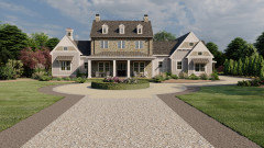
    Here is the latest rendering from our architect. Again, thank you all for your help! I think it turned out great! I know some may say to get rid of the cupula or chimneys, but I honestly like them. We did part ways with the three dormers, and I think that was the right decision. I see a lot of stone and brick homes with frieze board under the eaves. Our architect doesn't think we should add this, but I really like the look of it on other colonial homes. Thoughts? Anything else we should do or not do? We are just entering the bid phase, so there is still time to make changes, if needed. Again, I appreciate everyone's advice!!


  • 6 years ago

    That is so much better! Skip the frieze board-- your cake has enough icing with the cupola and chimneys. Or as Coco Chanel said, “Before you leave the house, look in the mirror and take one thing off.”.

  • 6 years ago

    Great advice!! Thanks, Jennifer K!!

  • 6 years ago

    That is a great improvement!

    Id see only a few minor tweaks depending on your taste.

    Remove the coupola and faux chimneys

    Different windows on the second floor gable ends; use similar shape and style as those on the first floor.

    The window grids should be the same on all the windows, either 4 or 6 will work throughout.

    :)

  • 6 years ago

    Thanks, SashaDog! I did ask the architect about the windows on the second floor gable ends last week and he thought it added interest versus matching the windows to the first floor. Maybe I need to revisit that. What are your thoughts on the trim detail at the top of the gable on the far right?


    For the other windows, can they all stay the size they are now, but just make sure the window grids are the same? It looks like they are all 4 except the top three on the main structure are 6...am I looking at that right? Thanks for your help!!

  • 6 years ago

    I am a fan of symmetry, so Id prefer the right gable to be the same as the left. But I don’t find the right gable offensive. Do you like it? Similar with the small windows in the gables; my personal preference on the left side would be to have a double window over the triple window..


    For the windows, sizes look good but I think the number/size of panes should match. I wish I knew enough to advise you if one style went bettter with your house than the other.


    Maybe someone else will chime in to help with those fine details.