Software
Houzz Logo Print
vanessa_gauthierdavidson

Looking for white grey paint colour!

Hello! My boyfriend and I just bought a house and are hoping to paint the whole house the same colour. We are looking for a very light grey (almost like a white with grey undertone) that has no undertones. What would you recommend?


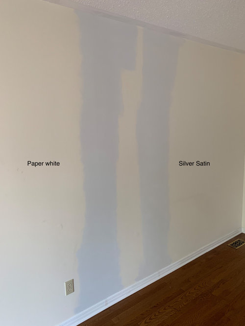
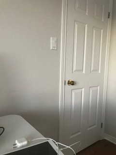
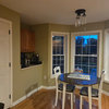
We recently tested Paper White from Benjamin Moore and I thought it was the one because I loved photos of it but it really looks blue (I've attached a photo). Do you have Paper White on your walls? Does it look like the photo below?


TIA :)


Comments (31)

  • 5 years ago

    Look into Benjamin Moore Classic Gray. Perfect white gray.

  • 5 years ago

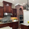
    My kitchen cabinets are painted paper white. They don’t look blue at all. Wondering if you should prime the wall white first and then try paper white on that. The current colour could be throwing you off. Also, check the “tone” of your lights. I have seen “daylight” recommended most frequently here.

    Vanessa Gauthier-Davidson thanked sydneyfv
  • 5 years ago
    last modified: 5 years ago


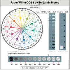
    All low Chroma, (near neutral) colours are more prone to colour shift as they are far more affected by the available light. They don’t have enough of their own inherent colour to avoid being bossed around.


    Colours from this Hue Family neighbourhood, are prone to shifting blueish in imbalanced lighting. Light which spikes more heavily in blue/violet wavelengths.


    These colours aren’t blue and don’t have blue ‘undertones’. It is an effect of lighting and context. It won’t happen in every home or every room.


    Do these colours shift both in daylight and lamplight? If they only shift in the evening then one can swap bulbs to improve the appearance. If in daylight, that requires more testing.


    🌈

  • 5 years ago
    last modified: 5 years ago

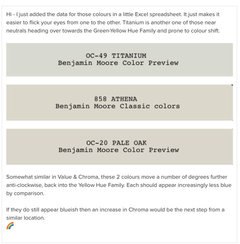
    2 options to mitigate your lighting, is to increase the Chroma of the colours you are considering and also move away from the Hue Family neighbourhood of colours which have shifted blue. You don’t want to keep repeating the same event.


    These colours move increasingly anti-clockwise, away from the colours you have tested and shifted blue. (Hue family) They also increase in Chroma to try and lessen the blue colour shift.

    We won’t know by how much you will need to alter colour attributes until you view a few more in your space.


    Try large paint chips before investing in more samples.


    Make a note of the name of any colour you sample, so it can be located on the Color Wheel above. This keeps your experiments organised and gives direction to any further samples.


    p.s. Paint any further samples upon boards, (2 coats), not directly on to walls.

    You want to be able to move them around your space to view from different perspectives.

  • 5 years ago
    last modified: 5 years ago

    We're struggling with a similar dilemma right now. Everything that looks perfect (even almost brown) in the store is coming off blue on our walls. We thought Benjamin Moore Titanium was *it*, but it comes off almost baby blue on our walls.


    I've found hue and chroma values for Titanium, but I'm wondering how to generate a chart like the one in Marylee's post above.

  • 5 years ago


  • 5 years ago

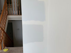
    Hi all, thanks for all your inputs. The photo was taken in natural daylight and maybe the yellow-cream colour is throwing me off but on the photo below we have the same 2 colours on a white wall. For those who have Paper White on their walls, do you think I should go back to the paint store. Does it look right?


  • 5 years ago

    Is there a color lighter than either one of those on the strip? I think once you get other one of those colors on the wall, they are going to be more color than what you are looking for if you are wanting an almost white color.

  • 5 years ago

    Thanks, Marylee! We'll take a look at those.

  • 5 years ago

    Vanessa, I don't have experience with Paper White, but it does look very blue in your photos.

  • 5 years ago

    What about putting the paint samples on posterboard, so you can move them around the room at different times of the day?

  • 5 years ago

    BM Paper White has a tendency to show a blue undertone. Your current wall color is only emphasizing how much cooler toned Paper White is compared. You could try painting one entire wall (2 coats) and see if you still see too much blue for your liking. If you still don't like it, then you should look at warmer off-white colors.


    When I read this question, I immediately thought of BM Dove Wing. It is frequently described as a white with gray undertones. Also, check out BM Cloud Cover, which is a tad lighter than Dove Wing and slightly more grayed/cool-tone. They are both warmer colors than Paper White.

  • 5 years ago

    Any thoughts on Intense white or White Wisp by Benjamin Moore?

  • 5 years ago
    last modified: 5 years ago

    Hi - White Wisp and Intense White, Paper White and Silver Satin all sit within 16° of each other at the end of the Yellow Hue Family into the Green-Yellow Hue Family.


    You are consistently drawn to similar colours from this neighbourhood. 🌈


    They all have similar levels of Chroma too. So I suspect White Wisp and Intense White are highly likely to also shift blue in your space, with your lighting.


    To avoid this as mentioned above, choose colours from anti-clockwise further into the Yellow Hue Family. You may also consider increasing the Chroma to help mitigate the blueness too.

  • 5 years ago
    last modified: 5 years ago

    If you're not going to commit to priming your entire room white before repainting, sampling over your existing color gives a better idea of how it will look in that room. But definitely try a larger sample, away from other colors you're trying.

    We recently painted several large rooms in our previous house before we put it on the market. We were painting over Behr Navajo White (an off-white with yellow undertones), and BM Halo was perfect there. It came off as a beautiful warm gray. Now we're painting over a light gray with a purple undertone, and the green in Halo comes out like crazy.

    In our new house, we're also dealing with north-facing rooms, so colors tend to look more blue. Every color that looks perfect in the store looks blue or slightly purple on our walls. (I'm looking at you, Titanium and Drift of Mist!) I don't know how to correct for the issue of north-facing rooms without getting into colors that are too beige.

    Balboa Mist and Collingwood have been suggested, but both are too dark for our space.

    Vanessa Gauthier-Davidson thanked vjwilkinson
  • 5 years ago

    Little update: I know Intense White by BM is in the same color palette of Gray Owl (slight green undertones) but we just tried it and I love it! Doesn't have the same crazy blue undertone as Paper White and just looks white-grey. Will be using Oxford White for trims and doors. Thanks all for your help/feedback :)

  • 5 years ago

    🌈👍

  • 5 years ago

    Sounds beautiful, Vanessa!

  • PRO
    5 years ago
    last modified: 5 years ago

    I may have missed this information, but what color have you painted the trim? It looks very, very, very white against the floors.

    IMO, I would look at Classic Gray before you commit. Just to get a feel for an off-white with a brown undertone.


  • 5 years ago

    @Vanessa Gauthier-Davidson, I am so glad you found "your" perfect white. It is tough when there are so many variables and when just a tiny change in chroma or hue can really alter how you perceive a color in your space.

    Vanessa Gauthier-Davidson thanked Jennifer Hogan
  • 5 years ago
    last modified: 5 years ago

    I just found that the "BM Halo" we used in our old house was actually a color-matched SW paint. No wonder the Halo we tried on our walls, from a paint sample we just bought from a BM store, looked nothing like the walls in our old house. (Well, that and different lighting from outside. ;-) )

    Now I'm trying to figure out why it's so hard to get some painters to use the brand specified by the customer. grrrrrr

    SW Frosty White turned out to be a beautiful light blue on our walls. It would be great if we were painting a nursery, but it's definitely not what we want for our main living space. We just put up Behr Campfire Ash, and I think we're getting there ("there" being a warm gray that doesn't look obviously blue, brown, pink, or purple). We may get a sample of BM Gray Mist as well, though I worry it has too much brown in it.

    Edited to add that I actually love Gray Mist--in our space, it appears as a light gray with a just a hint of green. Now I'm trying to convince my husband that it's not too light. He prefers Behr Silver Drop, which didn't seem bad when we first put it up (and a definite improvement over Campfire Ash, which did tend to look purplish in low light), but to me, Silver Drop looks lifeless when compared to Gray Mist. I am hoping that when we pair it with a brighter white trim (we are planning to repaint our trim--it's currently an unknown color that's definitely muddier than our white plantation shutters), it will be the one.

  • 5 years ago

    @vjwillinson keep us posted on what you decide to go with. I need to take a look at gray mist now!

  • 5 years ago

    @vjwilkinson

  • 5 years ago
    last modified: 5 years ago

    We finally decided to go with Behr Silver Drop. I am not in love with it, but at least it doesn't look tan or blue on our walls. I really like Gray Mist, but it's just too light (and probably has too much green for my husband to ever get on board with it).


    Vanessa, keep us posted!

  • 5 years ago

    Total zag happening here. When we painted more test patches of BM Gray Mist and Behr Silver Drop, both looked a bit brown--too similar to the SW White Duck we'd already ruled out. My husband fell in love with BM Intense White. I am concerned that it's going to look too blue (although it's not as blue as the SW Frosty White we ruled out), but I'm outvoted by him and our daughter. I guess we can repaint later if the space ends up looking like a nursery. ;-)

  • 5 years ago

    A while ago I posted a paint looking for a paint color for our daughters new condo someone posted a link to paint samples that are large stickers that can be moved they are easy to use and less expensive. I will never again buy samples the old way

    https://samplize.com/

  • 5 years ago

    I painted my whole house in Intense white and I don’t find it blue at all. I really like it, it seems to have less undertones than all the other colours we tried! Give it a try:)

  • 5 years ago

    Just took this photo in my office with lights turned off (starting to be dark early here though) to give you an idea!

  • 5 years ago

    Looks nice!

    I'm not in love with Intense White so far (the painter isn't finished yet), but maybe it will look better once we get all of our trim repainted--it's now a creamy white and we're painting it a brighter white (similar to what you have).

  • 5 years ago
    last modified: 5 years ago

    The painting is done, and Intense White is growing on me. It definitely needs a bright white trim so it doesn't look washed out. I like it best when natural light or yellowish artificial light hits it and brings out the greenish (warmer) tones. With less light or cooler light it's kind of meh for me, but overall, it's a big improvement over the previous purple-toned white. (I'm not sure, but I think it was SW Incredible White.)

    I'm definitely loving the color we painted our master bathroom: Benjamin Moore Moonshine. The room gets very little natural light, and the paint color comes off as a slightly greenish gray. (We tried it in the kitchen/dining area, and it looked more blue there. It was also a bit too dark for a main living area.)