

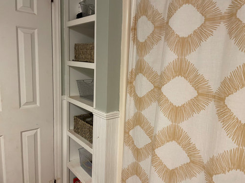
Bedroom and bathroom paint color
5 years ago
last modified: 5 years ago
Sort by:Oldest
Comments (9)
Related Stories
BATHROOM OF THE WEEKWhite Paint and Patterned Tile Freshen Up a 5-by-11-Foot Bathroom
A designer uses a light palette and hardworking cabinetry to update a couple’s 1970s hallway bathroom
Full Story
BEDROOMSHouzz Quiz: What Color Should You Paint Your Bedroom Walls?
Cool and soothing, or warm and spicy? Answer these questions and learn what hue is right for you
Full Story
BATHROOM DESIGNA Rustic Setting and a Paint Mistake Create Drama in the Bathroom
Near-black walls, wood features and elegant surfaces personalize this lake house bathroom
Full Story
ROOM OF THE DAYRoom of the Day: White Paint and Gold Polka Dots Save a Rental Bedroom
A few low-cost design moves transform a tiny bedroom with an awkward ceiling into an enticing space for rest
Full Story
COLOR PALETTES7 Beautiful Blue Paint Colors for Bathrooms
Whether it’s soothing or sophisticated, you really can’t go wrong with a blue hue in the bath
Full Story
BATHROOM DESIGN6 Elements of a Perfect Bathroom Paint Job
High-quality paint alone won't cut it. For the best-looking painted bathroom walls, you'll need to get these other details right
Full Story
BATHROOM DESIGNDream Bathroom to Your Bathroom: Translate the Look
You don't need a major bathroom makeover to get that designer look — minor accents and tweaks can convey luxe style
Full Story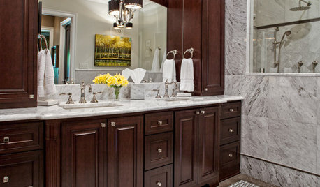
REMODELING GUIDESBathroom Workbook: How Much Does a Bathroom Remodel Cost?
Learn what features to expect for $3,000 to $100,000-plus, to help you plan your bathroom remodel
Full Story
BATHROOM DESIGN10 Bathroom Trends From the Kitchen and Bathroom Industry Show
A designer and his team hit the industry’s biggest show to spot bathroom ideas with lasting appeal
Full Story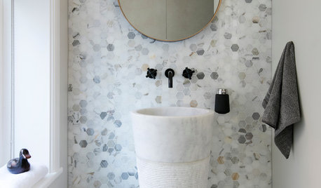
TILEHow Tiny Tiles Can Elevate Your Bathroom’s Style
Thanks to their ability to add texture and subtle pattern, petite hexagonal and penny tiles may be here to stay
Full Story

B GOriginal Author
Donna Peters
Related Professionals
Madison Interior Designers & Decorators · Natchitoches Interior Designers & Decorators · Charleston Interior Designers & Decorators · Monroe Interior Designers & Decorators · Juneau Interior Designers & Decorators · Cornwall Interior Designers & Decorators · Sebring Bathroom Remodelers · Lima Bathroom Remodelers · Shreveport Kitchen & Bathroom Designers · Montrose Kitchen & Bathroom Designers · Helena Kitchen & Bathroom Designers · Lake City Interior Designers & Decorators · Magnolia Furniture & Accessories · Lawrenceburg Furniture & Accessories · Lawton Custom Closet DesignersB GOriginal Author
B GOriginal Author
B GOriginal Author
Donna Peters
B GOriginal Author
B GOriginal Author
Donna Peters