

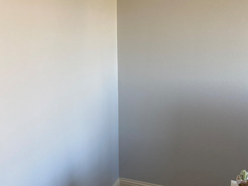
Help! Gray paint is looking blue or lavender
5 years ago
Sort by:Oldest
Comments (7)
Related Stories
FOLIAGEGet a Cool Garden Look With Gray and Blue Plants
Looking for plants that calm with color in the heat of summer? Look no further than these 14 soothing beauties
Full Story
GRAYDesigners Share Their Favorite Light Gray Paints
These versatile neutrals can help create a range of moods in any room
Full Story
BEFORE AND AFTERSA Casual Gray Kitchen Effortlessly Blends Looks and Functionality
Durable, family-friendly finishes and cool tones help this San Diego kitchen keep a laid-back profile
Full Story
GRAY8 Ways Your Bathroom Would Look Great in Gray
Gray may be a neutral, but it need not be dull
Full Story
GRAYChoosing Paint: How To Pick the Right Gray
Which Version of Today's 'It' Neutral Is For You?
Full Story
EXTERIOR COLORWhen to Paint Your Home Gray
This perfectly neutral and highly versatile color can create subtle distinctions among exterior architectural elements or stand on its own
Full Story
TRENDING NOWBlue, Green and Gray Cabinets Star in the Top New Laundry Rooms
White cabinets are still the most common choice in laundry rooms, but these trending photos tell a more colorful story
Full Story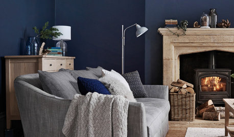
DECORATING GUIDESHow to Combine Blue and Gray in Your Living Room
Let these 10 versions of the versatile color combination inspire you
Full Story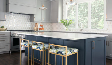
KITCHEN DESIGNThoughtful Style and Storage in a Gray-and-Blue Kitchen
This North Carolina kitchen features a marble-and-brass backsplash and carefully planned cabinet organization
Full Story
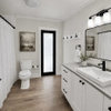
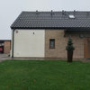
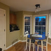
Therese N
Linda Kincaid
Related Professionals
Atlanta Interior Designers & Decorators · Anniston Interior Designers & Decorators · Dalton Bathroom Remodelers · Vicksburg Bathroom Remodelers · Manchester Bathroom Remodelers · Scranton Kitchen & Bathroom Designers · Cambridge Interior Designers & Decorators · Toms River Interior Designers & Decorators · Rock Hill Interior Designers & Decorators · Winston-Salem Architects & Building Designers · Texarkana Architects & Building Designers · Middletown Architects & Building Designers · Quincy Kitchen & Bathroom Designers · Yuma Kitchen & Bathroom Designers · Leamington Kitchen & Bathroom DesignersBeth H. :
Marylee H
Marylee H
Marylee H
TU TUOriginal Author