Software
Houzz Logo Print
kgrady17

Kitchen Cabinet Color

5 years ago

Hello! I am new to Houzz and would love some help. My husband and I have initiated a project for a new kitchen in our 1920s traditional home. Everything is ready to go, but ordering our cabinetry and getting the project off the ground has come to a halt because I cannot decide on the finish/color for the cabinets.

Our home has very warm elements. All of the trim is painted in SW Dover White satin throughout the entire home. The walls in the foyer, dining room, hallway up the staircase are painted in Dover as well, but matte. We refinished the floors and staircase in the entire house. Floors are quarter sawn white oak stained Golden Oak, so it’s very traditional and warm.

To try to cut the chase, for the kitchen project, I selected a quartzite that is very white with a warm, taupe grey and some dabbles of cream. My backsplash will be a dolomite marble. In this case I need a cabinet that is bright white, but I just can’t determine what it should be. I’ve been swimming in a sea of whites and exhausted myself with research. I am very apprehensive as I think a bright white may not be cohesive with the rest of the home. Maybe that doesn’t matter?

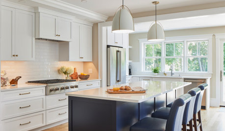
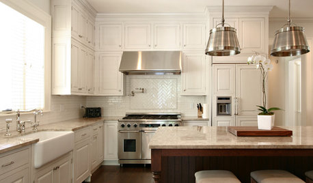
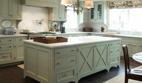
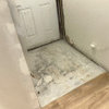
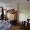
Any advice would be welcomed! Thank you so much! Here are some pictures.

Comments (87)

  • 5 years ago

    Mary Alice, my original countertop choice was Taj Mahal, but done slabs looked gray to me, so I moved one.

  • 5 years ago

    *some slabs

  • 5 years ago
    last modified: 5 years ago

    Taj Mahal has lots of lot variations. The creamier ones would be perfect. Try to find a wholesaler that has some of those.

  • 5 years ago

    Thank you! I still love the other countertop, but it may not be the one. I just love the subtlety of it. It’s actually a warmer taupe gray. I really don’t want to start all over either. However, Mary Alice said it best and so cleverly, why pick the ice blue mini dress that fits your neighbor and not you.

  • 5 years ago

    Beth—I the price that I gave you for my countertop included the fabrication. I went there today and they insisted it’s a quartzite, one they have never had before. Attached is a pic of the sign labeling it as a quartzite.

    I thought I might be able to find a different slab so that I could settle this and select a warmer white finish/color for the cabinet, but nothing. I’m still drawn to this countertop. I started to think maybe it’s the little black dress! But still can’t find the right white. What about SW Greek Villa? I see some green in it, but it doesn’t cast yellow.

  • PRO
    5 years ago

    SW Pure White will be perfect, virtually no undertones!

  • 5 years ago
    last modified: 5 years ago

    then if they're so certain, have them give you a little sample chunk so you can test it. I'll bet you it's marble. ask them if you can have a little 2" piece of it to verify it.

    Look up White Swan quartzite. it doesn't exist. they made up the name.

    Do you know how many stone places swear that something is quartzite and it's not? For years Super White was sold as quartzite. It's a dolomite. always has been. stone places don't care. you'd think they'd do their research, but they know people shy away from marble products.

    There is another poster on here that was sold granite, or so she thought. she specified she had to have granite because of her busy family. the guy swore it was granite. 7 months later, it's scratched to all get out. turns out it's a marble or a type of sodalite. She's suing him right now for false representation.

    If your guy is swearing that it's quartzite, will he write you a guarantee? that if it etches or scratches he'll refund your money?

    Quartzite will NOT ever etch. if he tells you differently he's lying. quartzite won't scratch because it's an 8 on the MOHS scale. (diamond is a 10. marble is a 3) (of course you could scratch it with a diamond since it's harder than quartzite! but glass will turn to powder when run across a quartzite surface.

    you have a sample of that slab they gave you? or, take a glass tile into the shop with you. on the corner of the slab (not the mesh or resin portion, just the stone itself) run it across the face of the glass tile. does it scratch the glass? does it turn to powder? does the glass scratch the surface of the Swan??

    oh, btw, I contacted the owner of that kitchen w/the marble, and she cannot find the can of paint she used.

  • 5 years ago

    Thanks, Lil. I’m afraid it will look stark. What about Chantilly Lace or is that the comparable BM color to SW Pure White?

  • 5 years ago

    I just matched SW Pure White with the countertop sample, it’s blue. However, SW High Reflective White doesn’t look too bad. That’s what I meant to ask, is SW High Reflective White comparable to BM Chantilly Lace?

  • PRO
    5 years ago

    Chantilly Lace is more yellow creamy:) the SW Pure White is not a true white contrary to the name lol, very versatile taking the color of the environment:) without being as yellow as other creamy whites... here is more about it https://www.kylieminteriors.ca/paint-colour-review-sherwin-williams-pure-white-sw-7005/

  • 5 years ago
    last modified: 5 years ago

    if you want SW, use Pure White.

    Pure White is beautiful for cabinets if you are going for a ‘white’ kitchen. It won’t be warm enough if you are looking for a softer, warmer white (in which case, you might check out Alabaster, which is coming up soon or one of these warm white paint colours)

    if using BM, use Oxford White. Simply White if you want a touch more warmth. Chantilly is very cool white.


    4 best SW white paint colors

    https://www.kylieminteriors.ca/the-4-best-white-paint-colours-sherwin-williams/


    Kylie has many articles on her blog surround paint colors. start here, w/this one. then look at her heading for cabinet paints

    https://www.kylieminteriors.ca/the-5-types-of-white-paint-colours-warm-cool-true-and-more/

    https://www.kylieminteriors.ca/painting-kitchen-cabinets-how-to-pick-the-best-paint-colour/

    want to see the cabs she's advised on? click on this one. they have a ton of white paint colors

    https://www.kylieminteriors.ca/category/portfolio/kitchen-remodel-design/

    this one was BM Cloud White. a bit softer


    High Reflective white


  • 5 years ago

    Beth—I totally agree. I researched White Swan when I first stumbled across this. I’m sure they have it mismarked. I’ve read too how this happens often. Calling a marble “soft quartzite” as a cover. And I do have a sample. I am able to scratch it, I guess that’s what I should do with this and start over! Ugh!

  • PRO
    5 years ago
    last modified: 5 years ago

    And another source https://www.loveremodeled.com/pure-white-sherwin-williams/ my favourite go to white

  • 5 years ago

    I’ve exhausted myself reading Kylie’s website and her videos. I keep vacillating. Maybe I should do Taj Mahal countertops.

  • 5 years ago
    last modified: 5 years ago

    no such thing as a soft quartzite. that's what I thought until an actual geologist on this site schooled me! thanks karenmt!!

    it's either quartzite, or it's not. this is no 'mixture'.

    if you can scratch it w/glass, it's 100% marble. (glass is harder than marble, but softer than quartzite)

    did you do the lemon test on it? if it doesn't etch immediately, maybe you could still use it.

    but, it's up to you.

    if you want a white quartzite, look into the Macaubas slabs.


    or, look at porcelain slabs. this is a calacatta porcelain


    don't stress about the whites.

    you don't anything in the creamy yellow line.

    just get a neutral white and be done with it!

    or, just do them in dover white. make sure you have 4000K bulbs to keep things from being too yellow


  • 5 years ago

    I’m definitely looking for a softer white. When I look at the Simply White swatch it looks too warm with the countertop. I was going for an all white look, but I’m open to a contrast.

  • 5 years ago

    I’ve looked at Macaubus. I’m not a fan. It looks gray to me, cooler than what I selected. I’ll do the lemon test, but I think it’s obvious, it’s marble.

  • 5 years ago
    last modified: 5 years ago

    then keep the dover. I posted two pictures of Dover white kitchens. the last two in my above comment

    and don't go off a swatch!! you have to sample them in your home w/your lighting


    i love that slab. if you don't mind being careful, I'd get it

  • 5 years ago

    I love the slab too!

  • 5 years ago

    I have Dover I. My house, it’s okay with the slab. Dover can look mayonnaisey depending on the day. To throw another wrench into this, I’m having a wi Dow removed. Changes everything!

  • 5 years ago

    *window

  • 5 years ago
    last modified: 5 years ago

    I know you have it, that's why i mentioned it. it seems like you're trying to coordinate w/the trim, and with this slab. Any bright white you pick if going to make the Dover look a little dingy.

    if you go with a softer white, then the white in the slab is going to make it look dingy!

    you need to pick a side and go w/it.

    I'd opt for bright cabinet white. (and by bright, I mean a neutral, soft white that matches the marble) it will look better if you want the white kitchen.

    trim can always be switched out another day.

  • 5 years ago

    I agree! You’ve been so helpful as well as everyone else.

  • 5 years ago

    I do not want a creamy kitchen, but I do want a softer white. I just don’t think I can find it to match the countertop. I can easily find a warm white cabinet color if I switch countertops. I might have to give it up for Taj Mahal. It would be a different direction than what I was aiming for, but I want it to look right. It’s too big of an investment.

  • 5 years ago

    Would you call Chantilly Lace a soft, bright white?

  • 5 years ago
    last modified: 5 years ago

    taj is nice too. and not cheap.

    I just copied this pic from another poster today. she said she used "White" for the cabs with her Taj


    another poster on here, Maryminnestoa not sure what cab color she used


    some taj slabs lean more gray, so you'll have to check around for the warmer ones


    this was the one at my stone place


  • 5 years ago

    For me, this color, Chantilly Lace, doesn’t seem to have any undertones unless natural sunlight is on it, and then I see a bit of warmth.

  • 5 years ago

    Yes, I’ve seen Taj look gray.

  • 5 years ago

    And, yes, it’s pricey.

  • 5 years ago

    @kgrady17 Chantilly lace is pure white, and stark in my house. I would feel like the cabinets are glowing...but that is my space. Trust your eyes, everyone's home and lighting is different.

  • 5 years ago
    last modified: 5 years ago

    chantilly is a brighter white. depending upon what type of light you have coming in through the windows, will play a big role on how it looks. to me, it's a cooler white.

    from kylie:

    What type of paint colour is Chantilly Lace? Is it a true white paint colour?

    Chantilly Lace is a white paint colour, and as far as Benjamin Moore is concerned, it’s THE WHITEST white! Chantilly Lace has an LRV of 92.2, which puts it WELLLLL into the white range.

    What type of paint colours look good with Chantilly Lace?

    • Chantilly Lace is good with most colours but PREFERS the cooler end of things
    • Chantilly Lace is ‘ooookay’ with warm colours like beige, tan and cream, but generally, I would choose a slightly warmer white like Sherwin Williams High Reflective White if I want a ‘white’ trim colour that isn’t a soft or creamy white

    I did my walls w/Simply White and it's pretty white.

    (my trim is also Simply White in the semi gloss)

    light is from one SW window. I don't see any warm tones at all.


    to me, it's really a great white. I originally painted the walls with White Dove and it was too dingy looking. like a white t shirt that gets washed w/ dark colors.


    you can see them side by side how Simply is a bit warmer. but on a wall w/bright daylight, doesn't appear overly creamy.


    what about Alabaster?

    alabaster and gray owl:


  • 5 years ago
    last modified: 5 years ago

    Chantilly Lace is a green white. It was very cold and stark in my house. My designer recommended the perfect light neutral color called Asiago, by Valspar. Not in Valspar paint though. I think it was Sherwin Williams that mixed it for us.

  • 5 years ago

    Thank you! Is that what’s pictured on the cabinets?

  • 5 years ago

    which one? you talking to me or marykat?

  • 5 years ago

    I see. It’s Alabaster, right?

  • 5 years ago

    Sorry, to MaryKat.

  • 5 years ago

    Beth—is BM Snowfall White between Chantilly Lace and Simply White?

  • 5 years ago

    MaryKat—that’s the Asiago on your cabinet?

  • 5 years ago

    Beth-Simply White does look pretty white in your space. You also have natural light from the south and west. Simply White does look white in brighter sun.

    I had to return my wood sample of it to the cabinet company, but I recollect it looked like it had a clear yellow undertone. I will have natural light from the East and I have breakfast nook with four windows, two facing south and one east and one west.

    I think I will buy a sample and paint a few coats on a white poster board. To move around in my kitchen. How does Simply White look in your kitchen with artificial light? And what color are your countertops? Thank you.

  • 5 years ago

    There will not be any cabinets in the nook area, which is set back a bit from the kitchen space.

  • 5 years ago

    I do have one other south facing window, but it is going to be removed, sadly. Old house, there was no way around it to make the kitchen space work.

  • 5 years ago

    Beth-Your backsplash looks like it it’s Calacatta Gold? Beautiful! Your space looks gorgeous!

  • 5 years ago
    last modified: 5 years ago

    thank you, yes it's calacatta. so is the island. that's the only real window I have in that space, and the door by the pantry. the window over the sink is completely under a patio cover and it's north.

    I had chosen Simply White for my cabinets but the painter said when he tried it it looked a little yellow. He ended up using his regular white (they use a cat. lacquer)

    I don't think it's an overly bright white. but it's not a creamy white either.


    since you have east light, which tends to have more blue, I'd go w/slightly brighter white that leans in the yellow spectrum (yellow cancels blue)

    Snowfall might work. I have never seen this color


  • 5 years ago

    Thank you! So helpful!

  • 5 years ago

    I’ve only skimmed the comments, but saw a couple mentions/links to Kylie M. Both Kylie and Maria Killiam offer online design packages for choosing colors. They sell out fast, but the $200 fee might be worth the peace of mind to stop second guessing yourself on the cabinet color. :). Good luck!

  • 5 years ago

    Thank you!

  • 5 years ago

    I’m going to use SW Pearly White for most of the walls in our home, take a look at it on the off chance it may work for you.


    I loved the white that my daughter used in her living room but had no idea which company it was from or which color name it was. I ordered 5 samples from Samplize and I fell in love with the pearly white. It turns out that it’s the color my daughter used in her living room. In some light it had a very slight greyish cast. It’s just a tad warm without being creamy.

  • 5 years ago

    Thank you Holly-Kay! I just had this swatch up against my slab and I really, really thought it went well. When I got home with it I felt it went a bit green. Do you see green in it?

  • 5 years ago

    What kind of natural lighting do you have, Holly-Kay?

  • 5 years ago

    I have an east facing window in my bathroom which is where I had my large sample. My dining room also has an east facing window and my daughter had some of the paint left and painted a swatch on the wall. I didn’t see green at all but it’s possible. When I go back over to our other home I’ll move it around in my other rooms and also take it outside to see if I notice green. I’m not sure where to find the colors that are used in a particular paint color but maybe a call to SW would be in order. The light that each room gets is the determining factor.


    Good luck with your decision and I’ll post back when I see how the color shifts in different lighting.