Software
Houzz Logo Print
kristy_dainton

Backsplash for Dark Kitchen

5 years ago
last modified: 5 years ago
Hi everyone!

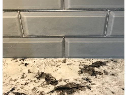
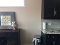
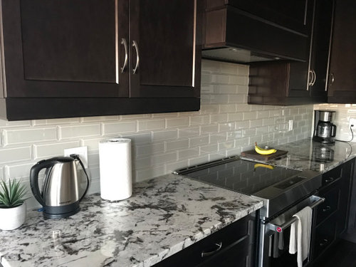
I had my backsplash tiled using a 3x9 taupe glass tile that I thought would match perfectly with the dark cabinets and granite countertops in my kitchen. However once installed the tiles took on more of a dark greyish blue colour that I don't think matches very well at all depending on the light! I'm looking for suggestions on what would be a suitable alternative - I feel the current tiles make the kitchen feel dark but I've looked into white subway tiles and I think they are too bright next to the countertops. I am open to changing the wall colour as well if that would help. Any advice would be greatly appreciated!

Thanks in advance!


Comments (35)

  • 5 years ago

    I’m not a pro, but what I notice is the wall color. It’s warm where your black splash runs cool.

    Kristy D thanked Mark Brunner
  • 5 years ago

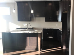
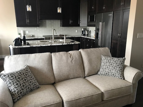
    I agree and that wasn't the intention at all! Here's a picture before the backsplash was installed where I thought the kitchen tied in with the wall colour much better. I'd like to get back to this lighter feel if possible by changing the backsplash.


  • 5 years ago

    From my monitor (which, as with any monitor, doesn't always resemble real life), the backsplash goes great with your cabinets and countertop....it's the wall color that's throwing it off a bit.

    Kristy D thanked lettersatoz
  • 5 years ago

    I admit from some angles and under certain light it looks ok. But at other times it totally seems to clash! Any suggestions on the wall colour? Do you think changing the colour of the grout might help?

  • 5 years ago
    last modified: 5 years ago
    Many of us here have chosen wrong for the backsplash. So you are not alone.

    Before ripping it out, I agree with Letter about the walls.

    It seems gray is the direction you are going in. I’m wondering if a griege could work, or a very light gray.

    Kristy D thanked eld6161
  • 5 years ago

    Do you have under the cabinet lighting? That may change the way you feel about the backsplash.

    Kristy D thanked erinsean
  • 5 years ago

    The different photos make it really hard to advise--like you say, sometime it goes and sometimes it doesn't.


    Don't worry about whatever backsplash you end up with making it dark. It's a dark kitchen. It's a good dark. As long as you have enough lighting to be able to work in it, don't think that dark is bad.

    Kristy D thanked Fori
  • 5 years ago

    Perhaps change out your light bulbs to a brighter one. Maybe then the wall will look better. It seems to be in shadow most of the time.

    Kristy D thanked Tara
  • 5 years ago

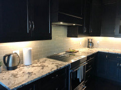
    Here's a photo with the under cabinet lighting which in my opinion makes it look even worse.


  • 5 years ago

    It looks fine.

  • 5 years ago

    Perhaps I'm being thrown off by the bigger picture? It definitely doesn't go with my current paint colour. I was thinking a warm grey/greige?

  • 5 years ago

    I have a similar countertop and dark lower cabinets. I did a white backsplash even though the counters are much creamier. My walls are almost the same color as the backsplash tile (and uppers are that color also)...bm simply white. Make sure that the UCL is 4000k...our cabinet guy really wanted to do 3000k but I insisted on the more pure white as the slight yellowish light makes the tile and the granite tones change.

    Kristy D thanked lucky998877
  • 5 years ago

    It must be my monitor but the BS looks pretty without the under-cab lights.

    But again monitors are all different. I do agree the paint might need a change but without seeing it in person I am not 100% sure. I would look for a greige paint for the walls. My go to Greige gray is Balboa Mist but this can sometimes read light light purple tone so be sure you get a sample and see if this is a color you like.


    Office · More Info


    Or maybe an even cooler gray....

    Grizzle Gray, SW 7068


    Eagle St Part II, Naperville, IL · More Info


    Kristy D thanked Boxerpal
  • 5 years ago

    Thanks everyone for your input so far. I double checked the bulbs on the under cabinet lights and they are 3,000K so I’ll definitely look for 4,000K to see if that helps.

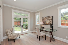
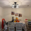
    I also wanted to include a picture of my sideboard as it is a warm tone (as is my dining table) that I think throws off the cohesiveness of the space. Do you think I could still do a grey on the wall and pull everything together?

  • 5 years ago

    You are so brave to use the grey tiles and they are beautiful, so work with enhancing them. Maybe consider adding some nice white or creamy white counter accents to pop nicely in front of the tiles (cannisters, baskets, utensil holders, etc., and include a nice wooden bowl filled with like bananas for example, placed at the left end of counter that ties into your sideboard/dining table.

    Kristy D thanked bearbev
  • 5 years ago

    Yes, I think you could change the wall color to something a bit more (light) grey/greige to tie everything together. That would be so much cheaper and easier than ripping out the backsplash which looks quite nice.

    Kristy D thanked lkloes
  • 5 years ago

    Before you start repainting the whole space...get 2-3 foam boards and paint them a warm white and place against your backsplash. See what it does. Use the other sides and test a gray paint (since that is what are leaning towards) and hold the boards against your cabinets/wall...see what that does.

    Kristy D thanked lucky998877
  • 5 years ago

    its a small compact kitchen with very dark cabs. If you get white tiles it makes the very dark cabinets even more of a statement. A muted light shade... like you have right now is actually best....a stark intense white isn't really what you want....too much contrast with dark cabs. I don't find the wall color to be a problem...it's a little shift into an ivory and just a tad warmer than the linen couch fabric. I think everything is fine. The kitchen cabs are dark but the space as a whole works ..maybe the realization that not very many changes are really going to alter the fact of very dark cabs. But I like it and wouldn't change things. If you want to alter something go and have a search for some new pendant fixtures.....something else right there would pull the eyes forward ...that might be nice for you.

    Kristy D thanked herbflavor
  • 5 years ago

    Well hold on a second. What does the WHOLE space look like? Does your furniture and decor work with your existing walls? If so you need to fix the backsplash. Painting the walls to work with the BS may make everything else seem off so tread lightly. I’d say post more photos of the whole area and also take a loose tile to the paint store to match the exact color of it and then post what that is. 4000k bulbs will only brighten the color that’s already there.

    Kristy D thanked thinkdesignlive
  • 5 years ago

    It is definitely the glass grey tiles that is throwing everything off. It's obvious when you look at the photo before the back splash was put in. Your warm wall color is fine, and works well with your furniture, the expresso cabinet color, and the countertop. You just need a solid warm white porcelain tile that looks like your wall color, or slightly lighter but with the same warm tone. Painting more gray on the walls will just extend the problem.

    Kristy D thanked calidesign
  • 5 years ago

    My monitor show the tiles throwing off a blue-ish tinge. The challenge seems to be the other colors in the house lean more beige-grey and the tiles are cool-grey. If the right paint color were chosen, it would all work without pulling out the backsplash. If painting the area is too overwhelming then you need to redo the backsplash. The best way to figure out which way to go is paint poster board different wall colors, and then paint different poster board possible tile colors. That may help your eyes to see what will look more cohesive.
    Your first photo shows the challenge. Glass tiles have a tendency to look different when installed.

    Kristy D thanked RedRyder
  • 5 years ago

    The backsplash looks blue-ish to me also, and it also does not look good with the countertop (based on the third picture). I would get rid of the backsplash and get something lighter and more neutral (no blue or gray). Your picture of the kitchen without the tile looks the best to me. Perhaps you can get something that's the color of the wall paint, which looks off-white to me.

    Kristy D thanked nester44
  • 5 years ago

    Love the suggestions of painting foam board as samples, never thought about it! @Kristy D i had the opposite problem where I loved my beige backsplash and hated the cool walls, so even though the open floor plan meant a huge painting job, I did it. If you love the walls, change the backsplash. Pick up some you love and stage them for a few days to decide. And all the planning doesn’t always work. We picked SW Rain for our exterior color and bought patio furniture with accents to match only to have Rain look like baby boy blue almost ALL the time. Cant Wait to see what you go with!

    Kristy D thanked alwayscold
  • PRO
    5 years ago

    Order sample paint colors from samplize.com. Easier, more accurate color, no foam board, no brushes and no need to safely dispose of pots of sample colors. Great resource. Their samples also have peel off backs so you can peel corner of backing off and stick on different walls at different times of day and night. But first change to 4000k lighting.

    Kristy D thanked Flo Mangan
  • PRO
    Kristy D thanked Lisa Caudill Designs
  • 5 years ago

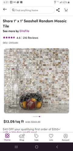
    @Lisa Caudill Designs -- you don't think that would be a bit busy when paired with her countertop?

    Kristy D thanked lettersatoz
  • 5 years ago

    Yes that is WAY too busy! You need something to calmly blend into the background. I would personally keep looking for a white tile.

    Kristy D thanked Rachel Simanski
  • PRO
    5 years ago

    Just because the counter has strong details doesn't mean the back splash has to be blah. This also comes in a white as well. With white grout, it pulls in all the colors you are looking to blend.

    Kristy D thanked Lisa Caudill Designs
  • 5 years ago

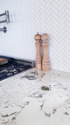
    I agree with @Lisa Caudill Designs. My similar (maybe the same?) counter is paired with a small scale white herringbone and light gray grout...the tile pattern shows clearly and does not fight with the granite. You don't need to go with very plain, unless that IS your taste.

    Kristy D thanked lucky998877
  • 5 years ago

    I think glass tiles are difficult to work with because they are so changeable depending on the light. Your counters have a lot of white also. I think your paint is nice but not next to the gray tile. I think gray is going the way of the Brown look of 10 years back so a more timeless choice would look less dated down the road a bit. Your kitchen is very pretty.

    Kristy D thanked ilesliemy
  • 5 years ago

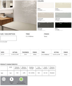
    So for those of you that think the backsplash needs to go, what would you suggest I replace it with? My husband is very partial to the beveled subway tile (which is part of the reason we selected the tile we did). Do you think the same style of tile in glossy white or very light cream in the same brick formation would look good? Would it be better to stick with 3x9 tiles (I think the 3x6 ones seem a little small). Would you pick a grout colour similar to the tile colour or something that pulls from the granite like a grey or brown?

  • 5 years ago

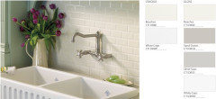
    I have the bottom crackle tile from Virginia Tile in White Caps. I think something like this would look really good. I would stick with matching grout. https://www.virginiatile.com/search/product?keyword=ceramic+tiles+international


    Kristy D thanked Rachel Simanski
  • 5 years ago

    Subway tile can be installed so many different ways. It doesn’t have to be Plain Jane Blah at all. First figure out which color you like, then you can easily find several installation suggestions here and online. Longer tiles can be stacked, shorter can be installed in a herringbone patterns. Textured, glossy, matte - the variations are endless. Or find a picket or Arabesque shaped tile in the right color. But go for the white-creamy-ivory family; whichever works with your countertop. I don’t think busy is a good idea here.

    Kristy D thanked RedRyder
  • 5 years ago

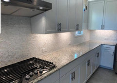
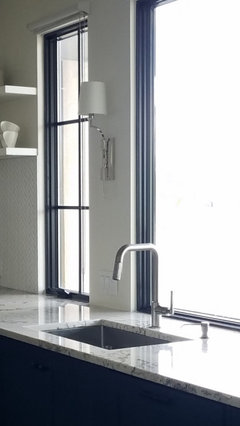
    @Kristy D this is the white that I did...it's not a cold white but doesn't lean too creamy either.


    Kristy D thanked lucky998877