Software
Houzz Logo Print
maryeve123

What is wrong with our vanity wall?

5 years ago
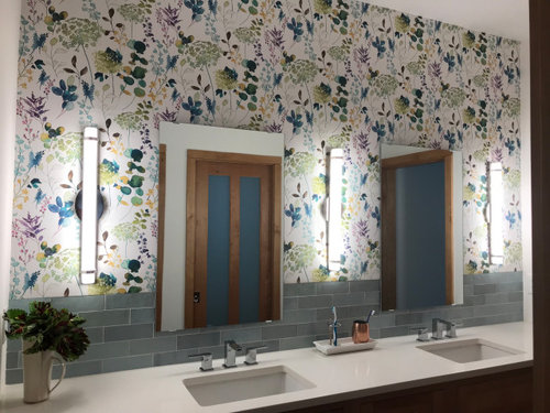
We just wallpapered one wall above our vanity, and while the paper is beautiful, something is off. Maybe the light fixtures? Mirrors too plain? Wondering what would help pull it together.


Comments (25)

  • PRO
    5 years ago

    IMO the backsplash should have ended below the mirrors and it really does not work with the wallpaper

  • 5 years ago

    Agree, it is beautiful wallpaper but doesn’t seem right with the tile. Bigger mirrors might help, the scale is way off.

  • 5 years ago

    i think the mirrors need frames. Wallpaper is lovely and traditional; mirrors are modern looking. I think frames will help

  • PRO
    5 years ago

    I feel like if you shorten the mirrors the lights will be too big... If you frame the mirror there's a lot going on. To me the biggest thing is actually the reflection of the brown doors that seem a different style than the rest. I like them on their own but they don't seem to go with the rest... I guess my question is what style is your house and is the room supposed to be? Is the wallpaper fitting or clashing with the rest?

  • 5 years ago

    Beautiful wallpaper. The mirrors are hung quite low, hitting the tile and wallpaper… would it look better if they are raised to just kiss the top of the tile? I agree the reflection of the wood doors is throwing me off.

    Maybe restyle the counter top a bit before making any drastic changes. You could hang a white sheet over the door if that would mock up painting them.

  • 5 years ago

    Try turning the mirrors 90degrees and hang above tile before any drastic tile wallpaper change

  • 5 years ago

    I think the tile and wallpaper look nice together! What bothers my eye is how much wall there is above the fixtures and mirrors. The fixtures seem almost hung to the mirrors’ top edge, which I would expect if they’re nearer the ceiling, but as it is it creates an odd hard line with a lot of blank space above. Almost like you’re artificially lowering your ceiling and emphasizing the width of the room instead of the height. It’s like the scale is off as a result. I would have done a light above each mirror, but perhaps there’s another way to draw the eye up?

  • 5 years ago

    Wall paper is too busy with the other elements


  • 5 years ago

    Two things imo:

    -the reflection of the wood trim distracts (great idea to mock up the painted trim effect with a sheet)

    -the mirrors are too plain and are hung too low


    Consider replacing them with beveled edge ones and hanging them to meet the bottom of the top row of tile.


  • 5 years ago

    I agree with above, rotate the mirrors 90 degrees to hang horizontally...


  • 5 years ago

    i think the wallpaper is beautiful. And while the backsplash is a little odd, its not fatal. However, i would have placed four light fixtures, one on each side of the mirrors. Having them spaced out, rather than tucked to the sides of the mirrors makes it look very busy and blocky.

  • 5 years ago
    last modified: 5 years ago

    Agree I love the wallpaper, and dont care for the tile at all, with it. with the counter being white, tile being dark, to me, it is too many visual solids. i feel the wallpaper should be an all or nothing look, with one color for counter. And, for a backsplash, maybe only a small, counter-matching maybe 4” high piece.

    The mirrors need a frame.

  • PRO
    5 years ago

    You have Craftsman doors reflected in the mirrors, yet you went with super modern mirrors and lighting. I don't mind the wallpaper/tile combo, but I'd replace the mirrors with ones that have a wood frame. Rejuvenation makes bent wood mirrors that split the difference between modern and traditional.


    I'd also consider replacing the lighting to something more Transitional.

  • 5 years ago

    I think you have a lot of mismatching going on….. Traditional/cottagey and contemporary fighting with each other. You have very contemporary plumping fixtures with clean lines along with your very clean looking counter, but traditional/cottagey wallpaper with plain frameless mirrors atop of it, and a backsplash style somewhere in the middle (which IMO goes very well with your counter and fixtures). And then the craftsman style doors reflected in the mirrors. Additionally, the fixtures do not play well with the wall paper.

    I think the wallpaper is the main culprit here and you have to decide which direction you want this bathroom to go….contemporary or traditional/cottagey), but you can’t have both working well together.

  • 5 years ago

    Something more organic and curvilinear for your wall sconces ? Just as an example, these transitional sconces might work to bridge the more traditional with the contemporary. As always, it is best to see items with each other, in real and in the space . I would bring some things home to hold up with the wallpaper and tile backdrop ( which I think look nice together, btw. ). I think your wallpaper is beautiful . I think the contemporary fixtures are good with it. My preference would be to change the mirrors to something with an opaque frame, either natural or painted wood with some “ weight” to the frames, so they show up better. The sconces and mirrors would be the easiest things to change out in order to bring the other elements into the beautiful potential they have as a whole.

  • 5 years ago
    last modified: 5 years ago

    I agree new framed mirrors, hung higher. And I was wondering about this light/mirror arrangement (example and mirror from Anthropologie.)


  • 5 years ago

    I think the reflection puts it off. Here is what mirrors framed to match the trim would look like.


  • 5 years ago

    Raise the mirrors and it will perfectly balance the modern and craftsman elements that are found through the room. No need to buy more things when everything looks brand new and lovely.

  • 5 years ago

    Wide frame around the mirrors will help

  • 5 years ago

    Different, more traditional sconces too

  • 5 years ago
    last modified: 5 years ago

    IMO it's that you should add a wood frame around the mirrors, yes, but it's mainly the sconces. You need something above the mirrors to add more height. Now it just looks "flat." You could also remedy this with longer, taller mirrors. Don't know why anyone would say tile and wallpaper are wrong together....they look perfect together lol.

  • 5 years ago

    See, mirrors should be taller than the sconces. Just gives height


  • 5 years ago

    I would def change the lights and mirrors - your wallpaper overpowers the room. Go bigger on sconces and mirrors and either match the wood from the door or pick a color that goes w/ the tile and is in the wallpaper.

  • 5 years ago

    Taller mirrors, hung a bit higher and change the sconces. The wallpaper is beautiful.

  • 5 years ago
    last modified: 5 years ago

    Love the wallpaper, but the space is too busy. The tile is too high /is competing with that wallpaper; that is, they're both trying to be the stars ... and then the mirrors and sconces are a bit much for the space. Your eye needs something calm /a break from the busy-ness.


    First choice: I'd get rid of the small mirrors altogether and GO SIMPLE with one large mirror. That'll give you more mirror /less of the busy wallpaper /a more calm look. This will also fix the problem of odd half-things reflecting in the small mirrors.


    Second choice: Yes, as others have said, frames would help the mirrors. Frames would give the eye "a break" between the wallpaper and the mirror, but it would be a bandaid rather than a fix. The wall would still be busy.