

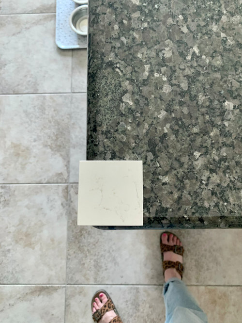
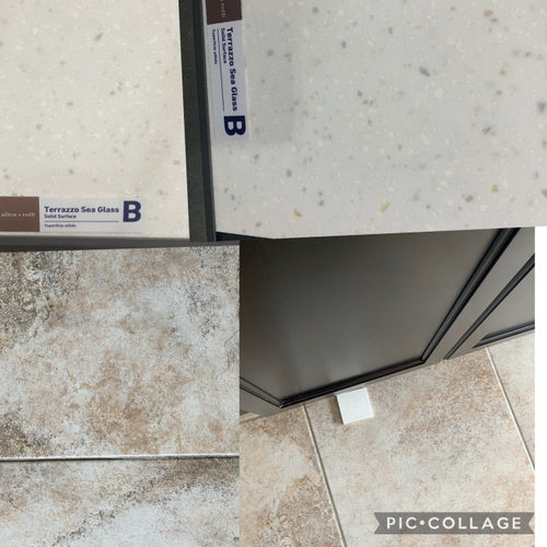
Which countertop do you like better?
5 years ago


Sort by:Oldest
Comments (2)

Related Stories
LANDSCAPE DESIGNGarden Overhaul: Which Plants Should Stay, Which Should Go?
Learning how to inventory your plants is the first step in dealing with an overgrown landscape
Full Story
KITCHEN DESIGNHouzz Quiz: Which Kitchen Backsplash Material Is Right for You?
With so many options available, see if we can help you narrow down the selection
Full Story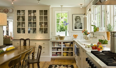
KITCHEN DESIGN12 Great Kitchen Styles — Which One’s for You?
Sometimes you can be surprised by the kitchen style that really calls to you. The proof is in the pictures
Full Story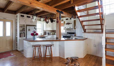
KITCHEN DESIGNOpen vs. Closed Kitchens — Which Style Works Best for You?
Get the kitchen layout that's right for you with this advice from 3 experts
Full Story
BATHROOM DESIGNWhich Bathroom Vanity Will Work for You?
Vanities can be smart centerpieces and offer tons of storage. See which design would best suit your bathroom
Full Story
KITCHEN SINKSWhich Faucet Goes With a Farmhouse Sink?
A variety of faucet styles work with the classic farmhouse sink. Here’s how to find the right one for your kitchen
Full Story
KITCHEN ISLANDSWhich Is for You — Kitchen Table or Island?
Learn about size, storage, lighting and other details to choose the right table for your kitchen and your lifestyle
Full Story
FUN HOUZZHouzz Quiz: Which Midcentury Modern Chair Are You?
Have a seat for a little fun. Better yet, have a seat that has you written all over it
Full Story
You Said It: ‘The More Dents, the Better’ and More Houzz Quotables
Design advice, inspiration and observations that struck a chord this week
Full Story
BATHROOM DESIGN12 Designer Tips to Make a Small Bathroom Better
Ensure your small bathroom is comfortable, not cramped, by using every inch wisely
Full Story
herbflavor
MojaveOriginal Author
Related Professionals
Spring Kitchen & Bathroom Designers · San Francisco Kitchen & Bathroom Designers · Austin Kitchen Remodelers · Norfolk Kitchen Remodelers · South Bend Kitchen Remodelers · Fall River Kitchen Remodelers · Syracuse Kitchen Remodelers · Cleveland Kitchen Remodelers · Wausau Kitchen Remodelers · Muncie Custom Countertops · Coldwater Custom Countertops · Lansing Custom Countertops · Boise Custom Countertops · Coos Bay Custom Countertops · Salem Custom Countertops