

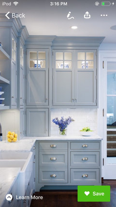
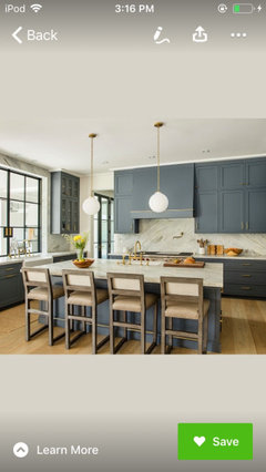
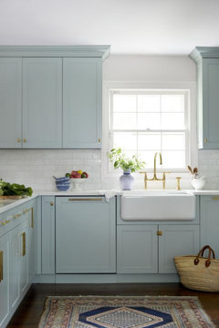
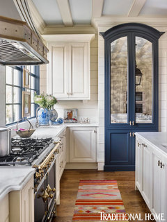
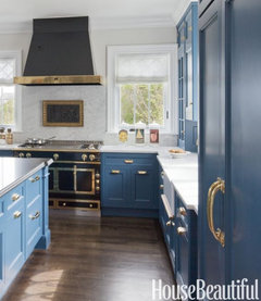
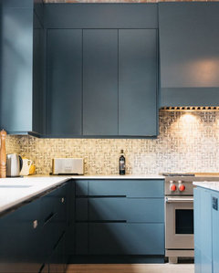
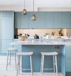
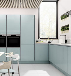
Aqua or blue kitchen
5 years ago

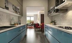
Nobilia touch 337

Blue (rendered at a local kitchen designer).
Featured Answer
Sort by:Oldest
Comments (12)
 5 years ago
- 5 years ago
Related Professionals
Cumberland Interior Designers & Decorators · Lima Interior Designers & Decorators · Sarnia Interior Designers & Decorators · Paducah Kitchen & Bathroom Designers · Tuscaloosa Kitchen & Bathroom Designers · Elizabethtown Kitchen & Bathroom Designers · New London Kitchen & Bathroom Designers · Tyler Design-Build Firms · Bridgeport Design-Build Firms · Dubuque General Contractors · Bakersfield Flooring Contractors · Tulsa Kitchen & Bathroom Designers · Greenville Custom Countertops · Burlington Custom Countertops · Sheridan Custom Countertops 5 years ago
 5 years agolast modified: 5 years ago
 5 years ago
- 5 years ago
- 5 years ago
- 5 years ago
 5 years ago
- 5 years ago
Related Stories
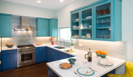
KITCHEN MAKEOVERSBlue and Aqua Cabinets Make a Splash in a Colorful Kitchen
A hidden step stool, a pullout pantry and double lazy Susans contribute to a highly functional space
Full Story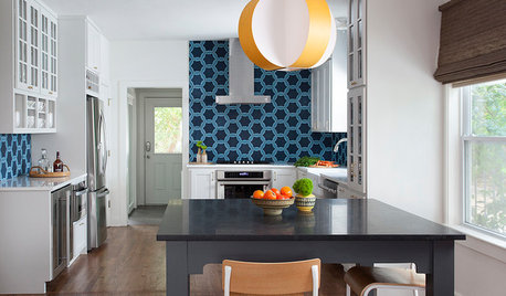
KITCHEN BACKSPLASHESThis Kitchen’s Geometric Blue Tile Steals the Show
An Asian-inspired island, newly stained floors and white cabinets complete the look
Full Story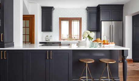
KITCHEN DESIGNKitchen of the Week: Wood, White and Blue in an 1890s Kitchen
A designer preserves 19th-century architectural details while updating the room’s style and adding modern comforts
Full Story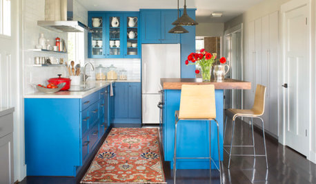
COLORFUL KITCHENSKitchen of the Week: High-Altitude Kitchen Bursting With Blue
A modest-size space gets a cheerful and smart update that improves flow and adds storage space
Full Story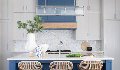
COLOR10 Ways to Add Blue to a Kitchen — and 10 Blues Worth Considering
Here are kitchen features to think about painting blue and beautiful blue paints for creating a stylish space
Full Story
PRODUCT PICKSGuest Picks: Whip Up Kitchen Cheer With Aqua and Red
Cool blue and hot red accessories are foolproof ingredients of a jaunty kitchen with a hint of vintage
Full Story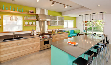
KITCHEN DESIGNKitchen of the Week: Aqua Knockout in Austin
Torn-down walls created more space, while vivid blue and green colors and clever storage gave a one-two punch to a kitchen remodel in Texas
Full Story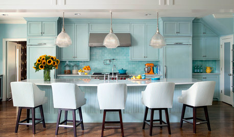
COLOR14 Ways to Bring Blue-Green Into Your Kitchen
Get ideas for infusing your kitchen with a refreshing shade of teal, aqua or turquoise
Full Story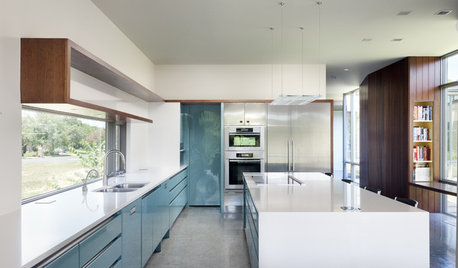
KITCHEN DESIGN2012 Color Trends: Blues for the Kitchen and Bath
Watery hues, indigo and denim tones relax, refine and rejuvenate your space
Full Story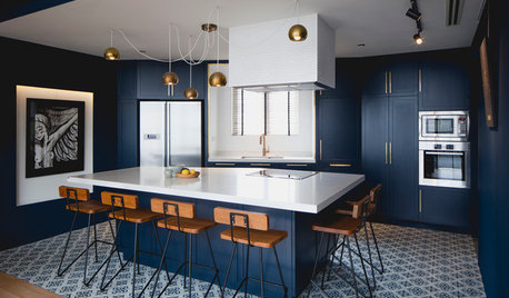
COLOR7 Sophisticated Blues for Your Kitchen Cabinets
Complement a white or neutral room with cabinetry in deep navy, blue mist, cobalt, teal, turquoise and more
Full Story
clt3