Software
Houzz Logo Print
mtnrdredux_gw

Primary Bedroom refresh question(s)

4 years ago
last modified: 4 years ago

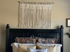
I am moving stuff around and re-styling our MBR. I have a question in re artwork over the headboard. I have a framed print I'd like to use but it's quite large. The scale and placement is pretty close to what you see here:


Does this scale of the over the bed artwork look right to you? Or is it too big? I googled it and they say between 60-80% the width of the headboard, I think my print is 68% of the headboard width. If I use the hanger that is there, there is ~ no space between, like the pic below


Comments (50)

  • 4 years ago

    I think too big, but it’s really just personal preference, and in the context of the room. With your high ceilings, it might work better.

    I have this size over our queen guest bed, low ceiling. Darn pic came out crooked, sorry:


  • 4 years ago

    I like it! Its interesting and unique!

  • 4 years ago
    last modified: 4 years ago

    oh sorry, i was unclear -- it's not that item, I am just showing the size and placement

  • 4 years ago
    last modified: 4 years ago

    I think it will feel too cluttered without the breathing room. It also tends to lower the ceiling. I prefer it empty.

  • 4 years ago

    The ceiling is 11ft, lowering the ceiling is probably a good thing. I agree about breathing room

  • 4 years ago
    last modified: 4 years ago

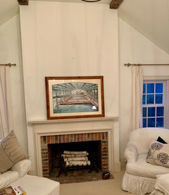
    I want to use this framed print I already have (humor me, i don't want to buy art and I am trying to bring blue into the room).

    Would you put it over the fpl or over the bed? I have other things to put over the fpl and headboard --- neither has to go empty.


  • 4 years ago

    I really do like either spot, both can take that size just fine.

    mtnrdredux_gw thanked Jilly
  • 4 years ago

    I like it best over the bed... with the wood frame it kind of mirrors the brick frame of the firebox, so brings that element to the bed side of the room. Over the fireplace, I think the frame is too similar to the brick and something else would be more interesting there.

    mtnrdredux_gw thanked Olychick
  • 4 years ago

    The original picture is too large, but your print isn't. Although do leave some space between it and the headboard (which turned out great!). Color and size wise it looks good over either, but it may be more suited to over the fireplace.

    mtnrdredux_gw thanked Tina Marie
  • 4 years ago

    It was meant for the bed with the tones in it and will work well with the wall.

    mtnrdredux_gw thanked Yayagal
  • 4 years ago

    I prefer it over the FP.

    mtnrdredux_gw thanked 3katz4me
  • 4 years ago

    Bed hands down! I would find something taller for over the fireplace.


    Your new headboard looks great!

    mtnrdredux_gw thanked amykath
  • 4 years ago

    I’m leaning towards over the fireplace. But can we see your other options before deciding?

    mtnrdredux_gw thanked Kitch4me
  • 4 years ago

    I prefer it over the fireplace too. If you want a painting above the bed, I’d try an unframed oil. It just seems like there are too many angles going on with the framing and lights competing with each other. Your bed came out really nice. What color did you use?

    mtnrdredux_gw thanked chickadee2_gw
  • 4 years ago

    Earthquake country resident here, but I’d still put it over the fireplace.

    mtnrdredux_gw thanked 1929Spanish-GW
  • 4 years ago

    Another vote for the fireplace. Is the print of the Sutro Baths?

    mtnrdredux_gw thanked Bookwoman
  • 4 years ago

    Both can take the size but I think I like it over the FP and would pick something lighter looking for over the bed because of the lamps. If it is mostly for staging, I am not sure it is that crucial. Lots of houses here and I mean Lots, end up with the Hepburn Holly Golightly print on canvas in staged rooms somewhere. At least it's not that. :)

    mtnrdredux_gw thanked palimpsest
  • 4 years ago

    @Bookwoman Bay Arean here, I also flashed on Sutro Baths.

    mtnrdredux_gw thanked Bunny
  • mtnrdredux_gw thanked Bookwoman
  • 4 years ago

    My mom and her friends went there when they were kids.

    mtnrdredux_gw thanked Bunny
  • 4 years ago

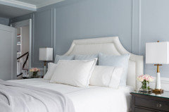
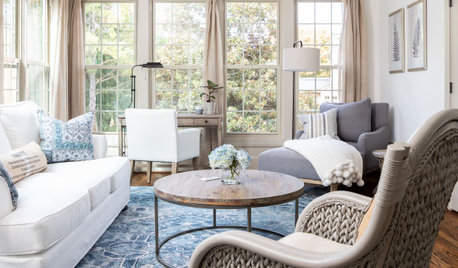
    I prefer the picture over the fireplace, and in true project creep, I'd love to see the frame painted in one of the lightest tones of the bricks. I still don't think you need anything over the bed, but one thought is to add moulding "panels" (if there is any other moulding in the room) like this:


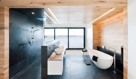
    Or, you could do something like this, but not sure how you feel about botanicals: (and they used two too many, imo.)


    mtnrdredux_gw thanked jojoco
  • 4 years ago
    last modified: 4 years ago

    Bookwoman and Bunny, (that sounds like a TV show)

    Years back, I was looking for artwork for our indoor pool,and came across the (yes very valuable) original poster of Sutro baths. The conditions in the pool are are too harsh for such a thing, but I had to at least have a copy, which I framed and is currently in the hallway from our MBR to the pool. I noticed the size when i walked by today and thought it could be put to better use.

    I had a print of the Odalisque over my bed, but for staging I think it is a bad choice and TBH I am tired of the colors in it. I also moved the serpent mirror that was over the fpl; it is really too small and I found a great new place for it in my LR!

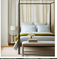
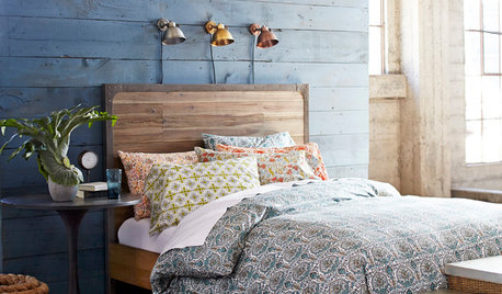
    I have decided to change out the bedding and throws and throw pillows.I have a place to reuse them. I want to use soft blue, with hints of green. I found an "inspiration bed" on the Serena and Lily site (see below). I liked the colors, the simplicity, and the fact that is had a cream background (not true white) which fits my room. My nightstands will provide some dark contrast. I actually have a plain, light blue duvet cover in Maine and I also have a fern green mohair throw, somewhere. I need to see if the colors are right. I am dying to buy anemones now, LOL

    Kitch, I will

    Pal, I have to shop my house and Maine for something lighter, I will see.

    Chickadee - Rustoleum chalk paint, I think they call it Chiffon Cream. I bought Linen White my mistake, that is pure white not the LW we all know and love by BenMoore.

    For color scheme only:


    I plan to keep the bed as close to what you see above as possible... nothing more.

    Then, for the two white duck armchairs that flank the fpl, a light blue throw on one, and two pillows from Maine. These are the outdoor pillows I just got this year; I have seven of them so could easily spare 2 for here, one lumbar and one square. They will be the only pattern in the room. If they are too loud when I place them, I will look for something else.


  • 4 years ago

    I vote for the print over the fp. Frankly, with the interesting lamps and the high headboard, I don't think the bed needs anything. For staging, you want to keep it simple.

    mtnrdredux_gw thanked Annie Deighnaugh
  • 4 years ago
    last modified: 4 years ago

    Jojo, I love the fact that the two rooms you showed use the colors I am thinking of!

    The molding is pretty, but the ceiling has beams so it may be too delicate.

    Love botanicals hung that way, but I am shopping my own stuff. Trying not to buy anything new since I have learned that often, things that work in one place are compromises in the next house, IYKWIM.

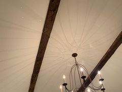
    The ceiling:


    Here is a little vignette I just did and I love it. This marble top nightstand was my parents'. It's on DH's side and I can only imagine what he'd say to a plant. But for staging, I just love it.


    Inspired by s&l


  • 4 years ago

    In re painting the frame; it's birds eye maple and I like it as much as the print!


    pa

  • 4 years ago

    Think the frame of the picture and the brick of your fireplace were meant for each other. Your room is absolutely lovely.

    mtnrdredux_gw thanked nekotish
  • 4 years ago

    Definitely like it better over the fireplace! Love the blue/green color scheme…restful yet fresh.

    mtnrdredux_gw thanked nini804
  • 4 years ago

    Oh wow, that frame is beyond gorgeous!!!

    mtnrdredux_gw thanked jojoco
  • 4 years ago

    Love the frame, and think it would work above the bed if hung slightly higher. Definitely works nicely above the fireplace.

    mtnrdredux_gw thanked OutsidePlaying
  • 4 years ago

    Kitch, thinking of this over the bed; size works, we own it already, it has green and blue in it, and it is not too dissimilar in mood from the larger one (which consensus says goes over the fpl).


  • 4 years ago
    last modified: 4 years ago

    I love that print of the Sutro baths and had it in storage until I gave it to our eldest son for his Florda condo. Mine was not an original poster but a print cut following the arch at the top and mounted on a heavy arch topped wooden back. I bought it in NYC at a small shop on Lexington Ave on the UES where we lived in the 80’s and early 90’s. The colors of that work are mesmerizing. I would put it over the fireplace and find something else for over the bed, maybe a big flat antique basket or a group of three plates? Something you would not normally put over your bed but has the right colors or shape, just for staging.

  • 4 years ago
    last modified: 4 years ago

    hmm, i love plates... going to start foraging now LOL


    Are you thinking like a big rectangular tobacco basket? It's kind of hackneyed but looks nice, easy to hang, goes with the cottagey vibe.


    PS Too funny you had the same print! Mine also follows the arch.

  • 4 years ago
    last modified: 4 years ago

    Yes a tobacco basket was what I was thinking, still trendy right now so probably a good choice for staging.

    If you had a collection of different plates in pinks and greens or blues and whites you could do a free form grouping over the bed, which would be lovely. I’m in the plates-as-decor-are-suitable-for-every-room camp 🙂 DH never did understand them in a bathroom (where they were perfect) or on the walls of our bedroom—or hallway or wine cellar, for that matter. In our old house they were in almost every room (momentary nostalgia).


    Yes that Sutro bath print is beautiful and one of my favorites. It moved from NYC and settled happily in our bungalow style 1928house in Ladue outside of St. Louis, then was perfect in our more contemporary Florida home. The look did not survive our move to Georgia and classic Colonial architecture, but DS1 was very happy to get it.

    mtnrdredux_gw thanked Kswl
  • 4 years ago

    I love plates on wall, but have only done it in my Maine kitchen.


    I actually found the email from the dealer from 10yrs ago. At 76"x80" the original would have been perfect for our pool area.

  • 4 years ago

    You know, you probably could have had that image custom printed on a rigid plastic sheet that was safe from humidity, but it would have cost a fortune, literally, and is the kind of thing one would do in what I used to call a “forever“ house. I keep meaning to come up with a new name for those 🤔

  • 4 years ago

    OMG, KSWL, I was thinking that exact thing last night. Honestly it would be sooo perfect because most of the building that houses the pool is lined with french doors, but I have a big square wall area just at one end, with a round window above. As it is I have an outdoor poster there (essentially an outdoor museum banner, another great idea of yours).

  • 4 years ago

    Can I interrupt to say I want to see the whole bed in the room! You tease!

    And oh how I love and covet that nightstand.

  • 4 years ago

    Nope, Jinx, too early, it just has all white bedding on it, blah blah. : )

  • 4 years ago

    Ok, ok. *kicks toe in dirt*

    mtnrdredux_gw thanked Jilly
  • 4 years ago

    You're so darn cute Jinx

  • 4 years ago
    last modified: 4 years ago

    Lol re:plates on walls….when we were first married we didn’t have much art but I had a bunch of blue/white willow ware plates my great auntie gave me. I put them in a pleasing (to me at least) design over our fireplace.

    My mom had gifted me with an interior designer to help me with some curtains and things…anyway, she was very chic and quite intimidating to 25 year old me. She looked at my plates and said, ”I’ve always found plates on walls in rooms where you don’t eat odd.” 😳 I literally never got thar snotty comment out of my head, 25 years later. 😩😂 Of course plates are fine as decor!!

  • 4 years ago

    Nini, I think many decorators believe things that aren’t their taste to be odd, unacceptable, tacky, etc., while while some designers can sublimate their own taste when necessary, to a point. l’ll wager your plates were lovely over the fireplace 🙂

  • 4 years ago

    I love your intended color scheme-- and not only because it is pretty much the one i have! I think it is calming and fresh and clean. The print is divine! Love the colors, mood and subject!

    mtnrdredux_gw thanked Funkyart
  • 4 years ago

    Who said people don't eat in their living rooms?

  • 4 years ago

    Exactly, Pal!!!! 😂

  • 4 years ago

    You know I’ve never been one to leave a wall nekkid, but I don’t think you need anything over the bed. Let the cool light fixtures be the art.

    mtnrdredux_gw thanked Sueb20
  • 4 years ago

    Chick, fans may be too fussy for what was a small barn, after all. Rough hewn ceiling beams and clay walls.


    Sue. you may be right. right now the bedding is all white and cream so it looks very blah, leading me to think it needs something. Plus, I have a hook there LOL.


    Thx, Kitch. Believe it or not, my snake mirror was an attempt to add verticality! didn't work. I am terrible at picking art.

  • 4 years ago

    Maybe something round and wreath-y?