Software
Houzz Logo Print
webuser_4358416994

Trying to decide on a backsplash

4 years ago
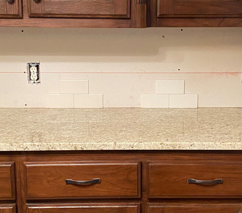


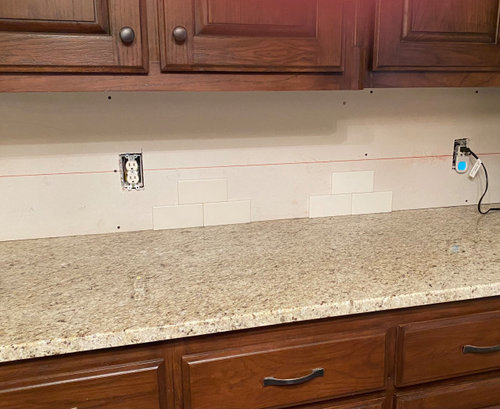
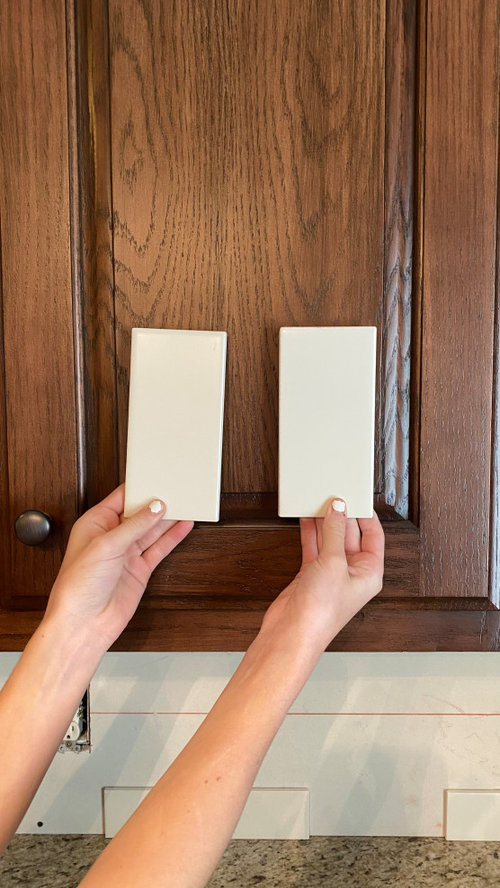
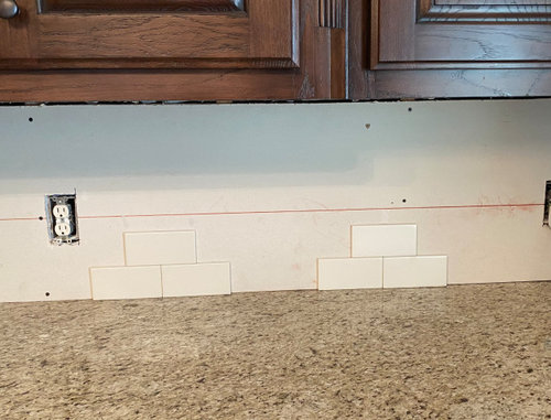
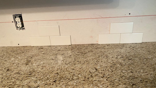
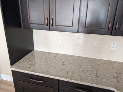
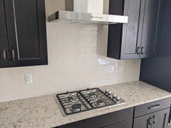
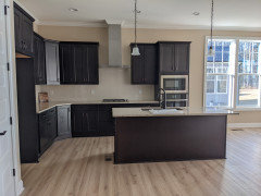
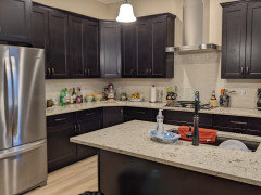
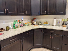
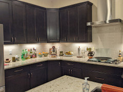
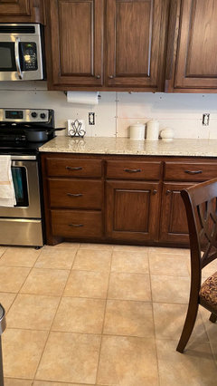
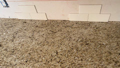
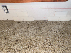
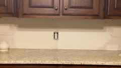
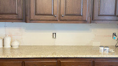
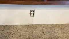
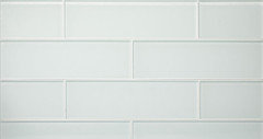
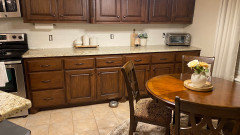
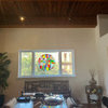
Can’t decide on which tile for our backsplash. The one on the left is almond and the one on the right is biscuit, both by Daltile. We are going with 3x6 in matte. My cabinet color looks red in the first two photos, but the next two photos are more of a true color to what they really look like. Countertops are Giallo Ornamental. I’m worried that the one on the left will be too beige and the one on the right might be too white. We have brought a ton of tiles home and these two have been the ones that we liked the most. Which one looks better or do either of them really work with what we’ve got?

Comments (47)

  • 4 years ago

    Hard to tell true coloron monitors but I like the left

    A thanked jck910
  • 4 years ago

    Another vote for the left. I think the right is too stark white.

    A thanked Connie Stackhouse
  • 4 years ago

    From where I see, I like the left.

    A thanked everdebz
  • 4 years ago

    Almond.

    A thanked Stacey
  • PRO
    4 years ago

    Definitely the one on the left.

    A thanked Diana Bier Interiors, LLC
  • 4 years ago

    I vote left, too.

    A thanked chinacatpeekin
  • 4 years ago

    I would go with the one on the left.

    A thanked kj s
  • 4 years ago

    Before reading it looked to me to be almond vs white and I would go almond almost every time. How does that biscuit not have a hint of brown? More and more I notice how STARK and cold these whites are that are being used in kitchens. Left all the way.

    A thanked arcy_gw
  • 4 years ago

    Well, gotta say, no way would I go with the almond but I am the lone voice on this one. Of these two choices, I would go with white. I would probably go with a very white white. Agree with arcy there are a lot of stark white kitchens, but yours is not one of them. I don't like stark white kitchens, but you already have dark counters and dark cabinets. I might go with a different color than white, but I definitely would not go with almond.

    A thanked User
  • 4 years ago

    If you looking for monochromatic, the left. If you want to introduce a little bit more brightness, the right. They are pretty close in color and either one should be fine. Also include your paint colors and the flooring to make sure the entire effect is what you want.


    When you're looking at the tile, turn on all the "real" lighting, including any undercabinet lights. Sometimes the color of the light bulbs or glass shades alter colors in a way you may not have anticipated.

    A thanked bmorepanic
  • 4 years ago
    last modified: 4 years ago

    We just built a new home and Daltile Colorwheel 3x6 glossy or matte in white or almond were standard, the biscuit was an upgrade. I chose almond in glossy because I need a little bit more oomph for this kitchen. In reality, I didn't have the interest to spend time trying to find a better backsplash which I'm sure is out there. For me, the backsplash is the background for my pottery. The countertops are Cambria Windermere.


    This is daytime only natural light from north and west-facing windows (before we moved in)


    This morning with canned, pendant, or under-counter lights on.


    A thanked Jen K (7b, 8a)
  • 4 years ago

    My preference would be to find the lightest color in the granite and match the tile to that color.

    A thanked Susan Davis
  • 4 years ago

    The left, Almond. The other one is too bright and white against the cabs and countertop; it's not horrible by any means, but the Almond is by far the better choice of the two.

    A thanked porkchop_z5b_MI
  • 4 years ago

    Left looks GREAT! A stark white would clash with the counters and make them look more gold

    A thanked User
  • 4 years ago

    choose biscuit. prefer crisper whites w somewhat richly stained darkish cabinets. almond and that kind of antique white and so on goes very dull w these elements . You are trying to invigorate older darker oak cabs. go crisp beautiful light. the light/dark play will be beautiful.

    A thanked herbflavor
  • 4 years ago

    What colors do you love? Your backsplash has to work with your counters and cabinets, but they are a vertical surface that serves as a background for the things you will have on your counter and will need to work with the wall color and trim in your home.


    I think both backsplashes work with your counter top and if I were selecting one over the other for my sister I would choose the almond. Susie loves moss greens and deep orange reds - fall colors. She also looks great in those muddy neutrals that make me look like a walking corpse.


    I would choose the biscuit color for my sister in law who has blond hair and blue eyes and loves cornflower blues and lighter yellow on peach tones and for me - a winter, deep purples and wine reds. Neither are perfect for my sister in law or me, but it would be easier to transition from the biscuit to colors that work well with our favorite colors than it would be to transition from an almond color to something that works well with our favorite colors.

    A thanked Jennifer Hogan
  • PRO
    4 years ago

    Sorry but I don't see how someone's hair and eye color would drive the color of a backsplash tile. It should coordinate with what's in the room--the cabinets and counter top being the most important. In this case, the warmer white on the left works better with brown cabinets and the beige counter top.

  • 4 years ago

    I think it was something of a metaphor... :) . I agree that the biscuit is far more versatile. Look at how many people bought the almond appliances/toilet/sink/shower... and those who bought the white. White is always in style. Almond is not. Just my opinion, YMMV. Good luck and enjoy your kitchen whatever you choose!

  • 4 years ago

    As humans we associate colors with happy memories and when we see certain colors that we associate with happy memories our bodies increases dopamine production, making us feel happy. Viewing colors can also colors can also change our heart rate, blood pressure and respiration.


    While helping people pick colors for their homes I have found a strong correlation between hair, eye and skin color and the colors they love. Most of us think back to that day when we were dressed in something that made us look like a 10 and the man of our dreams picked us out of the crowd. DING DING DING - that color that made you feel like a 10 is now a color that brings you joy. When we see that color in art or linens or décor items we tend to be drawn to it.


    I just had a conversation with my brother in law who was talking about his travels and how when he visited Japan that everything is decorated in primary colors. Hmmmm, do Japanese women look good in bright, primary colors? Tuscan colors and olive toned skin? The dusty pastels that grace so many Scandinavian homes and the light coloring found among most Scandinavian people.


    We are a melting pot, many cultures, many colorings. Some will look good on you, some won't. Some will bring you joy, some won't. Why wouldn't you consider someone's skin tone, hair color and eye color to help drive the color decisions for their home?


    Don't you want them to feel joy as they walk from room to room and look at their belongings. Don't you want them to feel like a 10 when they curl up under their comforter?


    You always have to start with the colors that must stay (can't afford to change or don't want to change). You may not love the cabinet color or the countertops, but if it can't be replaced you can't ignore it. Next I move to the colors the home owner loves. Then I figure out how to bring the colors together so that the colors flow from one room to the next and every room includes colors that bring the owner joy.


    A thanked Jennifer Hogan
  • 4 years ago

    Thank you all for your input! I’m still hesitant on what to choose. I love beige, but I don’t want it to look dingy. I like bright too. When we bought this house, it had pickled oak cabinets with a hunter green granite. Since they were pickled, they wouldn’t take stain so we finally found a guy who said he could get them dark by glazing them. I liked dark cabinets much better then. Part of me wishes I had painted them white, but I would’t like my floor with white and we don’t want to do all of that. Jen, the almond looks great in your kitchen! I am kind of wishing I had went with a lighter granite. I read on here the other day about how much light bulbs can change things so I am going to try some brighter white bulbs because I don’t want too much gold/yellow tints. We don’t have under cabinet lighting, I will look into that. I will take pictures of the whole kitchen and floor and post soon! Thank you all!

  • 4 years ago


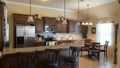
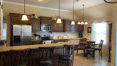
    Here are some more photos of my kitchen with the floor, walls and more of the cabinets visible.

  • 4 years ago

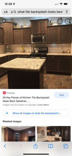
    Also, here is a photo of a similar kitchen that I found, and there is something about it that I just don’t like. If I chose almond, would it somewhat look like this kitchen? I don’t know the colors of this kitchen

  • 4 years ago

    A, the one you don't like - seems the floor has much brown in it, maybe that's partly why?

    yours is a beautiful kitchen.

    A thanked everdebz
  • 4 years ago

    notable was the bright beautiful light from the window. its the main thing that stands out. a lighter tile with smooth gloss finish will not disappoint you. in time you can lighten the wall color..change the pendants [frosted white shade] /add polished nickel hardware/ add a rug under table w some white in a pattern. I would pick as white and simple and glossy of a tile as I care to select.

    A thanked herbflavor
  • 4 years ago

    I am glad you didn't paint the cabinets. They really look good. You really have a lovely kitchen. Why not wait on this decision? You seem very undecided. And why not give yourself some more options? There are a ton of backsplash materials. For now, you could just paint it and live with it. Paint it the color of the almond tile. If after a month or two you think "wow I love that" good enough. I have been a fan of the warm whites *forever* and never embraced the grey trend. I liked beige when it wasn't cool. Will the almond blend? Probably, and that is fine if that is what you want. For me, there is too much blending going on. I feel some color or something brighte will help. I would leave it, were it me, and focus on something else. Hang out at a Habitat for Humanity, find yourself some nice glass shades for the lights, or a new used light, or do nothing. But let it simmer and the answer will come to you....

    A thanked User
  • 4 years ago

    Maybe get a couple more tiles to make final decision.

    A thanked Stacey
  • 4 years ago

    I’m a beige person also. Never have been a fan of grey. I had a jute rug under that table, but our cat ruined it, and I’ve just never bought another rug. I think we might actually just get some paint to color match and see what it looks like or possibly order some more tiles to see more together. I’ve ordered some bulbs off Amazon also to get less yellow lighting. No local stores had any without going completely daylight and I don’t like those. Thanks for all of the advice!

  • 4 years ago

    i vote the one on the left. It feels warmer. Check out the Santorini Polished Marble tile at Floor and Decor. It’s beautiful and might be a blend that will work nicely in your space.

  • 4 years ago

    "I’m a beige person also." Welcome. We're starting a group, "Beige IS a great color!" For too long the likes of HGTV and flippers have told us that beige is no good. We say no more! You'll find something (I support almond!)

  • 4 years ago

    On the kitchen pic that you just ”didn’t like” with similar colors, someone said it might be the more brownish floor. i think it night be the darker grout on the backsplash. With your granite I would go with the almond, but with a matching grout. Is there any way you could photo shop matching grout on that pic and see if it changed your opinion?

  • 4 years ago

    Looks like your cabinets came out beautifully! Either tile will look good, but I’m leaning on the left too, to blend in with your floor. New lights would be nice.

    A thanked Kate
  • 4 years ago

    I also took a biscuit tile to Sherwin Williams and had them color match a quart of paint. I painted the backsplash wall and lived with that a couple weeks before I made my final decision.

  • 4 years ago
    last modified: 4 years ago

    @HU-428454211 - the difference between almond and biscuit appears indiscernible on screens and even looking back at the sample deck, it's challenging to see it, too. Almond is a shade darker than Biscuit, according to Daltile but hard to determine. I would look at yours and think it was Almond. We have similar countertops so I can see how Biscuit or Almond would match.


    Previous poster opinions, (not attributed to you) "White is always in style. Almond is not." Makes people afraid to choose it as if it were tarnished by the 80's. I think Biscuit or Almond are possibilities. For me, I though Biscuit would be too light with Cambria Windermere, but Urban Putty (a shade darker than Almond) was too dark. Also, saved a bit of money going with standard tile vs. upgrading.

  • 4 years ago

    I went through a lot of sample tiles until I finally chose the biscuit. It seems simple enough until you actually start bringing them home. I had a hard time finding one that wasn’t too white , yellowish, or had a grey undertone.

  • 4 years ago

    Jen K, I made the comment about white always being in style. If you note, I also said I was beige when beige wasn't in. There is a lot of beige in my house. So I am not casting aspersions on almond as if it is contaminated by the 80's. I just don't happen to think the almond looks great with OPs cabinets, floors, decor-- it all just blends and some brightening/color is needed, in my opinion. Liking beige doesn't mean everything in a house need be beige. It is relieved (much like the grey trend) by some dollops of color or white. And if you look at history, which almost inevitably repeats itself, historically white is always in style, and almond is not. Therefore, if one is uncertain, one might take the classic and timeless path. Some people like to remodel their kitchens repeatedly. I am not one of those people. I like to go with timeless looks. But it's the OPs kitchen, so I encourage her to do what works for her.

  • 4 years ago

    It took me awhile, but I finally got some color match samples of the tiles to get an idea of what it would look like. Almond is still on the left and biscuit on the right. The first photo is at night and the second two pics are during daytime. We also changed the lightbulbs to a brighter white. It doesn’t show much different in photos, but it took out some of the yellowish tones in the counters and the floors don’t look as beige/peachy with them which I’m liking better. I originally was leaning on the almond a little more, but now I’m thinking the biscuit looks good too. I especially like how with the biscuit it reflects on the granite and makes it appear lighter. Seeing the matching paint on the wall, what do you guys think?


  • 4 years ago

    Definitely, Biscuit.

    A thanked daisychain Zn3b
  • 4 years ago

    I still like the biscuit. Adds a little brightness.

    A thanked Stacey
  • PRO
    4 years ago

    Pure Silk from Island Stone would look awesome


    or TULE


  • 4 years ago

    I like the biscuit in this small photograph, but I am trying to imagine it large scale, and I get brought back to pictures I have seen of Reno’s where the gold granite and wood cabinets were kept, and a white subway tile was the “refresh”, and I never quite like it. It always seems too white large scale. I still vote almond. I think a well coordinated kitchen with “dated” colors looks better than a single on trend color that is out of place. I think too many people turn their noses up at well coordinated, beautiful kitchens from 10-15 years ago simply because EVERYONE has to have white now

    A thanked User
  • 4 years ago
    last modified: 4 years ago

    Still like the biscuit. The reflection on the granite is quite dramatic, and will be even nicer with tile, in my opinion. The biscuit highlights the lighter colors in the granite and brightens the overall look of your kitchen. And interestingly, it makes the browns of the cabinet appear richer. This is just my opinion! I am not a trender, I am a timeless look, and I am not an all white nor an all gray. As stated previously, I was beige when it wasn't cool, but I recognize the value in looking at the whole picture. For me, your kitchen has lots of warm colors, and the biscuit is a nice counterpoint to that. I love your cabinet color and I think your granite countertops looks great with it! Good luck with whatever you decide :) .

    P.S. I really dislike the word "dated"... I do not think any color, in and of itself, is dated, and don't think almond woud be "dated" here. I just don't think it looks as good as the biscuit!!!

    P.P.S. Please post a picture of whatever you choose. I need the rest of the story :)

    A thanked User
  • 4 years ago

    Thank you! I will post a picture once it’s finally done.

  • 4 years ago

    So, 7 months later and most of the backsplash is done. I ended up choosing the lighter tile. I’m glad I did because it is definitely an off white seeing it all together and not stark. We still have caulking and outlet covers to put on. Also bought a more neutral beige fabric to recover the dining

    chairs. I plan on going with a lighter and less peach colored paint but that will be awhile.


  • 3 years ago

    Wow! Looks lovely! Congrats :)

  • last year
    last modified: last year

    Grout color with Daltile Biscuit?

  • PRO
    last year

    Will vote for the tile on the left.

Sponsored
Urban Upkeep LLC
Average rating: 5 out of 5 stars6 Reviews
Columbus High Quality Painting Expert