Software
Houzz Logo Print
webuser_446384553

is my bedding ugly?

4 years ago
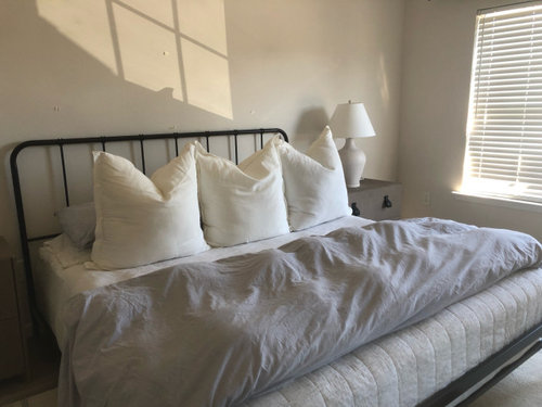
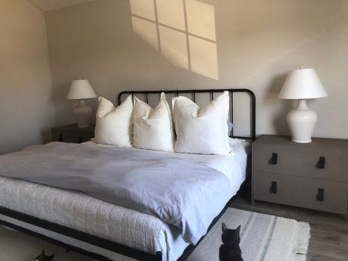
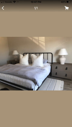
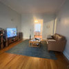
Can anyone tell me what I’m doing wrong? My bed doesn’t look beautiful like in the magazines. Do two pillows look better then 3? I really like the modern-organic scandi modern farmhouse trend going on and I’ve bought all new things. New nightstands. New lamps, new bed frame, new bedding. I’ve ordered a light sea grass/twine pendant light fixture. I also plan on having some neutral abstract art above the bed. Most importantly I just want my bed to look good. What is it missing? I didn’t want to clutter it up. Or do you think it will be ok once all my other items are in?

Comments (44)

  • 4 years ago

    Two pillow arrangement

  • 4 years ago
    last modified: 4 years ago

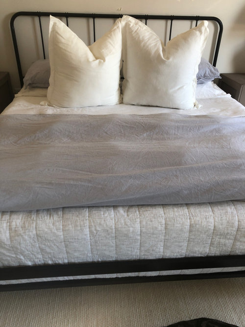
    Needs some color and some natural stained wood. Too much grey. Needs some natural colors. Get matching pillow shams for the duvet cover. Either the accent pillows or the sleeping pillows. Also, it's lumpy. Think sleek and smooth. Can the duvet be stored in a closet or a chest at the foot of the bed?


  • 4 years ago

    3 is better. Have you tried giving everything a steam?

  • 4 years ago

    I also like 3 and adding some color.

  • 4 years ago

    Like three pillows without the middle punch. i do think the artwork and a few accessories will help.

  • 4 years ago
    last modified: 4 years ago

    overall this bed is pretty, I just think it needs slight adjustments. it's weird that the white pillows are standing straight up and are bigger than the grey pillows. lean the white pillows against the headboard and lean the grey pillows against them in front.

    your accent duvet is too lumpy. try to smooth it flat. or consider getting a duvet cover for it that's kind of heavy, to help weigh it down. it doesn't need to have a pattern, look for something that has thick texture to add interest. West Elm has some really nice ones.

    or ditch that duvet and drape an interesting throw blanket over one corner. if it isn't big enough (like if you have a partner that wants to be warmer too), then keep an additional throw in a basket nearby, or folded up neatly under the bed for easy access.

  • 4 years ago

    Three pillows. Change them out to have more texture, and to match the bedspread better. I also suggest a textured duvet that will be smooth on the bottom of the bed and not lumpy. Try laying your grey sleeping pillows upright on the front of the backboard, behind the square pillows . You could also do with a bit of color (maybe soft sagey green??) as an accent and add texture in your

  • 4 years ago

    What really catches my eye is the color mismatch of all the elements. The bedding is a cool blue-toned gray. The nightstands look warmer, and the wall color is a definite warm-toned beige. I don't think art or other accent pieces will solve the fundamental clashing. Furniture is the most expensive element, so find some bedding that coordinates with the nightstands. Once those are in place, evaluate whether you need a new wall color too.

  • 4 years ago

    I think it looks nice! remember that monochomatic spaces on insta and in the magazines have incredible lighting and specific filters to make it look dreamy

  • 4 years ago

    It is absolutely not at all ugly. Not even close to ugly!!


    it is also hard/impossible for me to evaluate it knowing you have more elements coming. As it stands right now, it is a sea of blandness for me. That may not necessarily be a bad thing knowing the direction you want to take the room. However right now it feels like a bowl of oatmeal to me....I agree it needs some tweaking, and also for me it needs some color other than grey and beige. I like your idea of sea glass, and add some fabulous art over the bed - that may tie it all together and turn it from bland to beautiful.


  • 4 years ago

    Just wanted to add I agree with patriceny...not ugly! It only needs some tweaking using some suggestions here.

  • 4 years ago

    I think a warmer wall color would help. Also maybe glass lamps instead of the ones you have now?

  • 4 years ago

    What Seattle said about pillows…I think the pillow arrangement could definitely be tweaked. Having the space behind with the three big pillow sitting up in front doesn’t look very cosy like you could lean back and enjoy it. So I would play around with the pillows. When you get the art in there there might be a bit more color. Do you have any inspiration pictures that kind of show what you’re going for? You could take a look at those and see if you can figure out what’s missing for you.

  • 4 years ago

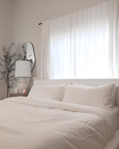
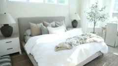
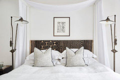
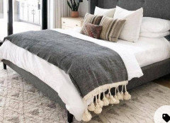
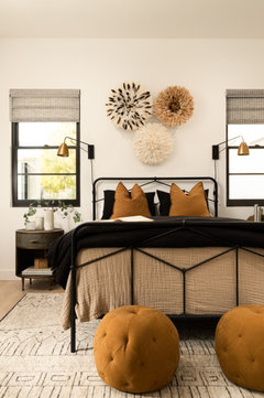
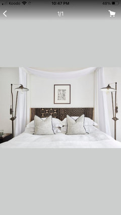
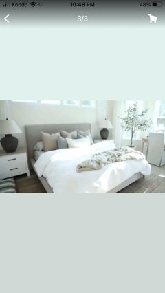
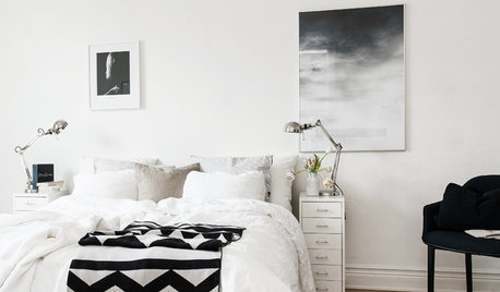
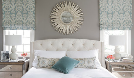
    @liasch so these are my inspiration pictures. I like the dull colors and clean vibe of these pictures. My favorite is the bed that is white with the chunky blackish lamps. I just don’t like how many pillows are there. I really like a “staged” look.

  • 4 years ago

    @SeattleMCM The reason I put the sleeping pillows behind the big square ones was because I saw this picture and really liked the minimalist arrangement. However it doesn’t really seem to be fitting in with my bed sadly. I will be trying other arrangements as you suggested.

  • 4 years ago

    @K R yes!!! I really need to get a steamer.

  • 4 years ago

    as for everyone else, thank you for your encouraging compliments. I guess that’s why there’s the saying “trust the process”. It was funny seeing that the issue is largely in my frumpy duvet. I was hoping it would look cooler like “parachute” bedding or casa luna from target.

  • 4 years ago

    Several pictures that you posted have headboards that carry more weight than yours does. Perhaps try pushing the pillows closer to the head board and see if that helps things. They appear to be closer in most of the pics.

  • 4 years ago
    last modified: 4 years ago

    I’d soften the look by not tucking in cover all around and create a better proportioned, softer pillow combination. Once you add art for added personality, it will be great.


  • 4 years ago

    Here is a sample that I love that has bed very similar to yours. Note the addition of color as someone mentioned. Your bed looks like a queen and this one appears to be full. Therefore, 3 pillows might be needed.


    Bird Lane Project · More Info


  • 4 years ago

    I think you're really close Karebear. Most of your inspo pictures are either more tightly monotonal (which is really hard to do well!), or they use a bit more color and/or texture. You're close, you'll get there.

  • 4 years ago

    I agree with the need to smooth out the duvet. It might also help if you move it further down to drape over the foot of the bed, stopping short of the bedframe.

    Keep playing - you'll get there!

  • 4 years ago

    I think it is really lovely so far…once you get some art on the walls, it will really come together.

  • 4 years ago

    Agree…play with it. Your pillows are much larger in relation to your own style of headboard, which is more delicate. And headboard is not as tall, so pillows stick up a lot. I think two pillows at most for those big ones, and maybe angle the bed pillows up a bit so everything moves back against your headboard more and blends with it better as a unit. Then maybe one smaller pillow in front. Putting photos side by side here for visual. Pillows need to look cozy and inviting even if your look is simple.

  • 4 years ago

    For the rest, it all looks good except the duvet cover. Lamps, rug, etc proportions work. The duvet cover others have suggested solutions so I would consider those ideas.

  • 4 years ago

    I think what everyone is saying is spot on. Maybe a throw with a lot of texture. Can I ask where did you get the nightstands??

  • 4 years ago

    I looked at your saved ideabooks, and saw this bedskirt - does your bed work with one?

    St. Andrews Plan 3 · More Info


  • 4 years ago
    last modified: 4 years ago

    1 accent wall?

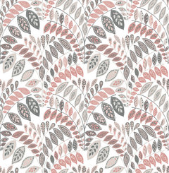
    Fiddlehead Pink Botanical Wallpaper Bolt · More Info


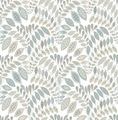
    Fiddlehead Light Grey Botanical Wallpaper Bolt · More Info


    "Japanese Fern in Green" Print, 22"x28" · More Info


    "Dandelion" Fine Art Canvas Print, 36"x24" · More Info


    "Golden Camelia Leaf" Poster Print by Albert Koetsier, 22"x28" · More Info


  • 4 years ago
    last modified: 4 years ago

    Fairly muted --

    "Meadow" Fine Art Canvas Print, 36"x24" · More Info


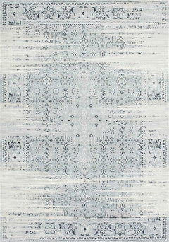
    Southwestern/Lodge Vintage Marceline Area Rug, Rectangle, Blue, 5'3"x7'7" · More Info


  • 4 years ago


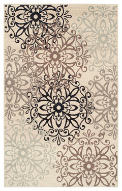
    Leigh Modern Floral Medallion Indoor High Traffic Area Rug - 6' x 9', Beige · More Info


  • 4 years ago

    I think you’re close, I think the pillows in the back are too flat and the pillows in the front too big. Home goods has these insanely thick pillows that you can remove the inside to make it the fullness you want. Maybe try those? The ones in front are gorgeous but just seem too big for the space, if they were a size down I think you’d be spot on. Maybeeee a third lumber in front of them. Great room and progress I love neutral everything lol

  • PRO
    4 years ago

    The reason that the duvet looks "lumpy" is that the insert is too small for the cover, so it's bunching up. In order to get that nice full look you need an insert that is about 6 inches larger than the cover. You have to pay attention to the dimensions and not just assume that a queen insert will properly fill a queen cover, since manufacturers' products vary in dimension. Also, a real goosedown insert will look better than a down-alternative, but it is much more expensive. It may be a good investment though, they last for a really long time.

  • 4 years ago

    You did a great job on nightstands. They look great. Your room already has great bones. I would layer in some
    More texture some art some greenery and call it a day. Best of luck

  • 4 years ago

    @Julie Schmooley yes! I did recently order some bigger pillows for the back. The cases are kinda big on the actual insert. I can’t give up my big pillows ! Those are the magnolia ones from target and they don’t come in a different size. I just can’t get rid of them yet. Don’t have the receipt either lol :/… what I think I’ll do is just use two. I’m not sure if I should still do a lumbar with only two pillows ? I’ll definitely be folding the duvet more so more of the bed shows and steaming it.

  • 4 years ago

    I would remove the duvet and not tuck in the bottom white cover. I would keep it at two pillows but lean the bed pillows up againest the headboard in back of the two large pillows so they don't take up as much space, they'll just be a background. Then again, I like to keep it simple. How about art above the bed in a serene photo of some type that is mainly neutral but with a little soft color.

  • 4 years ago

    @Diana Bier Interiors, LLC … yea I did assume a king would fit a king. I might just sew this duvet cover smaller or get the queen size one and I’ll be sure to use your 6” rule. I don’t remember if mine is a down alternative or real. When I purchased my insert I was unfamiliar with the options. I really hope it’s real since it was $200 from lowes online.

  • 4 years ago

    @oreolucca1 I will show pictures once I’m closer to being done. I think I would like to add an olive tree.

  • 4 years ago

    If the insert is real, you'll need to shake it regularly to distribute the filling so it doesn't bunch up in the separate chambers. I have one like it and it was so high maintenance it was relegated to back up guest bedding and replaced with a "hack" a sales rep gave me at a high end retail store. We don't live in a really cold climate so this worked for us: instead of using an expensive insert they sold with their bedding, she advised me to go to Target and get two alternative down inserts. The additional height filled the duvet cover beautifully and it gets rotated out in the warmer months.

  • PRO
    4 years ago

    $200 for a king duvet is probably not filled with goosedown, unless it's very very flat. Also, a good duvet is constructed with baffle boxes or channels to avoid the fill to bunch up. Your idea to make the cover smaller is a good one, and the least expensive.

  • 4 years ago
    last modified: 4 years ago

    Unless you bought it from a back alley, they can't lie on the label. If the label says 100% down, then it is. But my guess is that for that price, it's probably mixed with other materials. As long as you like it, then don't worry about it! And I agree with Diana to go ahead and tailor the cover.

    However, if you don't like the comforter and wind up replacing it one day, look at Ikea. They have mixed down/feather comforters that are really nice and affordable. I have two and they've held up beautifully for many years. Note that when it comes to cheap down, where that material was sourced is questionable. Cheap can sometimes mean unethically sourced, and let's just say the methods of harvesting it are horrible for the birds involved. Ikea guarantees that their stuff is ethically sourced.

  • 4 years ago

    One additional thought: you probably already know this but if you decide to tailor your current duvet cover and don’t already have ties, sew them on the inside of all four corners and all four midsections. Tying the duvet into the loops on your comforter(s) will keep them from shape shifting.

  • 4 years ago

    @JT7abcz hahahaha. Wow ok. I was squishing the corners of the duvet insert and just tying them with the tied in the cover. I haven’t put loops on the insert yet.

  • 4 years ago

    Not your fault, sometimes the inserts come with loops, sometimes they don’t. Be sure to secure the tie strips well, they’ll get a fair amount of tension as you use the comforter and you don’t want them breaking off. Please post photos when you have your art and other decor up, we’d love to see it.