

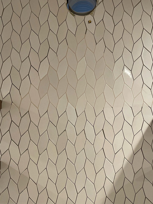
Grout for ridiculously expensive tile
4 years ago
Featured Answer
Sort by:Oldest
Comments (24)
 4 years ago
Related Professionals
Amherstburg Interior Designers & Decorators · Leamington Interior Designers & Decorators · McComb Architects & Building Designers · Fayetteville Architects & Building Designers · New Orleans Kitchen & Bathroom Designers · Spring Kitchen & Bathroom Designers · Richmond Kitchen & Bathroom Designers · Hackettstown Kitchen & Bathroom Designers · Cheyenne Kitchen & Bathroom Designers · Houma Kitchen Remodelers · Kankakee Kitchen Remodelers · Clarksburg Custom Countertops · Manchester Custom Countertops · Pittsburgh Custom Countertops · Calgary Custom Countertops PRO4 years ago
- 4 years ago
 4 years ago
- 4 years ago
- PRO4 years ago
 4 years ago
 4 years ago
- 4 years ago
- 4 years ago
 4 years ago
- 4 years ago
 4 years ago
- PRO4 years ago
- 4 years ago
 4 years ago
 4 years ago
 4 years ago
 4 years agolast modified: 4 years ago
 4 years ago
- 4 years ago
- 4 years ago
 4 years ago
Related Stories
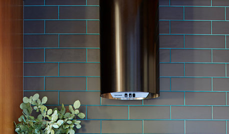
MOST POPULARIs Colorful Grout the Next Big Trend in Tile Design?
See how grout in 7 eye-catching colors is spicing up kitchens and bathrooms abroad
Full Story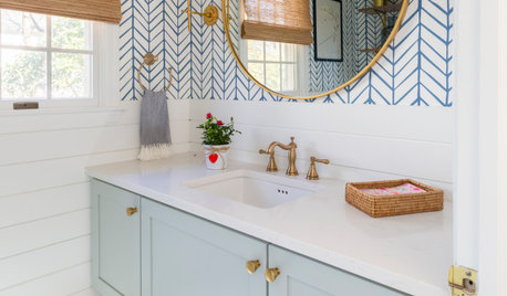
BATHROOM DESIGNWhat Grout Color Should You Choose for Your Tile?
More than an afterthought, the right grout contributes to your tile scheme by creating a cohesive, eye-catching unit
Full Story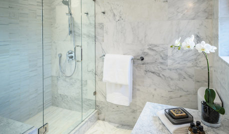
BATHROOM DESIGNConvert Your Tub Space Into a Shower — the Tiling and Grouting Phase
Step 3 in swapping your tub for a sleek new shower: Pick the right tile and test it out, then choose your grout color and type
Full Story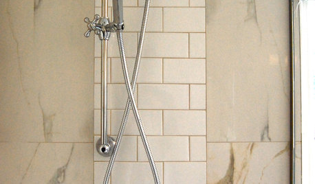
REMODELING GUIDES9 Ways Grout–Yes, Grout–Can Add to Your Design
Choose From a Palette of Grout Colors for a Warm, Unified Look
Full Story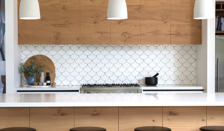
TILELet’s Talk Tile: An Alphabetical Guide to Tile Terminology
Get set for a tile project with this handy glossary of shapes, materials, finishes and more
Full Story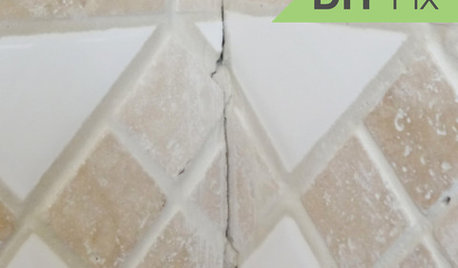
BATHROOM TILEQuick Fix: Repair Cracked Bathroom Grout
Banish an eyesore and safeguard your bathroom from water damage in 30 minutes or less with this DIY repair
Full Story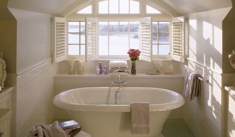
TILEBathroom Floor Tile: Glass Mosaic for a Luxurious Look
It's gorgeous. It's expensive. It's slippery when wet. Learn the pros, cons and costs of glass mosaic tile here
Full Story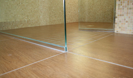
TILEEpoxy vs. Cement Grout — What's the Difference?
Grout is grout, right? Nope. Cement and epoxy versions have different appearances, durability and rules of installation
Full Story
TILE3 Key Steps for Grouting That Looks Its Best
Get your grout right to keep your tile beautiful and for an installation that will last
Full Story
KITCHEN BACKSPLASHES6 Ways to Add Style to a Basic Tile Backsplash
Bold grout lines, bright colors and unusual layouts can turn rectanglular tiles into an eye-catching focal point
Full Story




rebunky