Software
Houzz Logo Print
merris_delane

Which Paint Color?

4 years ago
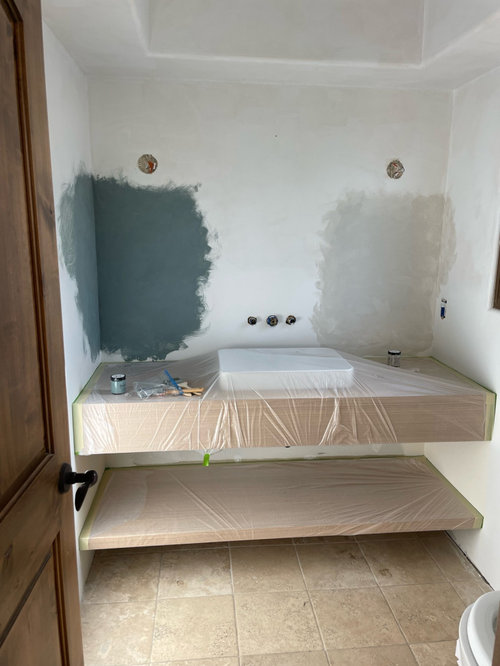
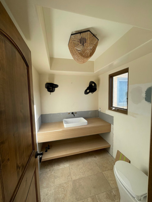
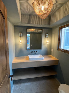
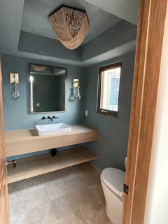
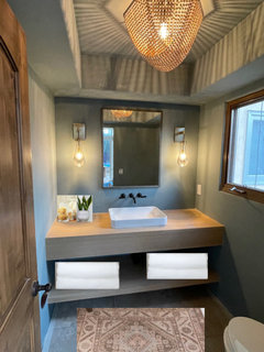
Please put me out of my misery by giving me your vote!! Both are limewash paint for our powder room. I’ve included a photo of the chandelier that will go in the ceiling tray.

Comments (118)

  • PRO
    4 years ago

    My preference would be for a more neutral rug to keep a more modern style going and a neutral pattern too. Tone on tone would be nice. Let the vanity and wall color and chandelier be the stars. 🤩

  • 4 years ago

    There was a neutral tone on tone one that Beth H had shown a while back. Maybe I’ll try both and see which one looks best?

  • 4 years ago

    We are redoing our bath and also have a wood vanity. We're using a blue very similar to what you have here and we love it. So dramatic!

  • 4 years ago

    No. 1 (herringbone ceilinig) - and don't overdo it with tile. It's looking perfect. Nice gold/champagne lever handle faucets - perfect!


  • 4 years ago

    Definitely would leave the ceiling alone, and from a practicality standpoint since you are using a wallmounted faucet I personally would tile the wall behind the vanity to protect the wall from splashes (but since a powder room doesn't get as much use as a main bathroom maybe its a minor problem.)

  • 4 years ago

    The lighter color has too much pink in it, so that it clashes with the wood. I vote for the blue by default.

  • 4 years ago

    That’s so exciting, Patti! I really like our blue. Which paint and paint color is yours? What rug and accessories did you use to accent it?

  • 4 years ago

    Thanks so much, Patty!

  • 4 years ago

    Yes, I’m going to try forgoing the tile on the backsplash for now, Archinut. I will definitely do it as a backup if it gets too splashed. I had our contractor install the waterproof material that they put behind shower tile as an extra measure from mold/moisture in the backsplash area too. But yes, definitely a little tile in a similar color back there if I need it. Time will tell. 😬

  • 4 years ago
    last modified: 4 years ago

    I didn't look at all the comments, so this may be a repeat. But I would use both colors, the gray as the main color and the green on one wall above the sinks/backsplash. I like the neutrals you have chosen, just needs the one soft punch of color. You could repeat the green in just the ceiling of the ceiling tray if you think it needs it for balance. Look forward to seeing your finished room.

  • 4 years ago

    Thanks so much, thiskidd!

  • 4 years ago

    Love the green and the new light, but personally I wouldn't paint the ceiling. I'd have the ceiling white.

  • 4 years ago

    Thanks for your perspective, nina47! Would you paint the soffit and the tray? Im a bit hesitant only because it may look a little more transitional that the limewash, earthy look im going for. I will definitely consider it in case I change my mind though!

  • 4 years ago

    Always choose drama in a powder room! The color is beautiful.

  • 4 years ago

    I would leave the ceiling white too. What you have now looks great.

  • 4 years ago

    Thanks, Ladies!

  • PRO
    4 years ago

    All tray in your wall color. It’s the total feeling. The vanity is modern, crisp and clean lines. So keep that feeling going. The lime wash is more of a farmhouse look. Doesn’t work well in the sophisticated look you have going.

  • 4 years ago

    I’m in total agreement with you re: the color and paint for all walls and ceiling, Flo Managan! The ONLY thing I’m a little surprised by is how many fabulous Houzzers suggested switching lime wash to paint. I feel like lime wash is super organic, textured, earthy to go with the old world travertine, is becoming really en trend and gives the paint a little somethin’ somethin’. I just worry paint will be less unique and look flat. 🤔🤷‍♀️. That said so so many of you incredible experts have said to switch so you all must be on to something.

  • 4 years ago

    Why not both? One solid color may be too dark. One as major color the other as a 'banner' size rail. Not just as a middle but above such as 42" to 50" from floor. You might do two ribs. One wider than the other no matter what color you choose as major. The thinner ribbon higher up the wall.

  • PRO
    4 years ago

    The modern vanity is the driver in this space. The “wash” look is more farmhouse look. So that’s why one solid color is best. We can “like” many looks but once you pick a lane you need to mainly stay in that lane especially in small space. 🤩

  • 4 years ago

    You crack me up, Flo!

  • PRO
    4 years ago

    It just looks like the blue/green is more solid than washed. The lime wash is a bit tricky as you know!

  • 4 years ago

    It’s totally tricky, Flo Mangan! Who would have thought that imperfection requires perfection in the craft?!

  • PRO
    4 years ago

    I think you might be being too hard on yourself. It looks very nice and now focus on the faucets, window treatment etc.

  • 4 years ago

    It’s ok. I really do think it could have come out better But at least the paint color I chose rocks! I can always color match it and have it painted with regular paint like you suggested.

  • PRO
    4 years ago

    I think you are going to get loads of compliments!!

  • 4 years ago

    Thanks, Flo! What sheen of paint? Eggshell?

  • PRO
    4 years ago

    Flat is my #1 choice. You aren’t going to have a lot of moisture in here.

  • 4 years ago

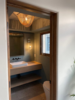
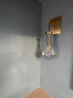
    UPDATE: The sconces are in! I don’t know if I’m more happy that they’re installed or that I finally made a choice. I suffer from severe paralysis from over analysis. It’s a thing. 🙇‍♀️

    Anyway, here they are!

  • PRO
    4 years ago

    Love it!! Fabulous choice of sconces!! Love the shadows the chandelier put out. Just wonderful! Congratulations!!

  • 4 years ago

    Thanks, Flo!!! 🥰

  • 4 years ago

    I'm so glad you left the ceiling the same color as the walls since the chandelier gives its own beautiful pattern. Did you know that was going to happen? In art school they call that a 'happy accident'!

    With such good light coming in through that window you have a great space for a plant on the left counter. Great choices!

  • 4 years ago

    “Happy accident”. I love it! Reminds me of a Bob Ross quote, “We don’t make mistakes. We just have happy accidents.” Totally agree about the plant! And also need to dress up the bottom shelf and put in a floor mat. But we’re getting there!!! Thanks so much for your thoughts, guidance and support.

  • 4 years ago

    Looks great!!

  • 4 years ago

    Thank you, kculbers!

  • 4 years ago

    The colors are great together. I really like it.

  • 4 years ago
    last modified: 4 years ago

    I love those sconces! looks great Merris

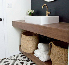
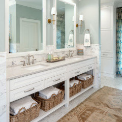
    what do you think about doing some baskets/towels below?


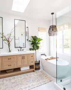
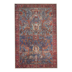
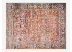
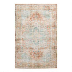
    (I love this kind of rug for your space too)

    how about some apothecary jars, and a glass vase w/twigs?


  • 4 years ago

    Ooh, I love it, Beth H!! You always find the best rugs!!! Where did you find it? And yes, I definitely need some fun stuff for the vanity (baskets, soap, decor. I need a good /pretty tray to set the soap dispenser on for decoration but to also prevent the water from pooling on the vanity top.

  • 4 years ago
    last modified: 4 years ago

    that was from a pic.

    but try cost plus world market. I think they have a few that will go w/your coloring.


    https://www.worldmarket.com/category/rugs/all.do


    This one is Della from Lulu and Georgia: they have other colors too


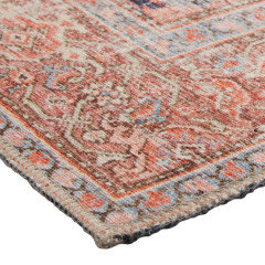
    also, I just found a place on Etsy called Soho Barn. they do polyester rugs that look like those more expensive ones. you can try them too

  • 4 years ago

    Love it!!!

  • 4 years ago

    It’s amazing what you can find on Etsy! I have used so many of those shops to decorate our Airbnb’s in Kauai! Such creative people!

  • 4 years ago

    The room is fantastic! The lighting is perfect and the ceiling looks really perfect with that specific fixture. Now find a great rug. 😀

  • 4 years ago

    Haha! Thanks, RedRyder!!

  • 4 years ago

    I like the cream color it already has, matches both the doors and chandelier- ties them all together.

  • 4 years ago

    Thank you!!!

  • last year

    What are the names of the colours you posted? I’m looking at color atelier samples also!

  • last year

    Hey! It’s St Remy and Blue Fog

  • last year

    So cool! I was going to go with St Remy! Nice to see what it looks like! My closet hardware is the same as your vanity wood. I’m worried the aquamarine tint will clash with our colourful clothes so I was trying to stay neutral! Thanks for responding so long later! Really helps me!

  • last year

    Ooh! That is going to be stunning!!! I also loved “Brushed Slate” which is a pretty black color. St Remy will be so nice and neutral and you can find your clothes and not have an eye color overload. 🤪