

wall color for a white kitchen
4 years ago


Featured Answer
Sort by:Oldest
Comments (15)
 4 years ago
Related Professionals
Fort Smith Kitchen & Bathroom Designers · Phoenix Kitchen & Bathroom Designers · Evanston Kitchen & Bathroom Designers · Miami Kitchen Remodelers · Tupelo Kitchen Remodelers · Muskogee Kitchen Remodelers · Beaumont Kitchen Remodelers · Moline Kitchen Remodelers · Springfield Kitchen Remodelers · Anchorage Kitchen Remodelers · Myrtle Beach Custom Countertops · Portland Custom Countertops · Duluth Custom Countertops · Pocatello Custom Countertops · Wenatchee Custom Countertops 4 years ago
- 4 years ago
- 4 years ago
 4 years ago
- 4 years ago
- 4 years ago
 4 years ago
- 4 years ago
- 4 years ago
- 4 years ago
- 4 years agolast modified: 4 years ago
- 4 years ago






Related Stories
KITCHEN DESIGNKitchen of the Week: Geometric Tile Wall in a White Kitchen
Skylights, bifold doors, white walls and dark cabinets star in this light-filled kitchen addition
Full Story
KITCHEN OF THE WEEKKitchen of the Week: A Punch of Pink for a White Kitchen
A homeowner shows her love of pink in bold walls that impart a cheerful vibe
Full Story
KITCHEN DESIGNCooking With Color: When to Use White in the Kitchen
Make sure your snowy walls, cabinets and counters don't feel cold while you're riding white's popularity peak
Full Story
KITCHEN DESIGNDream Spaces: 12 Beautiful White Kitchens
Snowy cabinets and walls speak to a certain elegance, while marble counters whisper of luxury
Full Story
KITCHEN DESIGNHow to Keep Your White Kitchen White
Sure, white kitchens are beautiful — when they’re sparkling clean. Here’s how to keep them that way
Full Story
KITCHEN DESIGNNew This Week: Moody Kitchens to Make You Rethink All-White
Not into the all-white fascination? Look to these kitchens for a glimpse of the dark side
Full Story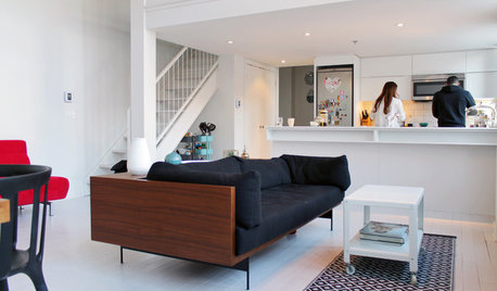
HOUZZ TOURSMy Houzz: Color Hits the Spot in a White-on-White Scheme
Bright red furniture strikes a dramatic pose against snowy walls and floors in a Montreal loft
Full Story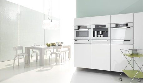
KITCHEN DESIGNWhite Appliances Find the Limelight
White is becoming a clear star across a broad range of kitchen styles and with all manner of appliances
Full Story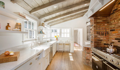
KITCHEN DESIGNKitchen of the Week: Brick, Wood and Clean White Lines
A family kitchen retains its original brick but adds an eat-in area and bright new cabinets
Full Story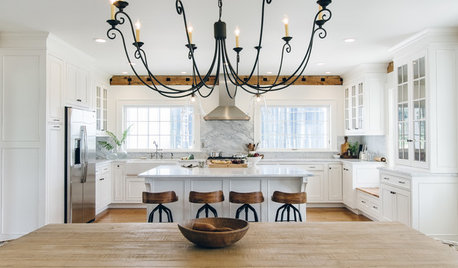
WHITE KITCHENS4 Dreamy White-and-Wood Kitchens to Learn From
White too bright in your kitchen? Introduce wood beams, countertops, furniture and more
Full Story
Susie Q