

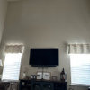
Rearranging the living room
4 years ago

Sort by:Oldest
Comments (18)
Related Stories
LIVING ROOMSLiving Room Meets Dining Room: The New Way to Eat In
Banquette seating, folding tables and clever seating options can create a comfortable dining room right in your main living space
Full Story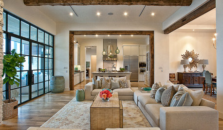
LIVING ROOMSLay Out Your Living Room: Floor Plan Ideas for Rooms Small to Large
Take the guesswork — and backbreaking experimenting — out of furniture arranging with these living room layout concepts
Full Story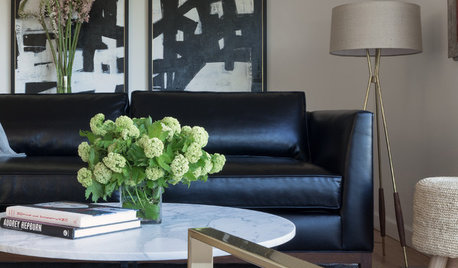
MIDCENTURY STYLERoom of the Day: A Living Room With Personal, Portable Style
Renting doesn’t mean forsaking style for a California family with a designing mom
Full Story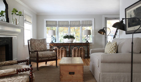
LIVING ROOMSRoom of the Day: Redone Living Room Makes a Bright First Impression
A space everyone used to avoid now charms with welcoming comfort and a crisp new look
Full Story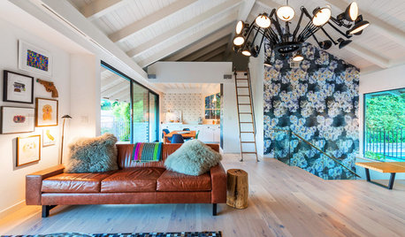
ROOM OF THE DAYRoom of the Day: More Fun for a Los Angeles Living Room
Bright furnishings and a newly open floor plan give a 1964 living room suffering from an identity crisis a new look
Full Story
LIVING ROOMSRoom of the Day: Eclectic Elegance for a Victorian Living Room
Rich colors and unusual details beg a second look in this San Francisco space, which works as well for socializing as for charades
Full Story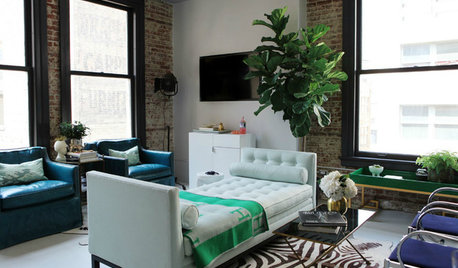
LIVING ROOMSRoom of the Day: New York Style for an L.A. Living Room
Flexibility meets urban chic in a historic downtown loft, decorated à la Carrie Bradshaw
Full Story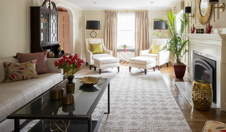
LIVING ROOMSRoom of the Day: A Subdued Living Room That Shines
This redone Boston living room fulfills its roles beautifully. It's both a quiet spot for reading and a stylish space for hosting guests
Full Story
ARTRoom of the Day: Art an Inviting Presence in a Formal Living Room
A redesign brings new energy into the room with a mix of contemporary furniture, forgotten treasures and appealing artworks
Full Story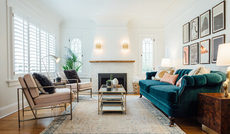
LIVING ROOMSRoom of the Day: Glam Comfort in a Tudor-Style Living Room
A family’s 1920s space gets a luxurious-looking update with new furniture, lighting, paint and fireplace detailing
Full Story




sdideaOriginal Author
Angie K
Related Professionals
Paducah Interior Designers & Decorators · Bowling Green Interior Designers & Decorators · Oxford Interior Designers & Decorators · Wichita Falls Interior Designers & Decorators · Norfolk Interior Designers & Decorators · Helena Interior Designers & Decorators · Montgomery Architects & Building Designers · Washington Architects & Building Designers · Middletown Architects & Building Designers · Savannah Kitchen & Bathroom Designers · Dayton Kitchen & Bathroom Designers · Spring Kitchen & Bathroom Designers · Saginaw Kitchen & Bathroom Designers · Harrisburg Kitchen & Bathroom Designers · Wenatchee Kitchen & Bathroom DesignerssdideaOriginal Author
Patricia Colwell Consulting
Maureen
decoenthusiaste
Tootsie
happyleg
sdideaOriginal Author
sdideaOriginal Author
sdideaOriginal Author
sdideaOriginal Author
susan graves
sdideaOriginal Author
sdideaOriginal Author
btydrvn
everdebz
Margery Wedderburn Interiors