Software
Houzz Logo Print
dojey

Backsplash tiling height

4 years ago
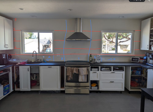
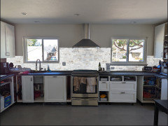
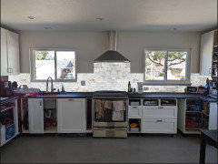
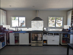
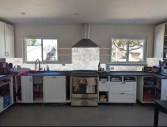
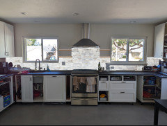
After many years the kitchen is slowly getting there (see photos for where it's clearly not finished yet). Right now we're trying to figure out the best height to install our tiles (planning on Aleutian Isles Aluminium Linear Marble).


The attached photo is where I'm trying to figure things out (with additional lines to hopefully help the conversation). These are the different ideas I'm playing with in preference order:

  1. Sections A/E to 2.5 (should've numbered it differently). B-D to 3. Prevents super hard lines with too strong of a horizontal on the wall

  2. All sections to 3

  3. Sections A/B/D/E to 2. C to 3. Concerned this will look weird with the linear lines showing at C

  4. Sections A/E to 2. B-D to 3. Similar to selection 1, though a bit lower.

  5. All to 5 (full wall, though likely cost-prohibitive.


Any other really good configurations I'm missing? Any recommendations for which would work best?


Appreciate the thoughts and opinions!

Comments (22)

  • 4 years ago

    Full wall, to keep cost down go with a less expensive tile laid in a simple pattern

  • 4 years ago
    last modified: 4 years ago

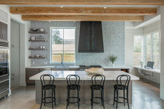
    to a certain extent it depends on the tile..marble look??? the features so far w monochormatic floor/black counter slider windows stainless hood feel mostly transitional if not somewhat modern. I personally would finish the tile quite low and under hood/between windows install a floating ledge ...seems more the aesthetic and does provide use as well..right where you will find it handy. I definitely would not put marble up to the ceiling ....does not seem the correct feel at all..maybe a different tile that high.... maybe....add personalization...something a little creative to the large wall w a ledge/shelf..its a big wall.... theres nothing there ,really, so far. I'd save the higher wall to be free of tile because I'd install a solar shade or cellular above each window... for practical purpose of filtering light and ....many are quite interesting looking now.

    Village Apartment NYC · More Info


    Villandry Circle · More Info


  • 4 years ago

    Definitely full wall!

  • 4 years ago

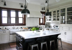
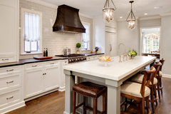
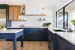
    these full walls of tiles seem to work pretty well because there are some details embedded ...window trim....custom hoods... some ledges ...directional sconces.....be careful with the wall voided of almost any detail/ character...or think about a small detail or two .

    Scandinavian Kitchen · More Info


    Bridle Path Residence · More Info


    Traditional Kitchen · More Info


    Classic 1940s Whole House Remodel · More Info

    .

  • 4 years ago

    Ooof! I thought I had responded but for some reason it looks like it didn't post. Thank you all for the thoughts and recommendations!


    I do worry about the whole wall as, with where I live, even a simple pattern will end up making it cost much more. That and the fact that our tile does have a pattern (added inline photo) to it makes me think it'll end up looking a bit busy too.


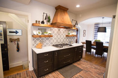
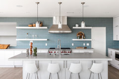
    I was initially thinking of something like @herbflavor's Classic 1940s photo... though I can see how my ventilation hood doesn't have the same appeal.

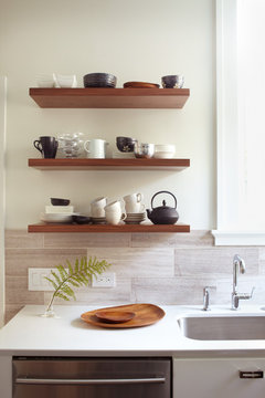
    If I were to do floating shelves, what would feel right? One row on each side (sections B and C)? Two rows feels tricky to add in.


    I understand the perspective of needing something on the wall, but trying to figure out the right thing to add

    (as another note, we've got some woven wood shades that are coming in mid-Sept... we're going with a straight shade look and here's the pattern that they'll have


  • 4 years ago

    different ways....

    Cannnonade Court · More Info


    Craftsman Kitchen · More Info


    Contemporary kitchen · More Info


    dojey thanked herbflavor
  • 4 years ago

    Thanks for the additional feedback. I need to do some photoshops to try mocking some things up, but right now am leaning towards something similar to Cannonade Court with some shelving going up both sides. They'll be pretty narrow (though they're pretty narrow on Cannonade as well) so I'm hoping it's doable.


    Will post in here when I've got some mock-ups.

  • 4 years ago

    Okay... it took a bit of time for me to get to it but I have some mock-ups right now (they have auto-generated ones but the scale was wrong).

    Looking at options 1-5 (top to bottom), with no full wall as an option because it's out of budget, we're leaning towards #2. Then potentially add in some additional open shelving on both sides to spruce things up a little bit.


  • 4 years ago

    I would probably do 3 with 2 shelves on either side but your choice is good if you want to keep it simple with no shelves. i love using my shelves and apparently am the odd one out that doesn’t love the full wall of tile!

  • 4 years ago

    Take the tile all the way up to the ceiling!! Beautiful

  • 4 years ago
    last modified: 4 years ago

    Last one and put 2 or 3 shelves each side. huge wall you want shelves and you will use them

  • 4 years ago

    Frankly -- none of them. They just don't look right on this wall with the differing heights of the windows and hood, it's a visual jumble, my eye doesn't know where to go.


    I'm telling you, this wall is begging for full tile to the ceiling. That might mean a different tile choice that fits within your budget but in the end it will look so much better than what you have mocked up.

  • 4 years ago

    Up to the base of the windows along the whole wall. I know people like to tile the full height upto the exhaust fan behind the range, but you don’t have to do that. I agree the tile is a bit busy, and limiting its extent will give you a more modern look.

  • 4 years ago

    Okay... I'm thinking we're going with the lower height and getting those floating shelves in there.

    I kept the far sides going higher because I think it'll look nicer at the corners where it needs to meet with the adjacent walls.


    The other possibility is to bring the tiling a bit higher up so that it meets up with the bottom of the shelves. Though I think that creates a really strong horizontal which may not be as appealing.


  • 4 years ago

    is the textural tile a given? Have you thought of a smoother streamlined look to the tile? Maybe its just the imagery on the program.....

  • 4 years ago

    Top image looks better than the bottom to me, but then I was advocating for one height, so my preference is consistent 😂

    Question for you: why not keep the same height throughout? The rest of your bs could be the same height as the under window height on the far wall.

  • 4 years ago
    last modified: 4 years ago

    The textural tile isn't a given. It's what we liked out of the choices... I'd have to go check with the SO to see their thoughts on this as well. (but yes... I'm photoshopping myself so it's not the greatest)

    @eam44, I'm trying to understand... you like the original top photo the most? (all too the bottom of the ventilation hood?)

    Or... the other way is assuming the following and here's what it would look like.

    a. one window has a sill and the other doesn't... I'm assuming I'd go to the higher of the two so that it looks a bit nicer?

    b. would you keep it at that same height by the stove top as well? I just have concerns with backsplash and grease and everything


    I'll said... fair points... maybe we do need to go back to look at the type of tile. SO isn't a big fan of subway... was initially but then got tired of it. Open to other ideas from the trusted opinions on here of course

  • 4 years ago
    last modified: 4 years ago

    In my original post I recommend this:


    In my second post I’m advocating the above all the way around the room (I hadn’t realized the side walls are tiled up to the upper cabinets before) with with a build up under the hood.

    You dont have to tile those side walls all the way up to the upper cabinets unless you want to.

    A backsplash has to protect your walls and cabinets ✅ and look good tou you✅. Whatever you find beautiful, as long as it perfoms its function is perfect.

    That said, why does one window lack a sill?

  • 4 years ago
    last modified: 4 years ago

    my #2 preference would be same height the whole wall, up to the base of the hood. (#1 would be tile up to the ceiling, which you said wasn't an option). I do think that whatever you decide, it should be the same across the whole wall. Varying the height in this case makes it look choppy and dated imo

  • 4 years ago

    in truth there is no right/wrong. Dated is a weird description. the shelves are a nice practical and aesthetic part ..I wouldnt omit them. You can do the tile in a few ways....maybe the character of the actual tile ought be factored w final option. You are close>>choose what you like!!!

    Boucher Kitchen & Powder Room · More Info


    Lucy McLintic · More Info


    1505 Loring Street · More Info


    Jennifer & Steve's Kitchen · More Info


    Native Woods · More Info


  • 4 years ago

    Thank you everybody for the continual feedback. Especially for things like this where there's no actual correct answer, I definitely suffer from analysis paralysis and making sure I choose the "correct" decision.


    Based on all the feedback, the photo below is what we're going to land on.

    · "same height" across all walls (though technically slightly higher than the adjacent walls since the wall cabinets are there... but your brain will effectively interpret is as same height all across

    · open shelving available


    @eam44, I have zero knowledge on why one windowsill is missing. That said, I'm actually sort of okay with that. In the sense that the missing one is right in front of the sink, which would actually get a bit in the way of the faucet and everything.


Sponsored
Daniel Home
Average rating: 4.8 out of 5 stars20 Reviews
Premier Interior Design Team Transforming Spaces in Franklin Co, Ohio