Software
Houzz Logo Print
veronica_dorr

Historic Home Decorating Help

3 years ago


Hello,

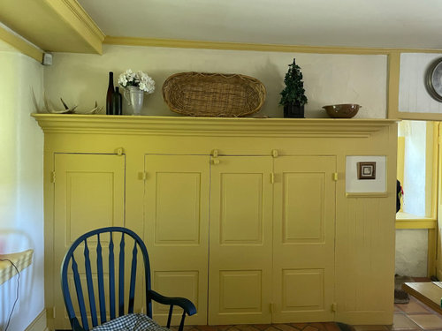
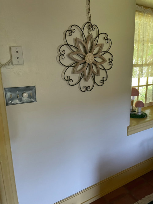
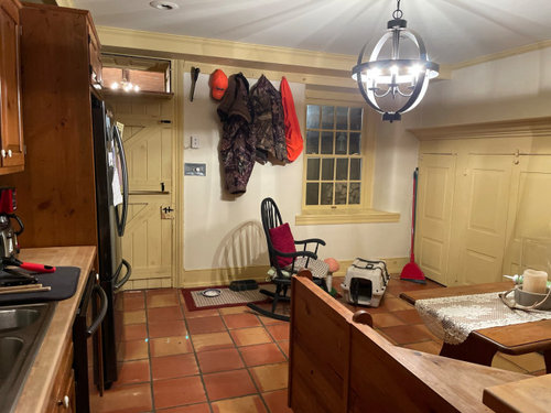
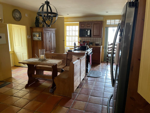
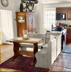
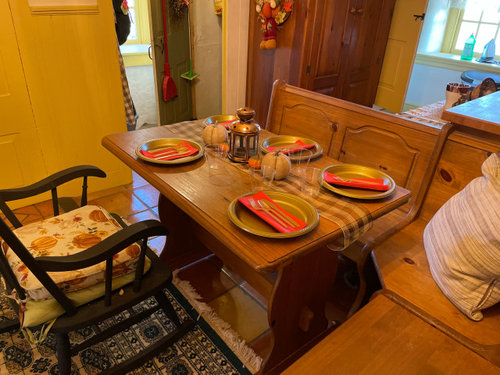
I live in a stone farmhouse that was built in 1800. there is so much i love about it. We have been here just over a year. However, there are some challenges with lay out/figuring out design and color i will be happy with. Please refer to some of the below photos. For the kitchen, I would love a more neutral look. However I am struggling with a color plan that will look nice. I am having a hard time picturing the large walk in fireplace as white, and how to decorate it so it does not look too cold/still looks nice with the floors. The breakfast nook attached to the island is somewhat awkwardly placed in my opinion. Not sure if this would look nice painted either.


i am new to design and really could use some ideas! i appreciate any thoughts.

Comments (12)

  • 3 years ago

    By the way, sorry for the varied photos. hopefully it gives the idea of how the room is laid out

  • 3 years ago

    Beautiful home, so much character and history. I am no expert on historic design, but without making and structural changes, paint is a such a temporary and easy way to change a space. I think a cooler color (compared to the yellow) would look nice with the floors. Something like Revere Pewter? I think the layout of the dining nook feels a little odd but it’s unique. If it’s not moveable, keep it. Rugs, light fixtures etc are all easy ways to change the feel of a space too and use color. Best of luck!

    Happyhome thanked Gardengnome
  • 3 years ago
    last modified: 3 years ago

    As I scrolled through your photos at top of the thread, I thought to myself that I love that buttery color, and how awesome that instead of the walls, it's the doors and trim (esp that Dutch door!!! swoon!)...... and the lovely saltillo tile and that charming cabinet by the back door that looks historical---is that a pantry?

    I really like your charming furniture and the wood countertop! And for a counterpoint, I will tell you that the Saltillo tiles are warm, your furniture is warm, and I would keep the walls a warm color, too. In fact, I love the colors they are now (at least on my screen).

    If you asked (which you didn't) whether there's anything that could use a refresh, I would only say that if there's black appliances (could be stainless--too much shadow to tell on my screen--stainless is fine!), and I wouldn't care for black in your space. I might change the backsplash, and get a single bowl sink, and change out that chandelier for something more in keeping with the rustic charm. Oh, and maybe add a rug (runner) in the kitchen, to add some more color, and it could pick up the warm colors you have.

    I'd love to have a house with a kitchen that had that much charm. Lucky you.

    Happyhome thanked Mrs. S
  • 3 years ago

    Thank you everyone for the feedback, i really appreciate hearing all of your thoughts.


    as i said earlier, my natural preference is a more neutral space although i did research some colonial homes and it seems the colors are largely in keeping with the home. if i keep the yellow - i know you favored staying warm, mrs s! - but i would prefer to ”break up” the space a bit with some contrast. any suggestions for how to do that?

  • 3 years ago

    I'd go for off-white and white. No yellow paint. At least you don't have to feel guilty about painting over wood. All that yellow, brown, pink, and orange would be too much for me. That touch of blue as shown above is nice.

    Happyhome thanked tracefloyd
  • 3 years ago

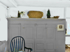
    I don’t know if this is what you’re thinking, but it’s helpful for me to play around with colors in a visual way. I use Sherwin William’s ColorSnap app, though I find the colors displayed are not true to the the actual paint colors at all. I’m sure there are other apps too. Play around with it and see what you like. This might be more dramatic than you’re thinking, but I personally like it (see mock up).

    Happyhome thanked Gardengnome
  • PRO
    3 years ago
    last modified: 3 years ago

    I'd use Ben Moore Navajo White all walls, and bring in warm greens for accent, and possibly even as a trim color!. The Navajo has just enough warmth without going to butter, and green is a winner with the saltillo, flooring and cabinetry..

    Please NO GRAY anything here?

    Not saying you need the saturated vibrancy of historical colors, but. Please no gray.


    Happyhome thanked JAN MOYER
  • PRO
    3 years ago
    last modified: 3 years ago

    What a treat to see this historical home, and aren't you lucky to be living in it!!

    I happen to love the Colonial era--the style, colors, textile patterns--and live in a Colonial revival home. I've decorated it in an 18th century style, some rooms more formal, some more casual, and also have mixed it up a bit.

    I would definitely keep the trim darker and the walls lighter (not necessarily white). Love the idea of green trim, and there are warm neutrals you could use without going too yellow. I don't think a cool gray would work well with your Saltillo tile floors. Ben Moore has two collections that are appropriate for your home--the Historical Colors and Colonial Williamsburg Color collections.

    Some warm neutral options to consider for the trim are:

    • Yorkshire Tan (HC23)
    • Quincy Tan (HC25)
    • Shelburne Buff (HC28)
    • Wilmington Tan (HC34)
    • Lenox Tan (HC44)
    • Williamsburg Stone (CW25)
    • Market Square (CW30)
    • Brick House Tan (CW145)


    Options for green trim:

    • Sussex Green (HC109)
    • Weathersfield Moss (HC110)
    • Tate Olive (HC112)
    • Louisburg Green (HC113)
    • Great Barrington Green (HC 122)
    • Kennebunkport Green (HC 123)
    • Bassett Hall Green (CW 480)
    • Nicholson Green (CW 500)


    Lighter warm neutrals for walls:

    • Monroe Bisque (HC 26)
    • Monterrey White (HC 27)
    • Putnam Ivory (HC39)
    • Shaker Beige (HC45)
    • Bleeker Beige (HC80
    • Manchester Tan (HC81)
    • Grant Beige (HC83)
    • Elmira White (HC84)
    • Capitol White (CW10)
    • Geddy White (CW20)
    • Cornice Tan (CW115)
    • Timson Sand (CW140)
    • Brick House Tan (CW145)

    Keep in mind that you need to get samples to view in your home with your lighting. Post them up on the walls and look at them during the day with natural and artificial lighting, as well as at night with artificial lighting. Also pay no mind to the names of colors--they often do not describe the color accurately. Trust your own eyes.

    I see you mentioned the fireplace, but I don't see any photos of it. You might want to add that.

    Painting first would be your least expensive option, but if you're going to do any layout changes or construction you might want to do that first before painting.

    Good luck and keep us posted on your progress!

    Happyhome thanked Diana Bier Interiors, LLC
  • 3 years ago

    This might be a separate issue, but that L shaped bench eats up alot of space. Those are meant for corners. I would replace them with a set of Winsor chairs similar to some of your other chairs. check out resale shops. Our local Habitat Re store had a round table and four nice Winsor chairs for just $125. The yellow works well with the Satillo tile so if you decide to lighten things make sure it is a warm shade.

    Happyhome thanked kathleen MK
  • 3 years ago

    You could remove those black metal hoops from the light fixture and if it looked too plain add those little lamp shades that fit on those chandlier bulbs. Brighter lighting will change the colors without lifting a paint brush.

    Ps I just love all the historic details like transom windows and deep window sills.

    Happyhome thanked kathleen MK
  • 3 years ago

    Swooning over your home. Would love to see the fireplace pic too. I think you can evoke historic color vibes without necessarily being totally historically accurate. After all, your cabinets, counter, and appliances are modern and it is ok to not hold yourself to historical accuracy. Here are some good inspiration links:


    Gil Schaffer Kitchens


    Farrow and Ball Colour Schemes

    Here is a link to a ton of neutral color schemes. As you scroll down you will see the colors get warmer. Click on a paint color. On the paint color page, scroll all the way to the bottom and it gives you 3-4 color schemes. Each scheme includes the color you clicked on along with two other colors that look good with it.


    I think a flat sheen will look best in your kitchen.

    Happyhome thanked Kendrah