

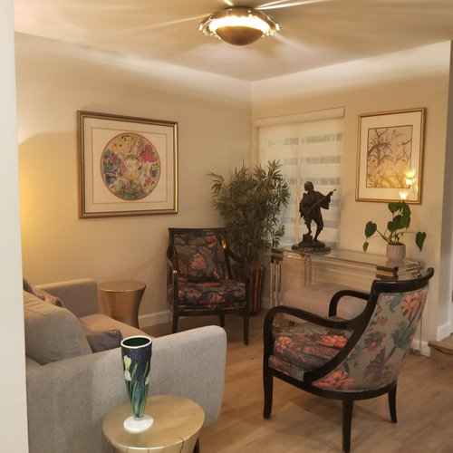
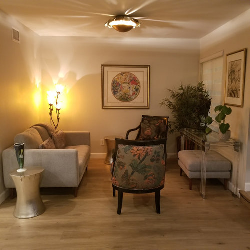
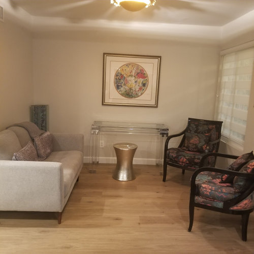
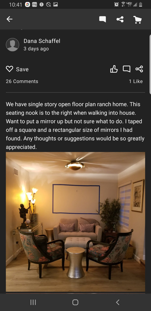
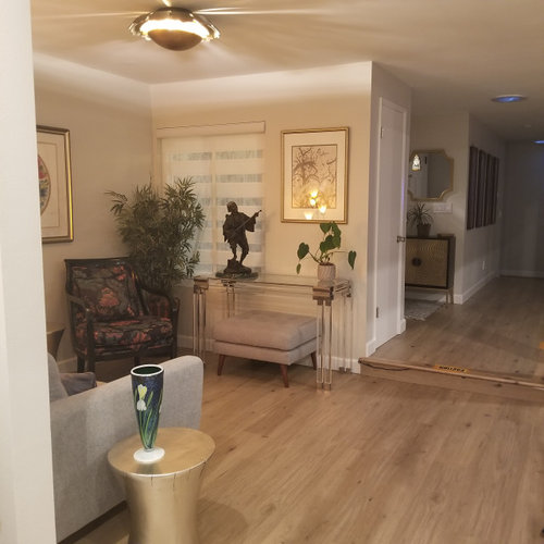
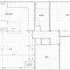
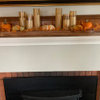
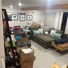
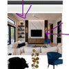
Here is before and after: thoughts?
3 years ago
Sort by:Oldest
Comments (9)
Related Stories
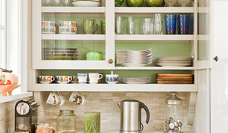
KITCHEN CABINETSChoosing New Cabinets? Here’s What to Know Before You Shop
Get the scoop on kitchen and bathroom cabinet materials and construction methods to understand your options
Full Story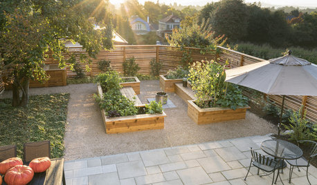
LANDSCAPE DESIGNBefore and After: 3 Beautiful Edible Gardens Rise From the Ground
Thoughtful designs, attractive raised beds and an abundance of plants transformed these outdoor spaces
Full Story
LANDSCAPE DESIGNBefore and After: 3 Front Yards Get Captivating Curb Appeal
Lively plantings and thoughtful touches turn a trio of once-bland spaces into neighborhood highlights
Full Story
BATHROOM MAKEOVERSBefore and After: 4 Refreshed Bathrooms of Under 100 Square Feet
See how designers reimagined cramped, outdated spaces with smart layouts, thoughtful details and personalized touches
Full Story
LANDSCAPE DESIGNBefore and After: 4 Midcentury Modern-Inspired Yard Designs
Landscape designers celebrate the era and complement the architecture of homes with thoughtful backyard designs
Full Story
KITCHEN MAKEOVERSBefore and After: 4 Bright Kitchens in 215 to 300 Square Feet
See how designers transformed kitchens with clever layouts, warm finishes and thoughtful details
Full Story
KITCHEN MAKEOVERSBefore and After: 4 Kitchens With Game-Changing Islands
See the thoughtful storage, stylish seating and dashing good looks that help these kitchen islands transform the space
Full Story
LANDSCAPE DESIGNBefore and After: Standout Patios Transform 3 Underused Yards
Clever layouts, elegant pavers and thoughtful details create stylish, hardworking spaces that enhance outdoor living
Full Story
MODERN HOMESBefore and After: 5 Modern Makeovers Done With a Light Touch
These thoughtful remodels introduce contemporary updates while preserving historic features
Full Story
BATHROOM MAKEOVERSBefore and After: 3 Bathroom Remodels Add a Curbless Shower
Home pros carefully accounted for wheelchairs, walkers and even a large bullmastiff in these bathroom designs
Full Story
acm
Jenn-z9b-AZ
Related Professionals
Belleville Interior Designers & Decorators · Myrtle Beach Interior Designers & Decorators · Orangeburg Interior Designers & Decorators · Amherstburg Interior Designers & Decorators · Fort Dodge Kitchen & Bathroom Designers · Little Rock Furniture & Accessories · McComb Furniture & Accessories · Dallas Interior Designers & Decorators · Wenatchee Interior Designers & Decorators · Aberdeen Architects & Building Designers · West Plains Architects & Building Designers · Mountain Home Kitchen & Bathroom Designers · Belleville Kitchen & Bathroom Designers · Gulfport Kitchen & Bathroom Designers · Davenport Kitchen & Bathroom DesignersKris Bruesehoff
Norwood Architects
Valinta
nelliebean
JAN MOYER
pricklypearcactus
Kendrah