Software
Houzz Logo Print
palimpsest

It's not gray..

3 years ago
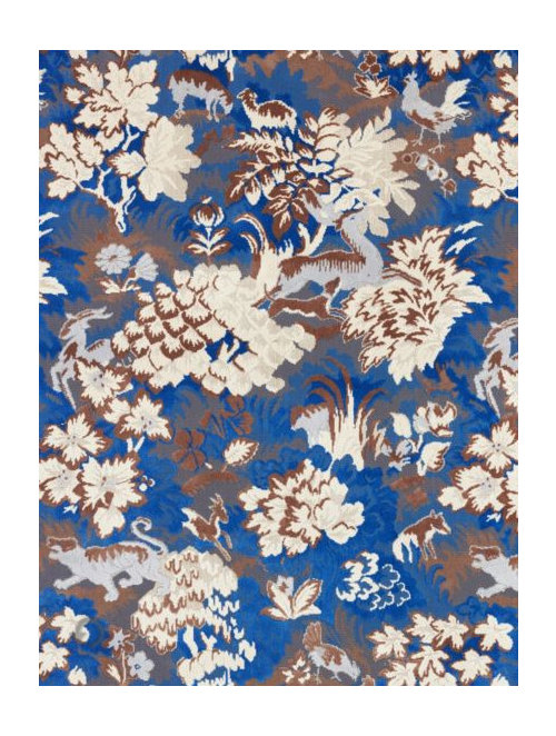
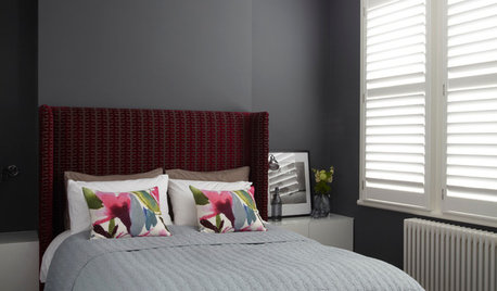
This is one of the newest fabrics from Old World Weavers (at one time owned by Carl and Iris Apfel)

It's interesting how different the top of the market is from what you see mostly everywhere (even as representing the top of the market editorially)


Comments (24)

  • 3 years ago

    It's way better than gray hotel lobby fabric but I didn't really like the 90s blue and brown trend so this would be a pass for me.

  • 3 years ago

    Give it 5 years.

  • 3 years ago

    Love it!

  • 3 years ago

    Looks like one of those ”can you spot the ( animal)” games.

  • 3 years ago

    Something about the color combination and intensity seems very 19c to me.

    Obviously these are very ordered Arabesque, Pillar and Arch and Vine and Drapery patterns, not a verdure, but I was reminded of these anyway.


  • 3 years ago

    Has high end design ever mirrored popular design?

  • 3 years ago
    last modified: 3 years ago

    Well, no.

    But one would kind of get that impression these days because a number of the Kardashian's houses and Real Housewives' houses are a very high end version of the same esthetic being put into the entry level houses around here. And this is the "high end" people see. (Which is of course only a portion of "high end")


  • 3 years ago
    last modified: 3 years ago

    I did not like the blue/brown trend in the '90s either, especially as used by one designer on TV (possibly in the 2000s instead of the 90s) that I believe was from Scandinavia. Anyway, I cannot remember her name, but the blue that she used was closer to turquoise (which I normally love), and the brown she used was a medium tone that I really do not like with turquoise. She used this combination a lot with textiles, for drapes, upholstery, and throw pillows.

    ETA: I looked for "blonde TV designer" and found out that her name is Candace Olson. I liked her as a person - just not her color choices.

  • 3 years ago

    I either missed that or blocked it out, but this particular fabric is so not 90s or 2000s, that I wouldn't make a connection anyway.

  • 3 years ago

    I really like the third pattern in your second post, Pal. I would use that in a powder room, a dining room, a hallway.

  • 3 years ago
    last modified: 3 years ago

    @Kswl That pattern is from Adelphi Paper Hangings, and it's Bamboo and Drapery c. 1811, in a custom modern colorway (above is the document). These papers and hand printed and expensive but getting it done in custom colors is a fairly standard thing.

    I think you like green. This is a bit intense and an interesting combo of warm/cool organic/inorganic colors.


  • 3 years ago

    I think it's gaudy.

  • 3 years ago

    There's no question that it's gaudy. I am sure that was the intent.

  • 3 years ago
    last modified: 3 years ago

    Oh, that green wallpaper is GLORIOUSLY gaudy and wonderful. And it’s used perfectly in a room that has the architecture and moldings to stand up to it— and a neutral color palette otherwise.

    I do love greens.. and wallpaper!

  • 3 years ago

    Old World Weavers was founded by the Apfels and sold in the early 1990s--although they worked with the company creatively into the 2000s.


    And of course OWW developed Tigre fabric, here in one of Lee Radziwill's houses


  • 3 years ago
    last modified: 3 years ago

    I saw Iris Apfel out and about in NYC when we lived there in the 80’s and early 90’s on the UES. (We lived just a few blocks from Sotheby’s and there was always somebody walking down York Ave to an auction.) She was a style icon her entire adult life— not something many can say.

    I remember that lavender / fawn color combination in clothing too, but seems like it was in the 70’s? Probably by the time I was aware of it, it was in mass markets.

  • 3 years ago
    last modified: 3 years ago

    Iris is my hero.

    She has a Ruggable line out now, too.

    I was in love with Lee’s sofa my entire life. It was in fine condition when Carole Radziwill (Lee’s DIL) inherited it, but her pets destroyed it.

    Before, already some damage seen —


    After —


    Damage the cats and dogs did:


    I used to watch RHONY years ago, when Carole was on, and saw all this happen in real time. I was yelling at the TV.

  • 3 years ago

    It got so faded, too, it seems.

  • 3 years ago
    last modified: 3 years ago

    I can’t remember if any was saved…. I would have tried to keep as much as possible for a pillow or something. And then put it behind glass to protect it. :D

    It’s such an iconic sofa and fabric.

  • 3 years ago

    I kind of have a hard time believing she didn't have the $50,000 for the new yardage if she really wanted it.

    Not doing it because you think it's stupid to spend that much money because you have pets or whatever I get.

  • 3 years ago

    I think it was the latter. She did explain it at the time, and iirc that was the reasoning.

    I wonder what happened to the fabulous stools.

  • 3 years ago

    There's nothing wrong with Carole Radziwill's LR, but it shows how anemic even high end decorating has gotten. It's kind of "discreet-let's-not-offend-anyone-hotel-lobby".

    I have the same table lamps. Or, I should say, she has the same table lamps as I do, because I've had mine for 20 years, if I want to indulge in some one-upmanship.

    But so much different from how it used to be done in that set. Which I think needs a different thread.


  • 3 years ago

    It got ripped. Geez...that's a mess.

  • 3 years ago
    last modified: 3 years ago

    That would be a fascinating thread. What you said reminded me of one of my favorite blogs: The Peak of Chic. She stopped posting long ago, but I still enjoy looking through it.

    I was curious about Carole’s apt … I don’t know if she’s since redecorated it, but here it is in 2019:

    https://www.architecturaldigest.com/gallery/inside-carole-radziwills-redecorated-new-york-city-apartment

    One last thing and I’ll stop hijacking … I posted about Sutton Place the other day. Joni of Cote de Texas did a lot of research into the different design eras of 1 Sutton Pl and although very long, it’s a fun read. What you said above describes the look now. It could be any high end hotel in any large city — no character, no warmth, no personality, very little history left. Just acquisitions.

    ETA: I was slow in typing this up, didn’t see you’d started a new thread. Sorry to ramble here!

Sponsored
Kuhns Contracting, Inc.
Average rating: 5 out of 5 stars26 Reviews
Central Ohio's Trusted Home Remodeler Specializing in Kitchens & Baths