Software
Houzz Logo Print
mehrhard

Revere Pewter Help!

3 years ago
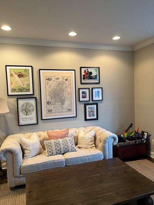
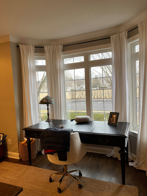
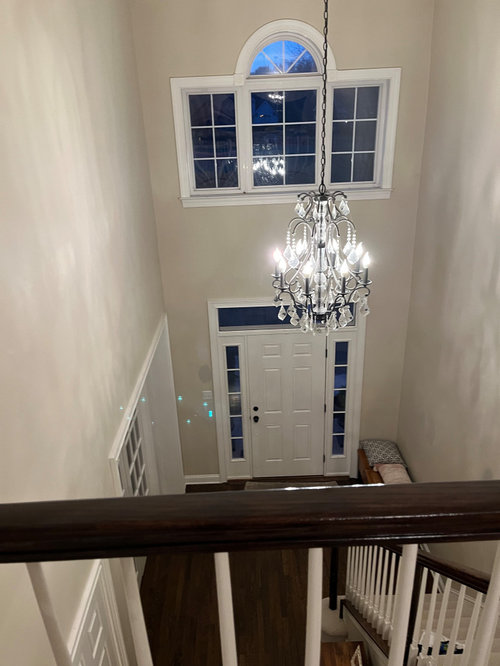
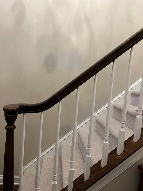
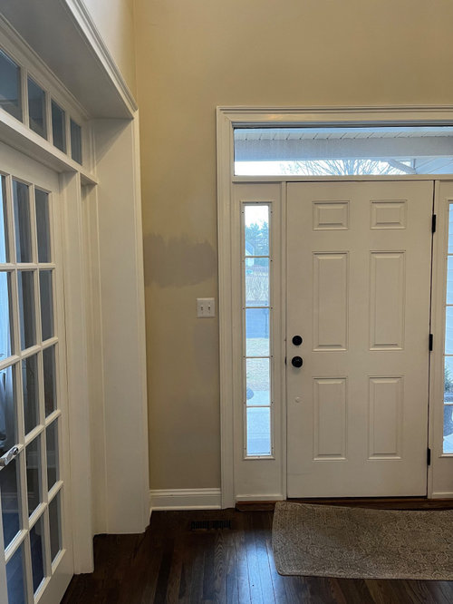
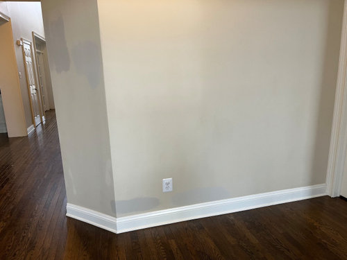
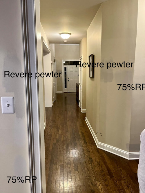
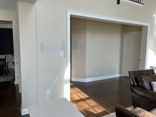
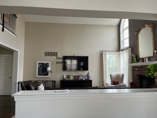
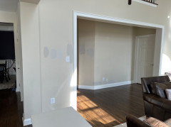
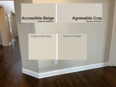
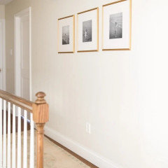
Hi - I am repainting our main living areas and have revere pewter in my front office and really like it and think I would like to do throughout. However, I am worried it may be too much/dark for a two story foyer and family room. I had it lightened by 25% to 75% pigment and `feel like that color, at times, looks too washed out but I'm not sure that will be the case once I paint the entire wall (or if the RP will look a lot darker once the whole wall is painted). I also tried Edgecomb Gray - the lightest - where they are 3 samples pictured. Attaching photos here - first two are of office where I already have RP and then snapshots of the large area I'd like to paint. It's so expensive to paint, I don't want to mess up. Thank you for any advice!!


Revere Pewter
75% Revere Pewter
Something else!

Comments (13)

  • 3 years ago
    last modified: 3 years ago

    when you 'lighten' a paint color, you aren't merely adding white to it. You are altering the color completely. Instead of doing that, pick another color

    whatever you have on the walls in this shot, appear too blue/purple gray.


    maybe it's your lighting. I'd look for something a bit warmer toned. more taupe/griege colored


    is edgecomb gray one of those samples? doesn't look anything like this.

    What direction is your lighting coming in the windows? north or east?


    What about BM Sea Salt? I think this would be a bit warmer and less blue/purple.


    I'd try a sample of this. (ssee below for some alternatives on that)

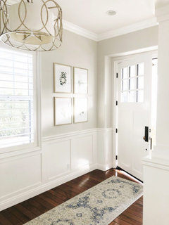
    This one is Pale Oak. (Balboa Mist is similar) I tried this one but it didn't work in my kitchen (c-below) I believe the trim color on this one is White Dove. (I prefer Simply White)


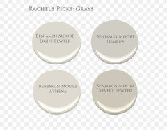
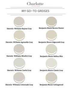
    Here's revere Pewter shown w/3 other similar colors.


    The two on the left might work in your space.

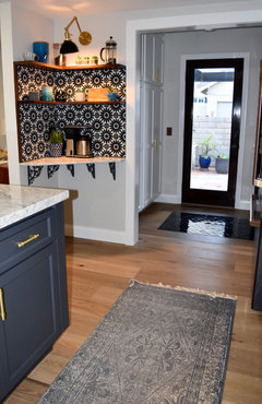
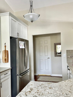
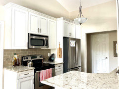
    I used Light Pewter in my own kitchen, It's on the wall around the tile and the door


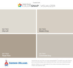
    If you want lighter, city loft or colonnade gray might work


    What I did w/my samples, I went to HD and got the color match of the BM color and had a sample made w/the Behr paint $3. It won't be an exact match, but to tell you the truth, I like Behr paint better. I've used both BM and Behr multiple times on my walls, and I like Behr better.

    Up to you. If you get the sample made in the behr paint and like how it looks, just use that paint. That's what I did w/my Light Pewter color

  • 3 years ago

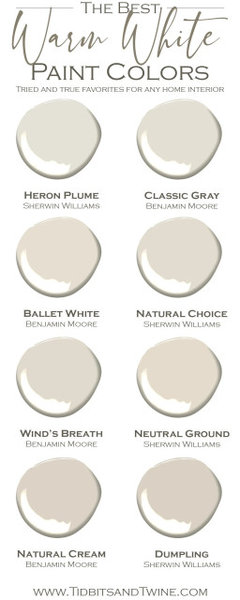
    Are you set on using a shade of gray? Another beautiful Benjamin Moore color for a pre-open space is OC 14, natural cream. I painted my open concept living/kitchen area with it and I love it.

  • 3 years ago
    last modified: 3 years ago

    MCL, funny you should mention that. I was just looking at Natural Cream


    Mehr, no need to lighten any of the colors w/these choices. they will already be on the lighter side. LRV around 70 and up


  • 3 years ago

    Natural cream is beautiful. It’s very light and bright, but yet gives enough contrast versus my white trim.

  • 3 years ago

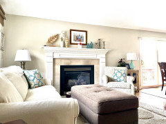
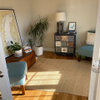
    My space painted natural cream

  • 3 years ago

    Thank you all! I was looking for more of gray/greige and getting a white couch, but will have a look at natural cream. Not sure it's right for my space. If going light, I was thinking Classic Gray

  • 3 years ago

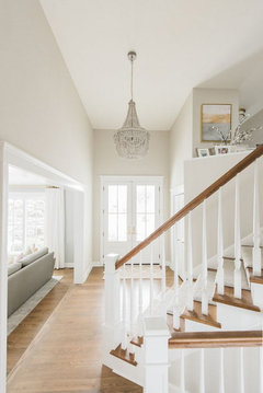
    Just want to say…I love how you have hung your artwork above your office sofa. Well done!

  • 3 years ago

    I have Pale Oak in a room with strong southern light and it's great. I tried Classic Gray in that room and liked it, but I like Pale Oak better. It has an LRV of 70, so it's not too dark, but does stand up to bright light. I have Edgecomb Gray in a room with north and west light. It's a little warmer than Pale Oak. Since you're concerned about how dark Revere Pewter is I think either one of these are worth a try. If you're paying someone to paint it is expensive, but you can do a large swatch yourself to make sure you like the color. I usually do about ten square feet before committing. You don't have to do it on the wall either. Since you're trying to find a color that will work everywhere you would be better off painting a sample board you can move around.

  • 3 years ago

    Mehrhard, I posted about 10 other colors in my first comment. did you see any of those? what about sea salt?

  • 3 years ago
    last modified: 3 years ago

    Thank you @elcieg! Do you have a picture of your room you could share? We have a lot of natural light and I really do want a constrast which is why I wanted to use Revere Pewter. I think it will provide a nice constrast to the trim, etc. The hall picture was taken at night, but yes could certainly have more lights or different bulbs to lighten. I have Gray Owl in my bedroom and love it in there, but wouldn't in the main area as it reads very blue/green at times.

  • 3 years ago

    Most people do just what you are doing, painting little spots of color another color, but the problem is you are seeing it in comparison to the color that is already on the wall. For light colors and neutrals I like to create a large sample. (18x24 or larger). I like using watercolor paper for samples and I keep a book of all the wall colors I have to take with me when I go shopping for furniture or accessories for my home. C2 Paints sells 17x25 samples of their paints - love their samples!


    But even with a large sample you are still seeing the other colors in your room. I have a simple white shower curtain liner that I take with me and tape to a wall when sampling colors in someone else's home.


    When I paint my own samples I also like to leave a white edge so there is a separation between the colors that are on the walls and the samples I am looking at.


    (Like these from The Turquoise Home website)


    Right now the most popular color scheme is white on white. But I have never been much of a trend follower and I find that people who go with the current trends are always having to try to keep up with the trends. I like to help people pick their perfect color. The color that works best with their furnishings and their art and all the things they love. The color that will work for them over the next 20 years.


    Revere Pewter is really not all that dark and sometimes going lighter doesn't brighten a space. My current home was painted an off white before I moved in. It doesn't have enough light to bring white to life, so it is dead and dreary. I am repainting and using much darker colors ranging from an LRV of 63 and downward toward 40. Having more color gives the rooms more life and the contrast with the white trim makes the rooms feel richer.


    Since you have already purchased samples of the full strength and the 75% Revere pewter why not paint a couple of large samples (Each jar will cover 50 sq feet, so there should be plenty left to do a couple of 3' x 4' samples. Live with the colors in different rooms and see what feels good to you when you walk through the rooms.


    mehrhard thanked Jennifer Hogan
  • 3 years ago

    Thank you @Jennifer Hogan I am doing just this and it's so helpful! I agree with you - I want more of a contrast, richer color. I just don't want it to be too overwhelming with the tall ceilings