Software
Houzz Logo Print
adele_naidoo

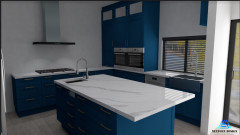
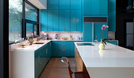
Is there too much blue in this kitchen ?

3 years ago
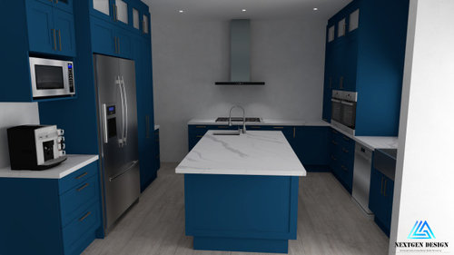
I love the design and layout but am not sure about all the blue.

I've been dreaming about this kitchen for a long time .


Comments (40)

  • 3 years ago

    Not too much just the wrong shade, in my opinion.

    Adele Naidoo thanked jewelisfabulous
  • 3 years ago

    It depends on how much natural light you have in your kitchen. Non-blue accents will lessen the severity. Brushed brass handles, green plant, etc

    Adele Naidoo thanked typeandrun
  • 3 years ago

    I think it’s pretty but agree with typeandrun that non-blue would help tone it down a bit. What is your plan for the back wall? Does the kitchen open up to another space?

    Adele Naidoo thanked Kelly Green
  • 3 years ago

    "Too much" is subjective, but to me, it's too much. Agree that it's not about the fact that it's all blue, but this specific color blue which on the rendering appears very strong, almost a dark electric blue or a cobalt. I'd suggest something that's more of a navy or a lighter blue with gray undertones. If you're in love with this blue, consider doing the island in that color and picking a more neutral color for the remainder of the kitchen.

    Adele Naidoo thanked HU-918119203
  • 3 years ago

    It would be a little much for me in this house, but my entire house is done in 1955 warm neutrals.

    I think some of that decision would depend on what vibe your other rooms reflect. It could work in some homes/apts, not others.

    Adele Naidoo thanked morz8 - Washington Coast
  • 3 years ago

    It’s a very chilly look. And dark without being cozy and moody. Of course, blue is my least favorite kitchen color, especially dark cold blues, because I feel it doesn’t enhance the foods I either have out or am preparing. Greenish or grayish blues look better if you’re going blue, and softer. And wood floors or some wood elements or stone, hence softer can work better.
    But to each his own.

  • PRO
    3 years ago
    last modified: 3 years ago

    Wrong shade of blue. Gray floor ....UGH! Sorry..it is cold feeling, made worse by being under lit.... and actually it's quite dreary. Don't dream on that kitchen. There are a million ways to have blue. .....in any style you favor.


    Post YOUR kitchen, with all your dimensions which means this layout has nothing to do with the fact yours may be similar.

    A scaled drawing of your existing space is where you begin. Not with finishes...not with color, but with feet and inches of everything, Your needs, how you cook, what you want in appliances, as appliance DRIVE a kitchen layout. What is the floor in the rest of your house, where do passages in the kitchen lead, what room if any is it open to. You can't go backwards from "finish" : ) You begin with a solid plan.

    Adele Naidoo thanked JAN MOYER
  • 3 years ago

    Yes, too much blue and the wrong shade of blue. Plus the floors are not appealing.

    Adele Naidoo thanked susan49417
  • PRO
    3 years ago
    last modified: 3 years ago

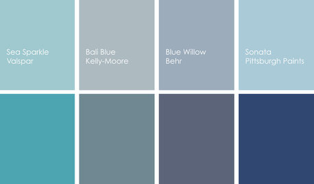
    I think it's the shade of blue that's the issue. Goes a little too far in the royal blue direction which is a little too bright. I'd either go with a shade o Navy (like Benjamin Moore's Hale Navy) or more of a blue/gray tone.

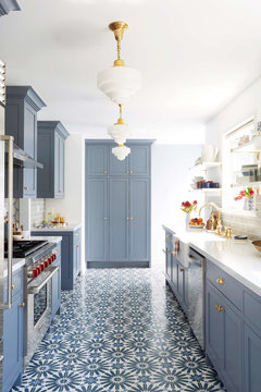
    Here are examples:


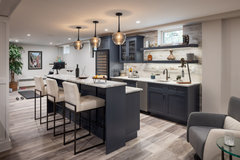
    Temptation Gray Bar · More Info


    modern deco kitchen redesign by emily henderson featuring clé's "big al" tiles · More Info


    Adele Naidoo thanked Sabrina Alfin Interiors
  • 3 years ago

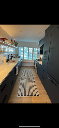
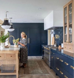
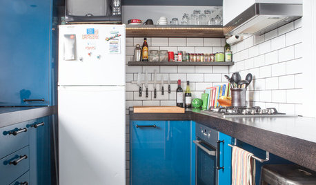
    As a non-pro blue kitchen owner, I find that particular blue unappealing. The bad lighting and floor is not helping either, nor is the tight feeling layout where all you see is blue. I love a moody dark blue mysd, but there are so many better ways to do a blue kitchen. Here is ours just for anlgjer reference point.

    Adele Naidoo thanked Jenn Powers
  • 3 years ago

    I like the blue in Sabrina’s second example.

    Adele Naidoo thanked chloebud
  • 3 years ago

    The cabinets should been a darker blue and your knobs on the Range are red you could do a red Runner to break some of that up or a black runner I don't mind the floor but the cabinet should have been darker it just would have been warmer

    Adele Naidoo thanked happyleg
  • 3 years ago

    I am with Sabrina. I like her choices. It is the shade of blue that's the issue. And, from my standpoint, far better than too much hospital white.

    Adele Naidoo thanked artemis_ma
  • 3 years ago
    last modified: 3 years ago

    Normally if I saw a kitchen with that color blue cabinets, it would tell me that the homeowner is a happy, vibrant, spunky, vivacious, fun loving person. Get ready to par-tay!

    And yet that inspiration kitchen seems kind of sad, dull, dreary, and depressing.

    I think it may be because there is no natural light? Would your home really have no windows in the kitchen like the inspiration?

    Could you possibly add two windows flanking the range hood like in M Milker’s kitchen? I might feel differently about it if it had windows.

    I see a few major issues with the layout.

    For example, how can someone open the fridge when someone is stanging in front of it prepping food on the island? That isle looks too tight even if it was not a prep zone. Looks like the persons butt would practically be touching the island with the frenc doors open.

    Also, what is happening in the far right corner? That looks like a major pinch point between the cabinets.

    I agree that the greyed out wood floor looks bad, but I would also stay away from woods that have a yellow tone. With yellow and blue being opposites on the color wheel, it would only intensify the electric blue color. I think it is bright enough as it is, so that any more enhancement might get a little too crazy. If you want the floors to be a light color, maybe that very light beigey-tan french oak color might look nice?

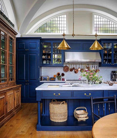
    Although, I think this bright blue kitchen with the rich warm wood floors along with the wood hutch looks very pretty. I notice a ton of natural light though.


  • 3 years ago
    last modified: 3 years ago

    I love the design and layout but am not sure about all the blue.

    I've been dreaming about this kitchen for a long time .

    I like blue cabinets, and I like the proposed shade -- but something's just wrong with that room, and it's hard to say exactly what. My specific thoughts:

    - It lacks natural light, and the back portion of the room especially is dark.

    - In addition to no natural light, the light fixtures are lacking. I'd want to see a pretty light fixture or pendants over the island and under-counter lighting. Those few little Swiss cheese lights on the ceiling aren't doing enough.

    - It is devoid of pattern and texture; this is most egrigious on the big, empty back wall. I think I'd like to see a patterned tile added to the walls.

    - The color scheme is cold. If you were to bring in a third color as an accent -- yellow or red? -- it would make a difference.

    - The layout is not ideal: the island will block the user from walking straight from the sink to the refrigerator; said differently, the island interrupts the work triangle. Note, too, that the island will make it difficult to get into the refrigerator -- just look at the picture and imagine opening the refrigerator doors; you'll be backed up to the island. This will all get old in a hurry.

    - The counter-depth cabinets on the back right side interrupt the work flow.

    - The floor is essentially a non-entity. It's almost invisible.

    - This kitchen needs "a star", a focal point. The cabinets are nice, and the counter tops (for marble) are nice ... but nothing stands out.

    Adele Naidoo thanked Mrs Pete
  • 3 years ago

    I would want my blue cabinets to tip one shade towards green.


    I would also need natural light.


    I'm not loving that kitchen at all, and i'm someone who usually really likes bold cabinet color choices when there aren't other busy things in the kitchen fighting with it. I like how simple it is here, but it's still really off putting.

    Adele Naidoo thanked H202
  • 3 years ago

    It’s very blue! i’d probably want a calmer shade maybe more of a slate blue. the design photo looks strangely sad and dark. are there windows anywhere? i’d want warmer flooring for sure. it also just looks too cramped to me. what are the aisle widths? i’m worried there isn’t enough space and you will always be bumping into people/things. or maybe just cab to ceiling uppers on fridge side so it looks lighter.

    Adele Naidoo thanked lharpie
  • 3 years ago
    last modified: 3 years ago

    Oh I love that shade of blue! It's gorgeous!

    But -- there's too much bulk in the upper part of the side walls, and not enough interest to balance it on the back wall.

    Good bold color choice, not sold on the design. Do you have any other views of the design, including a regular overhead footprint layout?

  • 3 years ago

    i don't like anything about that kitchen. I don't like that color blue. Don't like the countertops. Don't like the floor. The hood is a poor choice function wise as the capture area is poor. Aisles are too narrow. No windows. The whole kitchen feels cold.

    Adele Naidoo thanked vinmarks
  • 3 years ago

    I disagree on the comments about the color of blue. I think it's a beautiful shade. 


    I would, however, use something lighter and more neutral on the upper cabinets and keep the vibrant and dark color lower in the room.

    Adele Naidoo thanked jlaurelcacace
  • 3 years ago

    I love that blue! Brass hardware for cabinets, bright, colorful glass and pottery in those upper glass front cabinets.¡ some colorful art, countertop appliances in bright colors, and an abstract design rug. If you can, get the brightest bulbs for lights, on a dimmer. And under cabinet lights.

    Adele Naidoo thanked teamaltese
  • 3 years ago
    last modified: 3 years ago

    With both walls stacked with high cabinetry, nothing to break them up, lack of windows it seems, and not good lighting, it feels cave like. The color itself is attractive in an airy space and broken up with lighter elements.


    Adele Naidoo thanked Maureen
  • 3 years ago

    @Jenn Powers - I love your kitchen! what color is that blue?

  • 3 years ago

    I think that in NOT OP's kitchen just a proposal.

  • PRO
    3 years ago

    In addition to what everyone is saying about the color, lighting and layout, the photo in the original post is a computer rendering, not a real kitchen. I think that's what's adding to the other-worldly feel of it. It just looks fake and uninviting. All the real blue kitchens look so much nicer.


    Adele Naidoo thanked Diana Bier Interiors, LLC
  • 3 years ago

    @Kelly Green: I have no plan for cupboards for the back wall as such as I don't want the area to seems too closed-in. I thought once the cupboards are done I could decide on tile and shelving. Tile will probably be a white glazed terracotta to add interest...

  • 3 years ago

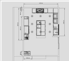
    Thanks all for the feedback - very valuable indeed. Yes, its a computer rendering so looks a bit off. I'm attaching all of the ideas as well as the floor plan. Perhaps it will help. There is a natural light challenge as the range wall cannot have windows due to the family bath behind it. Agree with brushed brass handles and taps and overhead pendants for lighting layers - we have ceiling downlights currently.


    . Keep the feedback coming, please:-)

  • 3 years ago
    last modified: 3 years ago

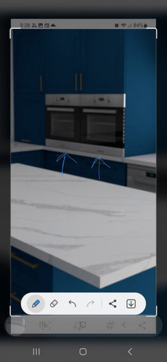
    Your floorplan is easier to understand, so more questions. Function first: What is that in the bottom left corner -- I don't understand the symbols. Why is the top left corner empty -- if it's a doorway, then I'd expect a lot of hip-level bruises from the two countertops pinching down the walkway, and directing traffic past a cooktop is not ideal. Will you have a table in the bottom right area? That would be good, so that you don't have to have people sitting at the island and encumbering the walkway. Wall ovens: while I see they could function there, I simply don't like how massive their cabinet is. Consider stacking them in a single cabinet, and gaining more countertop between them and the sink.

    Looks: I still love your bold blue color! and it will look great with white counters, brass or gold accents -- with plenty of light and a decent floor. I still don't care for a the large massing of cabinetry on the side walls. It's top heavy. Can you get a rendering showing perhaps the top layer in white? I like your idea to use a simple white subway tile on the back wall. Maybe with a bit of very very pastel color variation for subtle interest, because (in my opinion) using a highly decorative patterned tile would be a bold step too far, let your blue be the bold stroke in the design.

    This is an interesting thread.

  • 3 years ago

    What is the point of the countertop in this spot if it is flash or almost flash with the cabinets?


  • 3 years ago
    last modified: 3 years ago

    The prep sink on the island is much too small to have any use. Increase it to 18" width (46 cm).

    The overhead recessed lights should not be down the center of your aisles. Those lights should be closer to the edge of the cabinets - that way they light the workspace. Recessed lighting should be 12-14" in front of your upper cabinets (30-35cm). If you put the recessed cans down the center of the aisles like you've shown, you are just lighting the center of the aisles where you don't need much direct task light. The lighting for the island should be down the center as you've shown. Also you will need undercabinet lighting.

  • 3 years ago

    If you are going to have a wall with no cabinets on it, don't make it the range wall, which also cannot have windows. Instead, remove all the uppers from the window wall and make the entire wall windows. (That is if there is not another room behind the uppers.) This will bring in so much more light to your space.


    The small wing wall between your sink and glass doors - is it structrual? If not, I'd get it out of there. It blocks the light coming in from the door.


    I don't know what is on the end cabinet to the right of the fridge, but perhaps you can put stacked double ovens there. Then decide what to do with the hood/cooktop wall. Upper cabinets and if so how they will be laid out.


    Don't worry now about the shade of blue. You can decide that much later down the line. It will look so different anyway with more natural light, better placement of lighting fixtures, and different shade of flooring.


    Nice big space. Have fun making your dream come true. Consider another designer.


  • 3 years ago

    Yess

  • 3 years ago
    last modified: 3 years ago

    Ok so I am terrible at math so I am sorry if I have this this all wrong.

    When I googled 4150mm, it says it is 13’ 7”. Or 163”.

    You must measure the isle width from the countertop overhang to countertop overhang, the appliance handles, or whatever sticks out the farthest. Not cabinet to cabinet. A normal countertop overhang is about 1.5”. so the perimeters would be 25.5”. A few inches more is needed in real life to account for the fridge handles for example.

    Doing the math, I get the inside measuement for the island as 112”.

    163” - 25.5 - 25.5 = 112”

    (Again, it is really less then 112”, if you measure properly from the fridge handle.)

    In your overhead layout, the island looks to be two cabinets placed back to back. That would equal 48” plus the 1.5” everhang on each side, so 51”.

    112” - 51” = 61” that is leftover for the two isles.

    61” divided by 2 = 30.5”

    What?? No way, cannot be right.

    No real kitchen designer would think that 30” isle are anywhere close to adequate!

    36” is bare minimum. 42” is the minimum recommended by NKBA for a one person kitchen. 48” for a two person kitchen.

    Even a few more inches is nice when the isle is also a main walkway going through the kitchen like you have.

    Speaking of that walkway, when people are entering or exiting that doorway at the top left, they either walk through the prep zone or through the cooking zone. Both situations are bad and potentially dangerous, and epescially when you have anything less then 48” isles.

    Depending on which route they take through the kitchen, I can imagine several dangerous scenerios.

    Imagine someone walking through the isle accidentally bumping into someone prepping at the island with a sharp knife as they try to squeeze between them and the fridge handles.

    Imagine the same thing except bumping someone cooking near flames and hot stuff.

    Imagine the chef is turning around while carrying a big stockpot of pasta water to dump in the sink, just a child comes running through or maybe a pet. That is why it is always recommended not to have a walkway going through the work zones like your layout shows.

    I see other problems too, but that would be enough for me to fire this incompetant ”kd”.

    (Editing to add another issue. What happens when you are prepping at the island and someone wants a drink or snack from the fridge? Do you have to move now since the fridge is behind you? Two people cannot fit in the isle and at the same time and open the fridge doors can they?)

    It really is a bad design. I am not talking about the blue color or materials of the design, but the actual layout.

    Don’t worry though, you can still have the fabulous blue kitchen of your dreams!

    But I just don’t see you enjoying this particular kitchen layout. 😢

  • 3 years ago

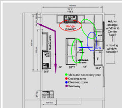
    Here is something I played around with. I don’t know if you can move and enlarge the window though. I was thinking the same as Kendra and others that having that right wall mostly windows would be awesome.

    This layout is very close to my kitchen and it works very well for us. Only difference is I have bar stools at my island and then behind my island is wide open to my living room.

    Of course when you must compromise due to space constraints, there will be cons to the layout. You just try and make due the best you can.

    One major con is you would have to lose the separate ovens and cooktop. In a small kitchen sometimes you must compromise and do a range. i think you would have space to get one with two ovens though.

    This still has semi- tight isles at 42”.

    The island also must shrink to a narrow 28”, but I don’t see how else to fit two 24” cabinets back to back for the island unless you keep the left wall completely empty.

    Or you could maybe do a 15” cabinet on the back of the island with 12” narrow pantries on the left wall, but then you would lose the coffee station.

    The reason I did the narrow pantry towards the top is because the space between the pantry corner and the corner of the cabinet to the left of the range needs space to not be a hip buster. I think someone mentioned that already.

    Hey you guys notice I attempted to be like Buehl with her colored circle zone mapping? Lol!

    Yeah, I will never be smart like her. My brain doesn’t work like it used to, and it is so frustrating and embarrassing.

    Oh well, I tried. Maybe it will spark some ideas. Hopefully the actual Pros or other kitchen experts will come up with something better for you.


  • 3 years ago

    Wow some folks are so abrupt...it's almost funny...not so helpful though. Seems like maybe a big box rendering maybe? Not sure...but often those computer programs make everything "fit" but do not really work well...like the idea of wall of windows...if you have as many deep drawers as possible you will be surprised how you need fewer cabinets...Like the idea on blue on the bottom...remember too with nothing on the counters, etc it can look off...definitely worth getting some help...It will be beautiful!

  • 3 years ago
    last modified: 3 years ago

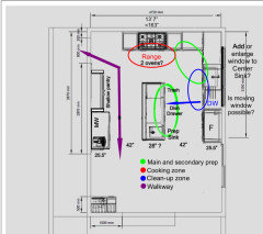
    I keep thinking about your kitchen now!

    i realized you had the microwave above the coffee station, so I put it back in that location.

    I added the prep sink back to the island. The reason I put it on the lower end of the island is so that people snacking, or washing hands, can access it without going inside the interior of the main L of the working area. Also because then if you are prepping on the island, you can sort of slide your cutting board or prepped items off the countertop over to the range without having to bypass an island sink.


    Ok, I promise to quit now. My numbers are probably wrong anyways. 🤭

  • 3 years ago
    last modified: 3 years ago

    If you love peacock blue, have peacock blue. I agree with pretty much everything Mrs Petewrote. The major problem is with how dark and cold the kitchen currently looks. You say you don't want cabinets on the back wall because you don't want the room to seem too closed in (and finishing touches like a backsplash on the back wall could definitely help brighten it up), but it's still going to feel very closed-in, partly because of the lack of natural light, partly because of the dark cabinet color, and partly because you have so much of those dark cabinets bunched on either side.

    As shown, the only open space between your upper and lower cabinets is that small area at the left of your inspiration rendering, where the coffee maker is located. The monolithic height of those dark cabinets from floor to ceiling around your refrigerator on the left and then opposite them on the wall on the right makes the kitchen feel almost like you're at the bottom of a canyon with towering cliffs on either side. If you were to put shelves or just a couple of uppers on either side of the vent hood with some breathing space around them and give yourself more counter space between the uppers and lowers on at least one of the two side walls, that might help break up the closed-in feeling, especially with a bright pendant light over the island.

  • PRO
    3 years ago

    I agree with other posters. The shade is a problem. I lighter blue might be better. Personally, I think a much, much lighter shade would be better if you want to have blue cabinetry.

  • 3 years ago

    A couple of things my eye went straight too - the island sink is in the wrong spot, both relative to the fridge and the stove top. You need that end of the island for a workspace to take things to the stove (vs the small space to the side of stove). It visually is also too crowded. The other spot is the counter to ceiling wall of blue in the corner to left of oven/right of sink. It really closes down that space. Get rid of that cabinet to open up the corner. Put in open shelving to visually open up the area. It will help quite a bit with the towering walls of blue. The color is fine, but is so visually powerful that it needs some toning down. It is quite nice with your countertops!