

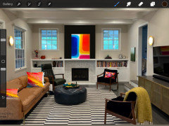
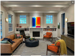
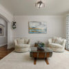
Decorating around bright/vivid art?
3 years ago


Featured Answer
Sort by:Oldest
Comments (22)
 3 years ago
Related Professionals
Tampa Interior Designers & Decorators · Charlotte Interior Designers & Decorators · Anderson Interior Designers & Decorators · Laredo Interior Designers & Decorators · Sedalia Furniture & Accessories · Mason City Furniture & Accessories · Dallas Flooring Contractors · Rockford Flooring Contractors · Cheyenne Flooring Contractors · Cape Coral Interior Designers & Decorators · Bloomington Interior Designers & Decorators · Owensboro Interior Designers & Decorators · Kearney Interior Designers & Decorators · Show Low Interior Designers & Decorators · Dallas Furniture & Accessories 3 years ago
- 3 years ago
- 3 years ago
- 3 years ago
- 3 years ago
 3 years ago
 3 years ago
 3 years ago
- 3 years agolast modified: 3 years ago
 PRO3 years ago
- PRO3 years ago
- PRO3 years ago
- 3 years ago
- 3 years ago
 3 years agolast modified: 3 years ago
- 3 years ago
- 3 years ago
- 3 years ago
- 3 years ago
 3 years agolast modified: 3 years ago







Related Stories
HOUZZ TOURSArt Deco Condo Infused With Color, Art and Whimsical Decor
A painted floor, a wallpapered ceiling and colorful chandeliers are among the eclectic touches in this Chicago home
Full Story
DECORATING GUIDESTake Cues From Van Gogh’s Art for Bright and Cheery Interiors
Consider complementary color schemes, welcome unmatched furniture and embrace the stars for a more joyful home
Full Story
DECORATING GUIDESDecorating Around the World: Creative Amsterdam Style
Get ideas for the playful details, fearless color and art in these inspiring Dutch homes
Full Story
HOUZZ TOURSMy Houzz: A Home Built Around Art and Family
An impressive art collection, elegant style and a cactus greenhouse leave room for warmth in this Swedish house
Full Story
PRODUCT PICKSGuest Picks: Around the World with Map Decor
Cure a case of wanderlust with 20 decorative map ideas to use right here at home
Full Story

Guest Picks: Culinary Art Prints to Decorate a Kitchen
Treat your kitchen walls to artwork celebrating food, cooking and the beauty of nature's bounty
Full Story
DECORATING GUIDESDecorating Around the World: British Style Charms Any Home
Whether you want country home style or the look of a luxurious loft, something British might be just your cup of tea
Full Story
BUDGET DECORATINGBudget Decorator: 11 No-Sew Home Decor Projects
No seamstress skills? You can still show off fab fabrics and trim — not to mention your creative ingenuity — all around your home
Full Story
DECORATING GUIDESDecorating 101: How to Start a Decorating Project
Before you grab that first paint chip, figure out your needs, your decorating style and what to get rid of
Full Story



justcallmepool