Software
Houzz Logo Print
anna_hill5261

Nomadic Desert for exterior …

3 years ago
last modified: 3 years ago

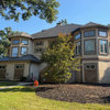
Im loking at possibly going with Nomadic Desert on our stucco (currently is very close to Kilm beige). A color consultant suggested pairing it with Pacer White for the trim (soffit, fascia, trim around windows and archway.

the shutters are close to Aurora Brown (in the red family).

Will the nomadic desert work with aurora brown? ive read that it ”fights” with some red so kind of worried about that …


Comments (17)

  • 3 years ago

    You might want to buy some poster paper and paint a few of them with the Nomadic Desert paint, and move them around the house on all sides. Nomadic Desert, can look a bit orange in some light.

  • 3 years ago

    Ive read that about nomadic desert. i had it in my home at one point (interior) as a ceiling color paired with herbal wash walls so wasnt an issue then.


    But I’m worried about the orange with the copper roof accent and the shutters.


    Are you familar with Antler Velvet? that was another choice by the SW color consultant

  • 3 years ago
    last modified: 3 years ago


    Stone and wood trim

  • 3 years ago

    Very interesting seeing them on your color wheel. Thanks for sharing!


    the Sherwin Williams site ”pairs” Antler Velvet with Pacer White. Pacer White is listed as having pink undertones which scares me a bit to be honest. The pacer white would just be used on the soffit, fascia and contrast around the windows so i don’t know if the pink undertones should be a concern?


    at the windows on the trim, it will be next to the Aurora Brown.


  • PRO
    3 years ago

    Undertones aren't facts. Paint manufacturers are paint experts, not necessarily color experts.


    Undertones are just someone's subjective opinion of what a color looks like to them under whatever light source there happens to be.


    If you were to ask Sherwin-Williams to explain WHY - specifically WHY - Pacer White has pink undertones, they wouldn't be able to give you an answer.


    Additionally, what someone is describing as pink would actually be peach because of Pacer White's orientation in color space - it's over near Yellow-Red (orange/peach) not Red (pink).


    Pacer White is just as likely to show up exterior as a creamy white with no discernible overtones.


    It's technically a Light Near Neutral. Because its Value is too dark to qualify as an off-white. Which is a good thing for exterior. Because colors of White and Off-White can show up too bright/brilliant in natural daylight.

    Anna Hill thanked Lori Sawaya
  • 3 years ago
    last modified: 3 years ago

    Very interesting explanation and that definitely makes sense. i used pacer white on some test areas both under our covered back patio and in the bright sun. it was so much brighter than i would have imagined by the paint chip - even under the patio. i didnt see any pinks but that ”fear” was there by what i read. Thanks again!

    Two color consultants that i used (one at SW and the other at BW) suggested 4 colors each. SW #1 option was antler velvet on the stucco, aurora brown (or similar color) on the shutters, divine white on the soffitt, fascia, eaves PLUS Dorian gray around the window trim and on the front french doors off of our study.

    I’m having trouble thinking abouy 4 colors and how it would look. Plus a bit worried about our HOA as they want the house to blend with nature. we have a rule that we can only have two dominant colors but no one has explained what makes a color ”dominant”

  • 3 years ago

    If you paid a color consultant, why don't you ask them?

  • 3 years ago
    last modified: 3 years ago

    The BM color consultant was paid and provided a mock up of three different color schemes. Two of the three i really disliked. The SW consultant was just their ”free” service service. they hust referred me to my HOA.

  • 3 years ago

    All I can see is the partial copper roof. Is it new and just hasn’t faded yet?

  • 3 years ago

    The copper roof, is all I see too. I really hope it will get a patina soon, to match in with the rest of the roof a bit better.

  • PRO
    3 years ago

    it was so much brighter than i would have imagined by the paint chip - even under the patio. i didnt see any pink


    Yep. Sounds about right.


    Usually...... dominant colors refer to body and trim. One color each. Meaning window trim can't be different from soffit and fascia; sometime gutters are included in the trim category. Downspouts can be trim color or match body.


    Only thing that's not in the dominant category is the main entry and it will have its own set of guidelines. Often times secondary entry doors are required to be the same color as the body. Door trim can be same as trim or body color.


    Again, usually. Your HOA may vary.

    Anna Hill thanked Lori Sawaya
  • 3 years ago
    last modified: 3 years ago

    The copper roof accent has been there since 2013 and not patina (very much like a new copper penny). We are replacing the roof in the next year (max two years) so I'm not too concerned right now since we will have options. The roof is going on 20 years and has seen its share of hail storms.

  • 3 years ago

    We are not planning on replacing the copper part just the shingles but hope we can get something that flows more with the copper and the rest of the house. i have not started looking at shingle colors so I dread that ….

  • 3 years ago

    @Lori Sawaya Thank you for that definition. The two dominant colors does look consistent for my neighborhood with the fascia and soffit always matching either the window trim color or the body of the house. The downspouts do vary from my drive around the neighborhood (either body of house or trim color).


    i have an email into one of the members of my HOA’s architectural committee to verify. We have lots of nature reserves in our subdivision so our houses are supposed to be secondary to nature and ”blend”. That doesn‘t always seems to be the case…. especually with some of the elements of my house.

  • 3 years ago

    If you are definitely keeping the copper, it will have to be your home base for choosing all other colors.

    Personally, I’d do away with it when you get a new roof. It doesn’t look like any other burnished, patina’d copper I’ve ever seen. Looks pinkish-salmonish.

  • 3 years ago
    last modified: 3 years ago

    It is very much a new copper penny look … not pink or salmonish. I’m sure it is not ”real” copper but the copper penny inset is a nice offset … just like to get a roof that flows better with it. We also have a back ”man-cave“ barn with a copper penny overhang that sits above two very large solid red cedar sliding barn doors.


    These are similar examples of copper penny accents.


    I’ve test painted the Antler Velvet with Divine White. Amazing how bright / white a technical non white or offwhite looks in the sun. Antler Velvet’s gray really comes through without being overly gray. Seems to be a nice warm color with the right amount of gray..