Software
Houzz Logo Print
randeeb1

Need Help Coordinating Colors

3 years ago
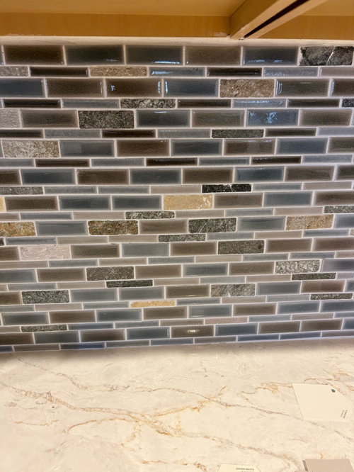
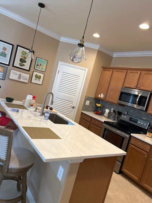
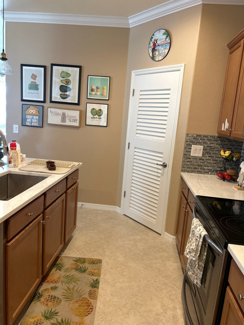
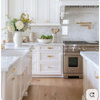
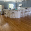
I am painting my kitchen cabinets Agreeable Gray. I have an open concept kitchen. I was thinking of painting the kitchen walls Sea Salt and the trim and pantry door Pure White or Alabaster? Do you think this will all go with the backsplash tile?

Comments (17)

  • 3 years ago

    Are the cabinets in good shape? If so, I wouldn't paint them. I'd get rid of the backsplash and put something else in that works with your countertops. Your floors, counters and backsplash are all competing with one another. Simplify the backsplash first.

  • 3 years ago

    The tiles were supposed to be random and I would have done them in alternating 4 blocks for interest.

  • 3 years ago
    last modified: 3 years ago

    agree w cpartist. change your backsplash. white tiles will be really flattering. The louvred door/ white ceiling trim/ white counters and the art on the wall say "this is fresh/ light and pleasant" ...you can keep the cabinet and wall color but the backsplash looks a little dreary as it is just dark. white tile will be quite the switch.....youd like the result for such small effort.

  • 3 years ago

    I just put in that tile. I loved it. Can I do a whiter cabinet such as alabaster or diver white to brighten it up?

  • 3 years ago

    Too bad you didn’t come here first. You pick a backsplash to go with the other elements in the kitchen…not the other way around. Now you have a dark, dated mosaic backsplash that meshes with nothing, not the quartz counters or the floors. Paint is not going to help.

    The wood cabinets are fine, and in style. The backsplash is not.

  • 3 years ago

    Oh Sorry but I have to agree with the others. The counters look great with the cabinets and your cabinets are a great colour and they both mesh with the floor. The backsplash is the outlier, but it doesn't go with anything and it's cheaper to replace it even though you love it. You might love that one element but you have now wound up with a kitchen that doesn;t flow colour-wise.

    So... you're going to paint the cabinets to match the tiles which is then probably going to throw off the counter which you will then want to replace and then what to do with the floors?


  • 3 years ago

    Since the OP just installed the tile and love(d?) it, rather than bashing that, wouldn't it be more constructive to give the OP advice on how best to make the dark backsplash work with his existing kitchen?


    Randee Bleiberg, painting the cabinets might be overkill. Wood finishes are back in style, so your best bet might be to paint the walls a lighter color and then re-assess. Sea Salt (I'm guessing we're talking the Sherwin Williams blue-green rather than the pale khaki Benjamin Moore shade of the same name, since you mention Agreeable Gray) is a soft beachy blue-green, but I don't see much of that beachy feel in what you already have, and it's hard to know if it would work in your open concept room without seeing pictures of the connecting space. I would think a warm off-white pulled from your countertop (the background, not the gold veining) would be a safer choice, since it would be neutral and brighten up the space enough that your dark backsplash and appliances would provide contrast but not overpower the "fresh/light and pleasant" vibe herbflavor mentions.


    Also, you didn't ask about the lighting over your island, but if you switched it out for something a bit larger (those pendants are really small, more the size I'd expect to see as task lighting over a sink than as a feature over an island) that had a dark-toned shade, that would help tie the tile in with the island. Something like this would help bridge the difference between the light island and the dark perimeter: https://www.houzz.com/products/luxury-cosmopolitian-pendant-native-brass-and-gray-uex2520-prvw-vr~186167895

  • 3 years ago
    last modified: 3 years ago

    put a runner down with grays and blacks in it..like a geometric pattern. maybe just wait if you like the splash mosaic ...there are small tweaks to pull grays/ darker things into a space...maybe dark pewter knobs. People are seeing more nice effect with the whites but anyway....maybe you like dark as a grounding contrasting tone....thats fair... I'd go look at runners/mats and new knobs ......certainly not paint for the cabinets.


    Printed Sea / Rust Skye Area Rug by Loloi II, Sea/Rust, 2'6"x7'6" · More Info


    Weave & Wander Pellaro Metallic Ikat Rug, Gray/Beige, 2'6"x8' Runner · More Info


    Safavieh Montauk Collection MTK821 Rug, Black, 2'3"x7' · More Info


    Belwith Hickory 1-3/8 In. Manchester Vibra Pewter Cabinet Knob P2011-VP Hardwar · More Info


    Emtek 86014 Providence 1-1/4 Inch Mushroom Cabinet Knob - Flat Black · More Info


    Belwith Hickory 1-1/4 In. Craftsman Black Iron Cabinet Knob P2170-BI Hardware · More Info


  • 3 years ago
    last modified: 3 years ago

    I'm going to say nay on the two choices, too pale for the tiles. Stepping back from the tile, not looking at each tile color, the impression is the back splash is blue. Painting cabinets is torture and I like the stain. How about painting the walls and leaving the cabs as is?


    This may be the blue for walls...you can give it a try and see if I chose the right one. It surely works with the counters.


    B.M. Phillipsburg Blue.


    As for the trim and the door, if you have the urge to paint , go more toward the tone of the granite. What is the color chip in the photo? It looks close to the counter.

    B.M. likes Mountain Peak White with Phillipsburg Blue.


  • 3 years ago

    yes, it seems that those colors will go. But I would do your walls and trim first before you do your cabinets. It will better help you decide on whether the agreeable gray works. It would be much more difficult to redo cabinets if you needed to.

    BTW you say you don't like monotone colors but nothing could be more monotone than light gray. Just saying. It seems to go, just doesn't really pop if that's what you want.

    I do like your tiles. Yes mosaics are dated but who cares. yours actually look a little bit different than the glassy mosaics that were common 10 years ago and I think what you have provides visual interest. The people that call your tiles dated probably have god knows what in their home that will be dated in a few years.

  • 3 years ago
    last modified: 3 years ago

    if there is a reason the cabinets are "horrible"... an explanation about that could have helped with narrowing the feedback. It is not apparent that the cabinets are horrible to a viewer....

  • 3 years ago

    Thank you Iluvdark kychns, I think I am going to go with Alabaster with black handles, change out the lamps with a larger black pendant, new stools and runner. After that is done I will work on painting the whole space in my open concept living/dining kitchen walls and trim.

  • 3 years ago

    Please disregard the two tile photos I posted. They were meant for my own post. 🙀

  • 3 years ago

    @Randee Bleiberg SW Alabaster is a nice light white with a hint of yellow-straw undertones. The yellow will compliment the blue tile and support the gold. Are you saying you will paint cabinets, walls, and trim all Alabaster? I rather like that clean simple approach. Ceiling?

  • 3 years ago

    No, Right now just doing cabinets until they are done. Walls, trim later. I got my sampilize samples today and I happen to like the Sohji white, which is a an LVR of 74. It picks up the beige and grey in the tiles as well as the brightness of the quartz. The Alabaster looked very yellow in the kitchen and very bright as it is an LVR of 83. I also tried Agreeable gray, way to dark.

  • 3 years ago

    @Randee Bleiberg I just meant if you plan to paint all white... SW Shoji White now... Will you use the same white? I was saying I like that look. But I also could see something like SW Pure White for ceiling and trim with the SW Shoji White cabinets and walls. I like cabinets and walls painted the same white to make the cabinets disappear, especially in an open kitchen.

    You might like to read up in the HOUZZ  discussions on whatever white you choose. Also Google the white you choose. There's a lot of discussion in both about undertones. I remember one post that said SW Shoji White had peach undertones, and another that it had green undertones in a room that had a lot of green outside. A couple discussions indicated SW Pure White would work well with Shoji White walls, because it also has warm undertones but is lighter than Shoji White. 

    SW Moderate White also has orange undertones, which would compliment your blue backsplash. I can say from experience that a white with orange undertones looks dirty in a north room, but that clears up in bright winter light or warm incandescent evening light. 

    Glad you got samples to view in YOUR kitchen in YOUR light. 

    Are you going to do the work yourself? Or will you have someone paint these cabinets for you?

  • PRO
    3 years ago

    No reason to spend 10K on having those cabinets professionally painted with a cabinet grade coating. They are the best part of the kitchen! Wood is back, so don't jump headlong into any gray fad that is over and done with. Modify what you have with a new backsplash and better lighting first.

Sponsored
J.Holderby - Renovations
Average rating: 5 out of 5 stars4 Reviews
Franklin County's Leading General Contractors - 2X Best of Houzz!