Software
Houzz Logo Print
webuser_59932511987

Soliciting opinions on backsplash

2 years ago
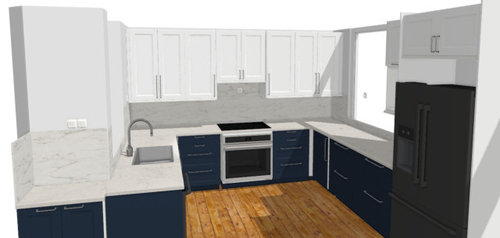
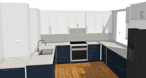
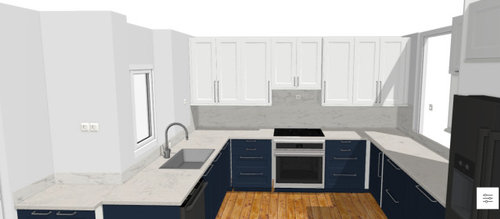
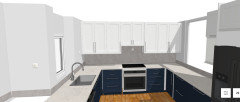
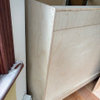
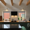
Which of these do you like?

1.

2.


3.


Comments (18)

  • 2 years ago

    2 or 3. I can't see the difference between them. Definitely not 1, unless there is a functional reason (crazy blender station maybe 😁)

    Matthew Lubow thanked Fori
  • 2 years ago

    Weed is ff

    Matthew Lubow thanked Julie Renaud
  • 2 years ago

    They all look the same to me in the pictures. It's easier for people to offer opinions if you post a picture of the materials - countertop and cabinets. It looks like you're planning on using the countertop material for the backsplash so as long as it looks good with the cabinets you're good to go.

    Matthew Lubow thanked kandrewspa
  • PRO
    2 years ago

    No way to tell. Too early probably. Wait til countertops are in and you have good lighting to be able to see real samples in your light with other elements.

    Matthew Lubow thanked Flo Mangan
  • 2 years ago

    First photo has a higher backsplash than the other two on the left side (which is around the corner from the sink to the left of the person standing there. )

    Matthew Lubow thanked RedRyder
  • PRO
    2 years ago

    They look the same to me and I gree not any way to help with the choice. IMO wall colr and backsplash are two of the last things you choose so wait and post pics of the kitchen when the counters go in.

    Matthew Lubow thanked Patricia Colwell Consulting
  • 2 years ago

    I would not do 1. I cannot see the difference between 2 and 3, but they both look good to me and are much more spacious feeling than 1.

    Matthew Lubow thanked Kendrah
  • 2 years ago

    #2 and #3 seem to have some difference in the area above the sink. Is there a window in #2 above the sink? If not, what is in that area? I like the low backsplash in #2 and #3 and I also like having a window above the sink -- so I guess my vote is for #3.

    Matthew Lubow thanked nester44
  • 2 years ago

    It would have been helpful for you to tell people what they are comparing. In this case I think you're comparing how to handle a slab backsplash around the unique area by the sink.


    I would choose #2 because it looks clean and purposeful. The slab backsplash is only on the one wall where it can go uninterrupted and provide a backsplash above the stove (where you need a backsplash most). The other walls then are mirroring one another by being just the low backsplash that can go under the window. My second choice would be #3 for similar reasons but I think the way the full height slab backsplash ends is a little wonky, especially on the side without the sink. At least in the rendering I dislike #1 because it looks very strange in the little pop out area. Now maybe it would look more purposeful if it's a coffee bar or something.

    Matthew Lubow thanked pricklypearcactus
  • 2 years ago
    last modified: 2 years ago

    I like #2 the best. Looks nice!

    I don’t like #1 at all. Way too much going on.

    I don’t like #3. The full height BS on range wall wraps around onto the two side walls and then drops down to the short splash. The left side stops under the upper cabinet and the right seems to go slightly further to stop at the opening (pass through?). That looks off to me. But, even if both sides stopped underneath the back cabinets, I still prefer #2.

    Eta… typo! #2

    Matthew Lubow thanked rebunky
  • 2 years ago

    The height on the left side, is that what the question is about?

    Matthew Lubow thanked Midwest (4b IA)
  • 2 years ago

    The backsplash cannot be correctly chosen from drawings…they should be chosen last…with real photos of the space…the right choice can be an upgrade…wrong one can devalue the whole space

    Matthew Lubow thanked btydrvn
  • 2 years ago

    3 makes the most sense to me of the three you show. I realize there are ranges with no backsplashes, but several do still have them. Can you confirm yours does not have one?

    If your range does have one, then at least take a minute and consider just having a 4" backsplash made of your counter material all around and be done with it. You are not using your backsplash as a design feature. You just chose a bit of off white. So why even bother to use such expensive "filler"?

    Matthew Lubow thanked kl23
  • 2 years ago

    #1 I would only like if consistent for entire room and if it had a narrow shelf in areas where there aren’t cabinets , and only on back walls no turning of corners .
    #2 and #3 not really cohesive IMO. Either make the back splash a feature at the stove only and use 6 inch backsplash elsewhere, or do a backsplash everywhere.

    Matthew Lubow thanked kodiac23
  • 2 years ago

    Thank you everyone. Someone had mentioned that i did not return to this thread. I am intently reading all opinions and value your help and input.

  • 2 years ago

    These discussions are meant to be interactive…with you….to address your needs likes…and hear what you think..

  • 2 years ago
    last modified: 2 years ago

    Sorry about the lack of response. I am getting to know the Houzz etiquette. I rarely do anything like this. Thank you all for the input. Based on your feedback I have decided on this version. We were thinking about the same gray and white quartz on the backsplash to keep it simple. For those of you that complain that you cannot see whats happening, click on the picture to enlarge it.