Software
Houzz Logo Print
webuser_918119203

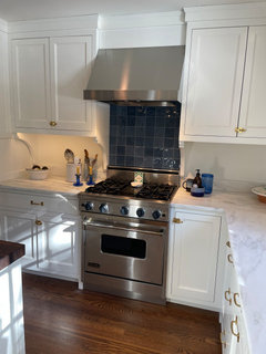
I hate my new backsplash!

2 years ago
last modified: 2 years ago
Okay, hate is a strong word.

Comments (65)

  • PRO
    2 years ago
    You did a GREAT job on your kitchen--it is stunning! I also love anything that Gil Schaefer does.

    I can't add any more to all the great ideas suggested, but just wanted to give you kudos on your selections.

    HU-918119203 thanked Diana Bier Interiors, LLC
  • 2 years ago
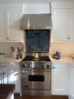
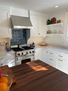
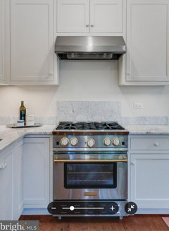
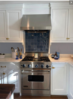
    Agree with everyone else….You kitchen is gorgeous and the tile behind the range is beautiful! Not too dark at all in my opinion. Although the blue color does look much darker in the photos behind the range then in the photos of the individual tiles. If you wouldn’t mind, can you please post a photo with the range hood lights on?

    One thing you might want to check on is the minimum height needed from your powerful Viking range’s burners to a combustible material above. The installation instructions should have a diagram. A wood shelf mounted somewhere under the hood might look cute, but it could be a fire hazard.

  • 2 years ago
    Piling on - I love the way it looks!

  • 2 years ago

    Yeah - turn on the light integrated with the hood and get used to leaving it on. It will make a huge difference.

  • PRO
    2 years ago

    I like the dark backsplash although seeing it in person might be a little different. If you wanted to replace it would you consider a metal or copper panel behind the range. Most of those that I've seen come with a bas relief that might be a bit much but, I'm sure, with some looking you might find one that would suit.

  • 2 years ago

    I really like your choices and the kitchen has come out beautifully! I like the suggestions here of adding in your accessories and color. PS: can I ask where you bought your cabinet hardware. I love it!

    HU-918119203 thanked NagyMama
  • 2 years ago

    That space directly above the hood: could you do something there with some sort of design? Maybe a stencil (don't all shudder at once lol), or some colorful small pictures or tiles to make the eye look up rather than directly at the dark tile? I think your kitchen is beautiful it just needs a little "pop" with suggestions others have made.

  • 2 years ago
    last modified: 2 years ago

    Thanks for the kind words, all! I will post a photo with the hood lights on and with some natural light (yesterday was dark and gloomy, today's sunny) for a better look.

    I like the idea of a shelf - maybe stainless a safer choice than wood?

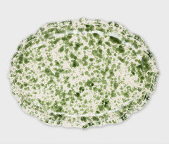
    I do agree that adding more blue throughout could help. I've been thinking about getting some blue Italian splatterware to put on the open shelves, for one thing.

    But I also am curious what folks would have done here setting aside this choice! I'm not *so* concerned about making it work, as this is basically the least expensive line item in the whole kitchen.

    Connecticut Yankeeeee Thanks! The hardware is from Merit Metal. It's to the trade and I purchased through my architect at a local hardware showroom (Canaan Distributors in Stamford, since you seem to be in CT too). Pretty reasonably priced, too.

  • 2 years ago
    last modified: 2 years ago

    I like it but it's not my kitchen. I would live with it for a while. I would caution you not to spend more than the tile is worth on blue accessories to try to make it work. Start with a few inexpensive blue items to see if that helps.

    PS, I'd love to see a wide view of the whole space. Your choices in your other pictures look fabulous.

  • 2 years ago

    @HU-918119203 - thank you! I wish I still had a home in Connecticut 😊. I’m in Texas, but can probably source that hardware through CT family trade. And I love your Danby! I have been eyeing it for years. I am in a rental home now with only a 4” backsplash. Surprisingly I like it and it hasn’t been a problem keeping it clean, despite the crappy paint. I will consider this when I finally buy a home. Your kitchen is gorgeous- well done to you 👏🏻

  • 2 years ago

    I agree with the OP, for me it is too dark and stands out too much even with similar accents. She does not seem too concerned about the cost of redoing it, so hope some pros on here can give her alternate ideas.

  • 2 years ago

    I'm a-thousand-percent smitten with your kitchen. Huge Gil Schaffer fan and he'd certainly give his seal of approval. I agree that it isn't quite right. Please don't ruin the look of a near perfect kitchen by cluttering it up with matching blue TJ Maxx doo-dads and cluttered counters.


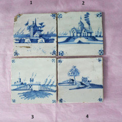
    Easy/lazy fix - Hang (velco command strips) a contrasting object - Four delft tiles, vintage serving plate, whatever to bring a bit of contrast. I'm seeing some green in your accessories, or try the round wood cutting board there. If that feels too decorative or cramped...


    A little less lazy - Remove the tile, smooth the wall, and either add an 8" piece of Danby or leave it totally untiled and just have the wall there. I did a 12" piece of counter top marble behind my last range and it was good. In our new house, I just left it totally blank, white wall color. It cleans up just as easy as tile, no mess ever. I think backsplashes are overrated.


    Please post pics of your entire kitchen so we can enjoy seeing the rest of it.


  • 2 years ago
    last modified: 2 years ago

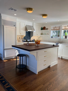
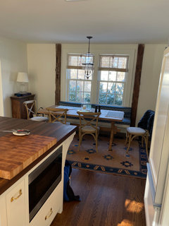
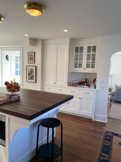
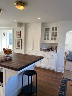
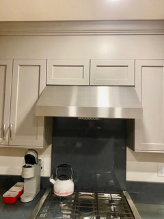
    Per request, some photos with hood lights on and from a wider angle, as well as the adjoining dining area that has blue in the rug and bench cushion. (Some clutter, please ignore.) I also put some random blue doodads on the counters to see if more blue has the desired effect.


    I like the idea of potentially doing a marble remnant back there, just unsure if that will be hard to install and maybe think it should go all the way up? And yes, there's some green in the kitchen and throughout the house.


  • 2 years ago
    last modified: 2 years ago

    Gorgeous space!

    It's crazy how different the backsplash looks in different light. And I suspect in person versus the photos. We have a labradorite island top that never photographs how it looks in person, no matter what time of day we take the photo.

    You have good taste. The bottom line is how the backsplash makes you feel when you walk into the kitchen. If you cringe, you know the answer.

    HU-918119203 thanked deegw
  • 2 years ago

    I love the backsplash and would leave it alone. I would NOT add any shelves, it looks great as is!

    HU-918119203 thanked Ann
  • 2 years ago

    These pics get better and better. Fantastic room.


    You did such a good job of coordinating everything else on the kitchen side of this room into a seamlessly calm sea of beautiful white cabinets and marble that the blue tile feels like the odd guy out. Yes the blue matches the seating of the room but kind of sticks out like a sore thumb where it is. Live with it for a while and if you still don't like it, do a half marble splash behind the range. Mine was super easy to put up, the counter dudes installed it the same way they did the short splash.


    HU-918119203 thanked Kendrah
  • 2 years ago

    I like the backsplash, and if you light it I think you'll like it better as mentioned above. Honestly, if I were standing in your kitchen I think I'd hardly notice it because I'd be swooning over your island countertop. Gorgeous!

  • PRO
    2 years ago

    If you spend about $20 at the Salvation Army or Goodwill, on "blue stuff", you can donate it back if you don't think it works. I think your range hood needs better bulbs. And that's about it as far as change.

  • PRO
    2 years ago

    I love the warmth of the wood floor and counter top. Love the nicely sized island with only seating for only two. Also love that you didn't open up the kitchen to the adjoining living/family room.

    Your kitchen should be required viewing to anyone here who thinks that a humungous kitchen outfitted in a sea of gray, with continent-sized islands with seating that looks like a diner, and open to all the adjacent rooms is a good look. (There's probably a better way of saying that.)

    HU-918119203 thanked Diana Bier Interiors, LLC
  • 2 years ago
    last modified: 2 years ago

    "Your kitchen is a must-see for those who believe a vast, gray-themed culinary space with continent-sized islands and diner-style seating, open to adjoining rooms, is a stylish choice." - ChatGPT

  • 2 years ago

    The only question that matters is if you want to try to make it work and get used to it - or banish it? Many of us are a little freaked out/upset/downright miserable with new changes. And three months later, we are in love. That MAY be what’s going on.

    I thought the addition of blue “stuff” helped. What about putting blue on the open shelves? Blue curtains on the windows? I would look for a blue and white runner (one you can easily return) to see if those additions make the blue work. If they don’t then you can always bite the bullet and take it down. But it’s different - and it’s pretty.

  • 2 years ago
    last modified: 2 years ago

    You could try upping the temp of those bulbs. they're rather diim. maybe a 3500K bulb?

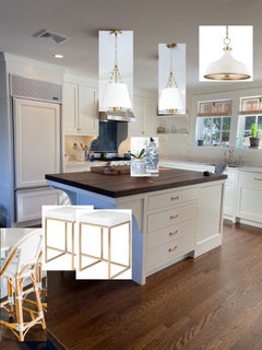
    can't imagine what those lights are for over the island. are they on a dimmer?


    I think some pendants would look better, and be more useful

    lighter stools too.


    don't know if you saw my earlier comment re the le creuset cannisters.


    Love everything else. you have a beautiful kitchen. the cabinets are stunning. were they custom made?

  • 2 years ago

    It’s even more beautiful than I thought it was! I love it all! You made amazing choices! 💙🤍💙

  • 2 years ago

    Color temperature of bulbs has nothing to do with dimness. That would be lumens.

  • 2 years ago

    Jan suggested painting the backsplash above the stone.


  • 2 years ago

    Painting the backsplash above the stone seems like a crime, or at least a misdemeanor offense.

  • 2 years ago
    last modified: 2 years ago

    Wow! what a gorgeous home you have. Seeing the same grey blue in the rug and bench cushion makes it all look cohesive to me.

    I would live with it for a while and if the the darkness bothers you, like you said, it is not a huge expense down the drain.

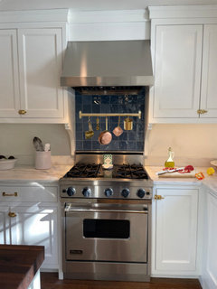
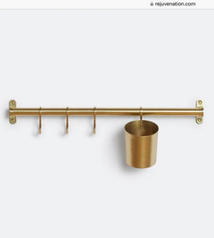
    What about hanging one of those brass rails with the hooks to hang stuff? Maybe it would break up the square of darkness? I tried to mock it up, but the scale might be off.


    This is from Rejuvenation. The brass seems a pretty good match to your cabinet hardware.


  • PRO
    2 years ago
    last modified: 2 years ago

    Personally, I think if you hate a thing, you change that thing

    A slab of matching Danby is the answer.

    A dollop of blue in a very few impact items on the counter and done, because as you now realize? A bit of a strong color in a white kitchen has a LOT of wow impact!: ) The less you use, the more you see that color.

    You don't need a permission slip to use your own great taste- no hand wringing necessary. The crowd matters not.

  • 2 years ago

    I love your kitchen. You have great taste! I do think the tile, while beautiful, is too much contrast. My suggestion would be to replace it with the Danby marble. Bring the blue into your kitchen by repeating the bench cushion fabric in roman shades over the sink and find a great blue fruit bowl for the island. I would not replace your pretty lights with pendants. I have the same fabric in my living room pillows, and love it by the way!

  • 2 years ago

    I love your kitchen!!! The blue range backsplash is a nice contrast to you light kitchen. I would not change it. I have a dark range backsplash, it is the same Silestone charcoal soapstone quartz as my countertop.

  • PRO
    2 years ago

    I always love seeing photos of your beautiful kitchen, kculbers!

  • 2 years ago
    last modified: 2 years ago

    Thanks all! Going to explore the Danby option further. To answer a few questions - the light temperature throughout the house is 2700-2850K. I know this is a point of contention for some people, but anything higher and it starts to feel like an airplane hanger or grocery store to me. I also find it washes out the white paint on the cabinets and walls. Again, totally subjective. The lights over the island are dimmed quite a bit (I also don't like bright light) but they are the type of LED bulb that yellows as you dim, supposedly to mimic a traditional incandescent bulb. Not sure if I like that or not, but I think that may be why it appears particularly yellow (in addition to my phone camera struggling to reconcile the contrast with the bright natural light streaming in). I didn't do pendants over the island because I wanted a hanging fixture over the table and felt that would be too much hanging from the ceiling in a quite small space (I think it looks larger in photos than in reality). I'm happy with that choice, particularly since I have relatively low ceilings in this antique c.1870 house. I will get new stools eventually, just not a priority at the moment. The window treatments are new and quite expensive chik blinds from India, so those stay.

  • PRO
    2 years ago

    I totally agree with you about the temp of the lighting. I don't care for bright white light either, and prefer incandescent and halogen lighting with their yellow-ish tinge. It's much warmer and gives off a cozier vibe.

    Just a question--where did you get the chik blinds? And how do you raise and lower them?

    HU-918119203 thanked Diana Bier Interiors, LLC
  • 2 years ago
    last modified: 2 years ago

    I don’t think the dark blue behind the stove relates to anything, and is quite jarring in this gorgeous kitchen. It’s what my eyes went straight to and distracts from the rest of the room. I also don’t think keeping a light on all the time, getting blue clutter to coordinate, etc, is worth trying to force something you really don’t like.

    I’d change it. I think in the long run you’ll be glad you did.

    Your house is so beautiful, you have a great eye … and I think you know it’s not going to grow on you.

    And I agree with you, Diana, Jan, etc about bulbs. If my choices need brighter and/or harsh (to me) lighting to look good, then I made the wrong choices. ;)

  • PRO
    2 years ago
    last modified: 2 years ago

    "I know this is a point of contention for some people, but anything higher and it starts to feel like an airplane hanger or grocery store to me"

    Not for me it isn't- I GET it. !!

    You are "talking" to a woman who has hoarded GE 60 Watt pink light bulbs...............: ).

  • 2 years ago

    Diana Bier Interiors, LLC I actually got them on Etsy, through a very well-reviewed seller based in India called BlindsAndFurniture. At the time I was looking, I could only find them there or through shops in the UK. They're frequently used by Rita Konig and other UK-based decorators (which is where I saw them), but don't seem to be widely available stateside yet. As their popularity increases, maybe that'll change. Regular bamboo blinds would be a good alternative that are available through conventional US retailers.


    They're easy to lower and raise; getting them to hook took a few seconds of fiddling around but not more than that. I haven't decided on a solution for the strings yet (will probably buy an unlacquered brass cleat for them at some point), so for now I just conceal the excess string in the rolled up blind itself. I don't raise/lower them often so this solution works for now. Obviously, the look is casual/bohemian, so imperfection is okay!

  • 2 years ago

    After a few more looks, I still like the blue tile. I think it relates well to the dark island top, the blue in your adjacent rug, and the other fabrics that you showed us.

    I suggest living with it a while. If it still doesn't appeal to you after a few months, sure, change it. The rest of the kitchen is so neutral that a figured/patterned tile should work, if you decide on white but don't want plain white. Just not too ornate, keeping cleaning it and the overall aesthetic of the house/kitchen in mind.

  • 2 years ago

    I hadn't noticed the first time around that you have the Gil and Rita blinds too!


    Super smart move on no pendents over the island.


    If you ever feel so inclined, I'd love to see what your living room looks like... Instead of stealing ideas from Gil, I might need to just start taking them from you!

    HU-918119203 thanked Kendrah
  • PRO
    2 years ago

    Thanks for the info on the blinds. I did a google search and most all of them are on Etsy. I wonder why the big US manufacturers haven't yet caught on? They are really attractive, although I wonder what they would look like if they had liners?

    HU-918119203 thanked Diana Bier Interiors, LLC
  • 2 years ago
    last modified: 2 years ago

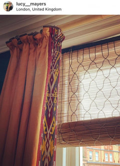
    I love those blinds — have this pic in one of my saved IG folders:


    More pics just for fun:

    https://www.houseandgarden.co.uk/gallery/lucy-mayers-london-flat


    Thanks for sharing the Etsy link.

    I really admire your style!

  • 2 years ago

    Love your kitchen - the counters, blinds, cabinets - and I agree with you on the blue tile (and my backsplash is navy). I think marble behind your range is the right move.

  • 2 years ago
    last modified: 2 years ago

    I think your kitchen is beautiful. But, if you continue to dislike it, remove it. I realize the cost, but after spending so much to remodel a kitchen, YOU have to love it. Believe it or not, you'll forget the cost over the long haul. I wouldn't buy a lot of stuff or change lighting to enhance its look. It has to stand on its own as it is a statement piece of the kitchen.

  • 2 years ago
    last modified: 2 years ago

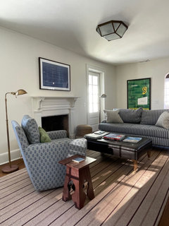
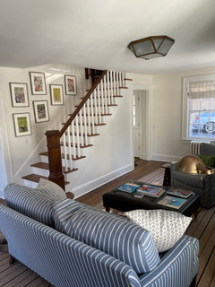
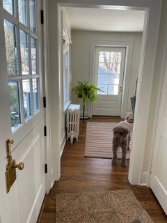
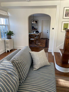
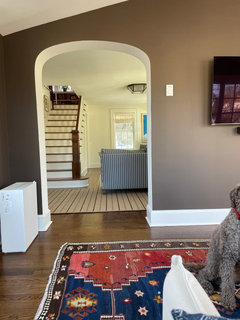
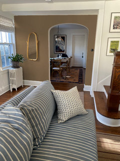
    Hi all, got some sweet comments asking for photos of the living room/rest of house. This is nowhere near as done as the kitchen, and needing a good cleaning, but ask and ye shall receive.


  • 2 years ago

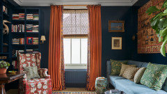
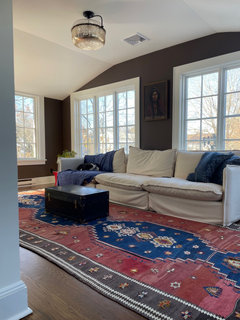
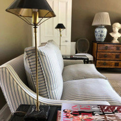
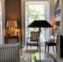
    And a few of the TV room - needs everything except a couch and a rug, but I’m proud of the dark brown color selection particularly since the painters looked at me like a lunatic when I spec’d it and later told me they loved it.

  • 2 years ago
    last modified: 2 years ago

    Such a beautiful home, and I love love love the brown walls. Swoon!

    You have a great eye!

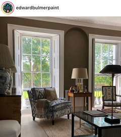
    Your rooms brought to mind this one I saved a while back — they even have a striped sofa. :)


    (Designer: Robert Moore)

    HU-918119203 thanked Jilly
  • 2 years ago

    Thanks Diana! That is also my favorite era - classic but whimsical.

    You’re pretty on target - it’s an 1800s era barn that was converted to a house around 1900. The exposed wood around the kitchen banquette are structural posts (complete with live edges and wooden nails) and there are original barn doors hidden behind the walls and barn siding underneath the shingles outside. Thanks to the barn framing, there was no need to add structural beams when removing the wall between the dining room and kitchen. But unless you knew it was a barn, you’d just think it was a typical turn-of-the-century cottage

  • PRO
    2 years ago

    Wow, you're right, who'da thunk it???!!! What a gem!

  • 2 years ago

    Yep, my painter hated my selections but luckily I realized right away he had no taste. Maybe a little more of that great brown?


  • 2 years ago

    Thanks Paul, definitely an option. In fact, the brown stripe in the carpet inspired the color. I went with FB Pointing on all paint surfaces and cabinets throughout the first floor to make it feel a little larger and more open, which it has (LR is 10’ wide!). Going to continue decorating and see how I like it once there is an abundance of color and textures (may paint the mantle as part of that) but could definitely see a color on the walls or wallpaper in here too.

Sponsored