Software
Houzz Logo Print
af81ad12

what would you do? (backsplash edition)

2 years ago

We are in the homestretch of our kitchen remodel and stuck on what to do for a backsplash. If anyone has suggestions or maybe inspiration pictures of your similar kitchen, I’d be so appreciative!

Cabinets- Kraftmaid warm white (perimeter) and cherry molasses (island)
Counters- MSI Calacatta Izaro (off white base and veining is warm brown, taupe, gray)

Option 1- a creamy white tile, possibly in a herringbone pattern

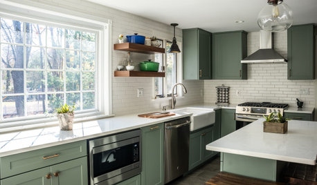
Option 2- a contrasting color tile, possibly an earthy green

I’ve posted a few pictures of the different tiles and a few different angles of the kitchen.

Comments (17)

  • PRO
    2 years ago
    last modified: 2 years ago

    A back splash is relatively permanent. I'd vote for the soft white, with the palest warm toned grout - if you wanted green? The time to think about that has passed could have been considered as island finish: )

    What is that golden strip in the crown perimeter?? I'd lose that , paint it out.

    Are you testing pendants? Both look a bit too small?

  • 2 years ago

    Thanks. Crown hasn’t been painted yet- it will be painted to match cabinets.

    Yes- our electrician cut out and hung a couple cardboard pendant sizes for us. There will be 3 on the 126” island.

  • 2 years ago

    I really like the tile on the left. Please come back and post pictures when done. Looks like it is going to be a gorgeous kitchen when complete

  • 2 years ago

    Thank you, Kay p.
    Yes, I should have mentioned that it was the left side of that sample board. We are not considering the x pattern.

  • PRO
    2 years ago
    last modified: 2 years ago

    Sweet spot for me is 15" but much depends the look: ) and whether very open or closed

    and shaded forcing light to the counter top always beats dispersing and cleaning glass....


  • 2 years ago

    Thanks, Jan. We are thinking something in the 13-15” range.
    The two cardboard cutouts are 12” and 14”. They spin a bit, so in the picture they might look much narrower.

  • 2 years ago

    I like the green. It seems to pair nicely with all of your fixed elements and is a welcome shot of color. I don't know if it's exactly the right color green, though - hard to tell on my monitor. I'd continue down the green path, bring home more samples and see which works best.


    I disagree with Jan -- it's not necessary that your island be green to use a green backsplash. Your floor is brown as is your island, and green and brown always go together -- look out the window and that becomes obvious.

  • 2 years ago

    Thank you, mxk3. I agree that this exact green isn’t the perfect one. I’m going to a tile store today to look some more.

    This is a kitchen I like. Yes, I know our island is darker than this one. But overall, I like the green accent next to the warm white cabinets.

  • PRO
    2 years ago
    last modified: 2 years ago

    The only way to know what rings your bell? buy a box of a couple favorites.

    Do a sample board each. stand them up on the counter.

    Yes, green and browns go together........and they will go together quite permanently here. Nothing wrong with that, echo the color in stools. The point? It's SORT of forever, as the rip and replace isn't a ton of fun. Lots of places to add green in a kitchen and stools are one, as are rugs, kitchen towels, even a pendant.....and the first just below? gorgeous and 15" : )


    Mossy and 18"


  • 2 years ago

    I like the idea of a green tile also. Or you could head in the blue direction. Bring home a lot of tiles if possible. Sometimes ones you think won't work actually work really well when you see them in your space.

  • PRO
    2 years ago
    last modified: 2 years ago

    You will get as many suggestions as readers.

    I dislike painting a client into a corner when the new lifespan of a kitchen is not ever as long as we think or hope and visuals now travel at speed of light.. Is there green or blue in the counter top? No.....There is pale beige, there is soft gray. Yes they are both neutral and very accepting of color in OTHER spots in your kitchen, and any and all of them are less arduous a future change, and just as visually interesting as a backsplash.

    Bear in mind, I adore green , also know it's the new darling after more than a decade of indigo, where it took a back seat in every iteration you can think of.. When money isn't an object? When the if come matters not one iota? I don't mind the whole hog a bit: ) and yes to green lol


    Wrapped views · More Info


    Wrapped views · More Info


  • 2 years ago

    I adore green, think it would look fantastic with your white cabinets and island, but, I would not use a green splash in here. Your island, while beautiful, is giving your room a very long and narrow effect. A band of colored tile is only going to reinforce and echo the long and narrow effect of the island. I think you nailed it with the tiles on the left (next to the diamond pattern). They will make your cabinets and whole room feel so much more unified than a disrupting green splash would. Then I'd splurge on two large fantastic green pendents to go over your island to serve as a real focal point.


    Or- get the pendents in your inspiration photo and some really beautiful green accessories like green stools and large green canisters or fruit plate for the middle of the island.


    Don't know your taste in lighting - here are just two examples that would make an impact in your space. Check out the galleries at Urban Electric for some incredible inspiration. https://www.urbanelectric.com/hanging/


    This can be created in custom colors - Urban Electric


  • 2 years ago

    Another vote for the iridescent white tiles. Keep the “permanent” items in the neutral zone. Green pendants, stools, towels and apples in a wooden bowl are going to look great. But the left side tile is the winner here.

    Your kitchen is great so far!

  • 2 years ago

    I too like the white tile.
    Your kitchen is gorgeous and will be even prettier soon!! Love it!! 🤎🤍🤎🤍

  • PRO
    2 years ago

    I would go with the same as countertops.

  • 2 years ago

    Check out glass tiles - larger and medium size subway tiles are available or herringbone pattern them. Glass tiles (offered everywhere) allow a more translucent color without being a strong pop of color - if you are looking for something more subtle. All white kitchen is obviously a different preference. I think bringing in at least some texture is necessary, if not some color. If you don't want a strong pop - glass tiles add texture interest with subtle or vibrant color.


    Post photos of the final result!


  • 2 years ago

    I think the tile on the left will read very 2024 and date quickly. If you love green (not because its trending) go with green. Hard to tell in the photos but I I think a slightly more olive tone or a tad lighter might go better, but that’s just the photos. Love everything you’ve picked so far!