Software
Houzz Logo Print
sanigruber

Wall Paint Colors - transitioning from Tuscan

last year
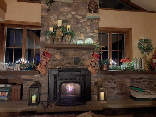
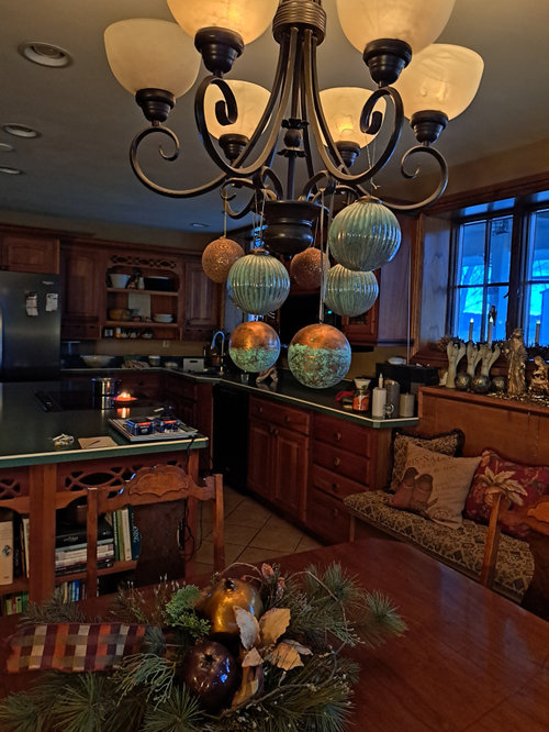
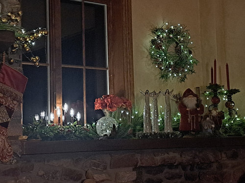
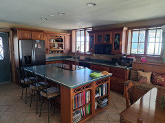
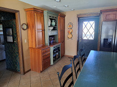
I have not painted my living room for 30 years!! Back in the 90s and early 2000's I decorated with the Tuscan style as I loved the warm earthy colors. My living room is currently the faux golden color which I like as it looks like candlelight at night. I know the Tuscan decorating look is now dated and I am ready for a cleaner fresher look. I have a huge rock fireplace and carmel color carpeting. Attached is a photo of the fireplace I just took at Christmas. The living room, dining room and kitchen are all open up to each other. The kitchen and dining area are painted a dark tan color and a tile floor. One obstacle I have is also the kitchen counter and island counter tops are a teal color with black flecks in it. I am looking for ideas to paint the walls to bring more up to date.


Comments (18)

  • PRO
    last year

    Didn't you post this same request a while back showing more pictures of the kitchen with an eating area? I seem to remember you had received lots of suggestions...

    Sandy G thanked lisedv
  • last year

    Please post some daylight photos with all the lights on.


    Are you planning to keep the teal countertops?


    Here is a lighter paint color.(in your ideabooks) that would coordinate well with your beautiful wood cabinets.


    New Country French Cottage · More Info

    Sandy G thanked apple_pie_order
  • PRO
    last year

    Yes please pics in daylight . Waht else non Tuscan are you planning since I see a ton of Tuscan elelments

    Sandy G thanked Patricia Colwell Consulting
  • last year

    White is the cleanest, freshest color. We went with Swiss Coffee in our cabin, which is a warm off-white. Looks great with the wood. Kelly Moore Swiss Coffee. Other paint stores will have to match the color formula since KM is no more. Benjamin Moore has a nice Swiss Coffee tho I haven't used it.

    Sandy G thanked tracefloyd
  • last year

    BM White Dove would be a nice option to lighten things up.

    although the decorations fill the home, I would start with a good edit and see what must stay and work off those colors. The countertop will always be a focal point with such a strong color.

    This tuscan room is painted BM Dove White


    Sandy G thanked Lyn Nielson
  • PRO
    last year

    I love Swiss coffee but it seems light with other fixed elements? I would also look at Benjamin Moore Navajo white (not the Sherwin Williams version which is the color of butter). I would also replace the light over the table- that screams 90s Tuscan. Looking forward to more pictures, looks like a pretty space that just needs some tweaks.

    Sandy G thanked HALLETT & Co.
  • last year

    Thanks everyone for the great suggestions. I'll answer your questions and am adding new pictures of the rooms (with Christmas decorations now down and better light during the day).

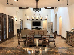
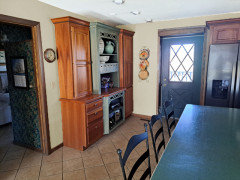
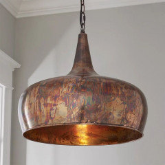
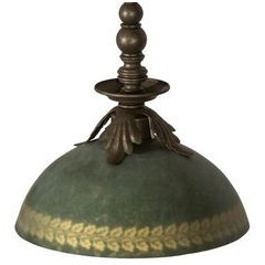
    To lisevd: I have not posted this before. To apple_pie_order: I love the look of the picture you have attached and like that paint color. Unfortunately, the teal countertop has to stay. There is nothing wrong with it and my husband doesn't want to rip out a countertop that is not damaged. To Hallett & Co.: yes, I want to replace the light fixture above the table. I am thinking of a pendant light maybe copper (?). Patricia Colwell: Anything I can change to make it look less Tuscan is what I want to do. The stained glass windows in the kitchen cabinets are grapes and leaves which I am going to change. I really went all out on the Tuscan idea but really need a change and upgrade. Thank you all for the paint suggestions. I am thinking that a warm creamy white is what will freshen it up.


  • last year

    Before you do anything drastic, you might want to read the article appearing currently on Houzz called "34 new design trends..." A lot of the old warm, woody, and colorful stuff may be coming back!

    Sandy G thanked Nancy R z5 Chicagoland
  • PRO
    last year

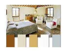
    Maybe go with this palette to still work with all the elements you have but just a lift from all the dark


    Sandy G thanked Patricia Colwell Consulting
  • PRO
    last year

    Some visual to go with


    Sandy G thanked Celery. Visualization, Rendering images
  • PRO
    Sandy G thanked Celery. Visualization, Rendering images
  • last year

    What a beautiful home, I really like the warmth it has. I would take the time as others mention to make sample boards to consider. Looks like the painting will be a big undertaking since it looks like it goes upstairs too on that living room wall. I would consider doing both ceilings and walls in the same color if it transitions to a lighter shade.

    I like the colors in the kitchen. Consider updating cabinet hardware to black knobs and reupholster the counter stools to a solid color that compliments the countertops. Look forward to seeing your updates!

    Sandy G thanked bearbev
  • PRO
    last year
    last modified: last year

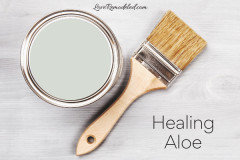
    I think the new pics ar so much better for showing the home. IMO the lighting is the first thing I would tackle those old style 6" pot lights in the kitchen are never good . Not sure what you are using for bulbs but IMO LED 3500K is what the bulbs should be and I aslo think thta same lighting everywhere before choosing wall color. dark spaces with lots of wood and stone need good lighting . I love 4000K but not in your space . Love the dog bed what a great way to handle one of those niches.. I have a MCM ranch and a huge stone FP that I LOVE so do not do much to the FP If you plan to do all the paint one color ( my choice ) then I would probably do something like this cut 25% it is a BM color and my clients who have it love it it seesm to work with almost every color and wood . BTW design trends are IMO something that requires change constantly and a nice throw pillow in the color of the year is as far as I ever follow trends in decor.. Do what you love then your home will always reflect you not some person who has not found thier happy place . I love my home as it is and it is me and that is what I try to give my clients a home their guests walk into and say this is "so you" Tuscan is not my style but I like your home if it is what you love .


    Sandy G thanked Patricia Colwell Consulting
  • last year
    last modified: last year

    Beautiful cabinets with lovely fretwork. If you remove all the wall decor items as if you were going to paint tomorrow, you will be able to see how the kitchen will look when de-Tuscanized. The pottery in the green cabinet could be displayed more prominently for a week or month (add fresh fruit or flowers) while you consider new paint colors.

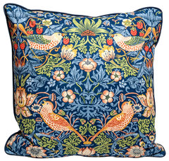
    Do you like William Morris prints? Williams Sonoma has a big selection now, including large dinner napkins. Napkins could be used as pillow covers and seat cushion covers.

    https://www.williams-sonoma.com/shop/tabletop-glassware-bar/tabletop-dinnerware-sets/napkins+tablecloths+williams-sonoma-morris-and-co/producttype-m-product-type-ff0007192028fe20-2/?isx=0.0.0


    William Morris "Strawberry Thief" pillow cover, designer pillow cover, 20"x20" · More Info


    Sandy G thanked apple_pie_order
  • last year

    Consider exploring lighter taupe paint colors. It may look excellent with your stonework and tile floors. Although it looks like your carpet has gold which may clash. I would look for upolstered furniture with cleaner simple lines in lighter colors like off white and cream.

    Sandy G thanked craftlr
  • last year
    last modified: last year

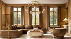
    Actually I love what you have. It went around in the last 30 years, and it is coming back. Wish I could find the cover of a pretty recent RH catalog I had sitting around here ….. all the warmer saturated tans and golds, like what you have.

    i would look at fresher curtains, less things on that giant mantel, less of the fuzzy furs. But you have a gorgeous architectural structure.

    Here is something fresh and new:


    Sandy G thanked Mrs. S
  • last year

    Thanks again everyone for the wonderful suggestions and inspiration! This is so exciting! I have bought 4 different pints of paint from BM based on your suggestions and will make the sample boards.


    To respond to some of your comments and also a few questions:

    Mrs. S, I love the picture you sent and it does give me pause with the current color I have as I do like it and the warmth it gives off to the room. The fuzzy covers on furniture are dog covers to protect the furniture. For guests I always take them off. I have two sets of drapes; the current ones are my winter ones as I live in a cold climate. But I like the color of the ones in your photo. My summer curtains are a lighter fabric and ivory color.


    Apple_Pie_Order, the William Morris prints are lovely. Would a napkin be thick enough to use a seat cover? Also concerned if the print would conflict with the bench covering (next to dining room table).


    Patricia Colwell, I do like my stone fireplace and do not plan to do anything to that. When you say 25% of the Healing Aloe color, do you mean to mix it with 75% white? This color is one of the pints I have for the sample boards. Also, do you know the paint colors in the palette you sent?


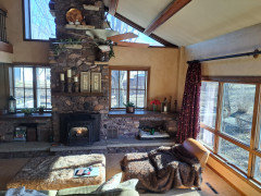
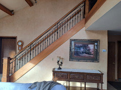
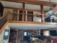
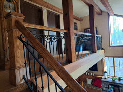
    Jackowskib, this will be a large undertaking as you talked about the color continuing up into the upstairs hallway. I have attached a picture of the wall that is opposite the fireplace and the hallway on the balcony upstairs. I like the idea of changing the hardware on the cabinets to a black iron.


    Nancy R., I read the article on '34 new design trends' and will take the information to heart.


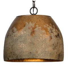
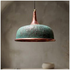
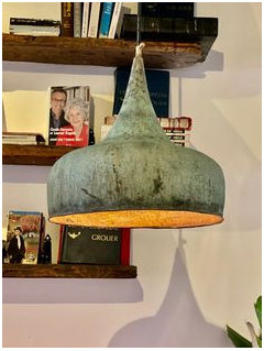
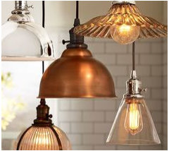
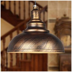
    I am also attaching a few pictures of pendants that I am looking at to replace the light fixture above the table. Any opinions are very appreciate as all of your suggestions are and so very helpful. Thank you!!