Software
Houzz Logo Print
mxk3

SW Neutral Ground

Anyone have SW Neutral Ground in their home? Would you share pics please? (Yes I can g**e search but would like to see some photos from real people, not photoshopped perfectly staged contrived photos.)


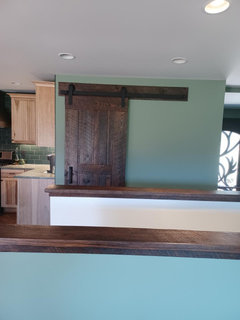
Reason I'm asking is because I'd like to lighten the walls in my (large) kitchen eating area and hallway. Right now it's BM High Park, which I *HATE* -- it's a very greyed green and utterly depressing, it drags down my mood. I've lived with it for a few years now and getting to the point I can talk DH into having it painted (he loves it as-is...but he's not home much and I'm the one who has to look at it way more...).


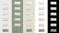
I don't want to do another green. I have BM Moonlight White in other areas of the house and love it, it's a beautiful subtly creamy white with the slightest hint of silvery-green undertone, which pairs nicely with all the wood in my house. It it gorgeous in my home office and hallways. I could default to this color, but the problem is in the kitchen area it reads as white-white, not an ivory or off-white, and I think it that might not look great in there. So I'm wondering if the SW Neutral Ground might be a good option. I have a Samplize swatch of it and doing comparisons with other swatches and what I've got going on the house, I think it might work. Hoping to see some real-life pics before I decide to trudge off to the paint store and get a sample pot to try.


My home color palette is green, brown, and white -- think pinecone-laden pine branches on a snowy day and there you have it. I accent with other colors here and there, but it's mainly shades of those three colors.


(BTW - the next color down from BM Moonlight White on the color strip is Old Prairie, which I've sampled before and it is BUTT UGLY on my walls. So going darker on that strip won't work.)

Comments (16)

  • PRO
    last year

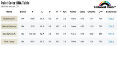
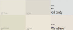
    Natural Elements or Rock Candy are more closely related to Moonlight White than Neutral Ground. In other words, they harmonize better. Factually.


    Would be good to get chips to compare to Neutral Ground and see how they actually show up.


    porkchop_z5b_MI thanked Lori Sawaya
  • last year

    "Natural Elements or Rock Candy are more closely related to Moonlight White than Neutral Ground. In other words, they harmonize better."


    I've not heard of those two colors -- I'll check them out. Thanks!

  • last year

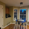
    I have SW Neutral Ground in my kitchen & 4 seasons room. This is a beautiful color. Have had so many compliments. The picture is dark because taken at night.


    porkchop_z5b_MI thanked milney_51031
  • last year

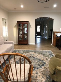
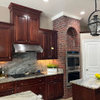
    Here's a couple photos of our update using Neutral Ground walls, and Snowbound for ceiling and trim.


    porkchop_z5b_MI thanked bearbev
  • PRO
    last year

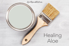
    IMO not neutral at all with those yellow and khaki undertones I do not find greens depressing and for sure not as depressing as beige so I need to see the actual sample sof the other walls in the home . I am sorry but seeing in someone elses home is never helpful , go get some poster boards and samples of 2 colors you might like paint each with two coats then move them into the spaces you want ot paint and see how they look at different times of the day. FYI this is one of my faves for a real neutral and not depressing at all it is a BM color and I often cut it up to 50% for just a hint of color and with pure white trim is is awesome .


    porkchop_z5b_MI thanked Patricia Colwell Consulting
  • PRO
    last year

    Funny I have put it on maybe 20 homes most where a builder wants a wall color long before clients are ready. Out of all those homes almost all have still kept the color. Sometimes the muddy look is rom your lighting if you have all yellow hued incandecset light every color will look bad IMO I do how ever never use HA full strength I cut it 25-50% often .

    porkchop_z5b_MI thanked Patricia Colwell Consulting
  • last year

    "Sometimes the muddy look is rom your lighting..."


    It pulled a lot of grey on my walls. Very drab and depressing. I am one of those who can see the smallest nuances in color and am sensitive to greyness, but I recognize not everyone is like this, and of course color looks different in different homes. I did test at 100%, didn't cut it.

  • last year

    There are quite a few things that we need to consider to help you get the right color in your space that will relate well to the Moonlight White but there are a few things that make me wonder what exactly is causing the same color/hue family to work in one room and not the next.


    I know the pat answer is lighting/direction of light, and that does have something to do with it, but we mentally compensate for changes in lighting subconsciously (You don't change the color of your makeup when you walk outside and back in to your home - the same colors still work with your skin tone. You may soften the colors for daytime vs nighttime wear, but if you look good in orangy/peachy tones you wont look good with purple / pink rose colors - time of day or lighting doesn't change the tone of your skin or what works together.


    The first two questions I have are:

    1. Do you have the same fixed colors in this space as the other spaces (Is the flooring the same, are the cabinets in the kitchen similar wood tones to the wood furnishings in the other rooms? Do the colors of the backsplash and counter repeat in other areas of your home?

    2. Are you testing the new colors against the High Park walls?


    We always see colors in combination with the surrounding elements.


    Based solely on one room getting more light than the next and washing the Moonlight White out I would probably start with a sample of November Rain.


    One puzzling piece of this picture is how High Park is turning gray and depressing in this space. It is dark, but I wouldn't think of this as a really gray green. It isn't electric green, but as far as interior color, it has a decent amount of color.

    porkchop_z5b_MI thanked Jennifer Hogan
  • last year

    Jennifer -- to your questions:

    #1: Yes, same colors in all the rooms I've updated; flooring is the same hardwood throughout most of the house, too.


    #2: I haven't actually tested any colors on the wall, just looking through a pile of Samplize I have and doing some comparisons that way.


    The problem with the Moonlight White in the kitchen/foyer area is it is reading as white-white, not creamy white; probably has to do with the exposure and large expanses of wall. The color will actually work tonally, but my fear is it will fall flat and be drab because it simply reads as white.


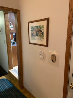
    To show you what I mean, here is a pic of Moonlight White going down the stairs; see how white it looks?


    It actually looks good against the wood IMO, but I'm really uncertain about a couple of large walls painted this light (one of them would be the wall with the door, but that is a small wall compared to the rest). Simply White is on the ceiling, you can see that is lighter than the Moonlight, but still Moonlight is going to read as an actual white on the walls.


    I tried November Rain first time around = big fat no; too greyed.


    I have a bedroom painted Fairmont Green and I love it -- rich, saturated green, so much better than this sad-looking, mood-killing High Park. Like I said above, I'm really sensitive to too much grey in colors, it drags me down. (the Fairmont Green isn't the right green for this space, fabulous as it is in the bedroom - plus I want a change from greens here).


    Maybe I should just say screw it and paint Moonlight White because I know tonally it will work, IDK....

  • last year

    It isn't your perception - I have lived your nightmare. The kitchen cabinets are really clean, light, creamy with a touch of pink. That makes every neutral in the yellow green / green family turn to mud on your walls. The grays get really enhanced. I remember painting a bathroom and looking at it when it was done and thinking that the color looked like an old 1960s gas station rest room on a rural highway. Not the aesthetic I was looking for!


    The white you have has the gray green undertones, but they are so light that it doesn't go to mud, but as you darken that same hue with low saturation it will go to mud.


    It is washing out in the bright sunlight, but I think that is okay. It will be whiter, but not mud.

    The other option is to go with a cleaner neutral that works with the cabinets. Lower Hue, not too dark.


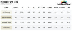
    I would love to be in your home with my samples and find that perfect color, but my gut is telling me to stay lighter, maybe around an LRV near 73 - 80 vs the 83 of moonlight. I think anything darker will be too dark.


    Maybe start with BM White Down or SW White Heron LRVs near 76.

    porkchop_z5b_MI thanked Jennifer Hogan
  • last year

    Thank you Jennifer, your insight is most helpful.

  • last year

    I got Samplize of the Rock Candy and Natural Elements. Of the two, I like the Rock Candy better. I'm not sure it's quite right, but it's a maybe.


    White down is pulling a hair too yellowy-peach.


    What about Soft Chamois?

  • last year

    Natural Elements is pretty green - would not expect it to good in your space.


    Soft Chamois is a bit less yellow / more neutral than White Down. It may be a really good choice.


    Rock Candy is blue undertones - I think it will be too cool - too gray.


    Running out the door - no time to look at much right now, but will try to get back to you later.


    Threw Pale Oak in - don't know if you have tried this one. Warm neutral with a nice mix of gray and beige. It is a tad darker than the others we have been focused on.


    porkchop_z5b_MI thanked Jennifer Hogan
  • last year

    Funny -- Rock Candy doesn't look blue in the slightest in my space, it looks like a softer, lighter, brighter Natural Elements. Pale Oak is a no-go = pulls slightly violet.

  • PRO
    last year
    last modified: last year

    What about Soft Chamois?

    It's in the same hue family neighborhood, nuance is slightly different from Moonlight.

    Perceptually, comparing chips, might be difficult for some people to discern a difference between Soft Chamois and Moonlight.

    Installed could be a different story; 100% depends on inherent light, contents/context.


    porkchop_z5b_MI thanked Lori Sawaya