

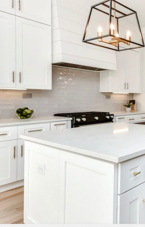
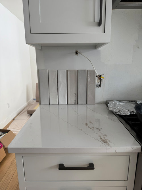
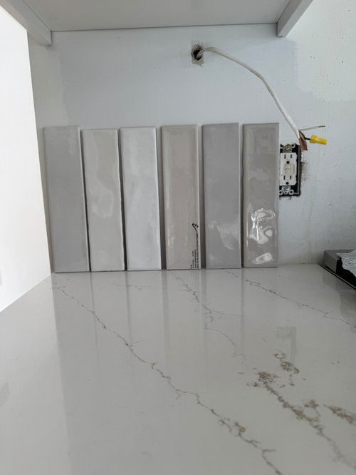
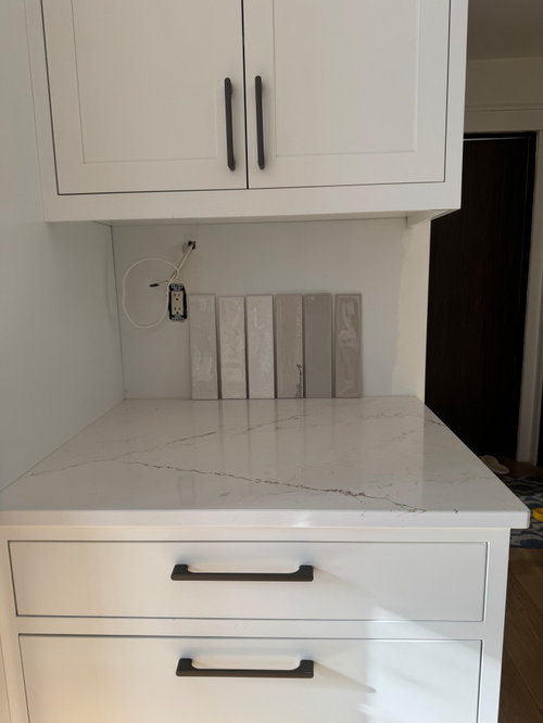
Please help pick a tile for my kitchen backsplash!
last year
last modified: last year
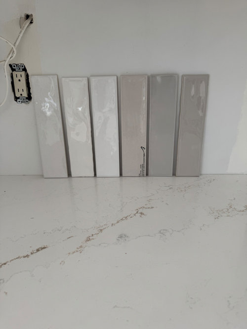
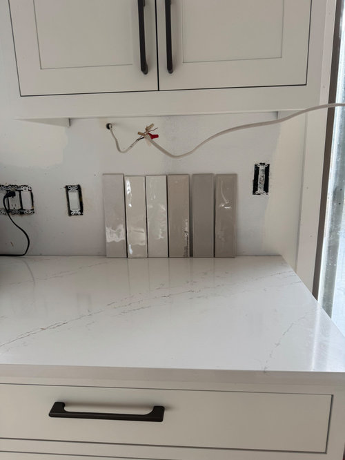
1
2
3
4
5
6
Featured Answer
Sort by:Oldest
Comments (9)
Related Professionals
Rochester Interior Designers & Decorators · Liberal Interior Designers & Decorators · Decatur Architects & Building Designers · Davenport Architects & Building Designers · Torrington Kitchen & Bathroom Designers · Lansing Kitchen & Bathroom Designers · Sedalia Design-Build Firms · Wheeling Design-Build Firms · Charlottesville General Contractors · London General Contractors · Lebanon Flooring Contractors · Honolulu Flooring Contractors · Amherstburg Kitchen & Bathroom Designers · Springfield Kitchen Remodelers · Duluth Kitchen Remodelers last year
- last yearlast modified: last year
- last year
 last year
 last year
 last year

Related Stories
KITCHEN DESIGNHow to Pick a Kitchen Backsplash That Wows
Design your ideal backsplash with help from these Houzz guides and inspiring ideas for every kitchen style
Full Story
KITCHEN MAKEOVERSKitchen of the Week: Backsplash Dazzles in Green Geometric Tile
A designer helps a growing family function better at home with a new kitchen, mudroom and dining room bar
Full Story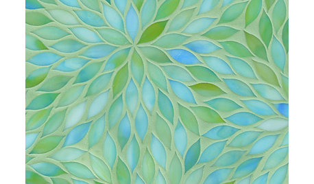
PRODUCT PICKSGuest Picks: Beautiful Backsplash Tiles for Every Budget
Explore 20 tiles curated by a pro interior designer, ranging from everyday affordable to art for the kitchen
Full Story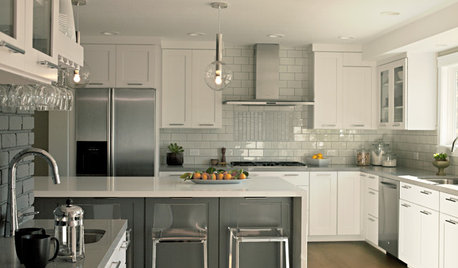
KITCHEN DESIGNEcofriendly Kitchen: Recycled Tile for Backsplashes
Pick a popular look for your kitchen backsplash design and go green as well, with beautiful tiles made from recycled materials
Full Story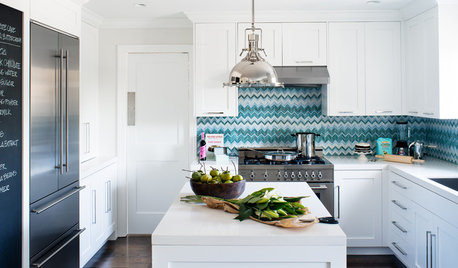
KITCHEN BACKSPLASHESDesigners Share Their Hottest Picks for Kitchen Backsplashes
Make a splash in the kitchen with these design pros’ selections for backsplash materials, colors and layouts
Full Story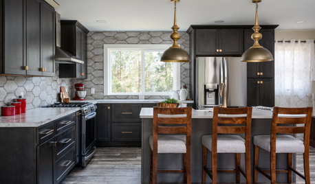
KITCHEN MAKEOVERSKitchen of the Week: An Open Layout With a Rustic Tile Backsplash
Removing walls opens up a Michigan kitchen, creating a more user-friendly space for an empty-nest couple
Full Story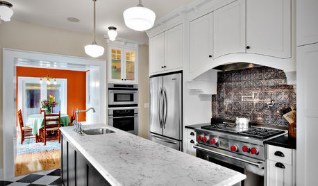
KITCHEN DESIGN8 Statement-Making Kitchen Backsplashes Beyond Basic Tile
Look to metal, glass and even wooden crates for an attention-getting backsplash that might even save you some money
Full Story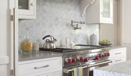
KITCHEN DESIGN8 Top Tile Types for Your Kitchen Backsplash
Backsplash designs don't have to be set in stone; glass, mirror and mosaic tiles can create kitchen beauty in a range of styles
Full Story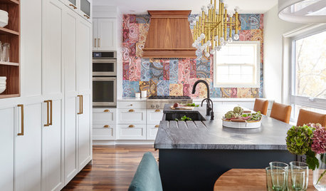
KITCHEN DESIGNPaisley Tile Backsplash Takes This Kitchen to a Whole New Level
The remodeled Toronto kitchen features a soapstone-topped island and a bold backsplash that makes an impression
Full Story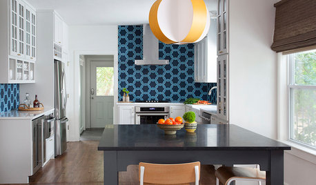
KITCHEN BACKSPLASHESThis Kitchen’s Geometric Blue Tile Steals the Show
An Asian-inspired island, newly stained floors and white cabinets complete the look
Full Story



Kendrah