Software
Houzz Logo Print
webuser_354366403

Need bathroom advice ASAP please!

last year
last modified: last year
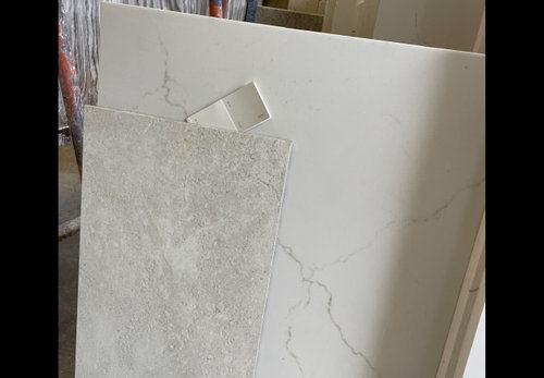
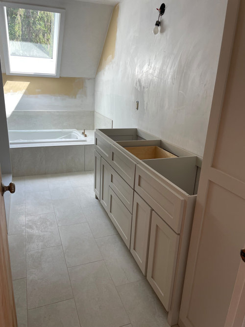
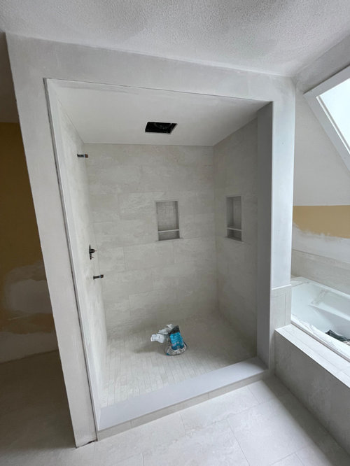
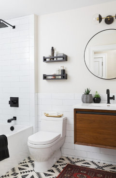
Hello, I’m doing a master bath renovation. My tile (a ’milk’ color 12x24” travertine), quartz vanity top, and BM Pale Oak painted vanity color is shown below. I need to pick a wall color now. I am going for a calm, spa-like vibe. Wondering if just darkening the Pale Oak by 25% and use that on walls? Not even sure if I should go darker or lighter. Only natural source of light is a north-facing ceiling skylight. Bathroom pics below also. Thank you!


Comments (20)

  • last year
    last modified: last year

    Great choices for the finishes! I would go lighter than the BM Pale Oak.

    It will appear darker on the walls.

    Paint everything, the walls and ceiling, even the trim the same color, different sheens.

    Sample BM White Dove or BM Simply White

    and BM Chantilly Lace (it's white white, with no undertones), but I think you be surprised how fresh it feels in a low light bathroom, and will enhance your beautiful finishes.

    The room will warm up once you bring in all the daily supplies and textiles.

    Diane Moran thanked Lyn Nielson
  • last year

    Didn't you post this yesterday?

  • last year

    I did, but no one commented on the post, so I reposted it with a better title! I am very stressed about picking the paint color because the lighting in the room is odd with just the skylight, and Pale Oak seems like it has undertones and can look not good with lots of colors?

  • last year
    last modified: last year

    Great advice already - just sample a few of the recommendations above and go from there - it’s just wall paint and can be easily changed

  • last year

    Will you be using the same door and trim color as you have in the rest of your home?


    The wall color you select will need to coordinate with everything including the trim color.


    What colors do you have in the adjoining rooms? You want the bathroom to feel cohesive with the rest of the home, not like it belongs in a different house.


    You specify that you want the room to feel spa like, so no vibrant, high energy colors, but there are a lot of less saturated blues and greens that will provide that same calming, relaxing feel to the room.


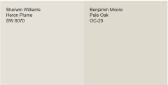
    Pale oak looks fabulous with darker taupe colors, with smoky blues smokey greens and grays. I love it with Heron Plume. . .


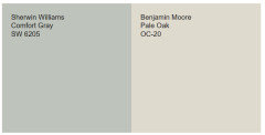
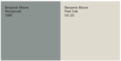
    And with blue green gray like Comfort Gray or Stony Brook. . .


    Diane Moran thanked Jennifer Hogan
  • last year

    Thank you for the color comparisons! The master bedroom walls are actually like a lighter version of Heron Plume. What I think of as a ’light khaki’. The trim is some kind of white. Good point about it coordinating. I will add Heron Plume to the list to test, along with the ones mentioned above. The Stonybrook might be too dark but I can test the Comfort Grey also.

  • PRO
    last year

    Get the lighting fixed first . The sky light only works during a sunny day . Do all LED 4000K ights then choose wall color.

    Diane Moran thanked Patricia Colwell Consulting
  • last year

    I like whatever Cream that is on the paint chip stuck between your stones in the first picture. Nice warm neutral. Love your stone and tile!

  • last year

    Random thoughts:

    - I like the tiles in the shower, and I like that you included two storage niches.

    - I like the pale oak vanity but hate the countertop with the veining.

    - Love a tub with arm rests!

    - I'd lean towards a color on the walls -- I'd probably choose a pale blue, maybe a sage green. Tan would do, but it would be a lot of the same across the room.

    - Don't forget you need to include your linens and artwork in your color choice.

    - Don't stress over-much about paint. It's the easiest thing to change.

    - With the angled roof and the skylight, this is going to be a lovely room.

  • last year

    @tracefloyd, that is called Seapearl. I wonder if the fact it is on the 4-paint colors card with the Pale Oak means it does coordinate? White Dove which someone suggested above is at the end of that same paint card.

  • last year
    last modified: last year

    @Mrs Pete Well, I hope the vanity top looks good, but hard to tell using just your imagination. That was overwhelming too, all the choices. And the vanity is being custom made so I had no one piece I could see in real life to base these decisions off of. Good point on the wall decorations, linens, rugs. I could work some of these other darker coordinating colors into those elements so its not boring.

  • last year
    last modified: last year

    I found this blog...Sea Pearl and Pale Oak are basically the same- just lighter and darker versions so yes, they all coordinate on the same paint strip.

    https://modandmood.com/seapearl-china-white/

    And this:


    https://www.homebunch.net/home-decor-interior-design-7/

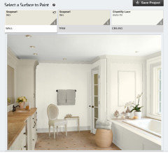
    For the Ceiling consider either Chantilly Lace or you could do a color wash.

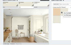
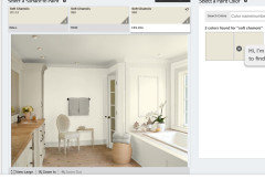
    From the Ben Moore Visualizer called Personal Color Viewer...


    Diane Moran thanked tracefloyd
  • last year
    last modified: last year

    Thanks for the like...it sounds like the painters might be coming so you can't wait till lighting is installed. Use a table lamp with different color light bulbs when testing samples.

    Here is Soft Chamois, even creamier than Seapearl.


    We had our bath with blue walls and white tile. Got tired of it fast. Blue or Green sounds nice till it goes up then it just feels dated. We have white walls now and very nice but all white bath is no longer trending. Cream and White palette sounds spa like and contemporary and warmer for a north facing room.

    Color wash with Soft Chamois also on the ceiling:


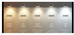
    Incandescent is 3000 Sunlight 5000

    Diane Moran thanked tracefloyd
  • last year

    Be careful of the undertones. Pale Oak is a true Taupe. It has violet undertones.

    Although soft Chamois is pretty, it has too much yellow next to Palr Oak. Seapearl is better, but we still don't know how it will work next to the trim shared with the bedroom.

  • last year

    They all look nice. Then you hear about the ’undertones’ and ’lighting issues’ and that is when I freeze up and can’t make a decision! Thanks for all the great inputs!

  • last year

    @Diane Moran - You are not alone. The idea of undertone and the color of light are things we just don't think about all that often, so they feel foreign.


    Truth is we don't pick out lightbulbs very often and years ago the color choices weren't so broad.


    There is no right or wrong color lighting and although lighting makes colors look different getting a different color light bulb won't make two colors that clash suddenly look great together.


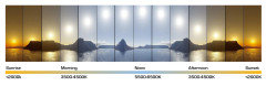
    In the morning and evening we have warmer light than we have at noon.


    The trees and flowers and leaves and water looks different, but because all the colors are either more yellow or more blue they still work together. Do you change outfits or makeup when you are going to be outside at noon vs at sunset or do you still look good in the same colors regardless of what color light is shining on you.

    Where we do see a difference is if you pick all your colors using a lower kelvin (more yellow light) and suddenly change the bulbs in one room to a daylight 5000k bright white light. The color on the walls in that room will look very different than the same color in some other room of your home.


    My sister has a Tudor home with antique furnishings and lots of wood and her color palette is a lot of mossy greens with gold and orange red accents (Fall Colors). She uses 2700 k lighting and it works with the furniture and color palette.


    I have an MCM home with MCM furnishings and a color palette of taupe and smokey purples with teal and wine red accents. I have daylight bulbs (5000 k).


    My home feels crisp and clean and higher energy, her home is much more relaxed. Funny thing is our homes are actually opposite of our personalities. She is very high energy, quick witted, an extreme extrovert (gains energy from others/hates to be alone). I am an extreme introvert (people can exhaust me/ I enjoy being alone or socializing with one or two people at a time). I am more contemplative. I need to think through things, consider different perspectives and weigh things before responding.


    I think our design choices may help balance our personalities. The higher energy pushes me while the lower energy of my sister's home relaxes her.


    Although many designers say you should have 3500 to 4000k lighting, but I think your lighting should match what makes you love your home.


    Diane Moran thanked Jennifer Hogan
  • last year

    Seapearl and Pale Oak are NOT lighter and darker versions of each other. Pale Oak has a violet undertone which may be noticeable or not, depending on the space, while Seapearl has a grayish-green undertone.


    I would never do 4000K in a bathroom. Too harsh, IMO, especially if you're going for a spa-like feel, and double-especially if you don't want to cry every morning when you look in the mirror and see the reflection of someone who looks 30 years older than they actually are with every line and dark shadow magnified....

    Diane Moran thanked porkchop_z5b_MI
  • last year

    @Diane Moran - You are not alone. The idea of undertone can also be confusing because we are talking paint colors. Something you pick every 10 or more years.

    But you actually work with undertones and neutral color selections every day.

    Your skin tone may be pink or yellow or neutral or olive.

    I have a lot of pink undertones in my skin. My powder would be the middle block below.

    Foundation middle of the top row below.


    I would not look good if I picked a green or yellow undertone for my makeup. I can't wear peach or orange lipsticks/blush or more neutral lipsticks/blush. I look good with pinks that lean toward purple and reds that lean toward purple. Wine or berry shades.


    Those same blush shade may look awful on someone with olive toned skin or more yellow tones.


    I can't wear yellow beige clothing, I can't wear blue grays or black. I usually wear more jewel toned colors but when I do wear neutral it has to be taupe.


    I am sure you have brought home a shirt that you thought would be the perfect shirt to go with a pair of neutral pants only to find that when you got it home it was too pink or too yellow or too green. . . and just wasn't right.


    It is the same concept with paint colors. The hardest part is that we are usually looking at small samples and it looks fine together with little one or two inch squares of color, but when you paint 100 square feet of the color on the wall and it is next to the 100 square feet of flooring all of a sudden those undertones that we didn't see in the tiny sample are amplified and screaming at us.


    Looking at the color samples in larger sized samples and under natural daylight can really help us see the colors.


    https://samplize.com/ has made getting larger samples easy.


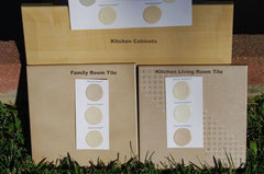
    Looking at the colors in daylight is easy - just take the samples outside on a clear day around 2:00 in the afternoon and look at them next to each other.


    Can you see below how the Kitchen Tile had more pink than the family room tile and how the family room tile looks kind of green next to the strong yellow tones in the kitchen cabinets.


    colors · More Info


    When I help others choose a color palette I look at the whole home, not just one room. You don't want one look throughout the home with one room that is suddenly completely different and feels like it belongs in some other house.


    I start with the colors that cannot change (Flooring or cabinets or furnishings that are not being replaced - sometimes includes the white trim color that is in the rest of the home) and the owners favorite accent colors.


    I look for the neutral color family that will work with both the colors that must stay and the accent colors that you love. Walls are a backdrop for your furnishings and art and things.


    Once we have found the neutral color family (not the exact paint color - just the family) I move to finding the countertops and flooring and tile and cabinets that are in that family and work together. You don't have near the number of choices on these items as you have when it comes to the paint color.


    Once all of those things have been selected I move to picking the paint color for the walls.

    I often use neutrals in the main living areas and coordinating colors for bathrooms/bedrooms, maybe a darker shade of the same neutral in an office or master bedroom. I pick my white for trim if we are changing the white trim based on what goes best with the neutral wall color.

    If the walls are going to be a white, I usually choose the same white for trim and ceiling.


    If you pick neutrals from different families in different rooms you need to be confident that they work together and you don't end up with a disjointed mess.


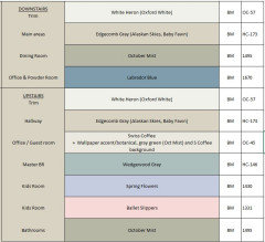
    Here is an example of a color palette I recently worked on for my niece.


    There were a few compromises - She would have liked to use Wedgewood Gray or a lighter/darker blue green in the Master Bath, but the tile and cabinets were too yellow and worked better with October Mist. She will update that when she has the money to renovate the upstairs bathrooms.

    She will most likely keep the October Mist color in the 2nd upstairs bathroom as it coordinates well with the Office wall paper and the two kids rooms.

    We actually tweaked October Mist and made it a shade or two lighter (I can't remember if it was 25% or 50% lighter).


    Edgecomb Gray worked with the kitchen counters, flooring and cabinets. Hardwoods throughout were being refinished. The Labrador Blue and October Mist were colors already found in her sofa and upholstered chairs and the area rug she was bringing from her previous home. She likes soft grayish blues, greens and blue greens.


    Her daughters got to pick the colors they wanted, but we limited their choices to shades were not overly saturated.

  • last year

    @porkchop_z5b_MI

    Seapearl and Pale Oak are NOT lighter and darker versions of each other. Pale Oak has a violet undertone which may be noticeable or not, depending on the space, while Seapearl has a grayish-green undertone.


    Although Seapearl is slightly less orange than Pale Oak (orange yellow when neutralized produces the pink/violet undertones) it is only a few degrees less orange/more green)


    Everyone sees color a bit differently, but I have not ever noted a green tone to Seapearl.

    I think if you placed it next to Kitten Whiskers it may appear green, but so could Pale Oak.


    Colors are always perceived as they are compared to surrounding colors.


    When compared to a green beige they look pink.


    Below is a representation of Sea Pearl, Pale Oak and to the left a block that shows Pale Oak lightened to the same Luminance value of Sea Pearl L 90.284 = same as Seapearl / Chroma and Hue same as Pale Oak. It is almost an imperceivable difference.


    .