

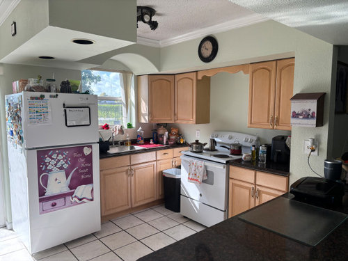
Need help on choosing paint for kitchen.
last year
Sort by:Oldest
Comments (4)

Related Stories
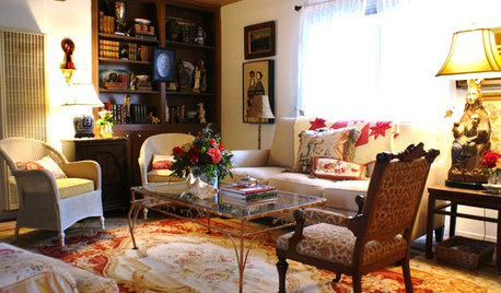
DECLUTTERINGDownsizing Help: Choosing What Furniture to Leave Behind
What to take, what to buy, how to make your favorite furniture fit ... get some answers from a homeowner who scaled way down
Full Story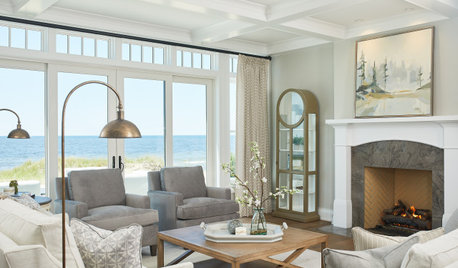
COLORHow to Choose a Paint Color
Designers offer tips for examining your closet, memories and daily life to find the right paint colors for your home
Full Story
COLORColor Palette Extravaganza: Room-by-Room Help for Your Paint Picks
Take the guesswork out of choosing paint colors with these conveniently collected links to well-considered interior palettes
Full Story
COLORChoosing Hues: Roll With the Color Wheel
See how an age-old tool can help you find the right paint
Full Story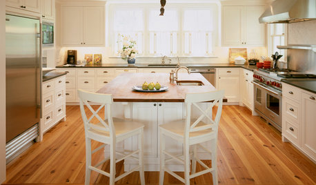
KITCHEN DESIGN3 Steps to Choosing Kitchen Finishes Wisely
Lost your way in the field of options for countertop and cabinet finishes? This advice will put your kitchen renovation back on track
Full Story
KITCHEN CABINETSYour Guide to Choosing Kitchen Cabinets
Updating your kitchen? See designers' top choices for kitchen cabinet styles, hardware choices, colors, finishes and more
Full Story
KITCHEN DESIGNKitchen Countertops 101: Choosing a Surface Material
Explore the pros and cons of 11 kitchen countertop materials. The options may surprise you
Full Story
GRAYChoosing Paint: How To Pick the Right Gray
Which Version of Today's 'It' Neutral Is For You?
Full Story
ORANGEPaint Picks: How to Choose the Right Coral
Don't Be Afraid to Try the Eye-Catching Colors of Dawn and Dusk
Full Story
MATERIALSKitchen Ideas: How to Choose the Perfect Backsplash
Backsplashes not only protect your walls, they also add color, pattern and texture. Find out which material is right for you
Full Story



andersons21
Kendrah
Related Professionals
Fayetteville Interior Designers & Decorators · Webster Interior Designers & Decorators · Akron Interior Designers & Decorators · Mansfield Interior Designers & Decorators · Clovis Interior Designers & Decorators · New Braunfels Bathroom Remodelers · Aurora Bathroom Remodelers · Lewiston Bathroom Remodelers · Niles Bathroom Remodelers · Cornwall Bathroom Remodelers · Florence Kitchen & Bathroom Designers · Great Bend Kitchen & Bathroom Designers · Frederick Kitchen & Bathroom Designers · Yakima Kitchen & Bathroom Designers · York Kitchen & Bathroom DesignersJennifer Hogan
Coccothrinax ArgentataOriginal Author