Software
Houzz Logo Print
homeingreece

1930s apartment remodel

7 months ago
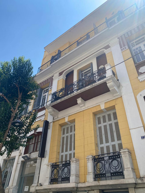
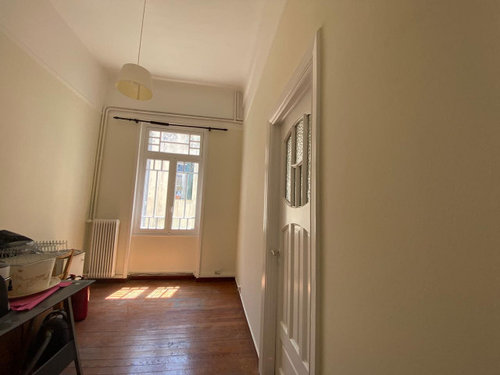
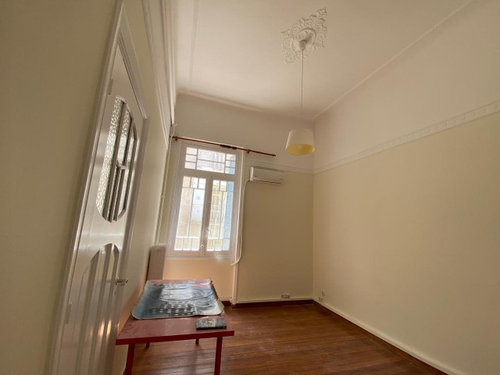
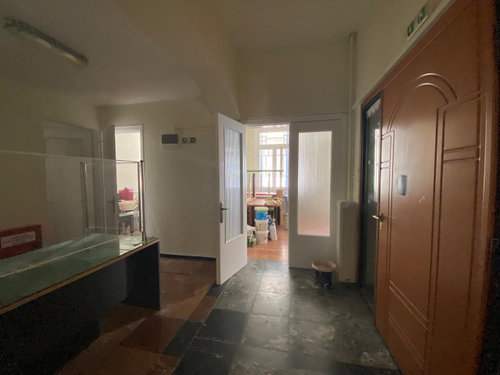
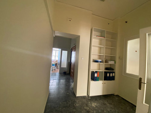
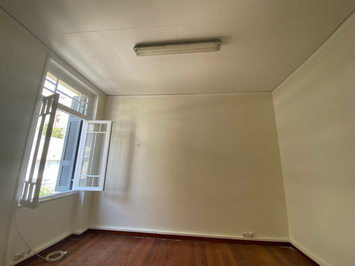
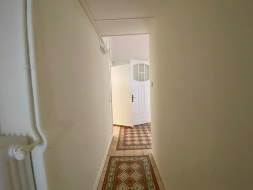
We purchased this apartment in a 1930s neoclassical building 6 months ago and are beginning renovation. Ours is the apartment with the single large balcony that takes up the entirety of the floor of the building.


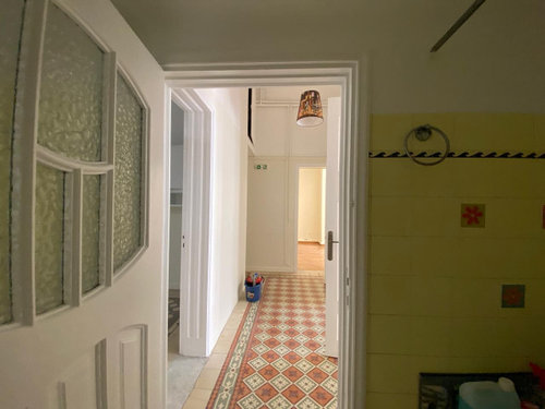
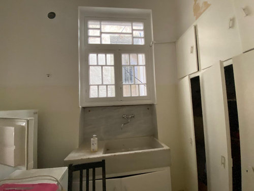
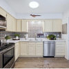
All false dropped ceilings will be removed to take the spaces back to their original 4m height and all original features will be kept. Where original flooring has been replaced we'll rip out the icky new stuff and put reclaimed original flooring back in. Bathrooms will be in keeping with the building but not highly themed to the era. In the kitchen we'll maintain that beautiful sink and want a clean, modern kitchen with antique and vintage furniture in it.


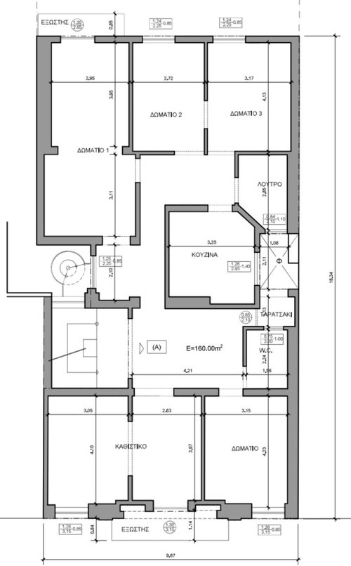
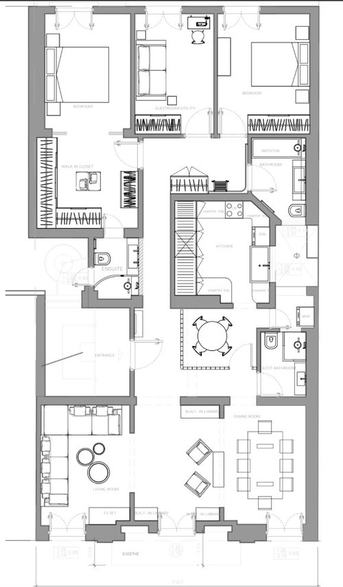
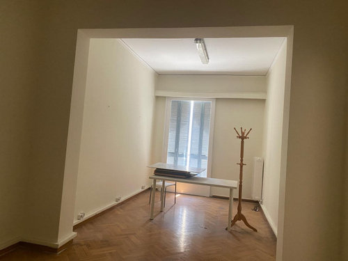
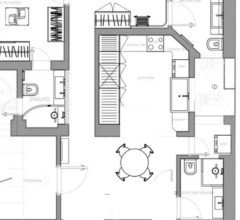
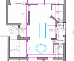
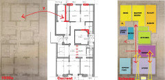
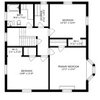
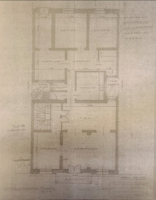
I attach photos as well as the original floor plan when built (for interest), the current floor plan and a proposed floor plan. The proposed floor plan includes the seating area in the kitchen - the surround is a greenhouse/glass wall to allow more light into the kitchen and prevent the hallway from feeling too cramped. One thing to note is that entry hall has a low 2-2.5m ceiling due to an original attic space and that ceiling will not be going any higher.


Any feedback and thoughts on the proposed floor plan would be gratefully received. Bearing in mind that this is a 1930s build in an earthquake zone so we're very limited in which walls we can rip out for safety reasons. We definitely want a seating area in the kitchen because we hang out in there a lot.


Yes - we are working with an architect because it's a big project and it's a listed/protected building.


Comments (19)

  • PRO
    7 months ago

    This is a US site, and we don't use the metric system, so it's just too much work to figure out the room dimensions. If you're using an architect, then don't waste time here crowd-sourcing information, it will just be confusing. But if you must, then go to the Houzz site for your country.

  • PRO
    7 months ago

    I have no problem with metric but I ad agree NA ideas and codes are very different than Europe I aslo am not sure what you want from us , your architect is who drives the bus and they must have an onsite designer that is who should help you. But good luck with what you have got . We stay in a 1932 apartment in Paris all the time and it is tiny but I love it

  • 7 months ago

    We definitely want a seating area in the kitchen because we hang out in there a lot.


    This is one thing that you really don't have in your new design.


    Can you cut back the counter so it the kitchen is more open to the eating area?


    Or can you remove the three interior kitchen walls and greatly expand the boundaries of what you consider the kitchen? Something like this - a non-seating island that creates a cooking galley area and table too?


    Lovely kitchen sink. Glad it will be preserved. Hope the interior doors will too. They are great.

  • 7 months ago

    I see a lot of walls where they are in the way. Obviously, they might be structural, but the part walls between the living room and the area between the LR and DR make it hard for you to incorporate that space into the LR, leaving you with a small LR and a big awkward space in the middle. Equally, the walls between the kitchen and the kitchen table area, are awkward.


    It's hard to read the original plans, but they look more sensible, but it's very hard to tell. Maybe you could darken them, add English descriptions of the rooms? If you want advice from us --- particularly if you can't read Greek or Houzz doesn't have a Greek site, you need to convert the measurements into feet and add English descriptions.


    Then, give us some idea of what's working for the layout and what isn't.

  • 7 months ago

    It appears this was performing well as a hostel prior to this. I see lots of potential converting it back to a single home.

    The ways a home conforms to American culture, lifestyle, and priorities is a bit different than elsewhere in the world. So advice here may not be on point.

    But having said that, in my opinion the proposed design doesn't seem to work well. The essence of the 1930s unit is lost, there is no arrival to spaces, there is no grandeur equivalent with the ceilings and proportions. Which seems ironic as you desire to respect it's history and design.

    It seems that proposed "rooms" were just fit to wherever works. The relationship to circulation and windows is muddled. You enter the unit right into a semi-screened table and bathroom, which seems like a backhouse area. The Master Suite enters through a closet. There are 3 lounge areas (or maybe 2+office) for a 2 bedroom unit. On the contrary, the original 1930s design was fantastic in those regards, the grandeur for guests, separating public vs private, utilizing the minimal natural light.

    I do see some things that have altered through the years from the original "as-drawn" plan. The bedroom walls and windows have been moved. So that may hint at what can be done in a current remodel.

  • 7 months ago

    Forgot to post my other pic:


    Can you open up this whole space by removing the three interior kitchen walls? I don't understand these measurements and know my blue squares are far from the correct scale. I'm usually not a fan of an open concept kitchen but feel this one is still well contained by division into the living room. This feels to me like you'd really make the most of the heart of the home. On the other hand, it removes a lot of the privacy entering into the bedrooms. Just tossing out ideas.

  • 7 months ago

    @mojavemaria, where do you see a library? I’m confused.

    I suspect that at least the thicker wall around the kitchen (next to where the round table and chairs have been placed) is load bearing, so I don’t think removing too many of the kitchen walls is possible.

    Why is there a door leading directly from the outside foyer into the master en suite bathroom? It seems very odd. Personally, while you say you want to hang out in the kitchen I think two dining tables so close to each other is overkill. I’d dispense with the round table and leave the entryway relatively clear. The rectangular table is still only about 3m away from the kitchen so not too far, and putting another table in between them feels claustrophobic to me.

  • 7 months ago
    last modified: 7 months ago

    @mojavemaria thank you very much. The closets are more reach in than walk in - it's a sort of dressing type area with closed fitted wardrobes around and there will be an antique dressing table opposite the bedroom entrance.


    The short walls between the living room and library are part of the original design with a sliding door to divide the rooms. They are staying so that we can close off that snug living room when people want to watch TV whilst our son is doing homework or I'm working etc in the library. Plus it's possible that down the line we would convert this to two apartments so that would then serve as a bedroom.


    The ceilings are lovely except (sadly) in the entrance hall because that's the way we designed that area in these old apartment blocks in Athens.


    I think re the eating space that is our thinking - to ditch it. We had hoped that some of those kitchen walls weren't load bearing but they are so they have to stay. That means we are now considering having a comfy nook in the kitchen and building out a little way (less than what we needed for seating) to increase storage and worktop space. We would put crockery and the dishwasher in the extension piece for easy access from dining room and an extra prep space - like a butler's pantry I suppose.

  • 7 months ago
    last modified: 7 months ago

    @Kendrah thank you. The original plan was to knock out that wall as you have shown and build an extension to the kitchen to increase storage and provide seating. Unfortunately the walls cannot be taken out so we're going to try a design to build a smaller extension into the entry way so it doesn't cut in so much but provides good storage and worktop space and put a nook in the kitchen. All doors, windows, shutters, cement tiles, wood floors (though not original) are staying. Wood floors might change to more age appropriate flooring if budget allows but we are big rug people so not sure it's something worth spending on.

  • 7 months ago

    @Sigrid thank you. The only walls that are different to the original are a more even distribution of space across the three bedrooms. And a wall we will take down between the dining room and that middle room that we're going to use as a library/office space. A bathroom was added after the fact in the entrance hall and the kitchen wall was built at a jaunty angle. Otherwise, that's it. So it's basically the same as the original plans. We're debating whether to add an extension to the kitchen because it feels small to us and that was the round table and chairs but we don't like it because we can't take out any more wall space than what is shown there. So we will probably build out a smaller space into the entrance hall as a butler's pantry (yes, entering the kitchen through the butler's pantry is a good thing as we've had it in a home before and loved it) and try to put a small nook in the kitchen.

  • 7 months ago
    last modified: 7 months ago

    @3onthetree I'm curious to understand what you think is so different between our drawing and the original aside from the bathroom addition (not our addition but it's there now so it stays at it doesn't eat into the entry space) and the kitchen extension which will be changed because we can't do what we had hoped. These are indeed backend but that's the way it was originally designed. There would have been a doorway opposite you as you come in to screen off the backend. We know that because the ceilings are very low in the entryway next to the kitchen and that bathroom as there is a big attic space there. So the entry hall in these apartments wasn't huge and impressive. It was around 5 foot deep and then you went off in either direction.


    The living spaces were always built like this - three smaller rooms with gaps between to adjoin and shut off as needed.


    There is minimal natural light in the kitchen only because, like you say, that was a work space. Hard to get any more into it as the window in there is internal to light shafts there. We had hoped to open it up a little but we can't.


    Not a single window has been moved. I'm confused as there really is no major difference between the original drawing and the current minus that bathroom addition, a slight quirk to the kitchen wall (which would have been done when built), the kitchen door moving (was in the narrow hallway opposite a toilet and then in the bedroom hallway and now will be in the entrance hallway) and the redistribution of bedroom space. These buildings have never had major remodeling work - this one especially. This was being used as a foreign languages tuition centre, not a hostel. Small rooms are traditional for us - very hot and very cold weather means small rooms make the climate easier to manage indoors.

  • 7 months ago

    @Kendrah just saw your open plan. No none of those walls can come down - they literally hold up the whole building. They're the core of it. The best we can do is that doorway opening. We had hoped to take down more of the kitchen walls but we can't. That's really what I was wondering by posting on here - if we're missing some sort of clever kitchen extension possibility but I don't think so.

  • 7 months ago

    @colleenoz thank you. The entry foyer is the door that opens opposite the kitchen extension (which will be removed as we are unable to do what we really wanted there). There is no entry into the master en suite except through the master bedroom. Are you referring to the small spiral staircase? That's an external staircase into a shaft between our building and next door. It's a window, not a doorway but if someone develops the roof space one day to make it a nice outdoor space then we might reconfigure to be able to access it through that stairwell. It's also a good fire escape. All our bathrooms in older buildings look into inter building or internal shafts. It's where all the plumbing runs.


    You're right re the kitchen walls - they are all load bearing and are the core of the building.

  • 7 months ago

    I am just looking at the original drawing vs the "as-built." The bedroom walls and windows are different (which you even said in a comment), with a couple other major things (the kitchen wall, the entry arch as shown in picture). It makes no difference to me what was done in 1930 vs now, but if those walls were moved at some time because they are not structural, then they can possibly move again. And the reason why I call that out is because I would completely rethink your adjacencies, and moving those walls would allow it.

    You asked for input on the design. The plan is not very good for the exact reasons I stated. That doesn't mean it's not what you want, or asked for from the architect, or livable. It just could be so much better.

    If I were already gutting ceilings, floors, redoing plumbing, all new converting back to a home, I would milk that remodel scope to make the cost and trouble worthwhile. So for a general design for most people, and for the most part universal concepts (except for maybe a Laundry Room), I would look at something like this. It is basically utilizing the 1930s public areas to capitalize on natural light. The proportions of rooms to each other are better. The circulation is better. Public vs Private, entry arrival is better.


  • 7 months ago

    If that is a soapstone sink, don't get rid of it.

  • 7 months ago

    @3onthetree while I appreciate your efforts I think there has been a misunderstanding. The floor plans from the 1930s are not what was actually built. That happened a lot in Greece - I don't know if it happened in the USA. It is highly likely that what actually exists is exactly what was built in the 1930s - perhaps I misled in the first post as I assumed people would understand. With the quirky kitchen wall angle (we know because the original 1930s toilet tank is in the attic above the current toilet in the bathroom against that quirky angled kitchen wall). The windows have absolutely not changed since it was built in the 1930s - it would be impossible to do that on a building like this. And now it's listed it's 100% illegal to do anything like that.


    Your plan leaves us with only 2 bedrooms (I absolutely don't want a bedroom with a door leading off the living room) and a dining room with a ceiling height of around 2-2.5m (6.5-8ft) vs the 4m (13ft) that we have in the dining room originally designed as the dining room in the 1930s. There was never a grand, high ceilinged entry way into this apartment. The double door entry shown on the 1930s floor plan is the front door to the apartment. There is around 1.5m (5ft) in front of the door as you walk in that has the high ceiling. Then you get a large load bearing beam (that red dotted beam) and from there to the bathroom/internal balcony there is that lower ceiling with a huge attic space above it. It would be like eating in a small, dark cave with no windows. And we couldn't extend right to the end for the dining room because that little space right next to the entry hall bathroom is a little utility balcony - boxed in green below. So we couldn't get a good rectangular shape on the dining room - we'd have a bite taken out of it. We could consider making that bathroom into just a toilet and sink by shaving off the front to bring it in line with the little balcony door - that would give a bit more room in the entry hall. But the cost of that doesn't feel worth it. Plus we have a very sociable popular son who has been planning his own social life since he was 3.5 - I mean talking to friends' parents at school pick up to tell them what he has planned with their child and organising times and dates for gatherings etc. He's already got ideas of friends staying etc. So a second freely accessible full bathroom would help with that traffic.


    In the 1930s it seems that the smaller room in the front (that we have designated as the TV room/living room/snug) was designed as an office - I assume for a doctor, lawyer or other professional who had an office at home and saw clients that needed an entry point from the building's main stairwell without needing to enter into the apartment itself.


    The smaller spiral staircase (next to a toilet in the 1930s plan - no toilet was actually put in there in the end but we will put the master en suite there) goes to the roof and down to the ground floor. It is an emergency exit through a window.


    In Southern Europe the 1930s layout was very common. Bedrooms and living spaces were big and bright and airy. Everything else was not - hence them being in the middle of the apartment with very little natural lighting. Small rooms were created intentionally to make it easier to temperature control between external temps of 25F to 95F but there were openings between them to merge when needed. And I know in the USA people like the huge master suites but we don't live that way in Europe preferring to have more space in the shared areas because we prefer communal living.


    Like I said, thanks for your help.


    I wish I knew how to turn commenting off so people didn't waste any more of their time. I did mean to put this on the UK Houzz but then once it was on here it was on here.

  • 7 months ago

    @User it's a marble sink as was traditional in Greece. We don't use soapstone. It's not going anywhere. Nothing original will be damaged or removed. Any original features missing or incomplete will be put back using reclaimed materials where possible.

  • 7 months ago
    last modified: 7 months ago

    Maybe keep in mind you are getting ideas from a different perspective, many of us are professionals and you are getting real, pertinent advice for free. Over the internet, I only know the info you present and can make some usually spot-on assumptions from that information. I see something that is not that great, and have ideas to make it better. I share them to hopefully help someone who has asked for help. I realize you are put off because I said it is not good, but sometimes people need to hear that. It is between you and your architect to go from there. Good luck with your remodel.

Sponsored
Snider & Metcalf Interior Design, LTD
Average rating: 5 out of 5 stars25 Reviews
Leading Interior Designers in Columbus, Ohio & Ponte Vedra, Florida